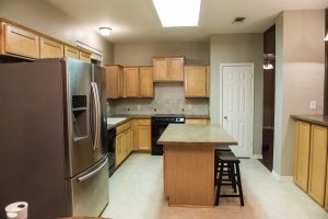
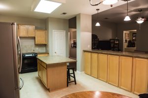
This home was built in the last 15 years and had been well-taken care of by previous owners. While our clients appreciated the simple and tidy kitchen, it wasn’t quite their style.
Our goals were to maximize cabinet space, brighten the room, and add new elements of design that suited our clients’ taste.
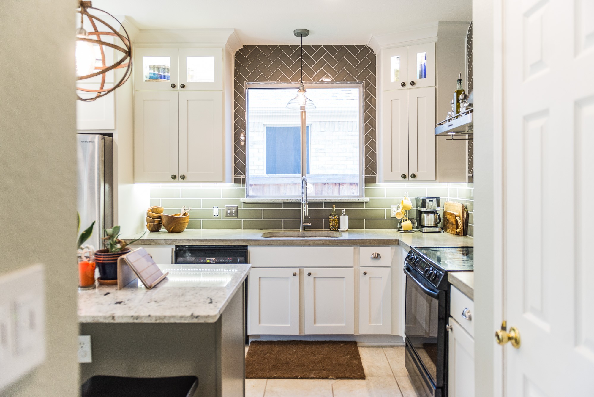
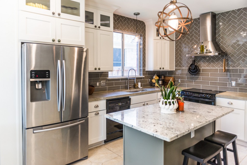
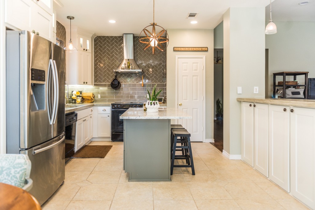
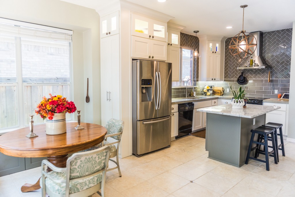
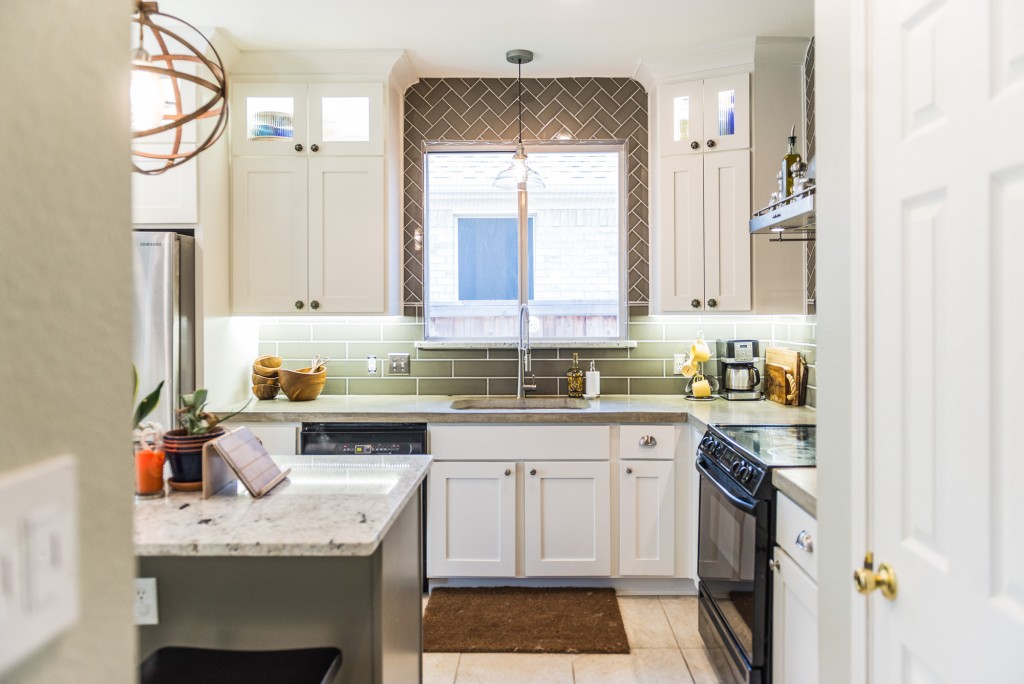
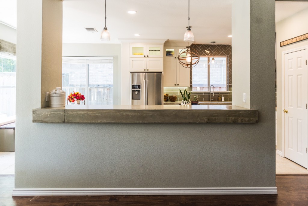
We rebuilt the upper cabinets above the refrigerator and on either side of the sink to extend to the ceiling. The doors and drawer fronts for the base cabinets were rebuilt to match. All cabinets on the stove wall were removed in order to create a tile accent wall featuring a stainless vent hood. The refrigerator was cased in with a fridge-height broom cabinet for extra storage in the breakfast nook.
Fluorescent lighting was removed in favor of LED can lights over the island and workspaces, a pendant over the sink and a wooden pendant handmade by the client over the island. In-cabinet and under-cabinet lighting were installed for ambiance.
After:
(Click here to see the mobile-friendly project gallery)
The backsplash mixed tile sizes and layouts, with a 4″x16″ subway in a brick lay design on bottom and 3″x6″ subway in a Herringbone pattern above.
Granite was used on the island, but the rest of the counter tops were concrete, poured in molds in the garage where they were sanded and polished, then transferred inside for installation. An apron-front edge was included on the bar top.
See all the after pictures below.
Island & Bench Seat Color: Sherwin Williams Adaptive Shade
Cabinet Color: Sherwin Williams Pearly White
Granite: Colonial White
Backsplash Tile: Arizona Tile H-Line Series in Pearl Glossy (4″x16″ and 3″x6″)
Before pictures provided by homeowner.
After pictures by Darby Kate Photography
After:
[FinalTilesGallery id=’6′]
You might also like




Leave A Comment