The “Windsor House” was built in the late 1990’s. While it had been well taken care of and was still in great shape, it was in need of updates. Check out all the details of this kitchen before and after below!
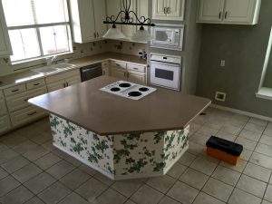
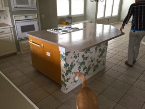
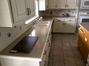
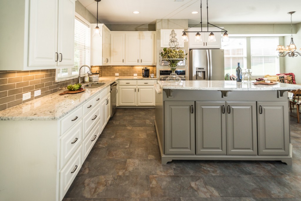
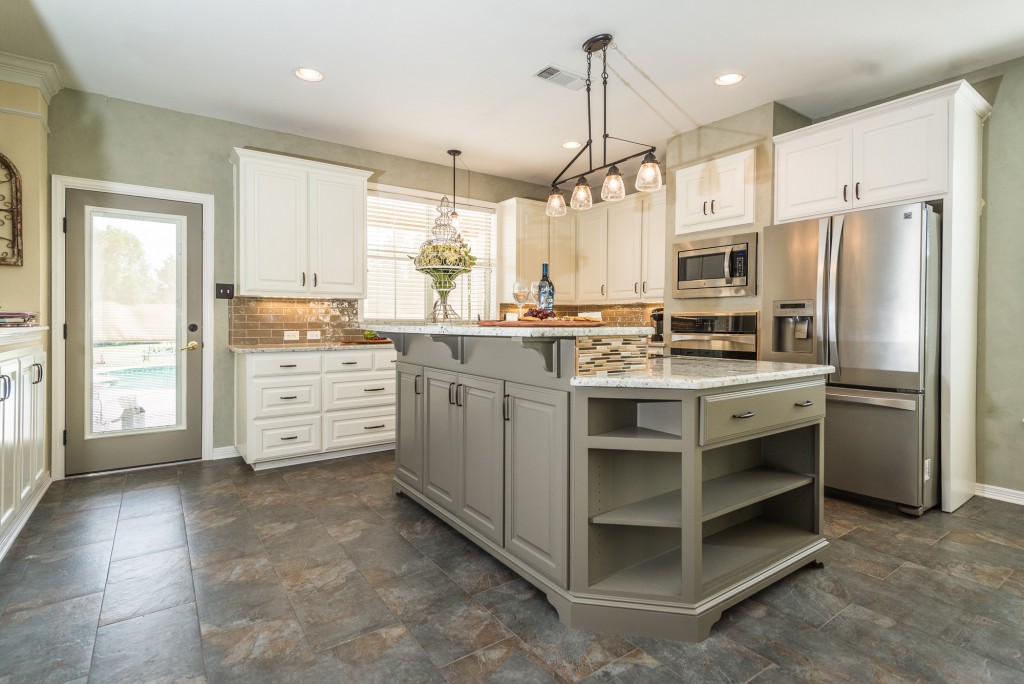
The cabinets had been recently painted, but the client desired a bi-level island with more storage and no wallpaper. New flooring, granite counters, tile backsplash and new lighting were also on the wish list.
Before:
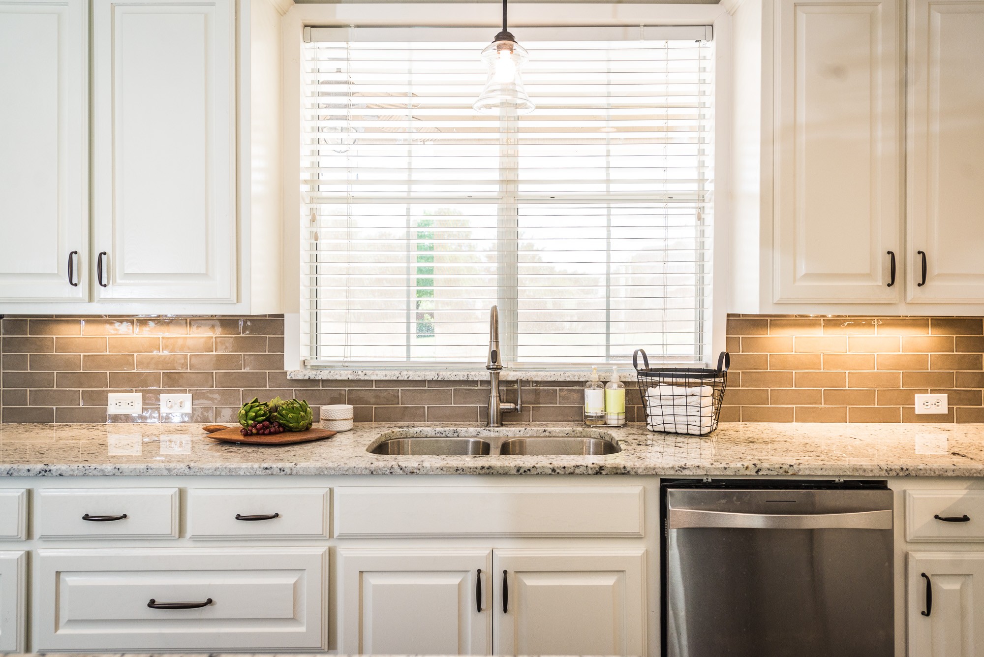
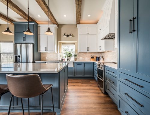
After:
(Click here to see mobile-friendly project gallery)
Since the kitchen and dining areas were spacious, larger floor tiles could be used to better suit the space. We replaced the standard 12×12 straight-lay tile with an updated 12×24 tile in a brick lay pattern.
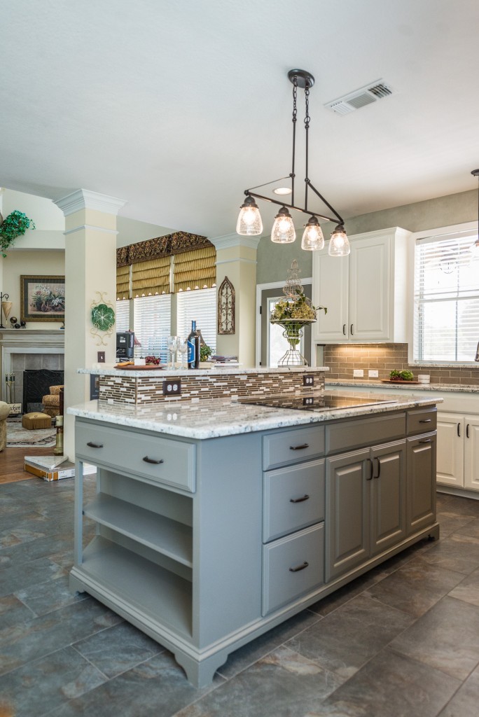
A custom island was made to look like a free-standing piece of furniture and incorporated more storage space as well as the bi-level eat-in bar the client desired.
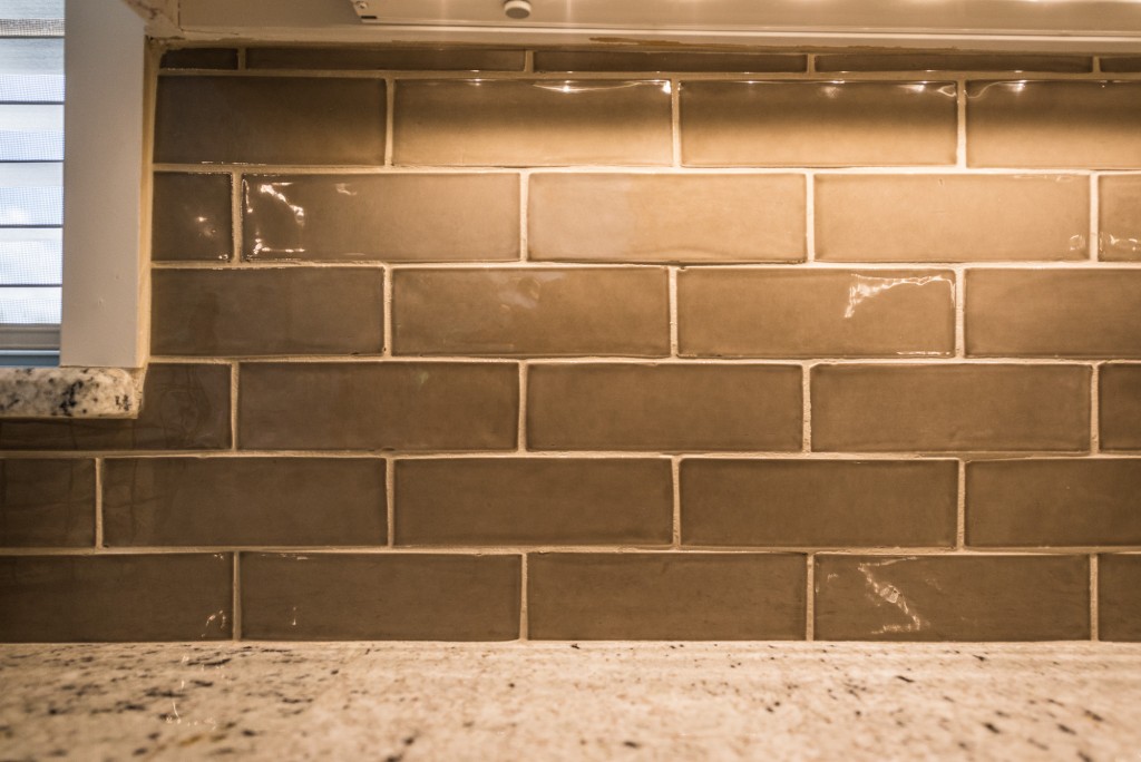
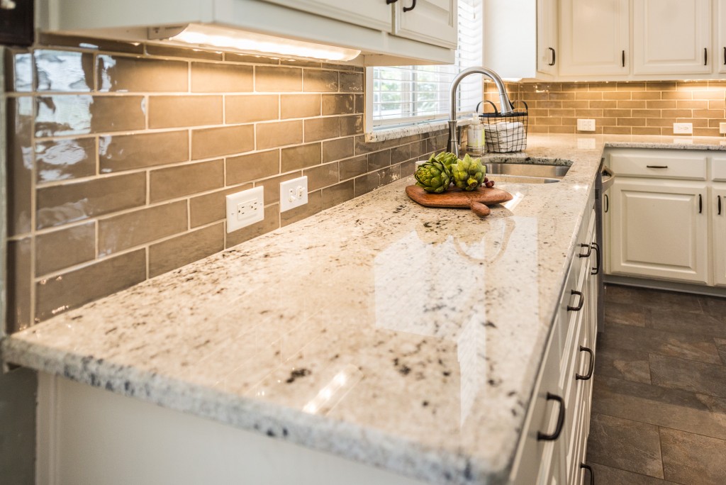
A mosaic backsplash was used as an accent on the island, while a classic taupe subway tile was used for the rest of the backsplash. This lovely Walker Zanger tile is handmade and contributes to the sense of quality in the space.
See all after pictures below. What is your favorite part of the Elegant Windsor Kitchen?
Granite: Colonial White
Island Color: Sherwin Williams Adaptive
Main Backsplash Tile: Walker Zanger – Tuileries Fedora Brique 2-3/8″ x 7-1/2″
Wood serving board by Pastrana Studio
[FinalTilesGallery id=’7′]
Before pictures provided by Jeremy Irwin
After pictures by Darby Kate Photography
You might also like





Leave A Comment