The Irwin Farmhouse project is especially significant for us as it is our own “new” home. It may just be our favorite project to date. While we’ve renovated for ourselves before (see our most recent project at our previous house here), we always made changes one room at a time. This time we updated the entire house at once before we moved in. That enabled us to make the whole house cohesive from a design standpoint and create a space that perfectly reflects what feels like home to us.
We first spotted our farmhouse on a realty website. It was in our ideal location with lots of room for our boys to roam outside. Despite the choppy layout of the house, we immediately envisioned its potential and were under contract within 24 hours.
The house was built in 1981 and two separate additions were built over the years. From what we can tell, the first was the sunroom and laundry room and the second was the garage conversion. We purchased the house as a 3 bedroom, 2.5 bath with three living spaces. We decided to take out two load-bearing walls in the kitchen and living room area, completely redo the kitchen, hall bathroom and laundry room, and convert the garage addition and half bath to a new master suite (adding a bedroom and bathroom).
Due to the large scope of this project, we’ve split it up into three posts. Part I encompasses the kitchen, living room, sunroom and laundry room, Part II covers the hall bath, kids’ rooms and guest room, and Part III is the master suite.
(See end of post for sources and materials)
KITCHEN + LIVING ROOM
B E F O R E
A F T E R

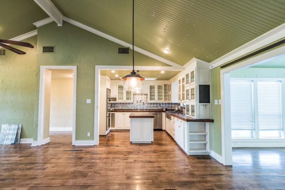
In the original layout, the front door opened to three walls. The house felt cramped and uninviting. We removed the walls separating the entry from the living room and kitchen, making a huge difference in the view from the front door.
[FinalTilesGallery id=’97’]
The house had been partially updated, but the layout was still choppy and inefficient for how our family functions. We loved the solid white oak floors throughout the house, and they were a big selling point for us. The oak counters in the kitchen were beautiful, but there was no pantry (which is not ideal when trying to keep growing boys fed) and very little counter space for food prep. The kitchen felt isolated from the living room, and overall wasn’t our style.
The white painted brick on the wood-burning fireplace was smoke-stained and the mantel seemed insubstantial for such a tall fireplace. We saw the shelving area to the right of the fireplace as an opportunity for more storage.
We came across a few “before before” photos in an old MLS listing of the house. Be sure to navigate all the way through the before photos to see them!
[soliloquy id=”4999″]
We envisioned a modern farmhouse aesthetic with neutral colors, clean lines and lots of texture for the whole house. We both love carpentry projects and wood furniture we’ve made fills our home. Therefore, we incorporated lots of wood-tone accents to warm up what could otherwise be a cold or sterile color palette.
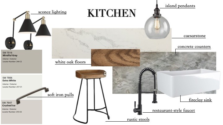
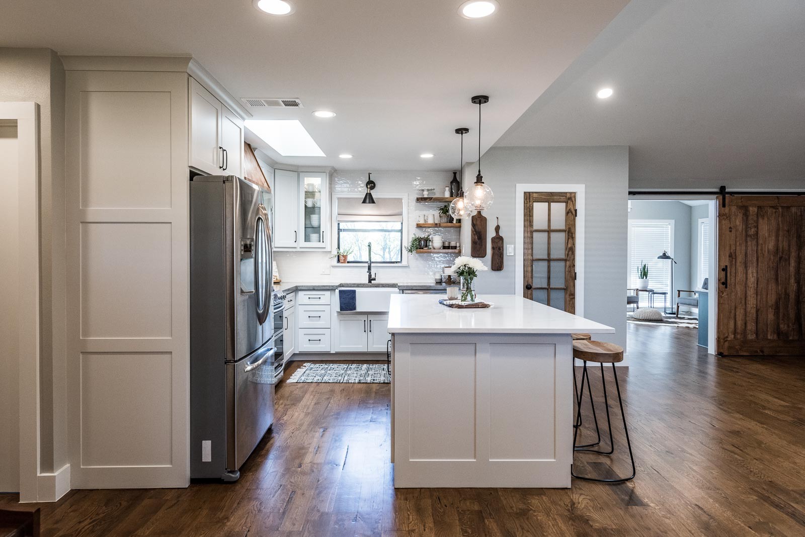
In planning the kitchen and living room we infused black and iron elements for an industrial spin on the modern farmhouse design, though we still chose some traditional farmhouse elements like shiplap and a fireclay farmhouse sink. We’re fans of mixing countertop materials, so we chose a quartz by Caesarstone for our island and coffee bar counters while going with hand-poured concrete counters for the rest of the kitchen and the living room hearth cap. We chose a handmade-look 2×10 brick backsplash tile for the kitchen to achieve a classic look, yet had plenty of texture.
Demo days are always fun, but this one was special. Both our workers and our friends filled the house as everyone took ceremonial sledgehammer swings at the walls we were removing. We installed large lam beams in the attic in place of the walls we took out. Stripping the kitchen to the studs gave us the opportunity to bring in a gas line for a gas range.
Relocating the doorway between the living room and sunroom provided the opportunity to build a pantry with a coffee bar. We installed custom cabinetry in a new kitchen layout with a large island for plenty of prep space. We built molds directly on the cabinets to allow us to pour the concrete counters in place. Navigate through the slider below to see all the kitchen “during” photos!
[soliloquy id=”5009″]
The white oak floors had to be repaired and patched after removing the walls, and we refinished all the flooring to match. By the fireplace, we took some space from a closet behind the open shelving to create a built-in cabinet and shelving unit. We installed a rustic pine wrap around the preexisting beam in the living room, and installed a mantel to match. Shiplap was installed above the mantel, wrapping around to the built-ins. Below the mantel, we stripped the paint off the brick, then applied a “German Smear” mortar technique for more texture and interest. We installed a concrete hearth cap to coordinate with the concrete counters in the kitchen.
[soliloquy id=”5011″]
[FinalTilesGallery id=’92’]
SUNROOM
B E F O R E
A F T E R
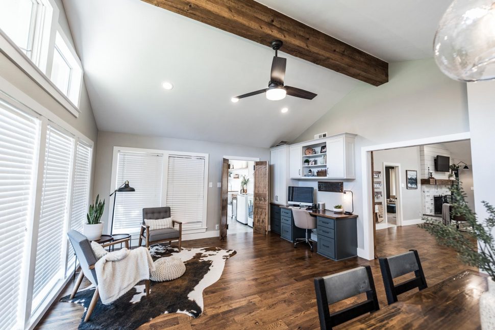
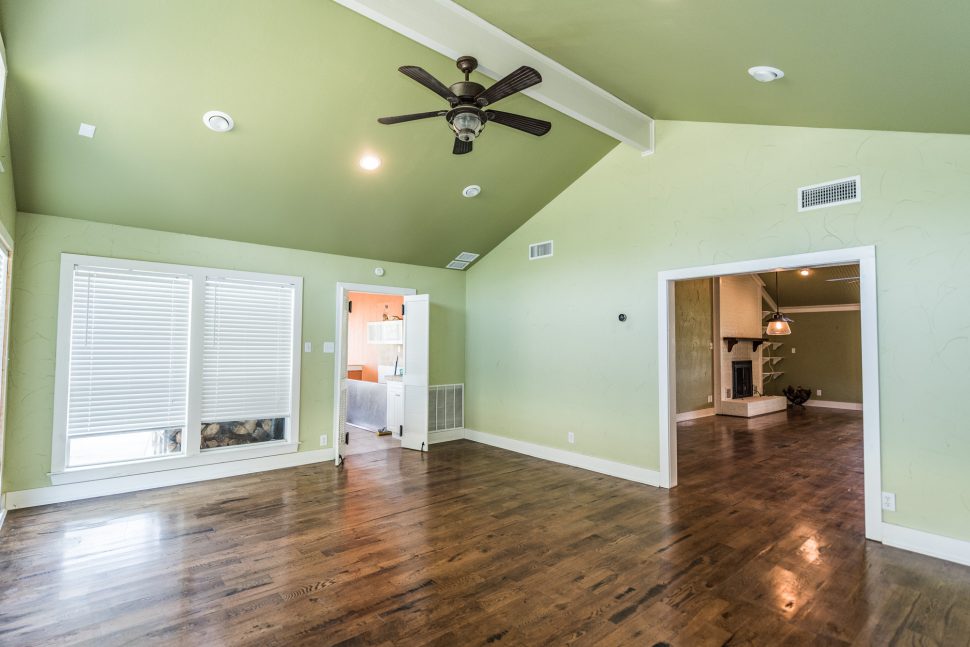
There was very little about the sunroom for us to change! We loved the walls of windows and the vaulted ceiling. We wanted to be purposeful about the use of the space, and decided two living areas right next to each other wasn’t the most functional choice. We planned the room as a combined dining area and home office.
[soliloquy id=”5013″]
We kept the same color palette throughout the common areas. To introduce a pop of fun color, we chose a darker blue-gray for the base cabinets of the built-in desk and built-ins by the fireplace. Since this room is multi-purpose for work and gathering for meals, it felt like the right place to bring in some fun elements. A cowhide rug and large portrait of an alpaca (who our kids named Baxter) were the perfect additions. Lots of industrial iron elements were in the design plan for this room to balance the whimsy of some of our other choices. The wood and metal Irwin Construction logo piece above the desk was a surprise for Jeremy from Kelley on the day we moved in.

A custom built-in desk was fabricated for the sunroom to give us a large work area with tons of storage. We built a large barn door for the sunroom, so the office area could be closed off. (The second door in these photos is in the master suite – Part III of the blog!)
[soliloquy id=”5015″]
[FinalTilesGallery id=’94’]
LAUNDRY ROOM
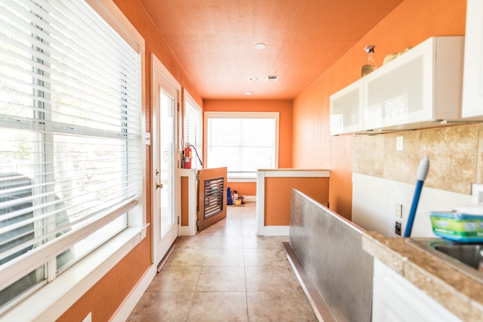
B E F O R E
A F T E R
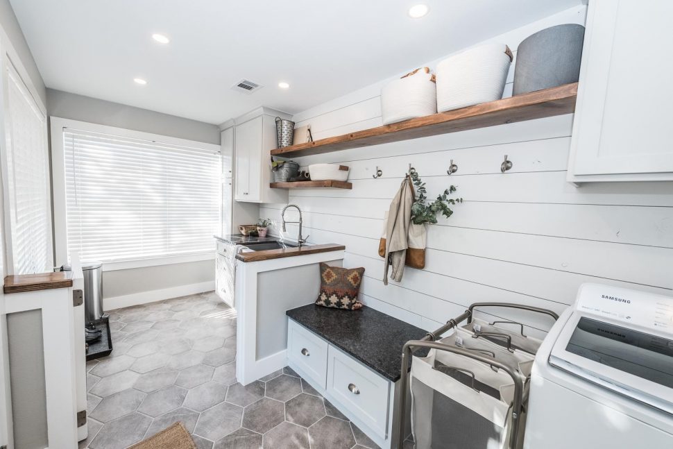
The large laundry room also drew us to the house. While there was a utility sink, it was small and the room lacked other elements of an effective mudroom.
[soliloquy id=”5017″]
We rearranged the layout of the room, moving the washer and dryer towards the door from the sunroom. This gave us plenty of space to build a mud bench across from the back door. We installed shiplap on the entire back wall, and added custom cabinetry throughout. The large stainless steel sink that had been in the previous kitchen was repurposed in the mud area, and we pulled in some wood tones with long open shelves and stained saloon-style doors. We chose the hexagon tile to add a fun pattern, and the color and texture are a nod to the concrete counters in the kitchen. We loved this hexagon shape so much that we incorporated hexagons into every tiled area in the house.
[soliloquy id=”5016″]
[FinalTilesGallery id=’96’]
Part II and Part III of this project are up now! Drop your email in the Subscribe box at the bottom of the page to be notified when posts are published!
Before and after photos by Darby Kate Photography
KITCHEN + LIVING ROOM
FLOORS – WHITE OAK HARDWOOD FLOORING
PERIMETER COUNTERTOP – SEALED CONCRETE
ISLAND COUNTERTOP – CAESARSTONE STATUARIO MAXIMUS QUARTZ
BACKSPLASH – TOUCH TILE 2×10 BRICK IN WHITE GLOSS
KITCHEN CABINETS + FIREPLACE SHIPLAP – SHERWIN WILLIAMS CRUSHED ICE
WALLS – SHERWIN WILLIAMS 50% MINDFUL GRAY
LIVING ROOM BUILT-INS – SHERWIN WILLIAMS GRAYS HARBOR
TRIM + CEILINGS – SHERWIN WILLIAMS EXTRA WHITE
PANTRY DOOR, BARN DOOR, SHELVES + VENT HOOD – MINWAX SPECIAL WALNUT STAIN ON PINE
SINK – CLASSICO FARMHOUSE APRON-FRONT 30″ FIRECLAY SINK
FAUCET – GICASA SEMI-PRO KITCHEN FAUCET IN OIL-RUBBED BRONZE
CABINET HARDWARE – FRANKLIN BRASS IN SOFT IRON
SCONCE LIGHTS – WRAY BLACK AND ANTIQUE BRASS WALL LAMPS
POT FILLER – DURANRYAN BRASS POT FILLER
SUNROOM
WALLS – SHERWIN WILLIAMS 50% MINDFUL GRAY
TRIM + CEILINGS – SHERWIN WILLIAMS EXTRA WHITE
DESK UPPER CABINETS – SHERWIN WILLIAMS CRUSHED ICE
DESK LOWER CABINETS – SHERWIN WILLIAMS GRAYS HARBOR
DESKTOP – MINWAX SPECIAL WALNUT
DINING PENDANTS – CASAMOTION 11″ WAVY VINTAGE INDSUTRIAL HAND-BLOWN PENDANTS
IRWIN CONSTRUCTION SIGN – CUSTOM BY BLAG FLAG METAL (ETSY)
LAUNDRY ROOM
FLOOR – ELEGANZA LANDSCAPE 11″ HEXAGON PORCELAIN TILE IN LIGHT GRAY
COUNTER AND BENCH SEAT TOP – STEEL GRAY LEATHERED GRANITE
WALLS – SHERWIN WILLIAMS 50% MINDFUL GRAY
TRIM + CEILINGS + SHIPLAP – SHERWIN WILLIAMS EXTRA WHITE
CABINETS – SHERWIN WILLIAMS CRUSHED ICE
FAUCET – KINGO IN BRUSHED NICKEL
WALL HOOKS – FRANKLIN BRASS
You might also like
Irwin Farmhouse – Before & After Part II 
Irwin Farmhouse – Before & After Part III 
Modern Farmhouse Bathroom – Before & After
Irwin Farmhouse – Before & After Part II




Fantastic post and incredibly beautiful home. I love everything about your house. 💕
Thank you!
Beautiful! Great job!
Wondering if you have a post that details how you guys did the fireplace mantle? Thanks!
We do not – I’m sorry!