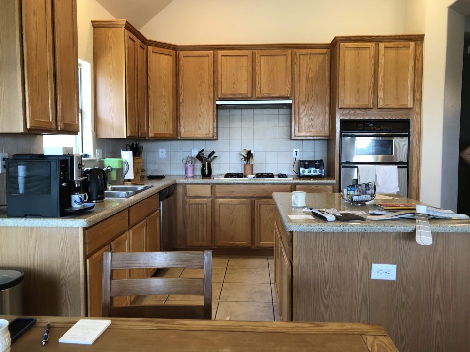
The Persimmon Kitchen was an incredibly fun project planned for a couple living in Denton, TX. They were the first owners of the house when it was built in 2003 and felt it was time for the kitchen to receive an update in both functionality and aesthetic. They had outgrown the oak cabinetry and warm-toned granite counters, and were ready to bring a little personality into the mix.
(See end of post for sources and materials)
B E F O R E
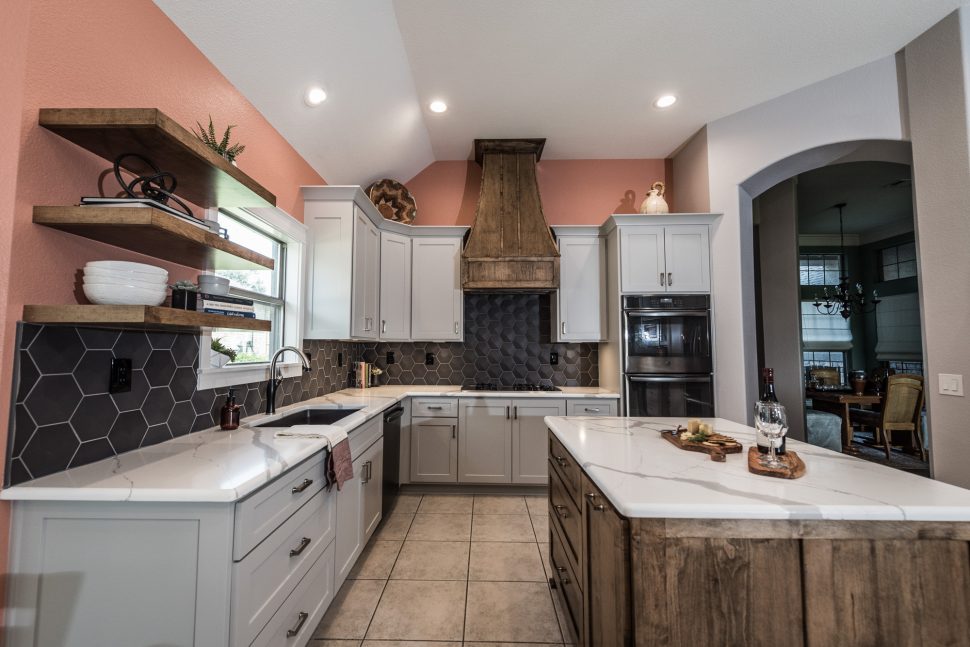
A F T E R
The kitchen started off with a great layout. It was spacious and open to the dining and living areas. There was plenty of counter space and the ceilings were high. However, the the pantry and desk areas didn’t function well for our clients. The pantry walls extended all the way to the ceiling, interrupting the flow of that half of the kitchen. It also wasn’t efficient in terms of usable space. Additionally, our clients did not have use for the desk area so they wanted to change this to usable space.
Our clients decided to revamp the desk space into a mini bar with a built-in wine fridge and lattice wine storage. We designed the cabinets in this area with glass panels to showcase the bar glassware. The previous pantry was removed and replaced with a built-in pantry cabinet that ties in with the rest of the cabinetry on the wall.
[soliloquy id=”6566″]
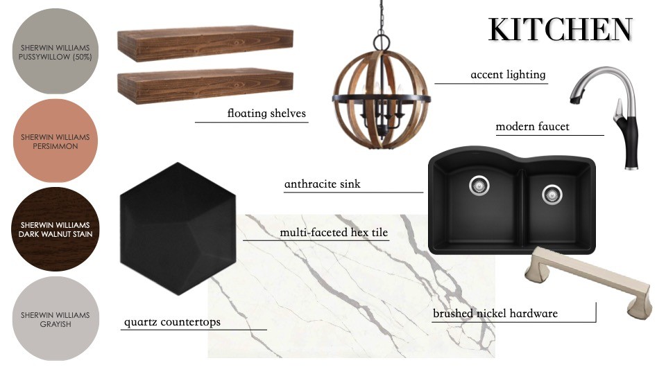
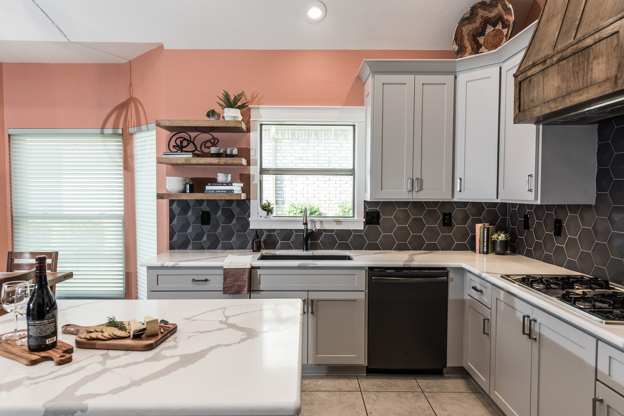
A foundational aspect of the design for the Persimmon Kitchen was the color orange. Our client loves orange and wanted to tie this color, that makes her feel happy and bright, into her into her kitchen. We opted for a shade of peachy-orange from Sherwin Williams called Persimmon. The kitchen floor tile was remaining in place, so we considered colors carefully to ensure they coordinated well with the colors present in the tile. To let Persimmon be the star, we planned the rest of the space to be subtle and neutral.
Light gray cabinets, gray and white quartz counters, a black anthracite sink, and sleek brushed nickel fixtures and hardware were in our plan to update the space while not overshadowing the Persimmon. Since most of the cabinetry was painted a neutral gray, we brought warmth to the color palette by staining the island and vent hood.
The backsplash tile was a favorite selection. While the matte black color is simple, the multi-faceted texture catches light in a really interesting way and makes the whole kitchen come together.
[soliloquy id=”6569″]
[FinalTilesGallery id=’121′]
After photos courtesy of Darby Kate Photography.
Sink – Diamond 32” Equal Double Low Divide sink by Blanco, in Anthracite (via ProSource)
Faucet – Blanco Altona Pullout Spray Single Hole Kitchen Faucet (via ProSource)
Drawer Pulls – Liberty Mandara in Satin Nickel
Counters – Calcutta Toscano Quartz (via ProSource)
Backsplash – Soho Studio Hexagono Series Piramidal Grafito Matte 6” Hexagon with Schluter Jolly Edge Trim in Aluminum Pewter with Winter Gray grout (via ProSource)
Hardwood Floors – Artisan Collection Engineered Hardwood Flooring in Tadema by Greenworld Industries (via ProSource)
Painted Cabinetry – Sherwin Williams Pussywillow (50%)
Stained Cabinetry – Sherwin Williams Dark Walnut
Walls in Kitchen/LR – Sherwin Williams Persimmon
Walls in Hall – HGTV Home by Sherwin Williams Grayish
Trim and Ceiling – Sherwin Williams White Flour
Chandelier – Ashley Emiliano Wooden Pendant
You might also like:
-
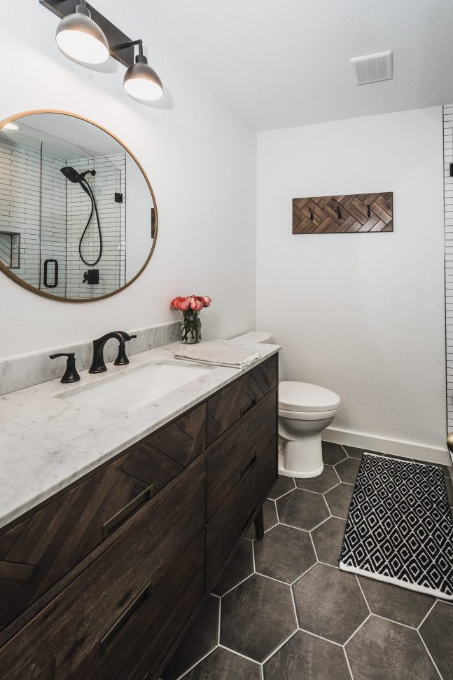
The Open Door House – Before & After -
The Sienna House – Before & After -
Izzie’s House Before & After
The Open Door House – Before & After




Leave A Comment