[FinalTilesGallery id=’73’]
The Family Style Galley Kitchen is in a Tudor-style home built in 1920. The house had so much character, from the diamond-pane windows in the front room to the dark wood paneling throughout, but the kitchen didn’t fit the stately elegance of the rest of the house. Our clients’ main goal was to open the kitchen up to the surrounding rooms. They also desired to create more space in the kitchen so the whole family could be in there together, and update the design to a blend of modern style and timeless sophistication.
Before
A true galley-style kitchen, it was short, narrow and closed off from the rest of the house. There was a small breakfast nook in the kitchen, separated from the cabinetry by a post and pony wall. Walls closed the kitchen off from the formal dining room on one side and hallway on the other.
[FinalTilesGallery id=’71’]
For this project we even have “before before” photos! Our client had pictures of what the kitchen looked like prior to its current state. Seeing the transformation over the decades was so fun!
[FinalTilesGallery id=’75’]
The Process
We removed the current flooring in the kitchen first. The kitchen had pine flooring that did not match the original white oak flooring in the rest of the house, so we installed new white oak to match. The two walls separating the kitchen from the dining and hall were removed and we installed beams in their place.
The two windows in the previous breakfast nook were too long to accommodate cabinetry in front of them. As a solution that allowed us to keep those windows to match the other original windows in the house, we modified them to be shorter and reinstalled them.
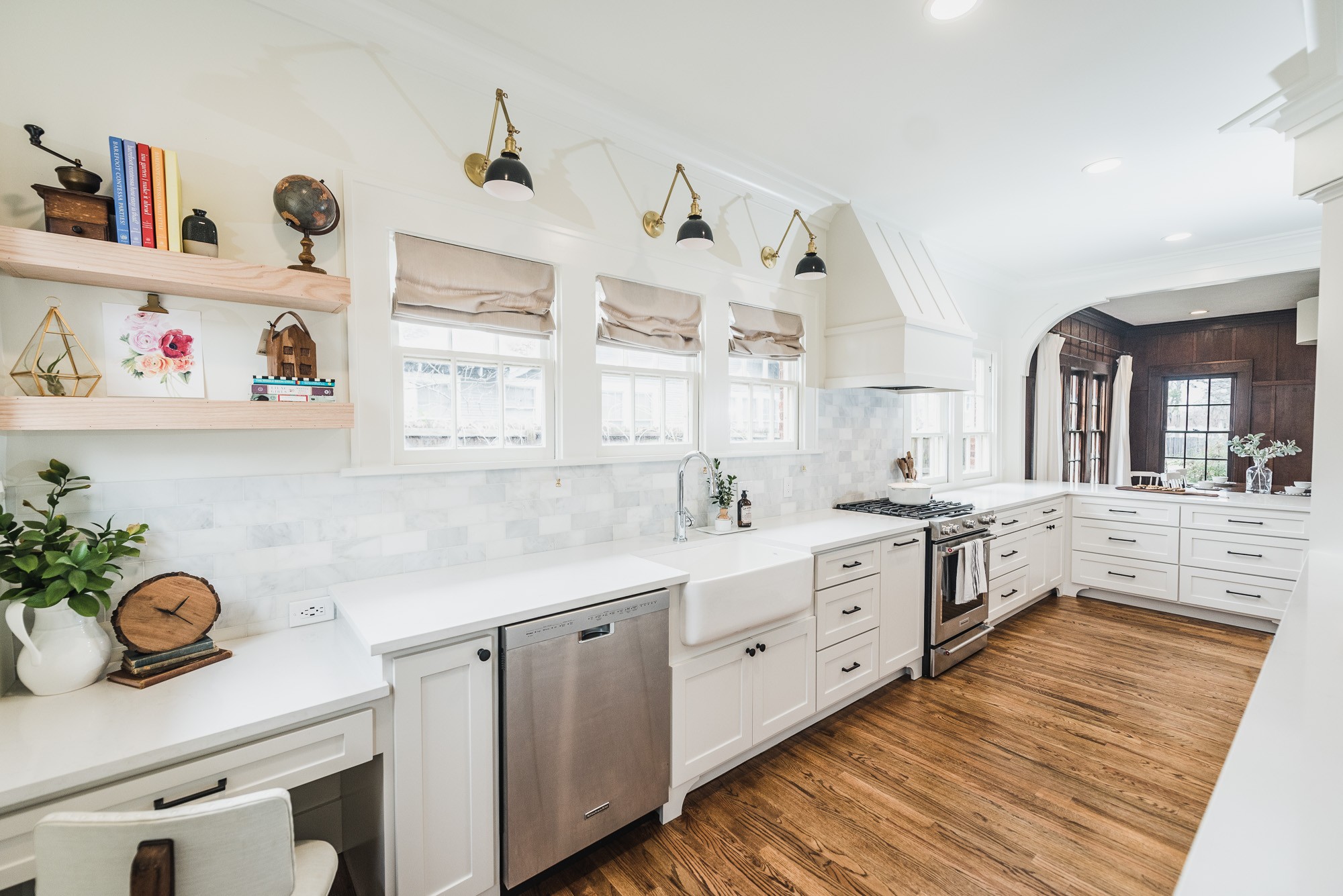
Old cabinetry was replaced with new custom cabinetry, and we created a twist on the traditional galley shape by placing the fridge on an angle. This opened up the whole space, allowing room for a large peninsula with bar seating. We installed clean white quartz countertops and a marble subway tile backsplash for a sleek and timeless look. The farmhouse sink added a vintage feel along with the increased functionality that comes with a deep single-bowl sink.
Some of our favorite features are the wooden vent hood, the custom-made corbels separating the kitchen from the dining room, and the new trim with backbanding around the original windows!
[FinalTilesGallery id=’72’]
After
[FinalTilesGallery id=’74’]
After photos by Darby Kate Photography
Counters – Silestone Eternal Statuario Quartz
Backsplash – 3×6 Carrara Marble
Walls & Trim – Benjamin Moore Swiss Coffee
Cabinets – Benjamin Moore Pale Oak
Back Door – Farrow & Ball Off Black
Watercolor Farm Bouquet Print – Florals For Freedom
You might also like






Hi!
Love this family style kitchen reno! Could you tell me what kind of cabinet hardware was used here?
Thank you!
Colleen