Gleaming Quartz Kitchen
INTRO
We’re thrilled to take you behind the scenes of our latest kitchen transformation, where functionality meets stunning design in a perfect symphony. This project was a unique blend of our client’s vision and our expertise, turning a once-constrained kitchen into a spacious and vibrant culinary haven. From the challenges of integrating custom elements to the final aesthetic touches, this renovation was all about enhancing beauty and utility in equal measure.
Join us as we detail the exciting transformation of this kitchen, revealing not just a renovation, but a reimagining of space that elevates everyday living. Prepare to be inspired by the seamless integration of modern luxuries and timeless design!
BEFORE
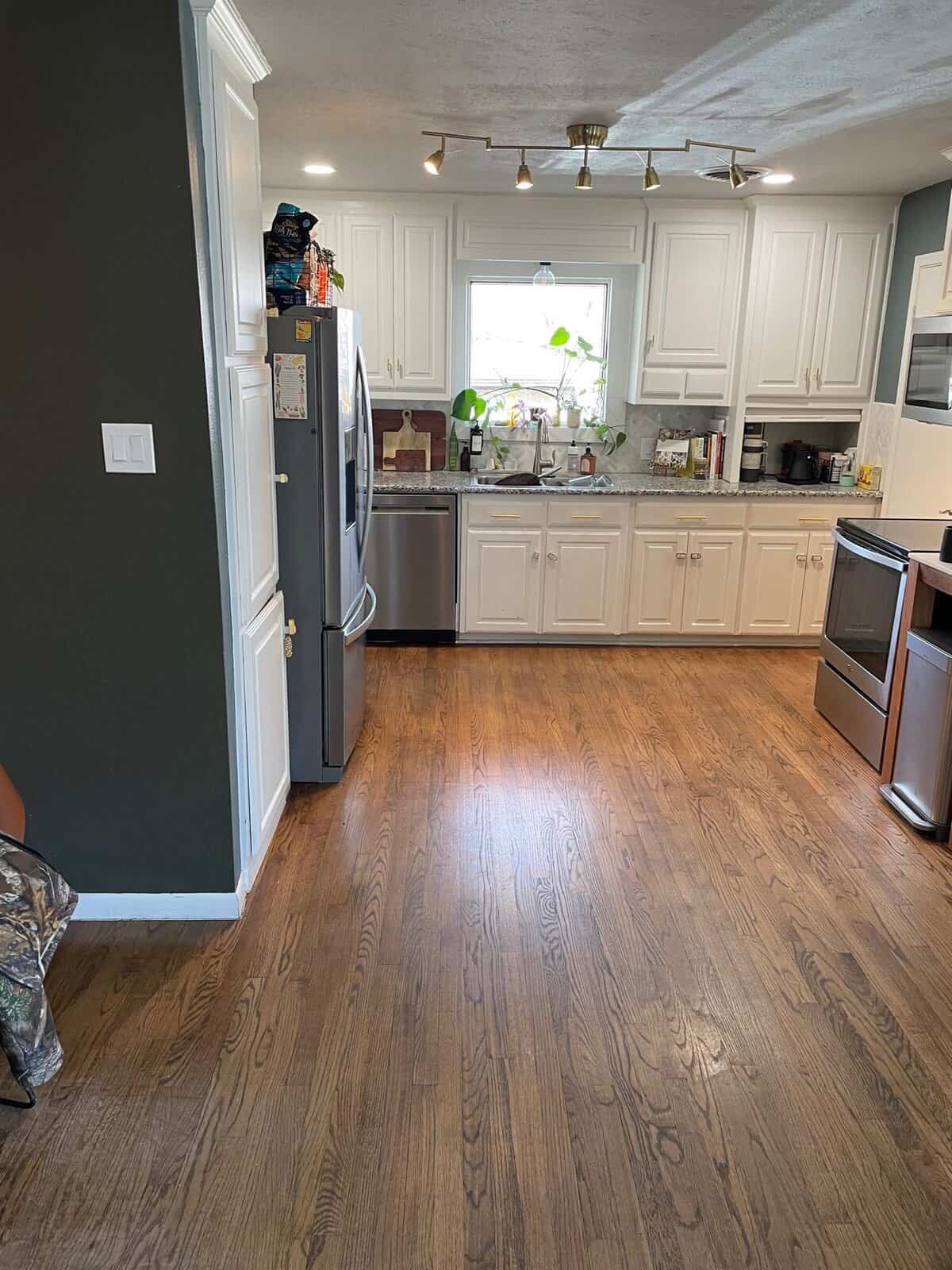
Imagine a kitchen that feels disconnected, with a small pantry, outdated cabinets, and a layout that stifles both movement and style. This was the reality faced by our clients – a space that was functional, yet far from their dream kitchen. The cramped pantry next to a poorly placed fridge and a little desk cluttered the area, making the kitchen feel smaller than it actually was.
But every kitchen has potential, and with our vision and our client’s trust, we embarked on a journey to transform this tight space into a sprawling and functional kitchen, primed for culinary adventures and social gatherings.
Choosing the right team for the job isn’t easy. Our clients stated the factors that were involved in their decision to pick Irwin Construction:
“The kitchen is the heartbeat of our home and we wanted a kitchen that reflect that sentiment. We decided to go with Irwin because we knew the quality of work & attention to detail is above and beyond. Time management and honest upfront cost throughout the process was important to me so I could make sure to stay on budget.”
DURING
The transformation began with a strategic redesign of the layout to enhance the kitchen’s functionality and aesthetic appeal. We relocated the refrigerator and pantry to a more practical spot, which immediately improved the flow and spatial dynamics of the room. This change allowed us to merge the existing pantry and laundry areas, creating space for a generously sized island that became the centerpiece of the kitchen.
In the process of the redesign, our clients had selected a custom cabinet maker. We seamlessly integrated these pieces into our design plan, ensuring they complemented the new layout and features perfectly. This included precise adjustments to align with the overall vision and functional needs of the space.
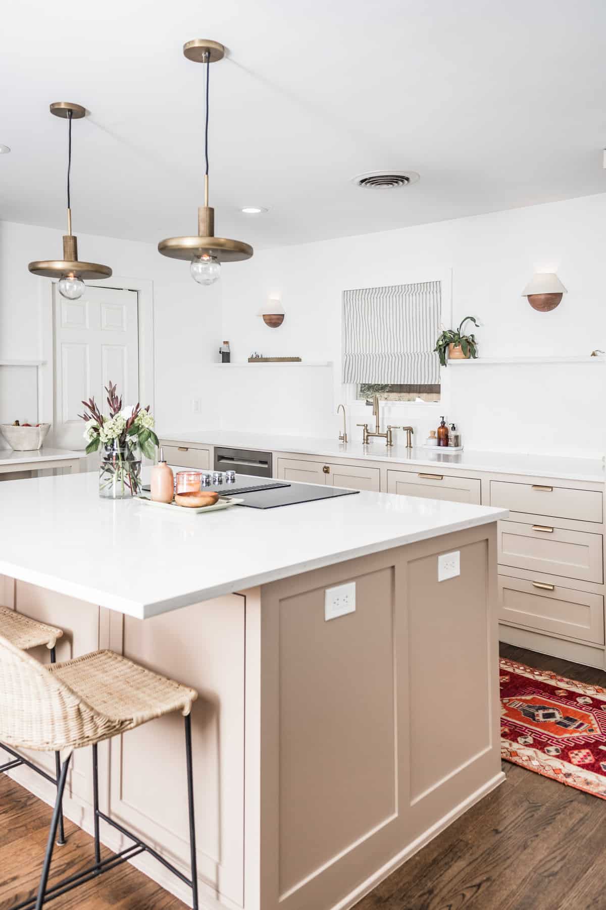
Lighting was a major focus of this renovation. We installed LED recessed can lights for bright, energy-efficient illumination, flanked the window with elegant sconces for added ambiance, and centered a chic pendant over the island to serve as both a focal point and a source of warm, inviting light.
Throughout the renovation, we maintained a clear vision and a meticulous approach to every detail, ensuring that each element of the kitchen’s design was harmonized to create a cohesive and welcoming space.
AFTER
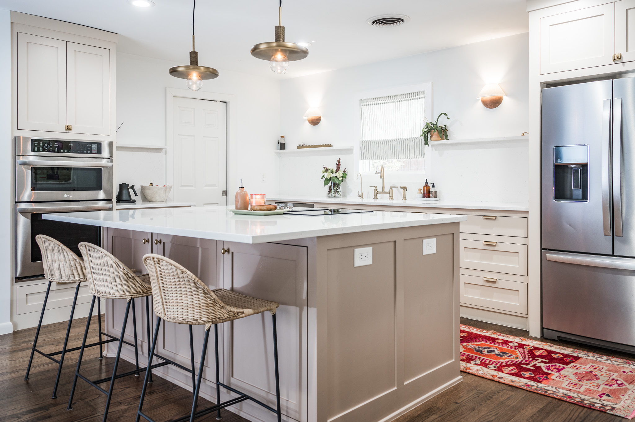
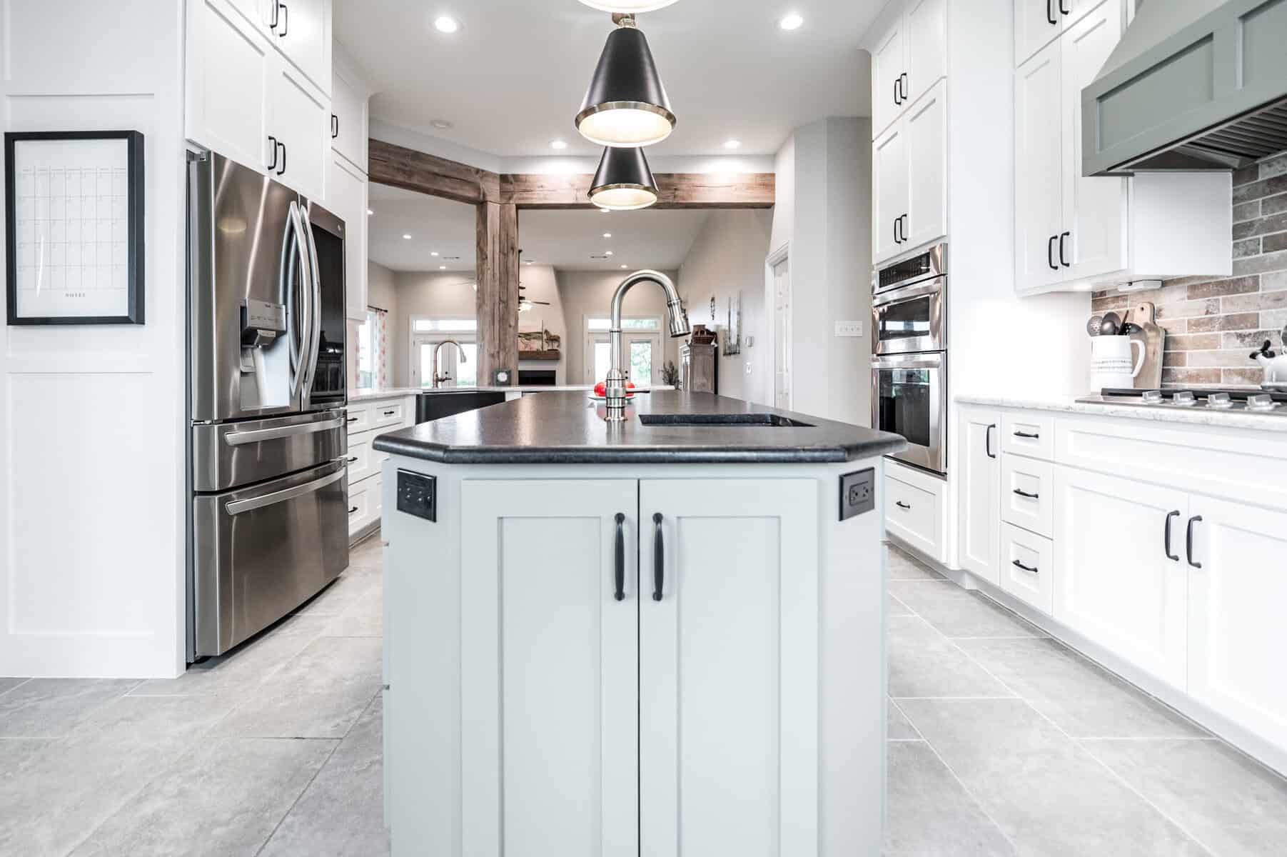
As the dust settled, the true beauty of our work came into view. Central to this kitchen’s charm are the Calacatta Miranda quartz countertops and backsplash, which provide a sleek, seamless look with their sophisticated square edge profile and dramatic waterfall on the island. The cabinetry, painted in Farrow & Ball’s Joa’s White, with the island in Smoked Trout, offers a soft yet impactful color palette that complements the modern aesthetic of the kitchen.
The flooring was another critical element; after altering the cabinet layout, we repaired and refinished the original oak hardwood floors, ensuring they met the new cabinetry perfectly without needing to alter their depth. This not only preserved the home’s character but also enhanced the continuity and flow of the space.
Using quartz for the backsplash instead of typical tile was a deliberate choice that paid off, lending the kitchen a cleaner, more contemporary look without the fuss of grout lines. This, paired with the clever integration of functional features like the sink cover that doubles as additional counter space, illustrates our commitment to creating kitchens that are as practical as they are beautiful! And the biggest change of all according to our client:
“Our lives! It has changed the way we do life in our home- To after school Snacks to dinner with friends. WE love it! But if I had to say the one change that has made the biggest impact I would have to say the island.”
The final result is a stunningly beautiful and highly functional kitchen that perfectly aligns with our clients’ lifestyle and aesthetic preferences. We hope this project inspires you to envision the potential in your own home and consider how thoughtful design can turn any space into a beautiful and functional area for you and your family to enjoy.
Our clients LOVED the end result of their beautiful kitchen and had this to say:
“Over all Irwin Construction is the best. We will use them for all projects going forward!”
Thank you for following along on this journey of creation and style. We look forward to bringing more inspired transformations to life in future projects!
Project Materials & References :
P A I N T :
Cabinets – Farrow & Ball Joa’s White
Island – Farrow & Ball Smoked Trout
O T H E R :
Countertops – Calacatta Miranda quartz
Search #GrayStoneSerenityMasterBathroom on our Instagram | @irwin.construction
[instagram-feed]




Leave A Comment