Welcome to Part II of our Irwin Farmhouse before & after! If you haven’t seen Part I (kitchen, living room, sunroom and laundry room) you can find it here. In Part I we shared our vision for the whole house and the scope of our renovation. The same modern farmhouse aesthetic with our own flair was the basis of our design for the hall bathroom, our boys’ bedrooms, and the guest bedroom. The only interior area of the house that hasn’t been renovated yet is a small en suite bathroom off the guest room. We’ll be tackling that and sharing the process with you in the future!
(See end of post for sources and materials)
HALL BATH
B E F O R E
A F T E R
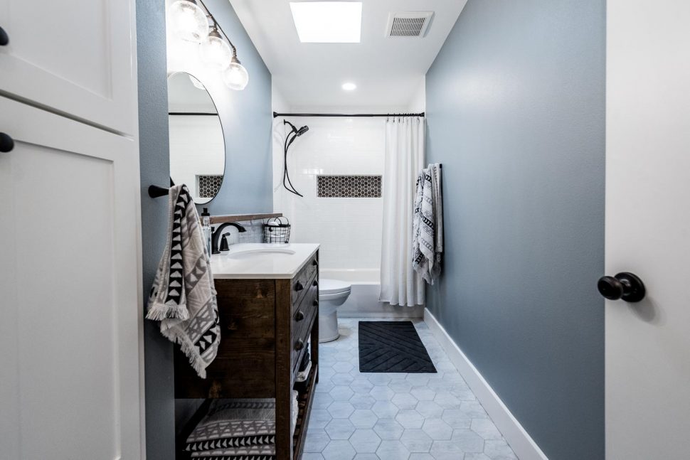
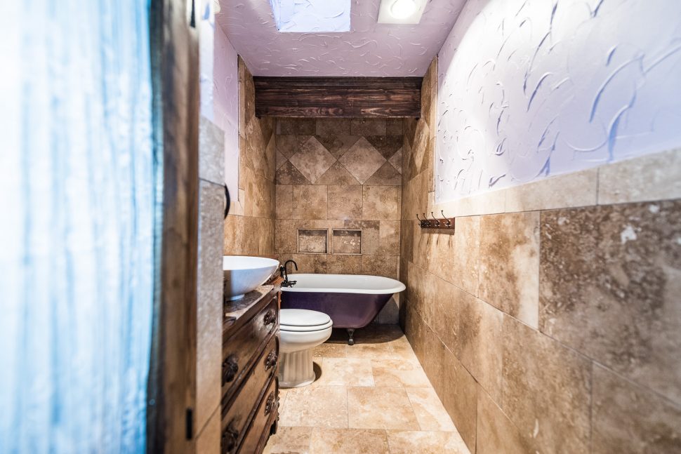
The hall bathroom had a built-in cabinet that significantly narrowed the entrance to the bathroom. We didn’t want to lose this storage, but wanted to open up the bathroom as much as possible. The clawfoot tub was amazing, but since our two little boys would be using the bathroom, we wanted a standard bathtub/shower that would be more functional for them. (Don’t worry about the clawfoot tub – we kept it and have great plans for it!) The travertine-look tile and ornate vanity weren’t quite our style, and we knew our kids would have a hard time using the vessel sink.
We came across a “before before” photo in an old MLS listing of the house. Be sure to navigate all the way through the hall bath before photos to see it!
[soliloquy id=”5035″]
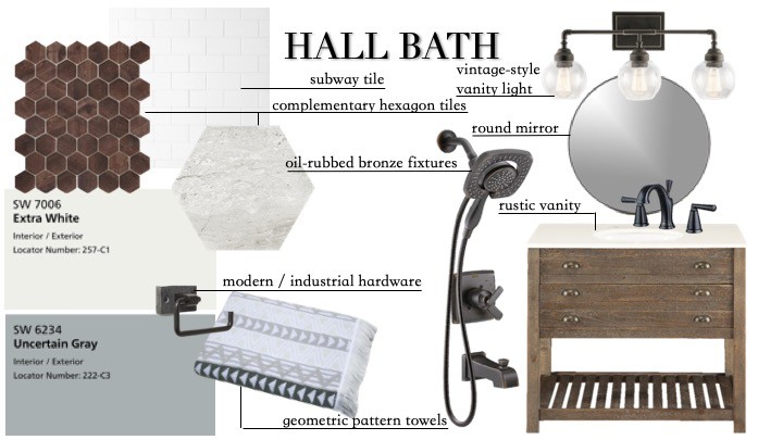
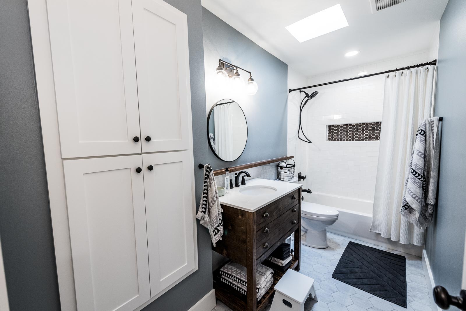
Our overall goals for the design of the hall bathroom were kid-friendly function and a neutral color palette with a little bit of a masculine spin. The reclaimed wood vanity, vintage-style vanity light and iron accents kept the white and blue-gray of the walls and subway tile from feeling too feminine. In keeping with the common thread of hexagon tile throughout the house (see the concrete-look hexagon tiles in the laundry room in Part I), we chose a mid-size hexagon tile with subtle gray marbling for the floor. The color choice was for function just as much as design. Our kids bring all the grass and dirt from outside into the bathroom at bath time, and the color variation in the tile helps keep the bathroom from looking horribly dirty every day. We chose a woodgrain smaller hex tile for the shampoo niche to tie in both the floor hexagons and the wood tones in the space. The round mirror and geometric-print towels add a little fun flair.
[soliloquy id=”5044″]
A hall closet containing the hot water heater was on the other side of the built-in cabinet. Since we planned to replace the hot water heater with a tankless unit in the attic, we took advantage of the open space and recessed a new cabinet into the wall. This opened up the entrance to the bathroom considerably.
We stripped the bathroom to the studs and installed all new tile, drywall, and a standard bathtub that will be easy for our young children to use. This little room transformed so much that it’s one of our favorite spaces in the house!
[FinalTilesGallery id=’103′]
GUEST ROOM
B E F O R E
A F T E R
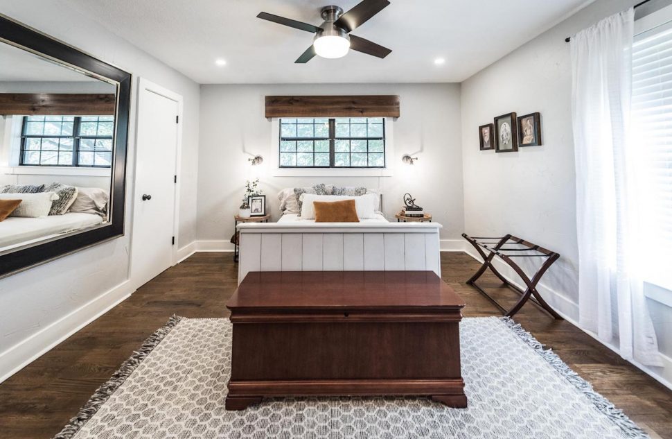
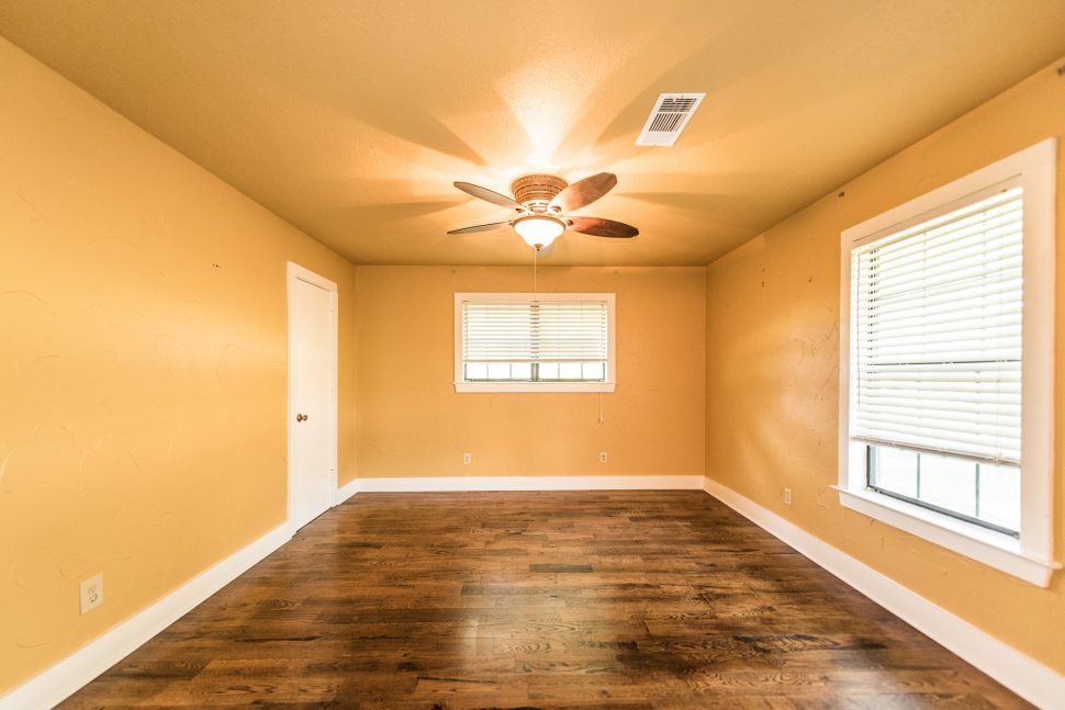
We changed very little in the back three bedrooms of the house. These consisted of the previous master bedroom (which is now the guest bedroom) and our two boys’ rooms. We modified the wall texture, painted, and refinished the floors in all three rooms.
In the interest of sharing our design vision for the whole house with you, we’ve included some shots of these rooms and shared a bit about the decor pieces that are most significant to us.
A few aspects of this guest room are very special to us. The antique photos on the wall to the right of the bed are Kelley’s great-grandmother (c. 1921), great-great-grandfather (c. 1861), and 4x great-grandfather (born in 1821). Jeremy made the double daybed and the glass-topped desk. Kelley’s great-grandmother crocheted the blanket in the basket, and the portrait on the desk is a tribute to Kelley’s grandfather who passed away this fall.
[FinalTilesGallery id=’104′]
BOYS’ ROOMS
B E F O R E
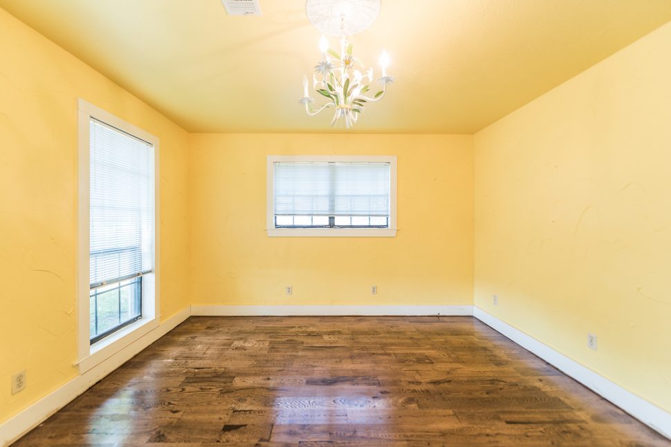
A F T E R

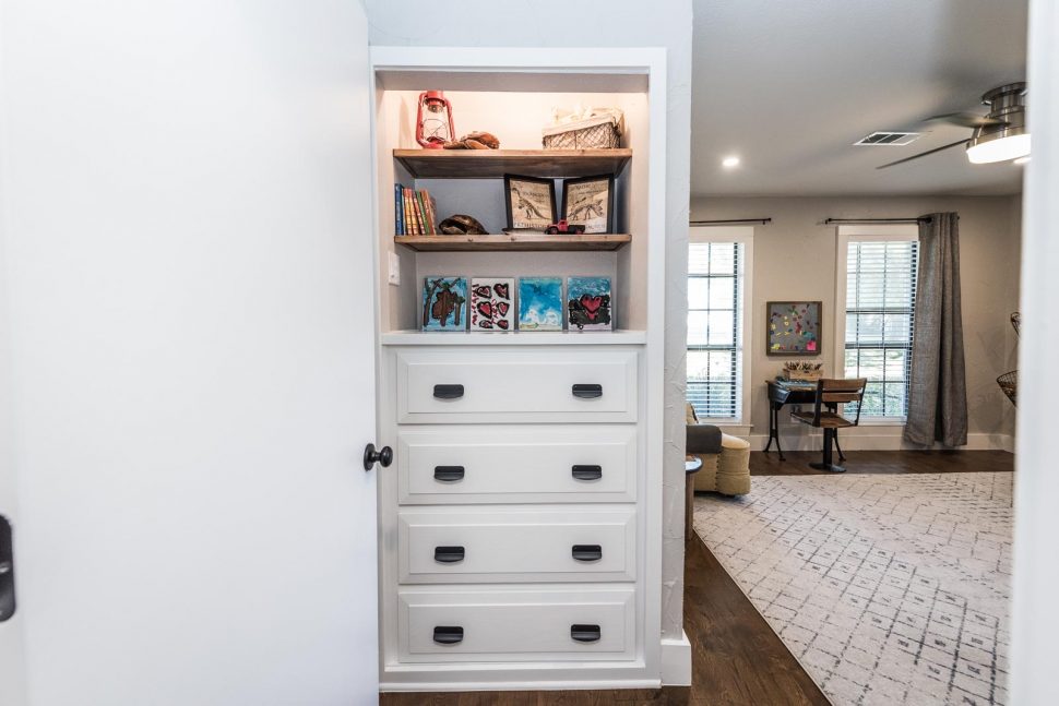
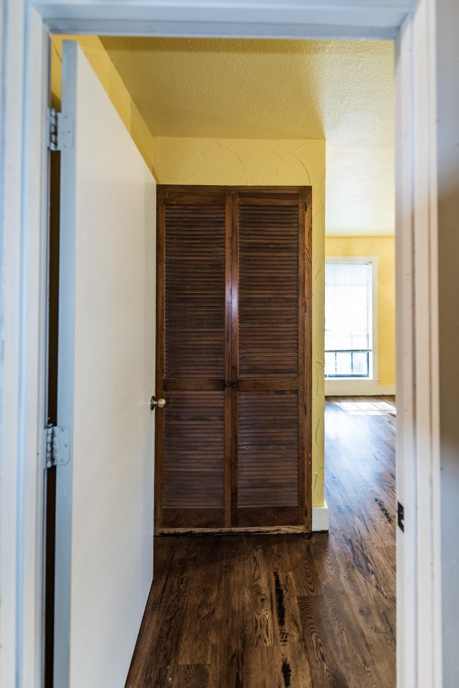
In our older son’s room, we incorporated the open industrial-style shelving unit we built for him in our previous home. The room already had a built-in dresser, but the collision of bedroom door, double doors in front of the dresser, and drawers was not ideal. We reconfigured the opening around the dresser and painted it to match the room. Some favorite elements in here are the antique school desk that we found on Craigslist and refinished, the vintage chair Jeremy found on the side of the road more than a decade ago and we reupholstered, and the little round wooden side table that our son designed and built for himself.
[FinalTilesGallery id=’105′]
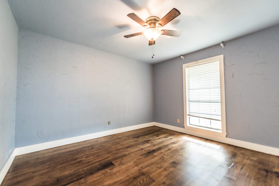
B E F O R E
A F T E R
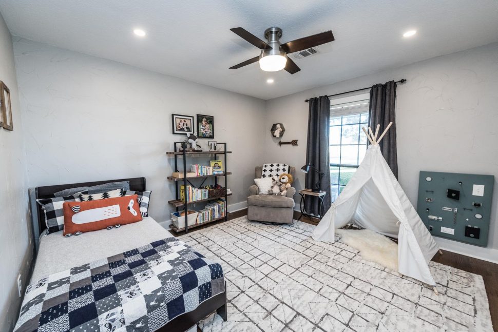
Our younger son’s room showcases handiwork from the rest of the family. Jeremy built the “busy board” on the wall when our oldest son turned one. Kelley made the quilt and stuffed fox (on the shelves), and our older son created the rock garden and wooden nameplate (also on shelves).
[FinalTilesGallery id=’106′]
Head over to Part III to see the last installment of our Irwin Farmhouse Before & After!
Drop your email in the Subscribe box at the bottom of the page to be notified when posts are published!
Before and after photos by Darby Kate Photography
HALL BATH
FLOOR – SPEARTEK 5″ VERONA HEXAGON TILE IN GREY
WALL TILE – ARIZONA TILE H-LINE SERIES 3×6 SUBWAY TILE IN COTTON GLOSSY
SHAMPOO NICHE – EMSER TILE ECHO HEX IN 2×2 BROWN
VANITY – RUSSELL 36″ SINGLE SINK VANITY – VIA WAYFAIR
FAUCET – ENZO RODI IN OIL-RUBBED BRONZE
SHOWER TRIM KIT – DELTA ASHLYN SERIES IN VENETIAN BRONZE
VANITY LIGHT – KICHLER NILES 24″ 3-LIGHT CLEAR SEEDED BATH VANITY LIGHT IN OLDE BRONZE
MIRROR, ROBE HOOKS + TOILET PAPER HOLDER – CB2
WALLS – SHERWIN WILLIAMS UNCERTAIN GRAY
BUILT-IN, TRIM + CEILING – SHERWIN WILLIAMS EXTRA WHITE
BEDROOMS
GUEST ROOM WALLS – SHERWIN WILLIAMS BIG CHILL
BOYS ROOM WALLS – SHERWIN WILLIAMS AGREEABLE GRAY
You might also like
Irwin Farmhouse – Before & After Part I 
Modern Farmhouse Bathroom – Before & After 
The Honey House – Before & After
Irwin Farmhouse – Before & After Part I



Leave A Comment