Moody Master Bathroom
INTRO
Welcome back to our Before & After series here on our blog. Today we will be walking through the renovation process of our Moody Master Bathroom project. This renovation was all about using space more efficiently.
According to our client,
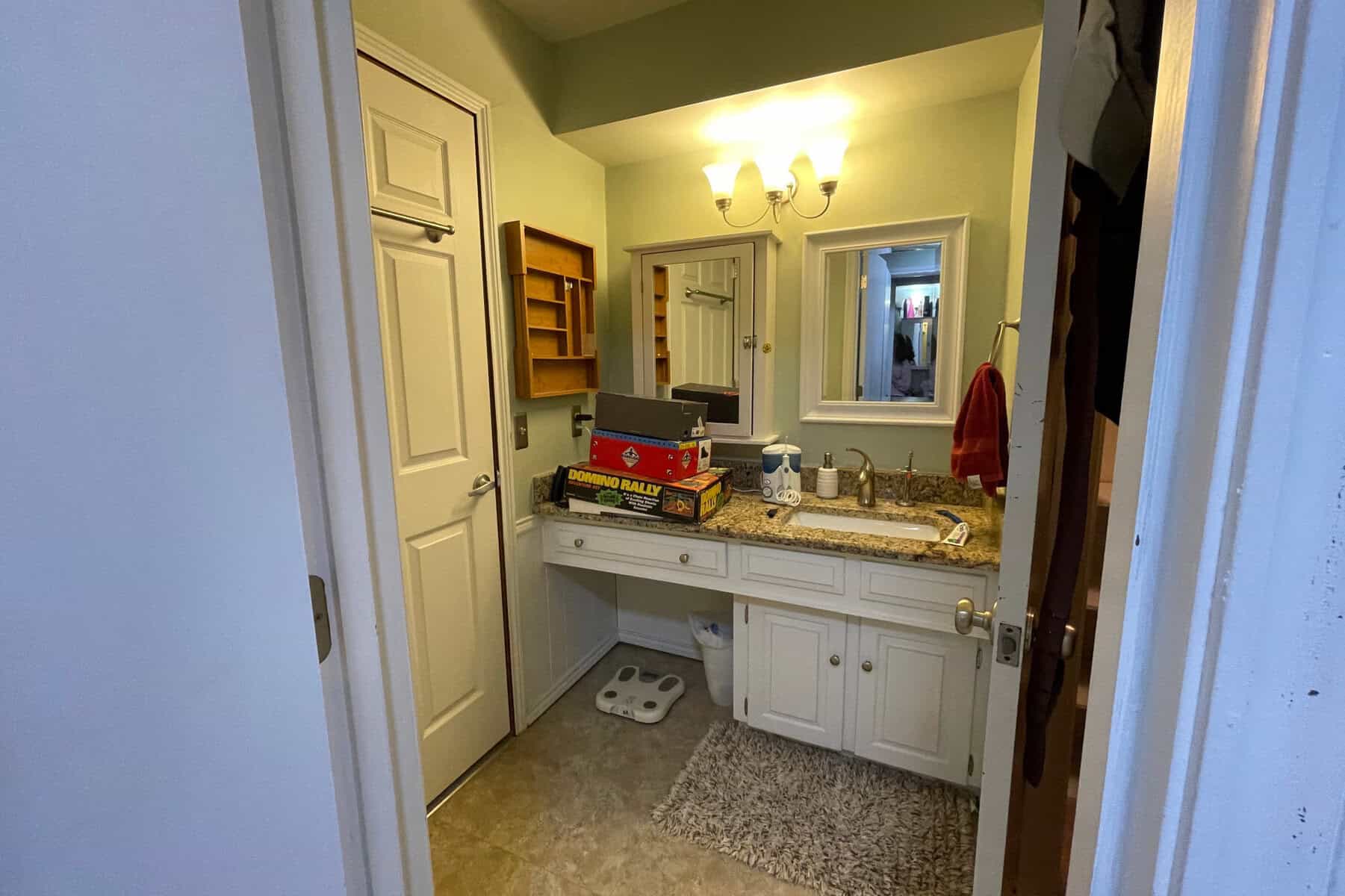
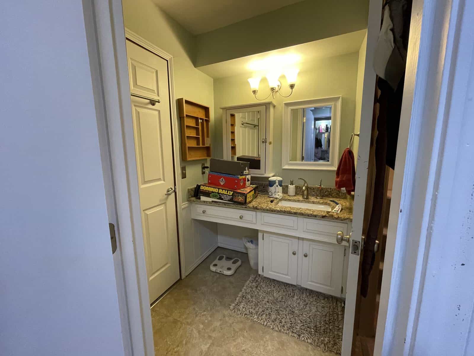
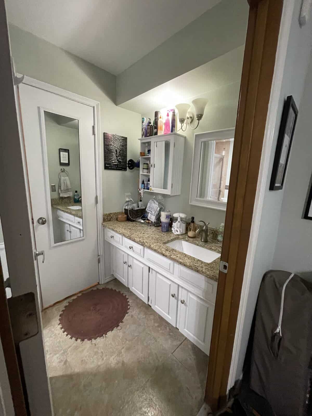
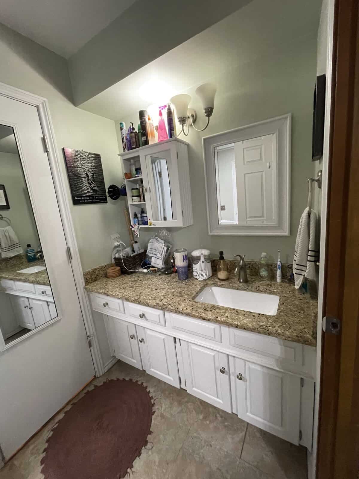
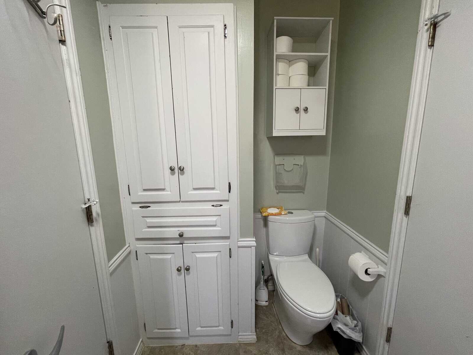
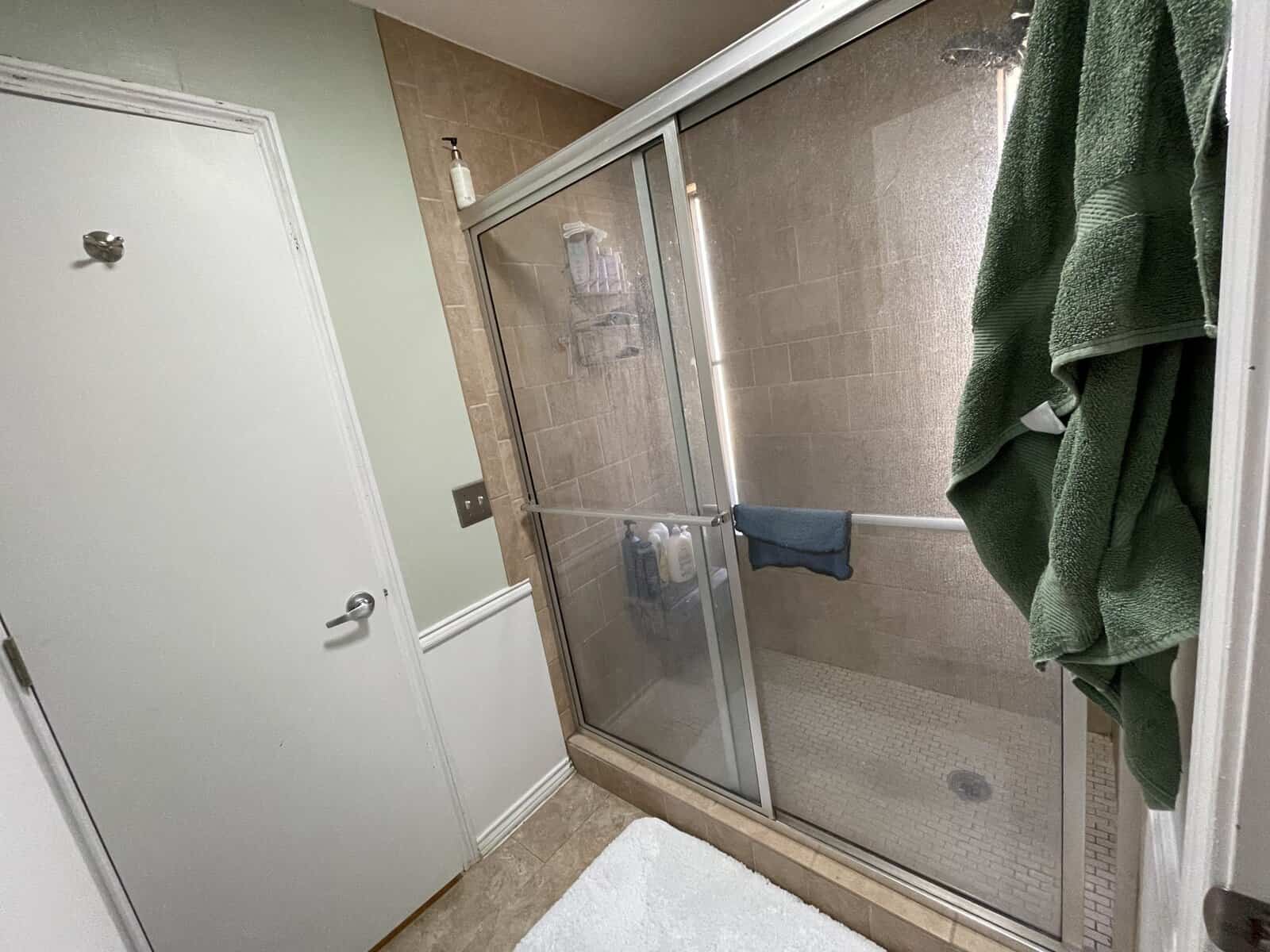
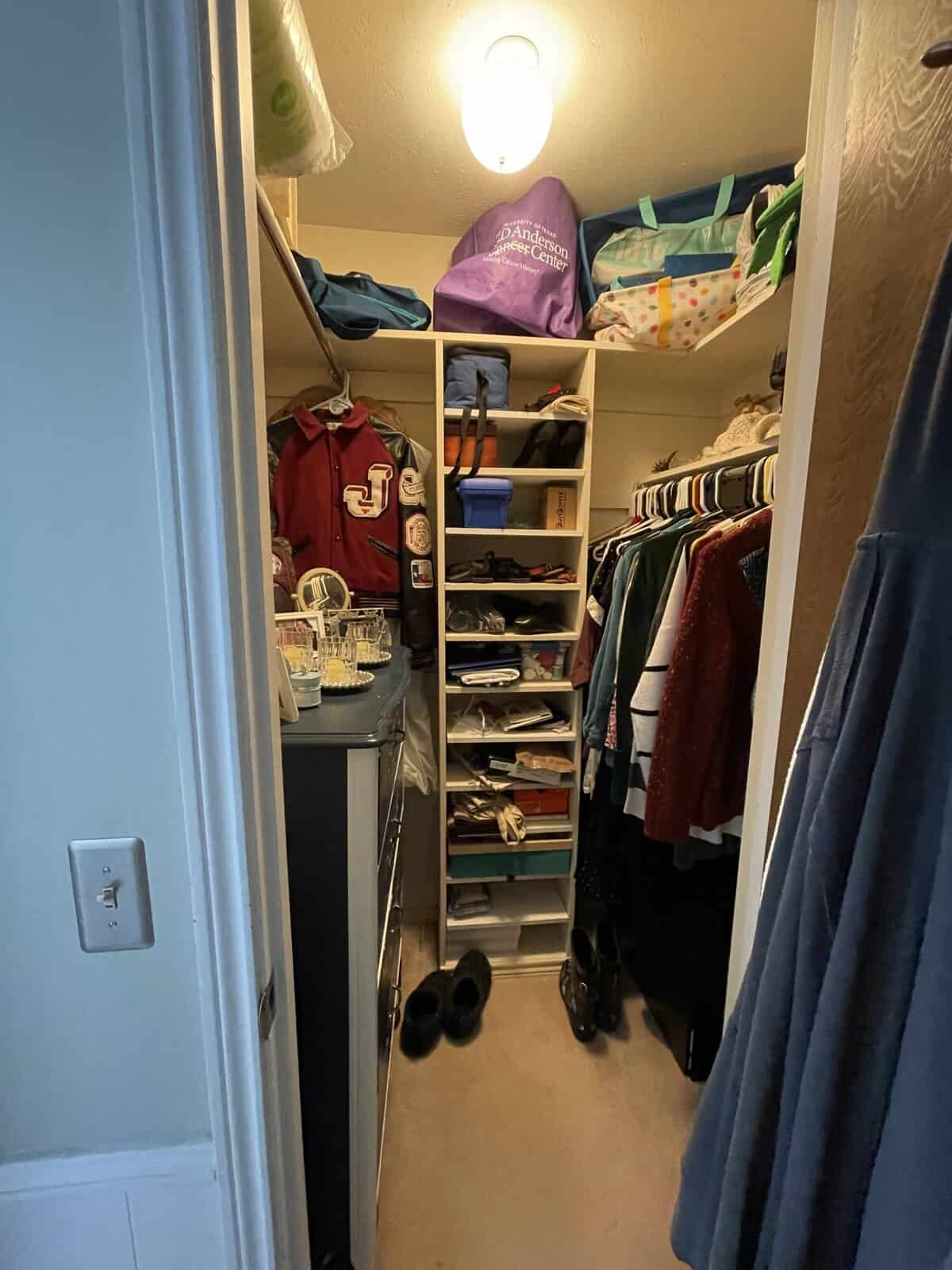
“The space before was crowded and inefficient. There were several unnecessary doors that sectioned the bathroom into 3 small rooms. The previous owners had made some modifications including removing the bathtub/shower and installing a tiled shower with a sliding door on the footprint of the bathtub. It was very large and not sealed properly, so it leaked. There were many aesthetic problems – the toilet was too large for the space and impeded a door, improper paint was used and was cracked and peeling, storage cabinets were not a useful size.”
BEFORE
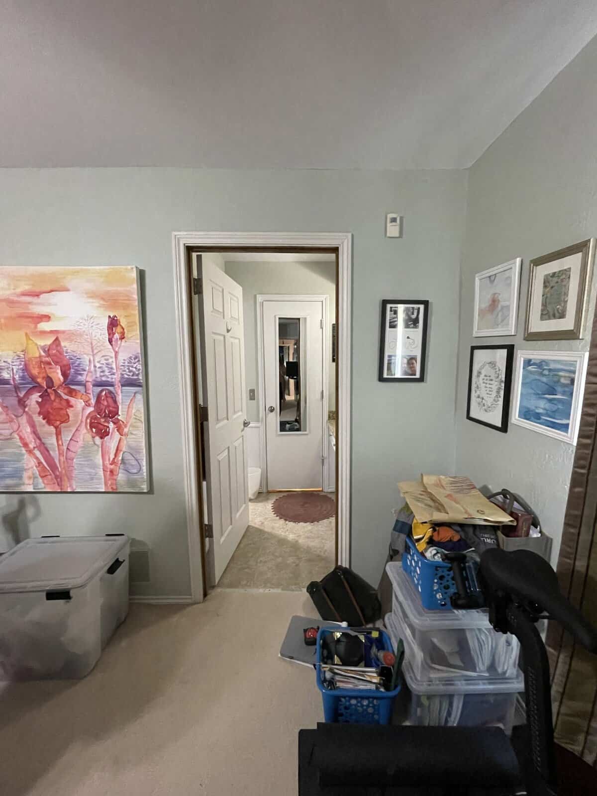
The original bathroom/closets were segmented into five spaces: two vanity areas, two closets, and one shower/toilet room. This made the already-small space feel very cramped, especially with all the doors running into each other.
Our goals were to address the aesthetic issues and enhance functionality to meet the family’s needs while maintaining coherence with the rest of the client’s home.
DURING
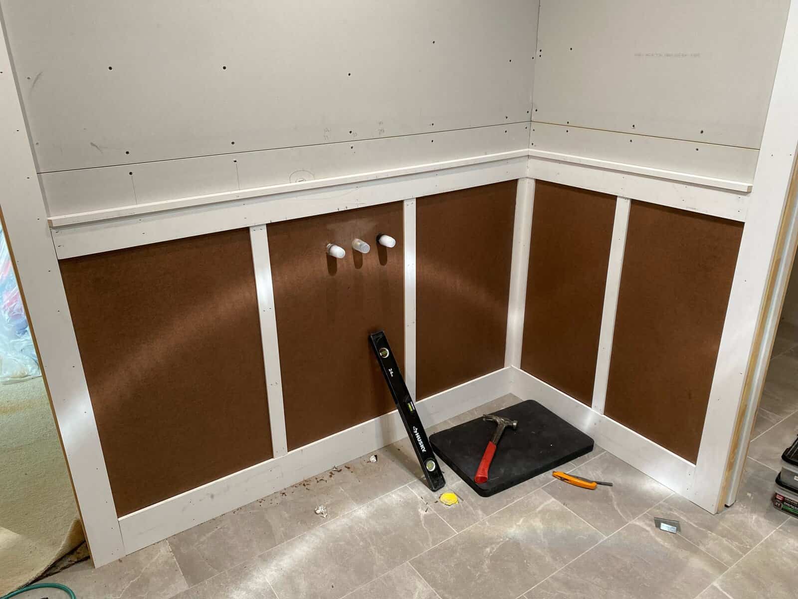
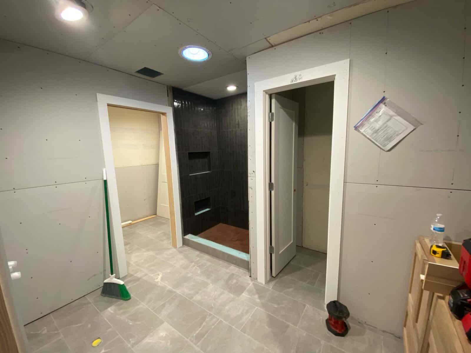
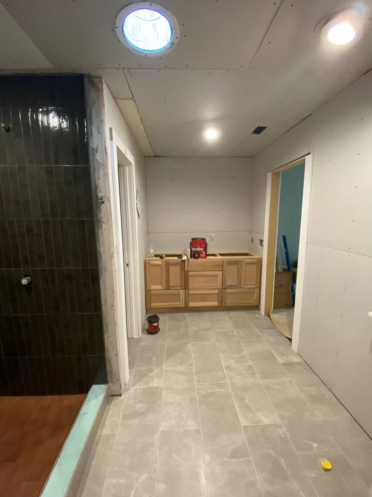
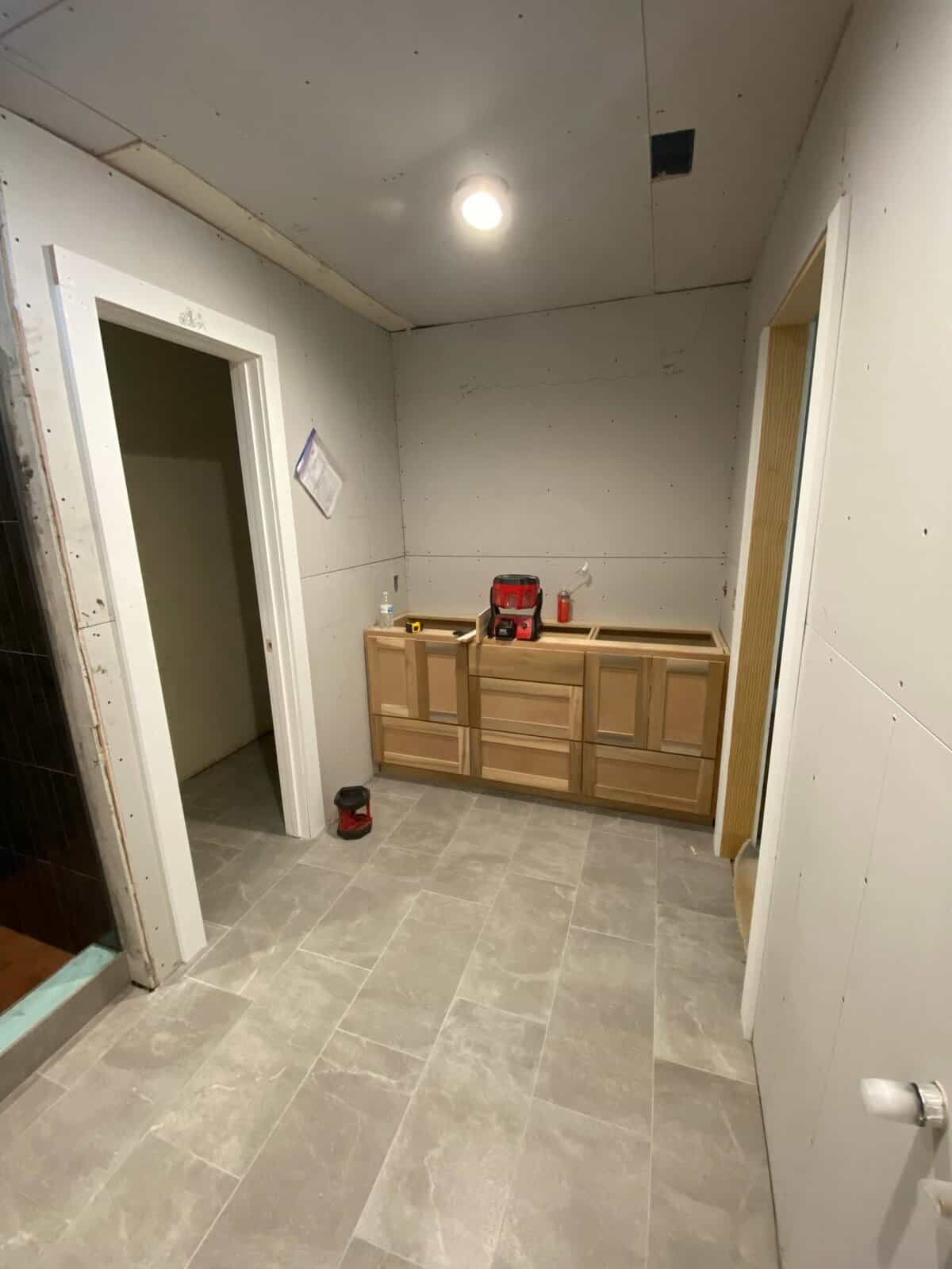
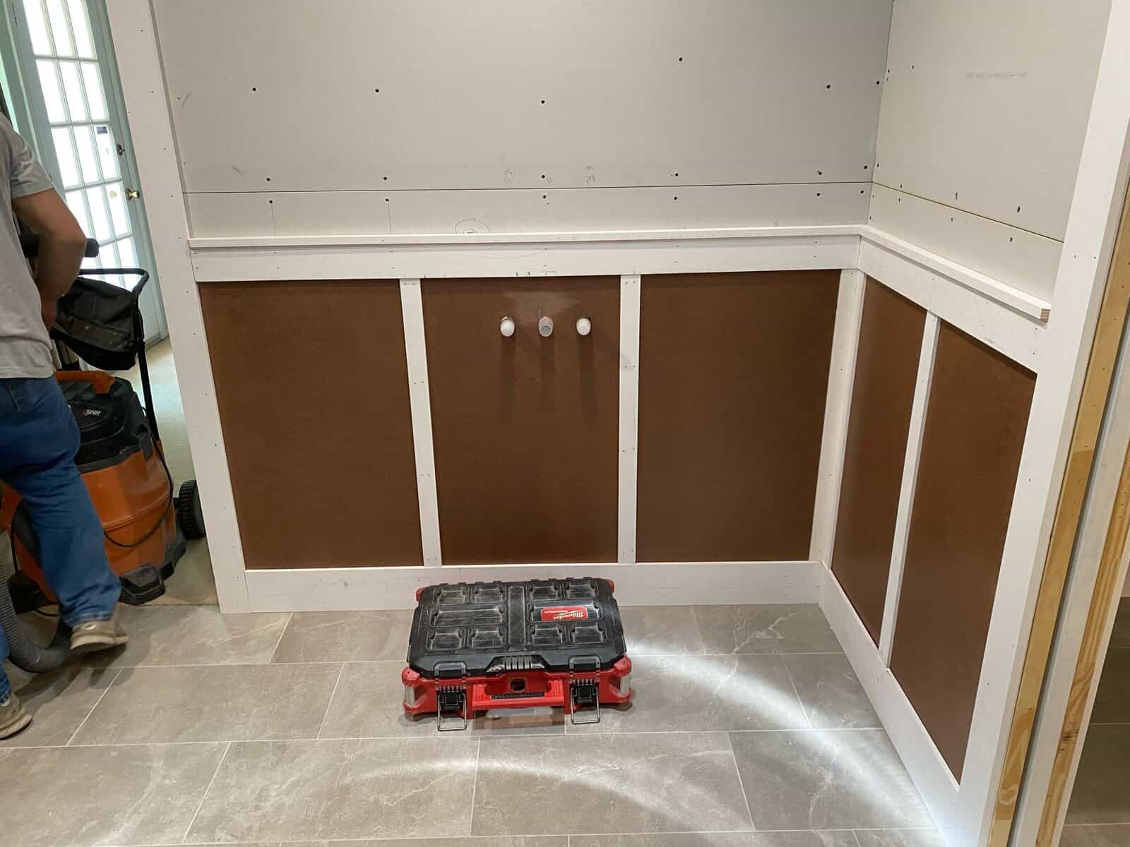
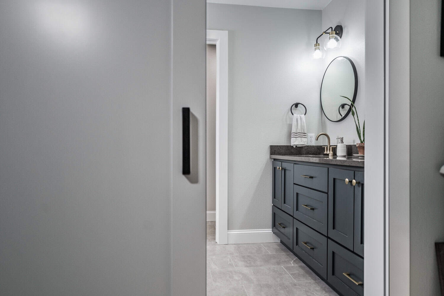
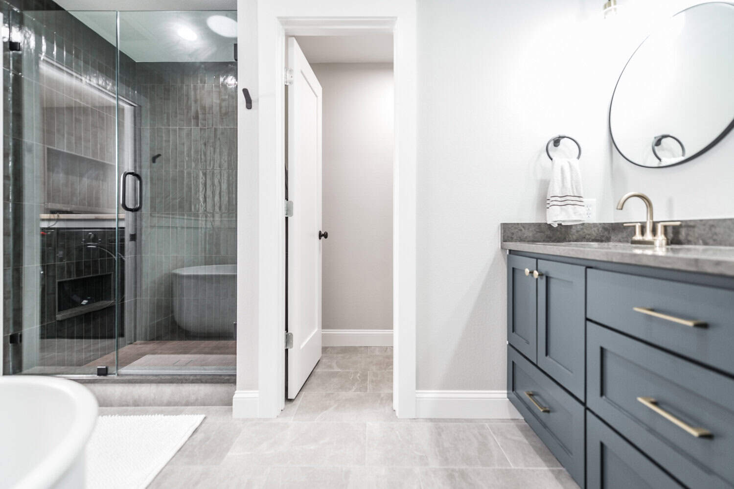
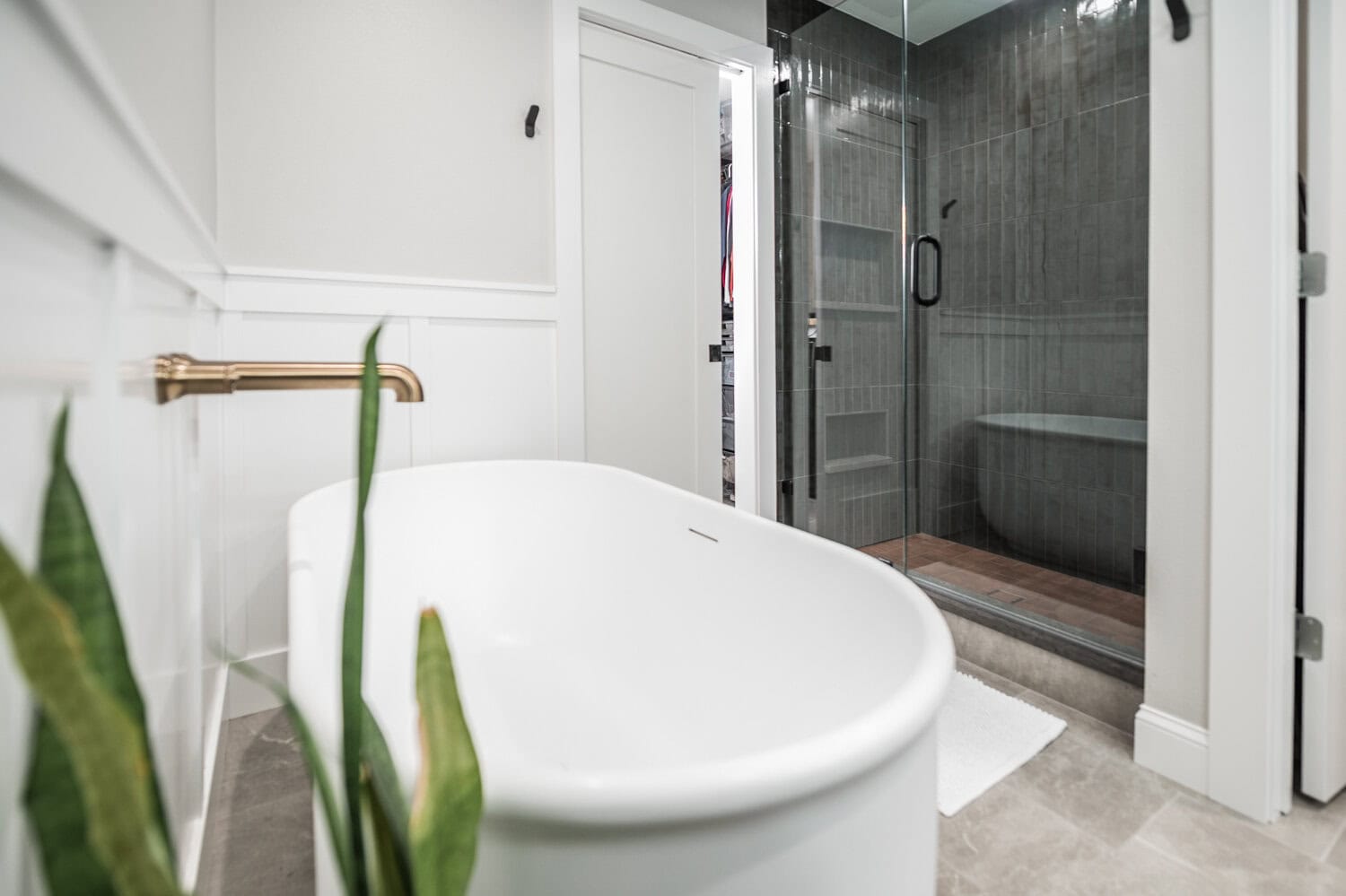
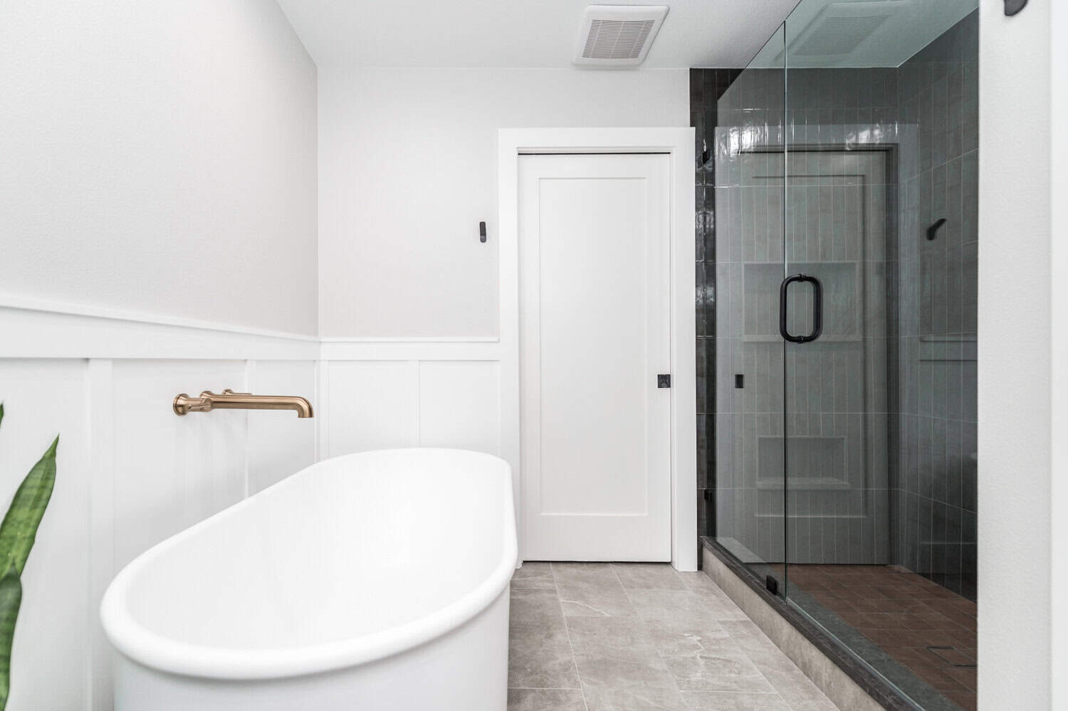
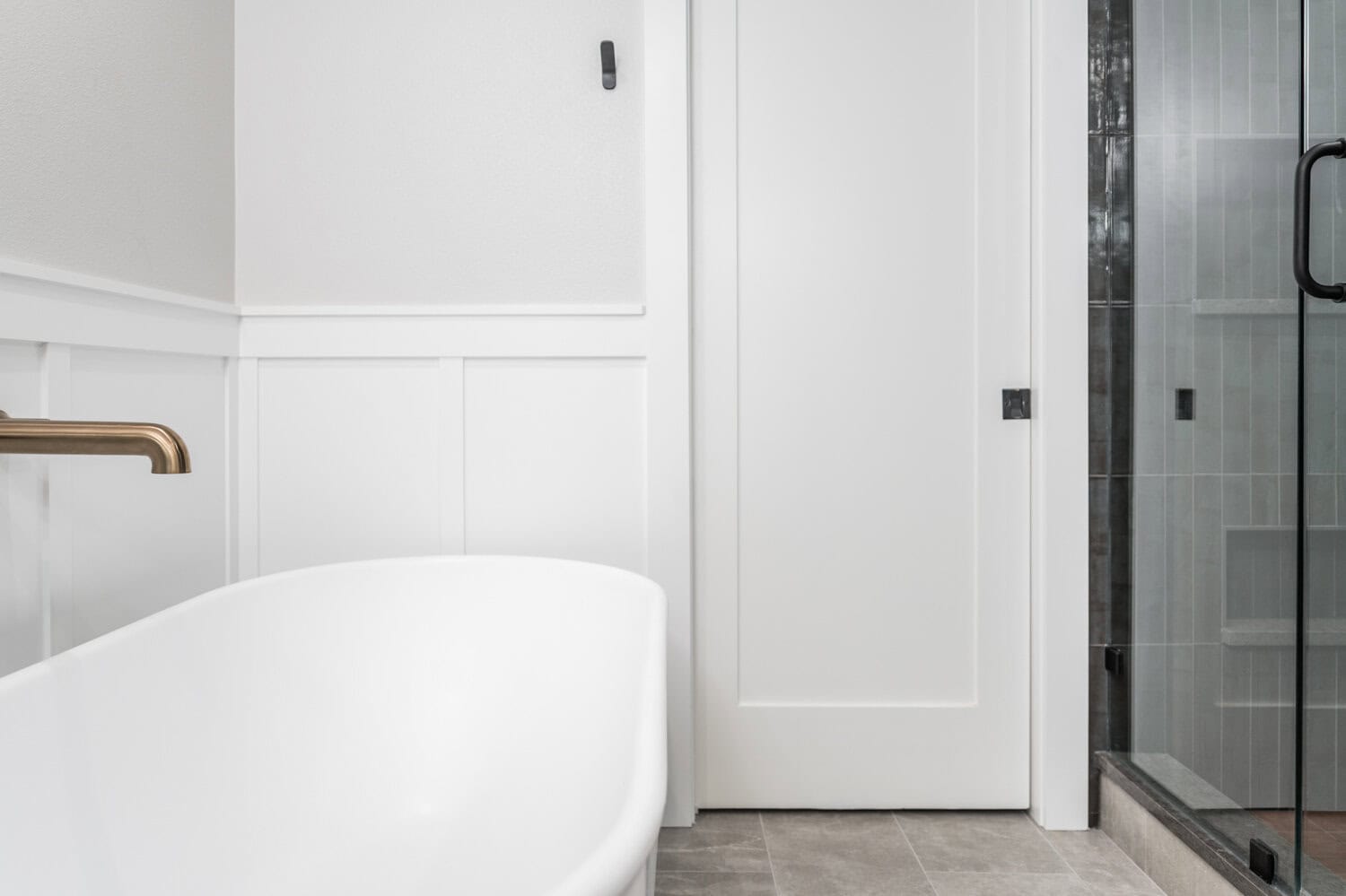
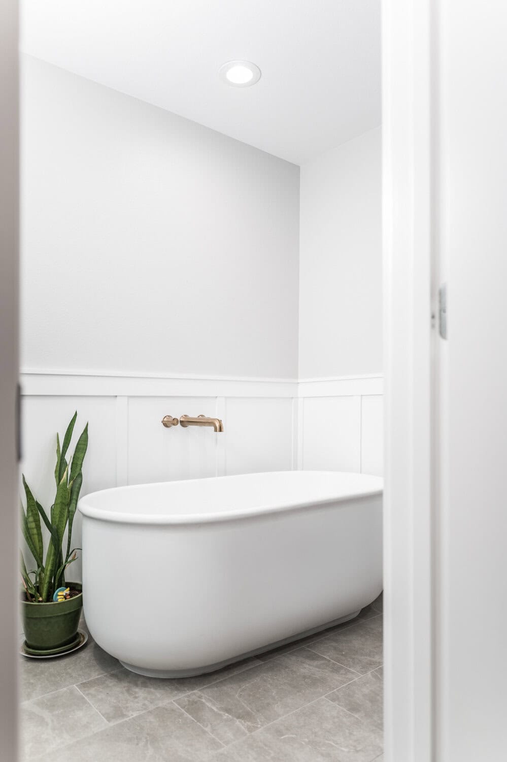
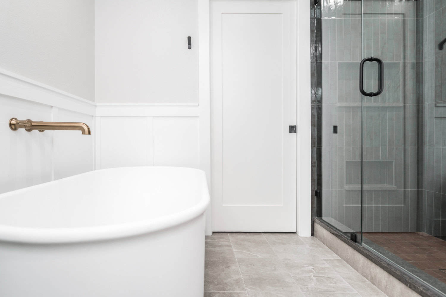
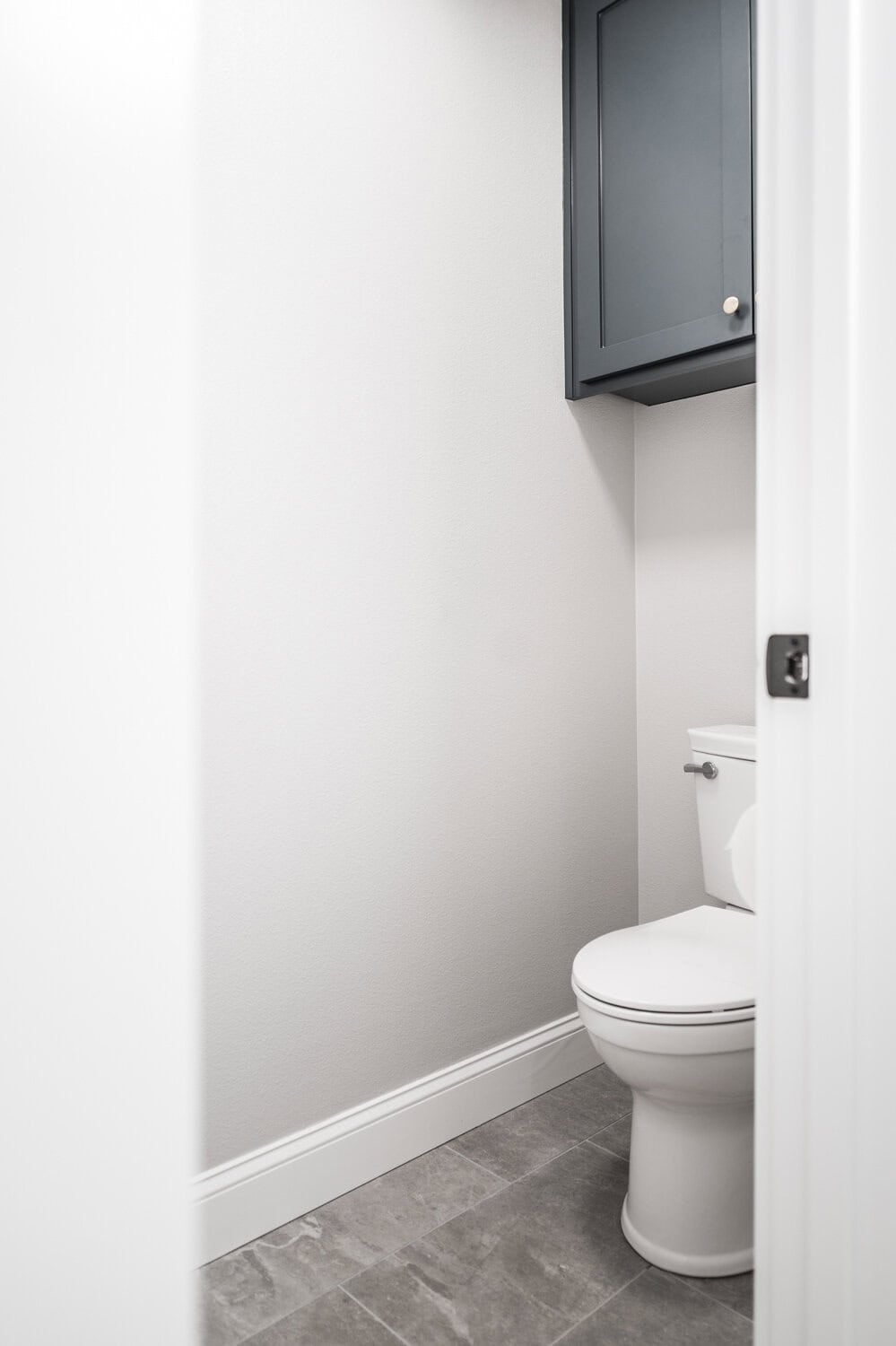
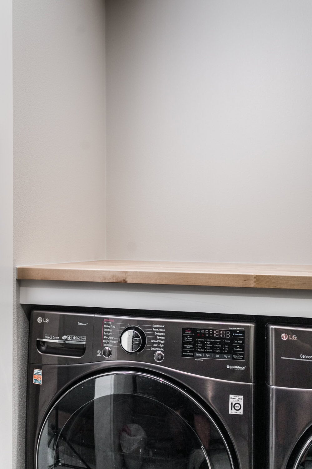
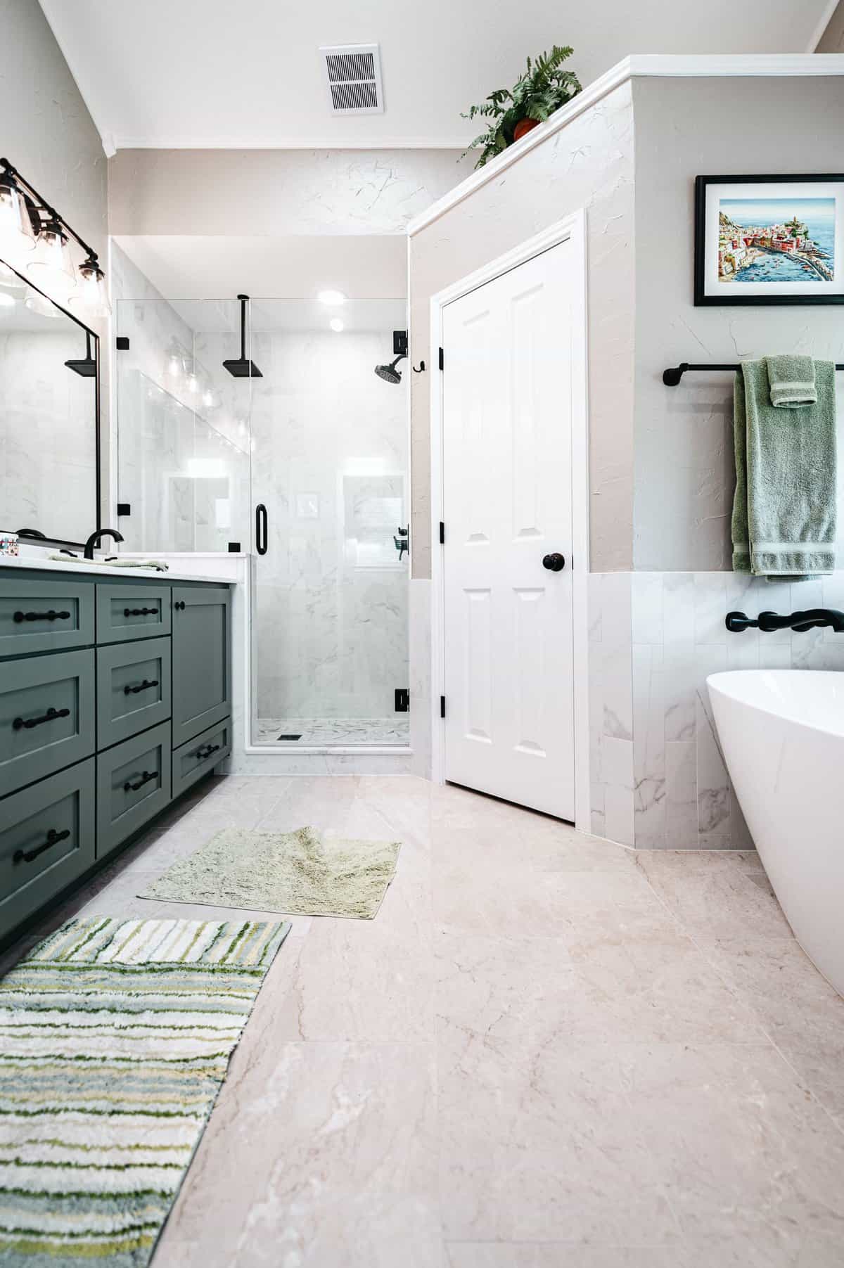
The bathroom was redesigned to include a unified space with a separate toilet room, a more functional vanity area, and ample room for a freestanding tub and spacious shower. By combining the two closets, we created additional space to accommodate the washer and dryer, complete with a folding countertop. The original laundry room, which served as a crowded pass-through to the garage, was transformed into a more functional mudroom. To optimize space further, a pocket door was installed between the bathroom and closet.
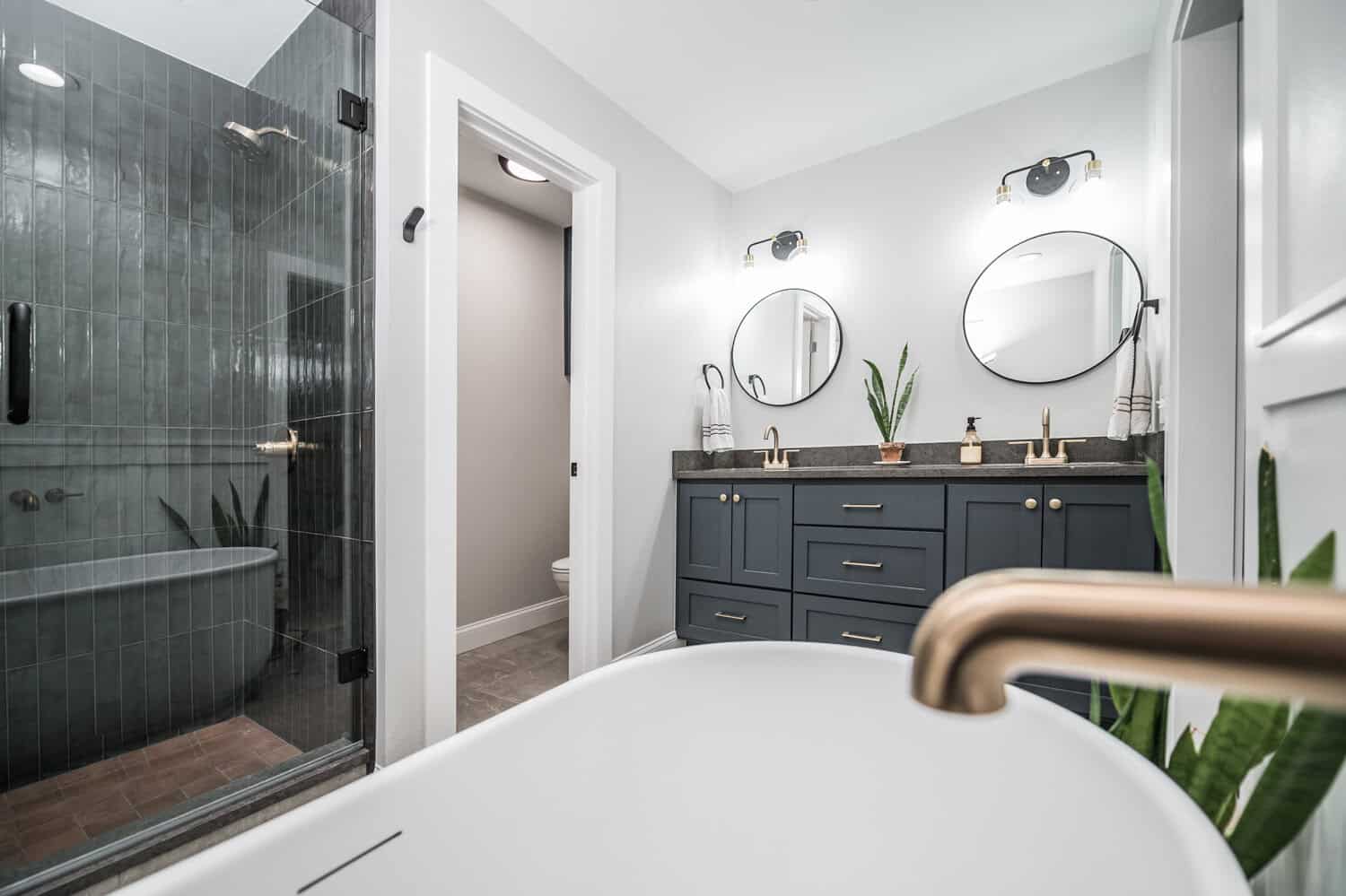
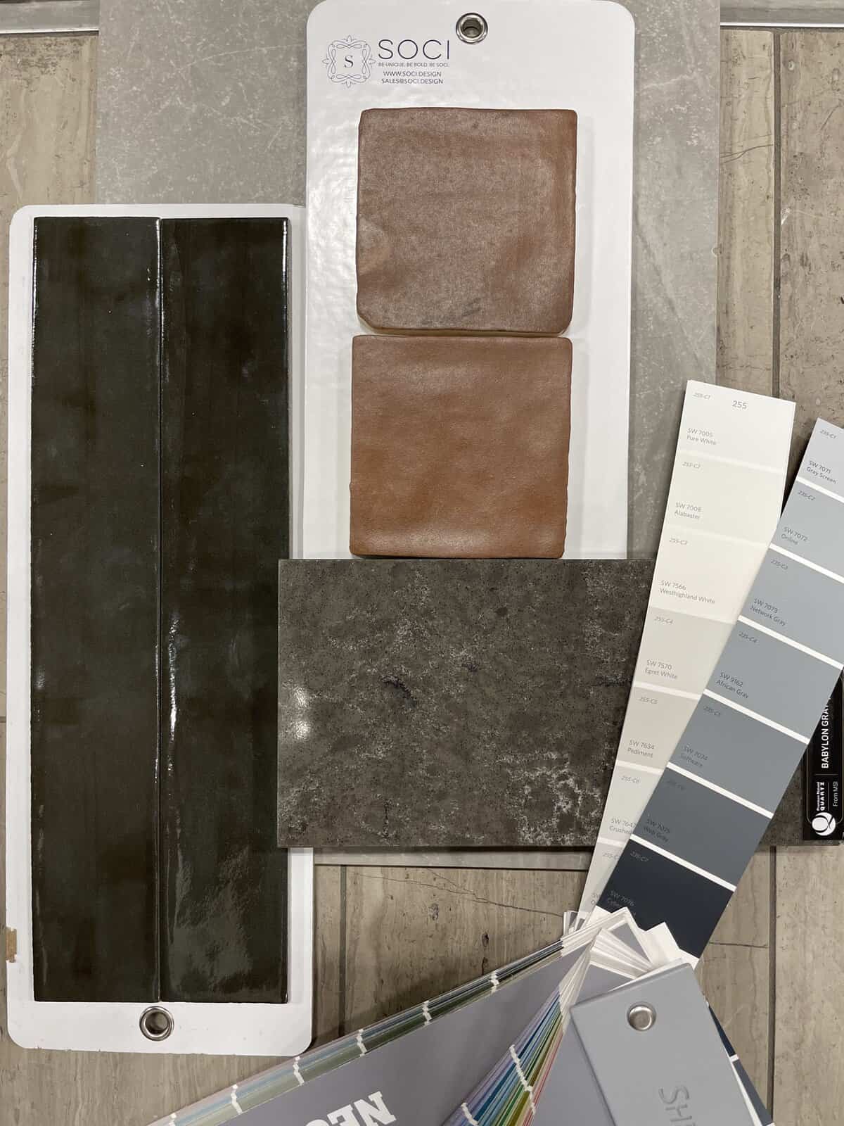
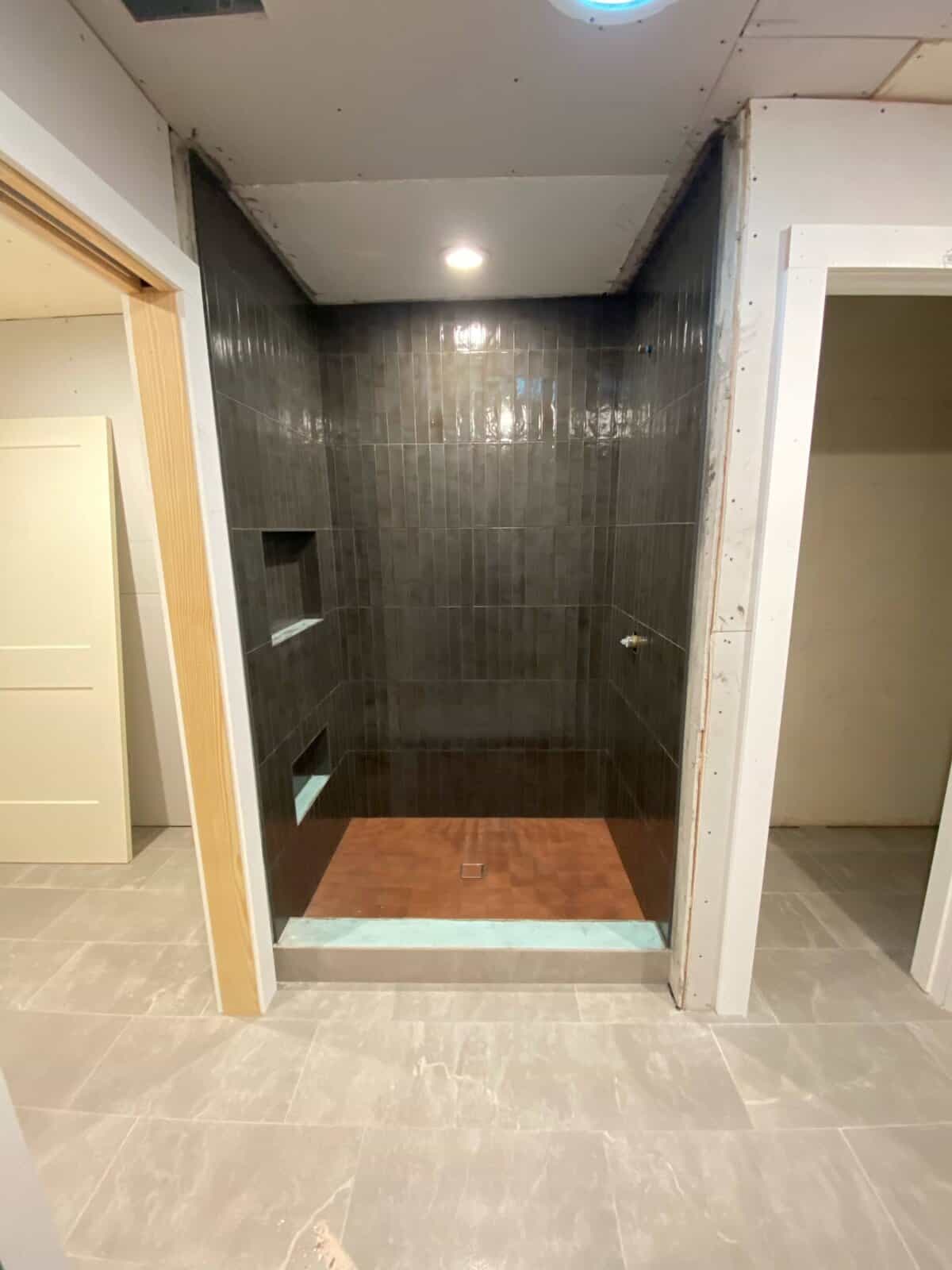
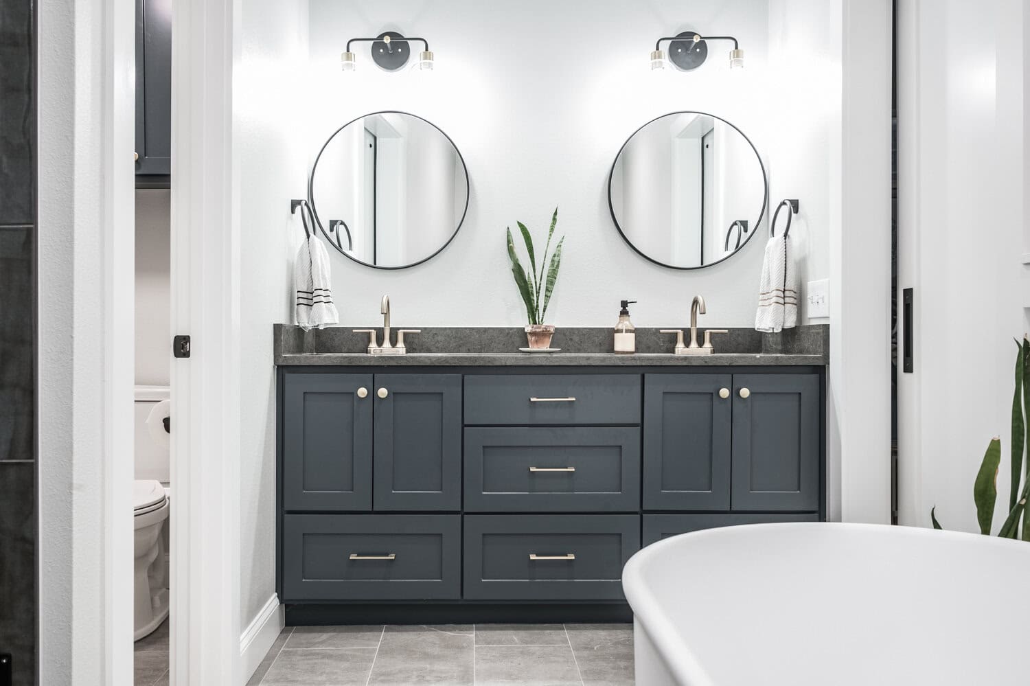
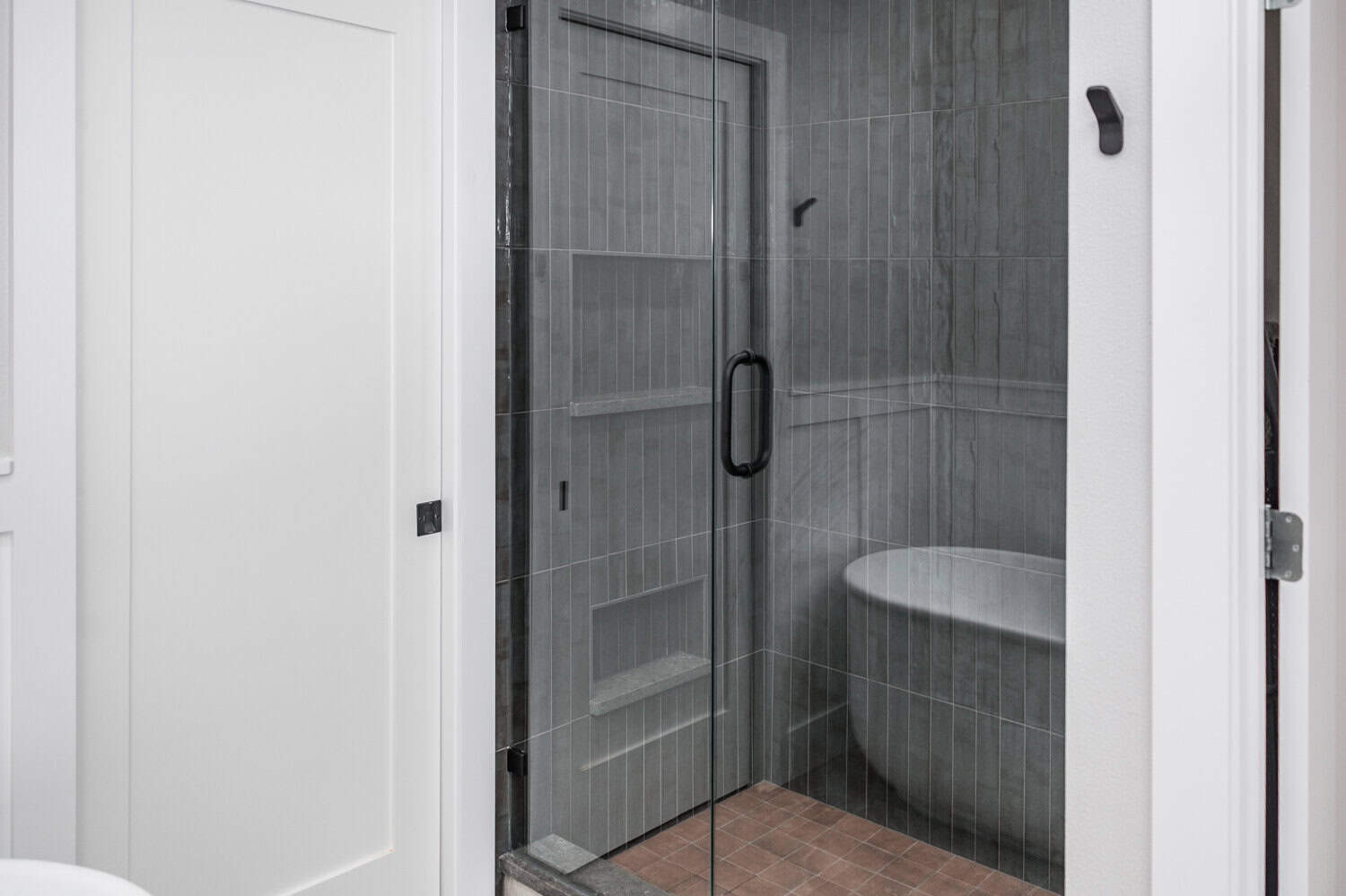
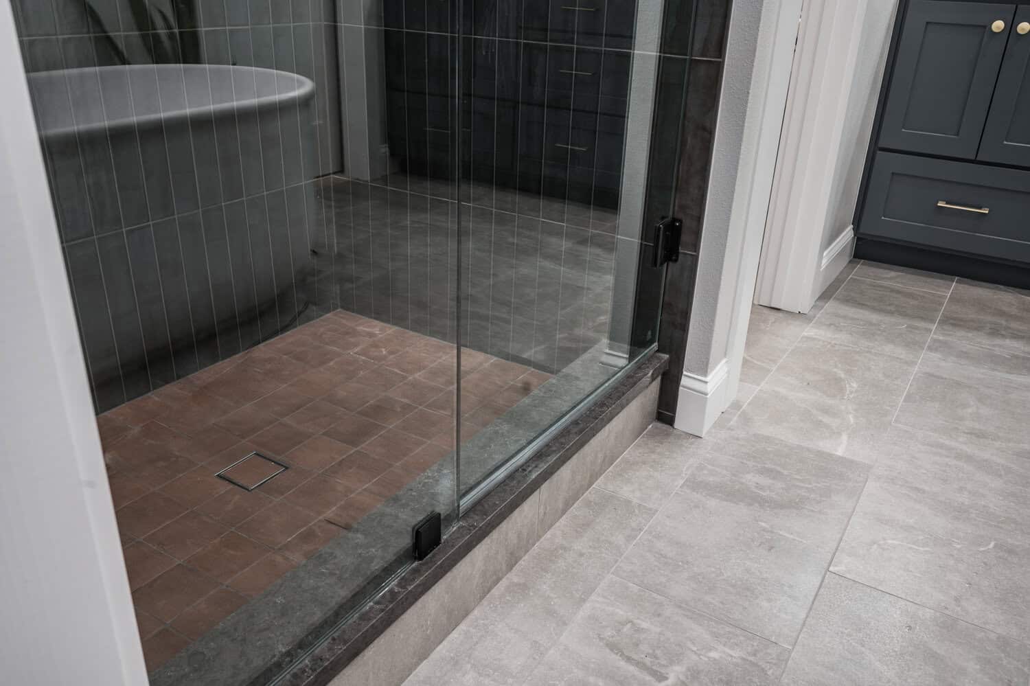
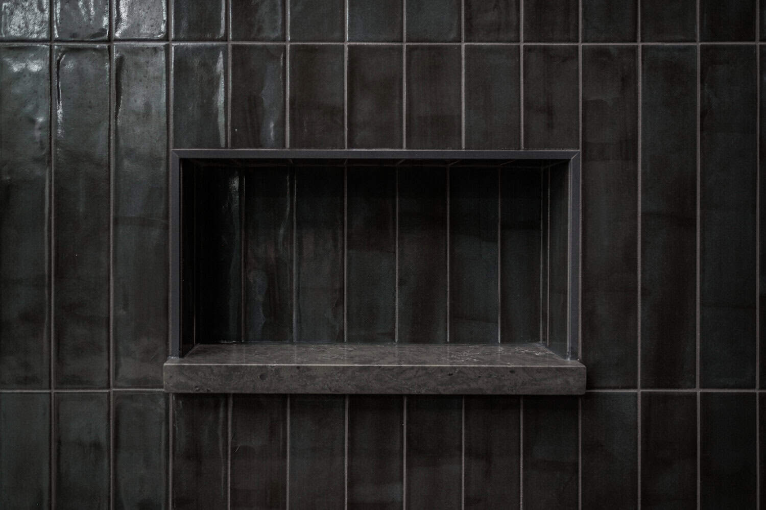
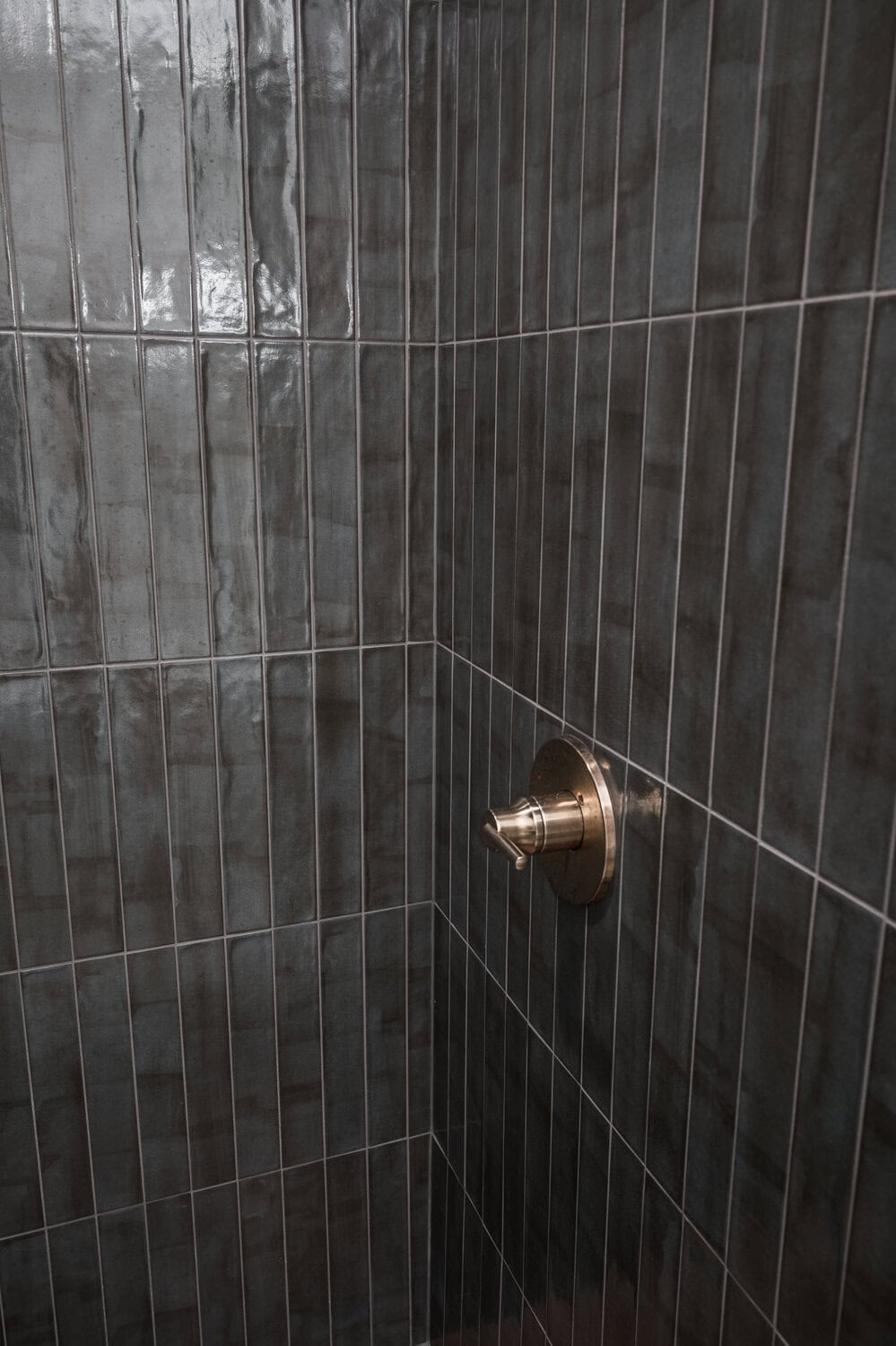
Our client wanted a moody retreat space with lots of contrast. We chose deep, rich colors as the basis for our design to achieve the desired aesthetic. The shower wall tile was one of the first materials we selected with the client, which we decided to install in a vertical straight lay pattern for a more modern feel. In order to tie in the existing Saltillo tile in the entry and kitchen of this home, we selected a shower floor tile in an amazing Terra Cotta hue. The combination of these two tiles creates an earthy and refined space that offers more than just a functional shower—it provides a captivating experience. To upgrade the shower’s functionality, we built two shampoo niches – a higher one for toiletry storage and a lower one as a shaving ledge.
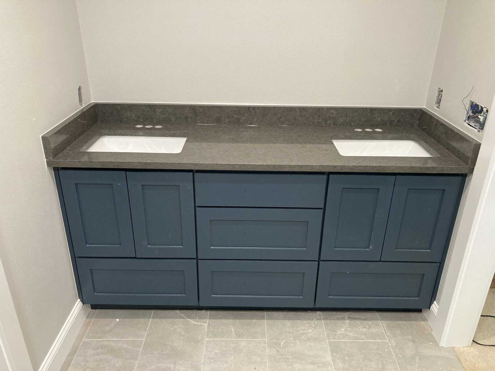
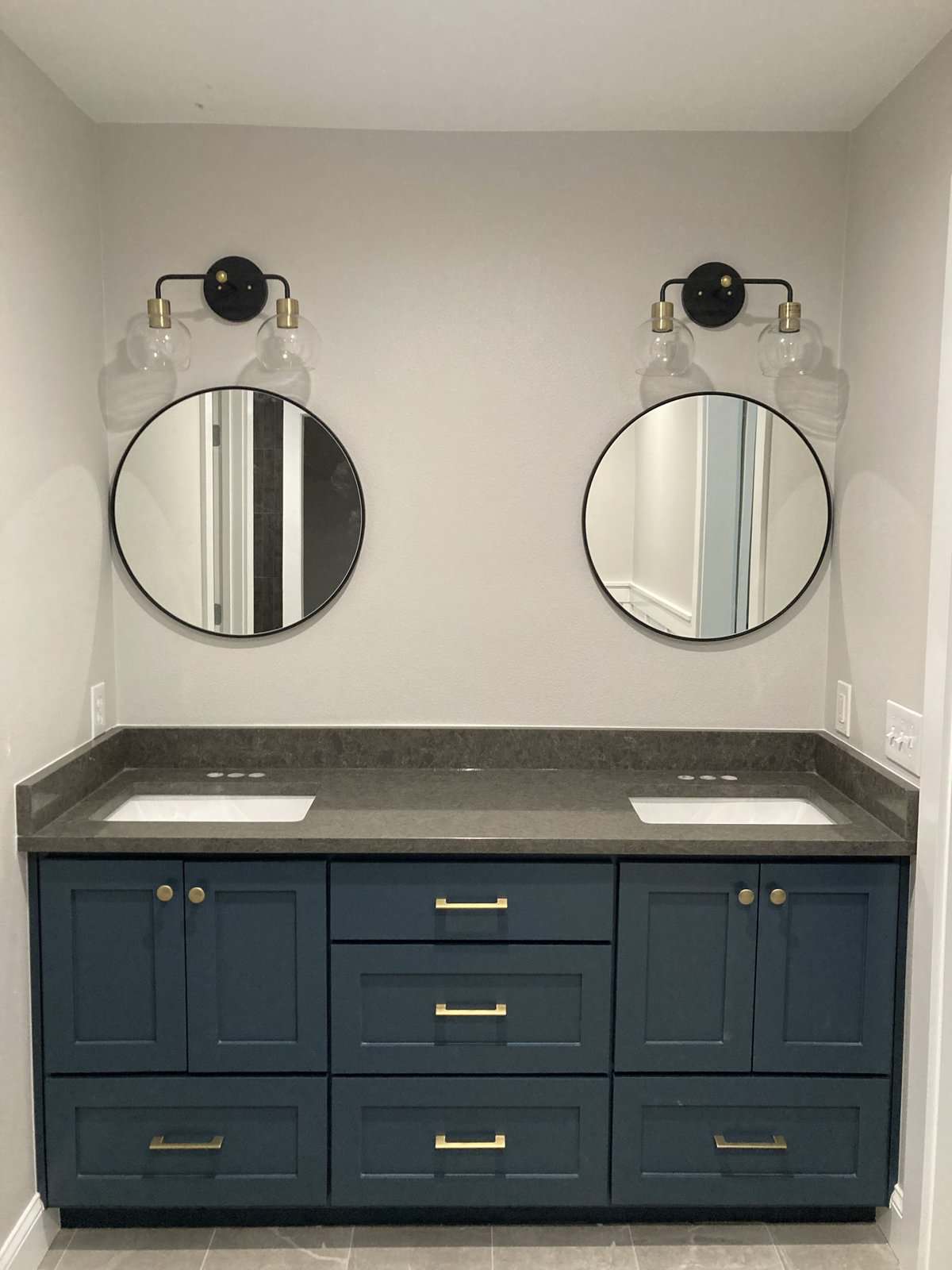
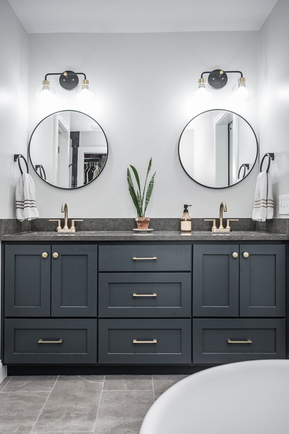
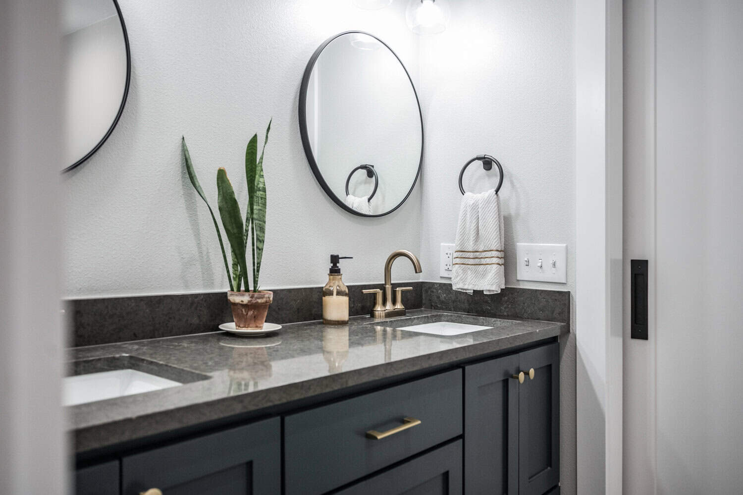
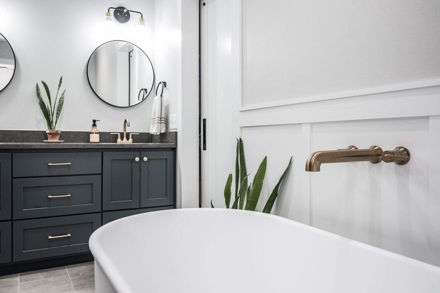
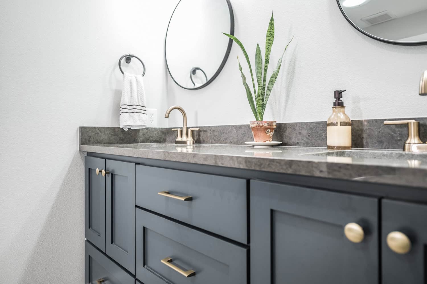
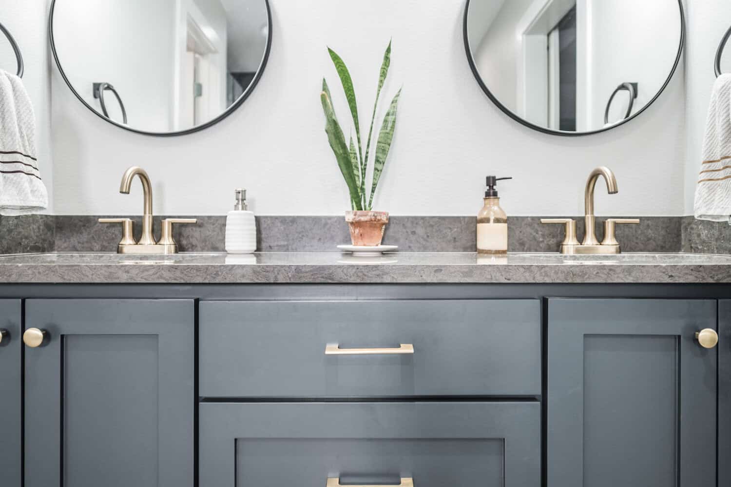
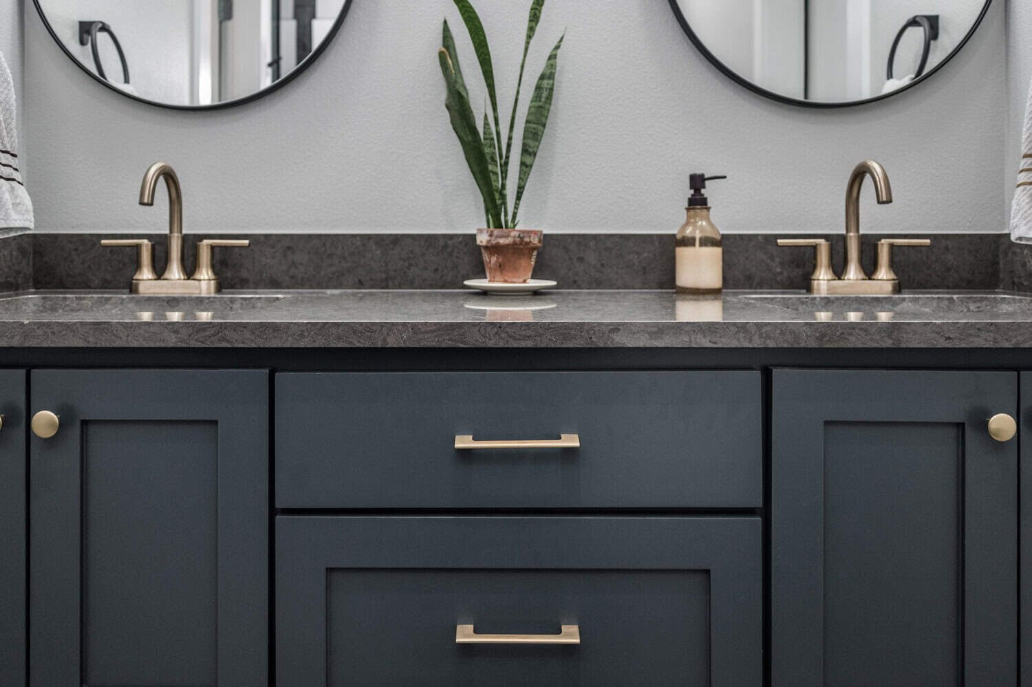
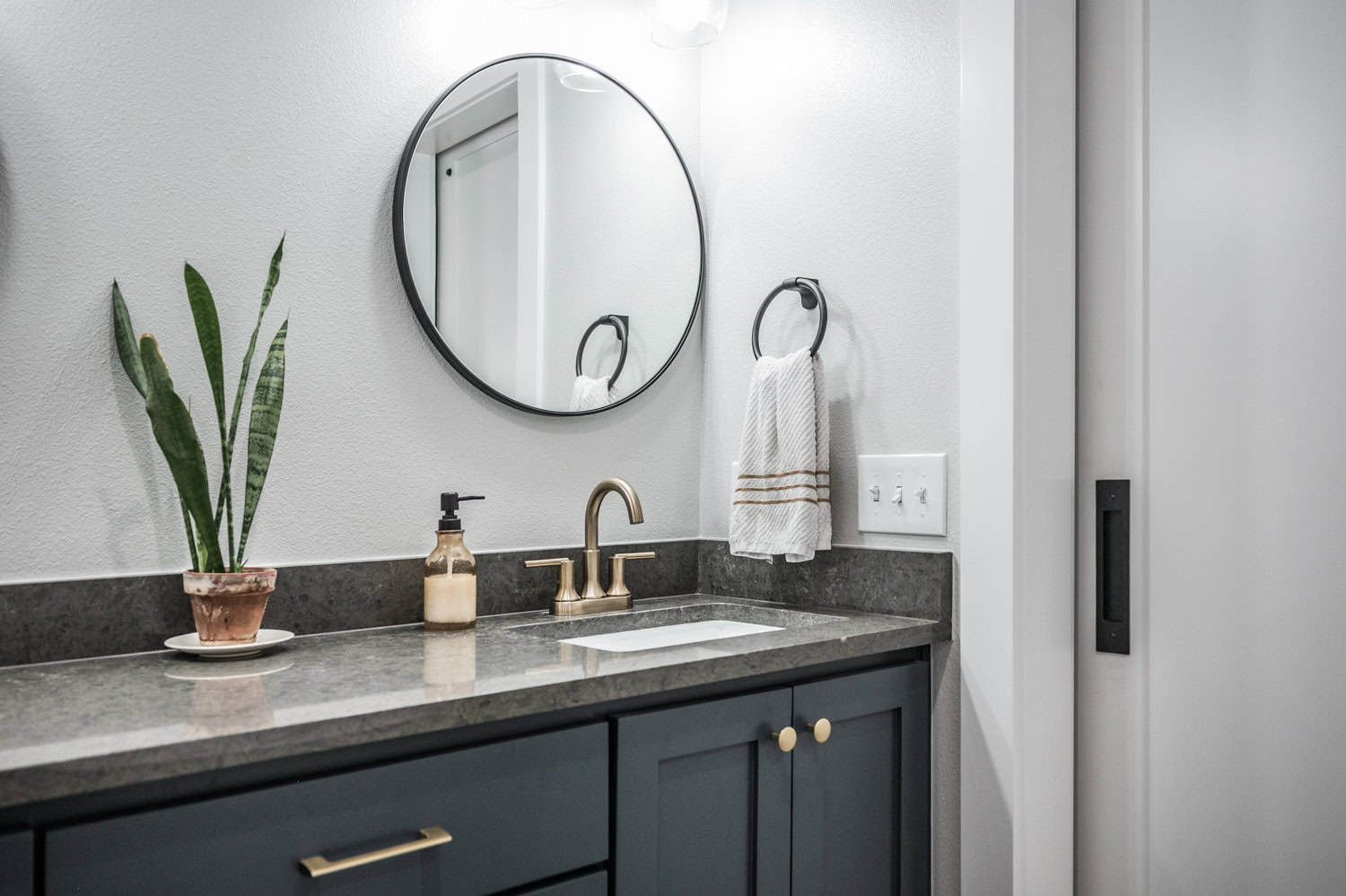
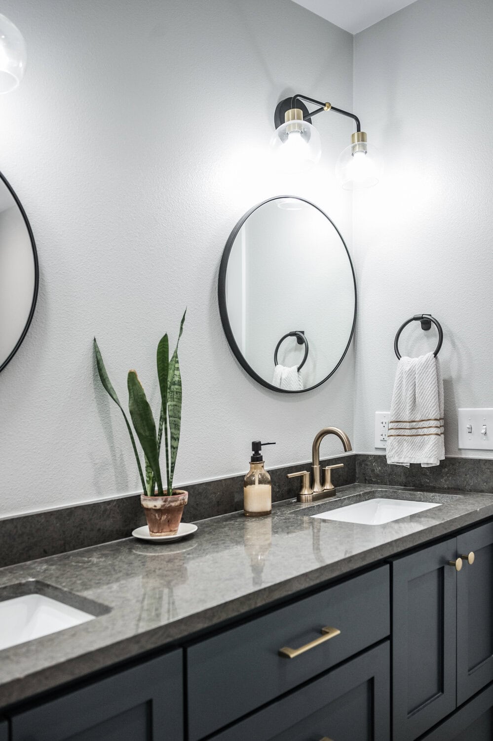
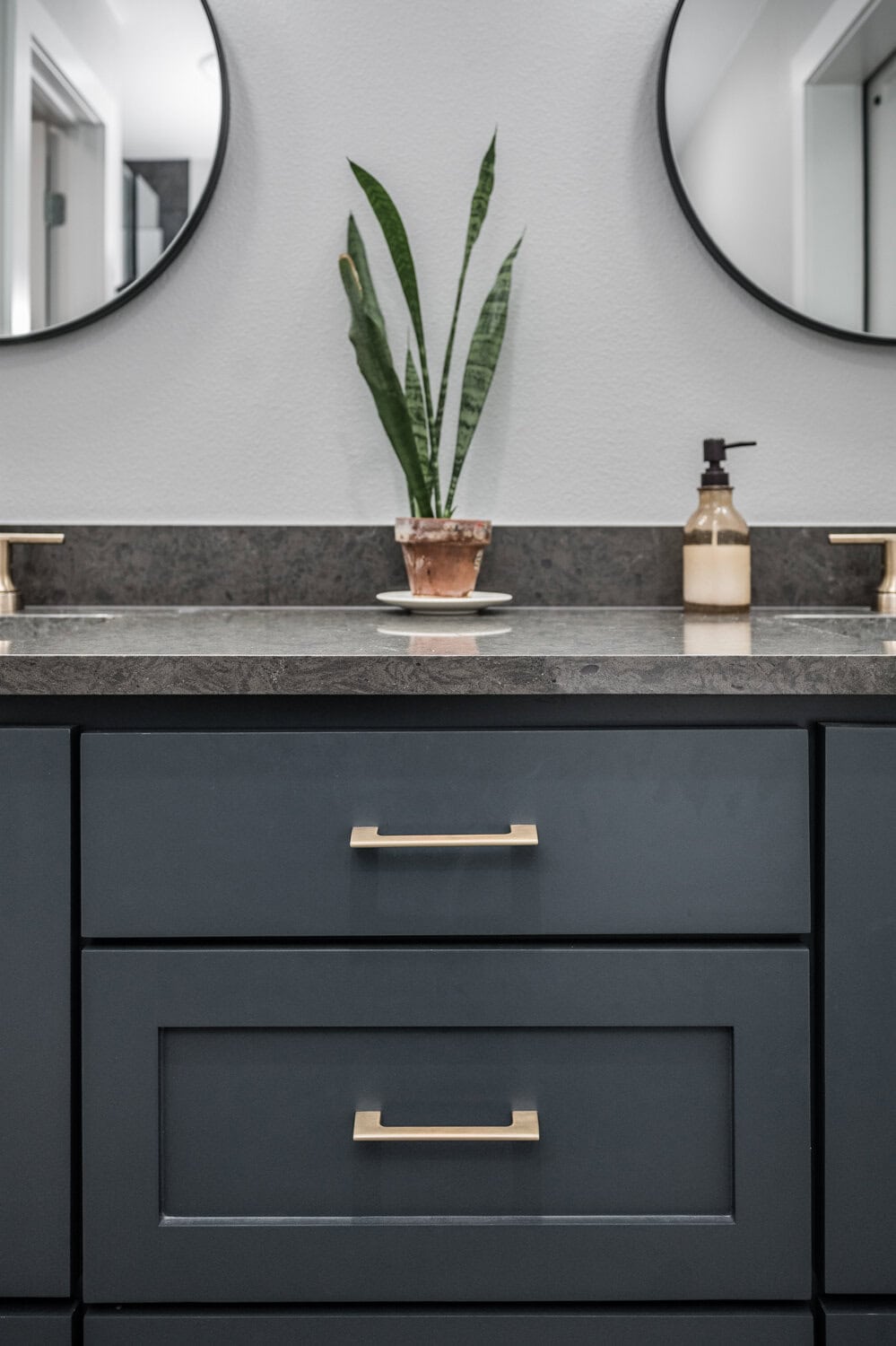
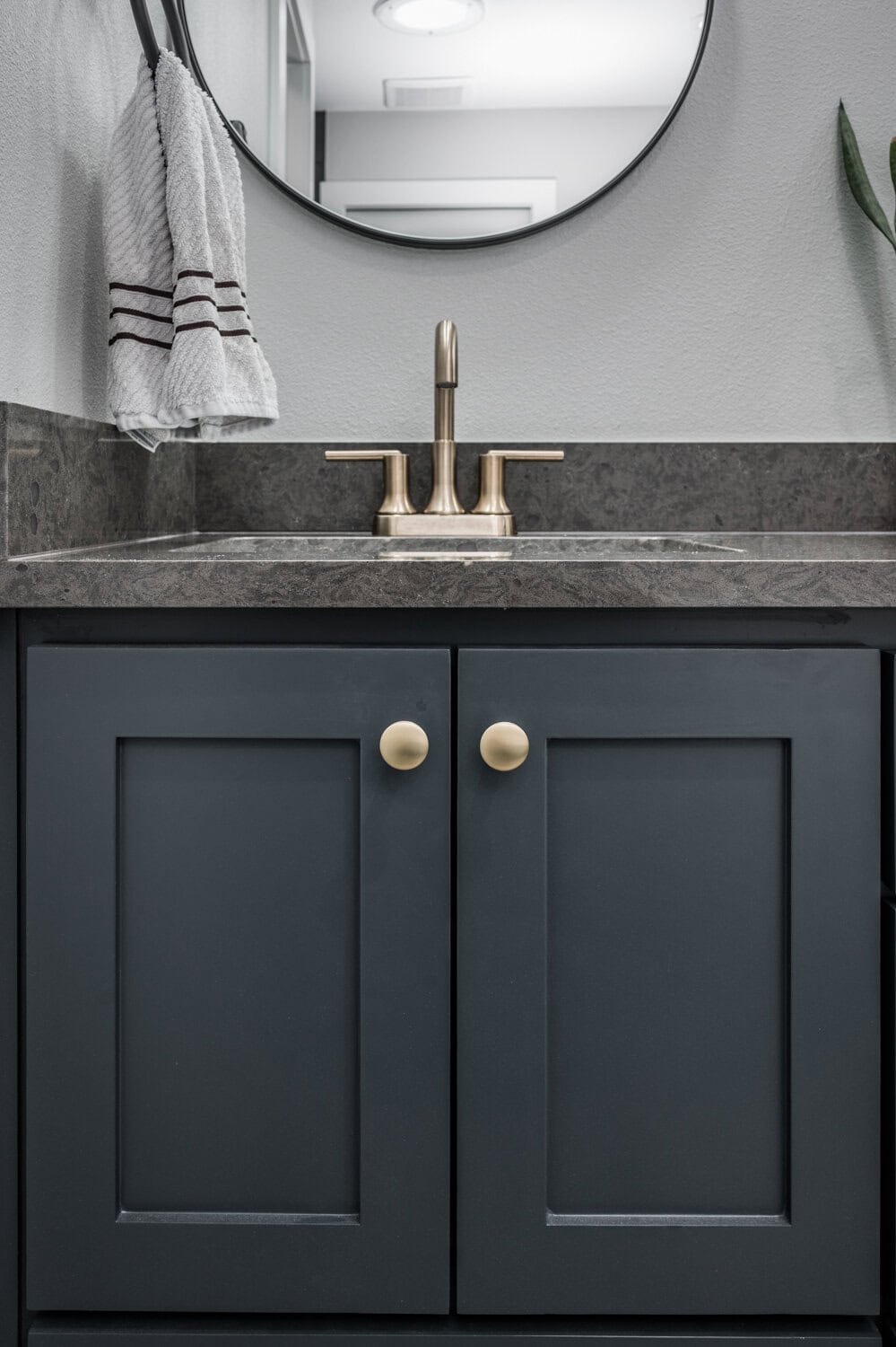
In order to offset the dark tones of the shower, we chose a bathroom floor tile in a light gray with just a hint of movement. The countertop is Babylon Gray Quartz (sourced from ProSource), which brings another layer of warm, deep color to this space. Sherwin Williams Sea Serpent on the vanity provided the perfect pop of color in contrast to the floor tile, and a dose of Sherwin Williams Crushed Ice on the walls lightened up the rest of the bathroom.
AFTER
Upon completion of the project, our client commented,
“The new bathroom looks nothing like the previous layout. It is warm, bright, flows efficiently, and works much better for our needs. My favorite thing is the moody/dark color palette. I did not want a white bathroom and so we went with darker, rich colors for the shower tile, cabinets and countertops. It is moody and earthy but still feels clean and fresh.”
We hope you are as pleased with these results as we and our client are. This was truly one of our favorites!
Project Materials & References :
P A I N T :
- Walls – Sherwin Williams Crushed Ice
- Vanity – Sherwin Williams Sea Serpent
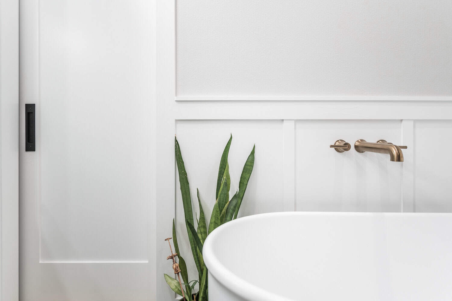
- Trim, board and batten, doors, ceiling – Sherwin Williams Extra White
T I L E :
Floor Tile – Marazzi Historia 12”x24” tile in Heritage Gray (via ProSource) with Custom Grout in Gravestone
Shower Wall Tile – Glazzio Bistro Collection 2-1/2” x 14-1/2” in Yarsen (via ProSource) with Schluter Jolly trim in Dark Anthracite and Custom Grout in Truffle
Shower Floor Tile – 4×4 Fika Rosso in Red (via ProSource) with Custom Grout in Truffle
O T H E R :
Countertop – Babylon Gray Quartz (via ProSource)
Bathtub – Taft Acrylic Double Ended Freestanding Tub
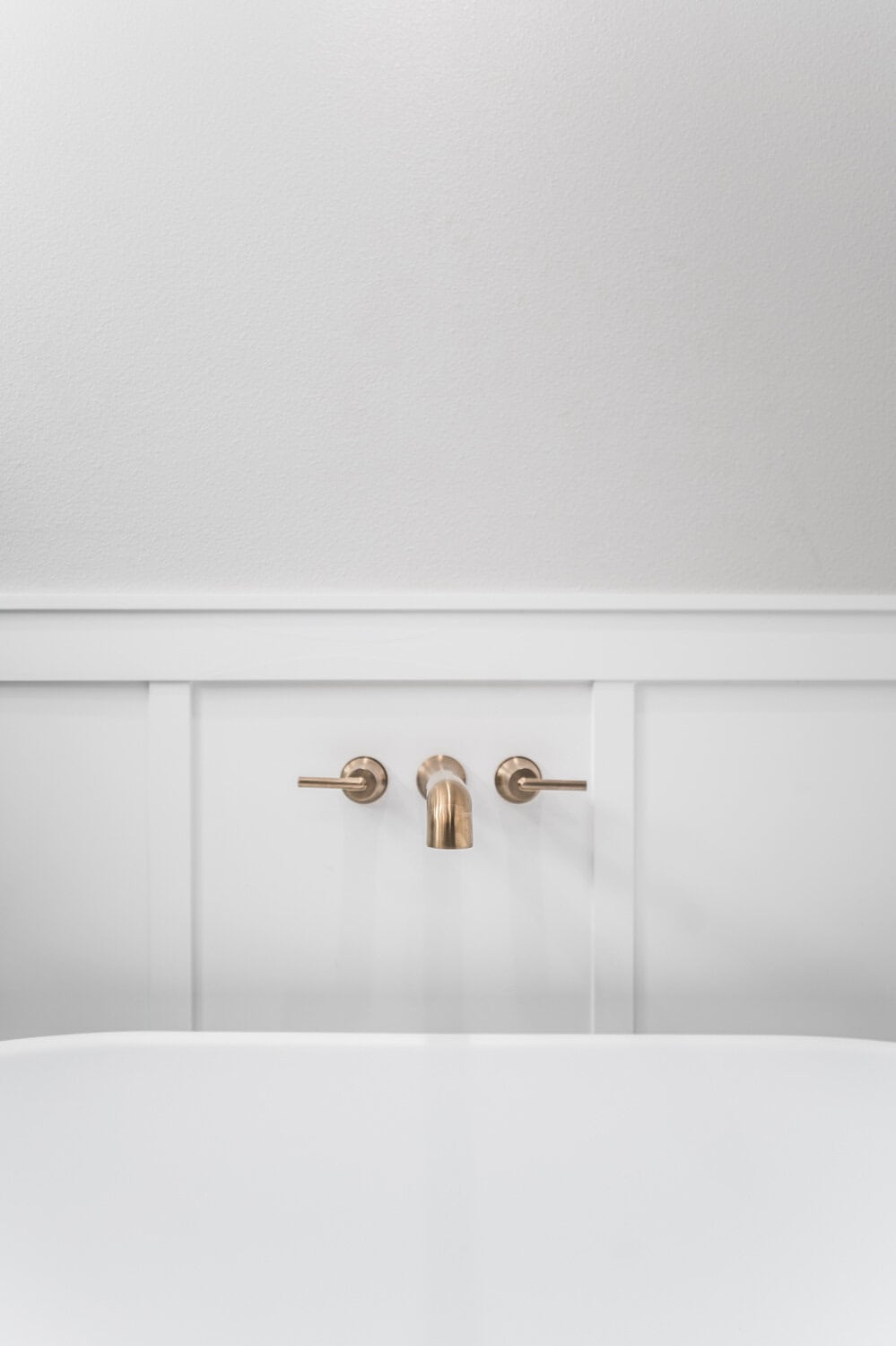
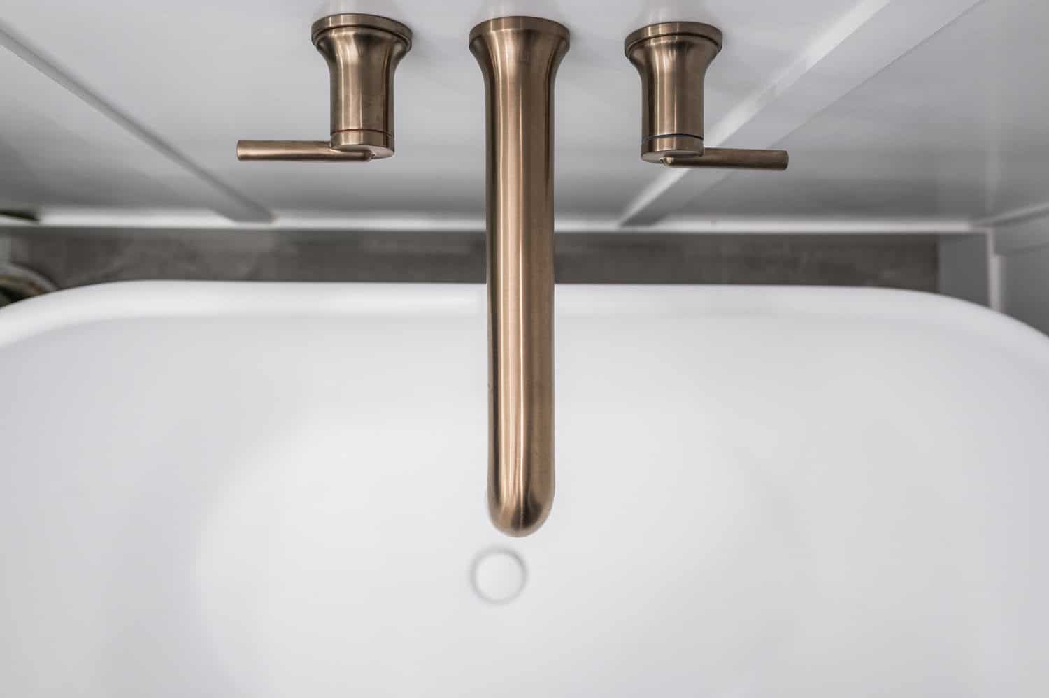
Bathtub Filler –Delta Trinsic wall-mount in Champagne Bronze
Mirrors – 24″ Round with Black Frame
Vanity Lights – Shades of Light
Knobs – Dish Knob
Pulls – Talbot Pull
Search #moodymasterbathroom on our Instagram | @irwin.construction
[instagram-feed]





Leave A Comment