BEFORE
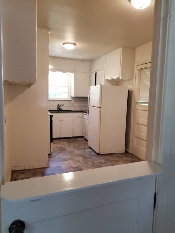
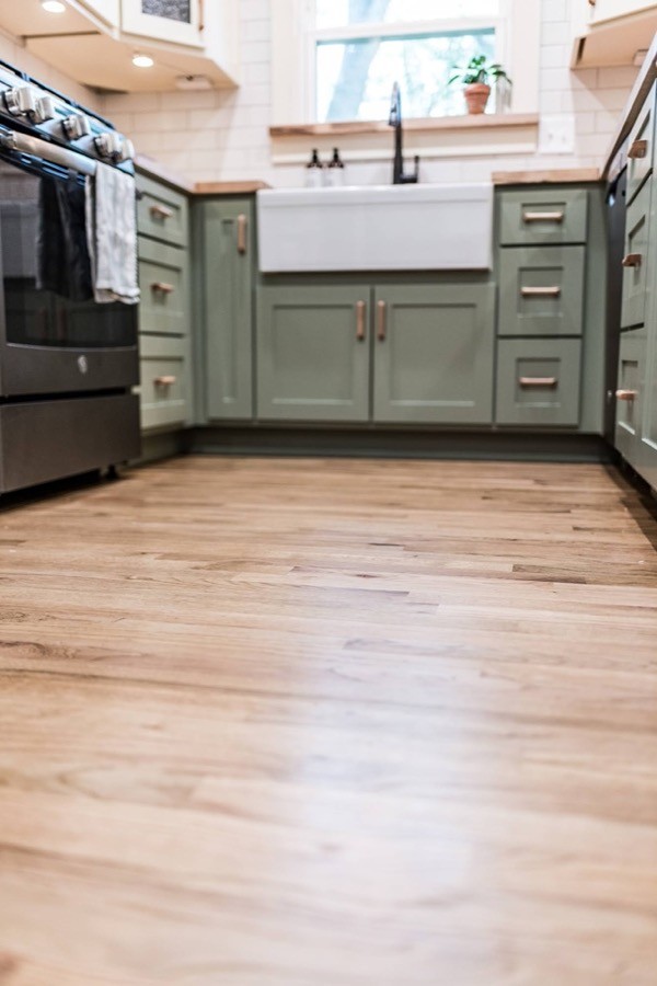
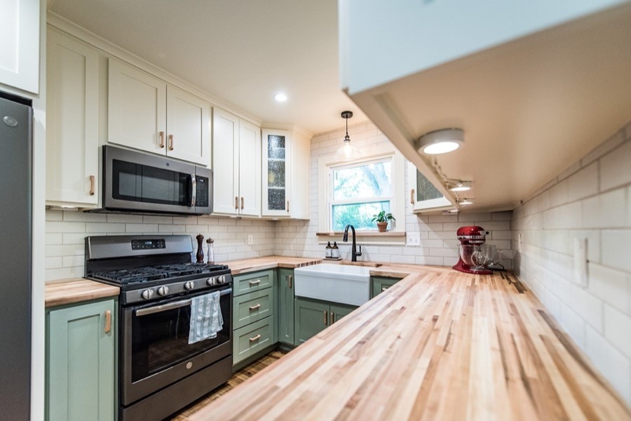
Our clients at the Sage + Ivory Cottage Kitchen project came to us desiring more useable space and storage in their small kitchen. The original kitchen in this 1949 home was washed out, cramped, and outdated (though it had seen some updates over the years). We partnered with our clients to bring the kitchen into the present day with a little TLC.
The main goals for this project were to:
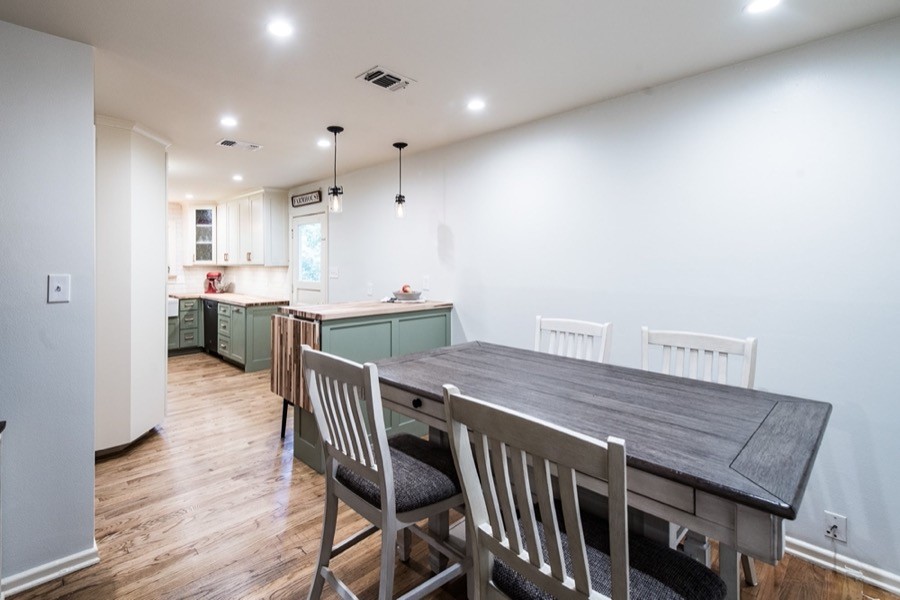
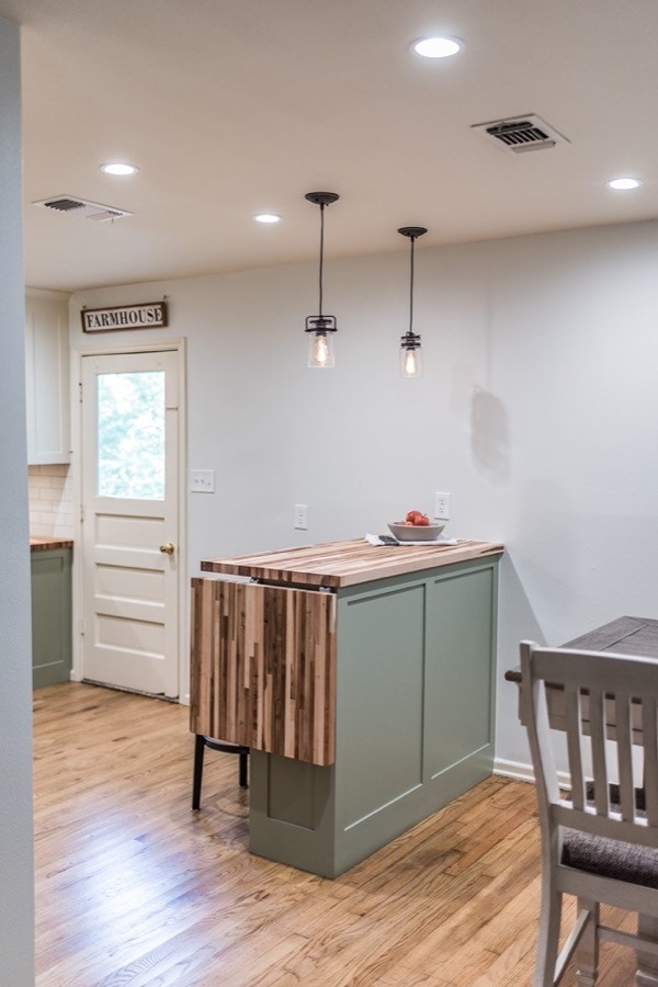
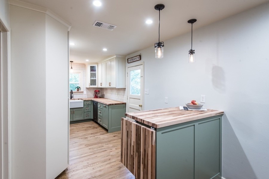
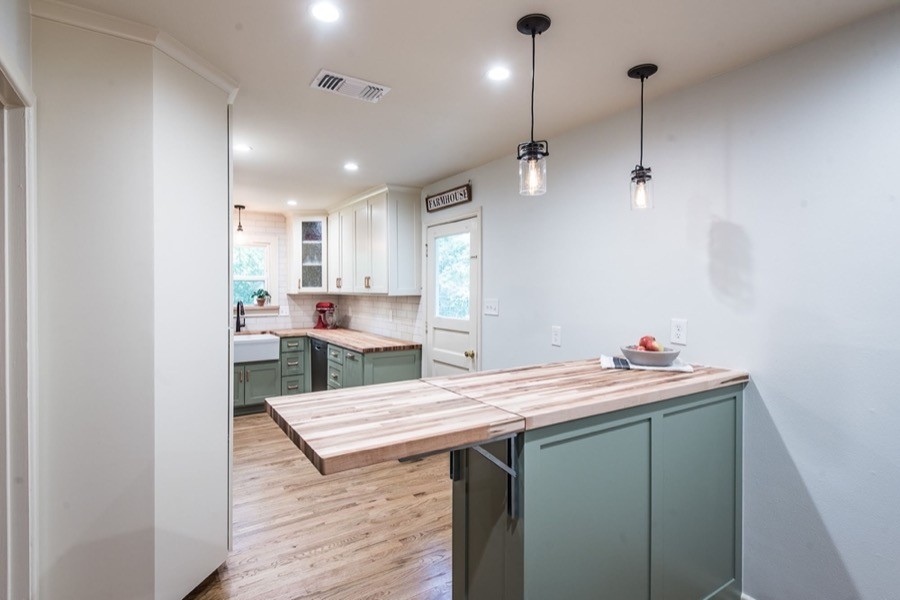
- Remove the wall between the kitchen and dining room to create more usable space for entertaining
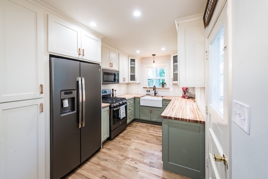
- Rework the layout of the kitchen to gain a wider walkway and more cabinet storage
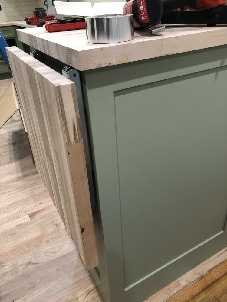
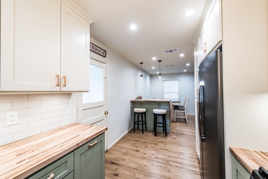
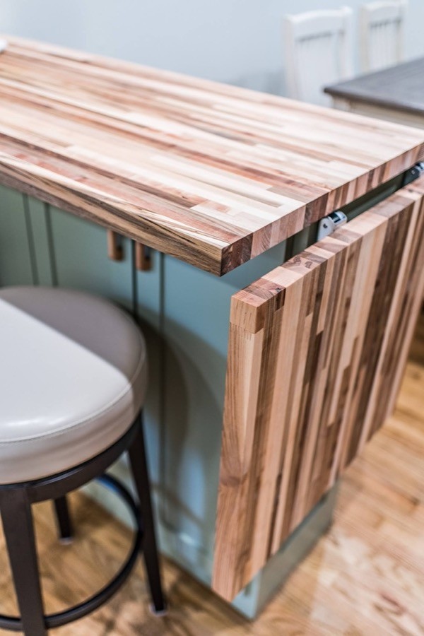
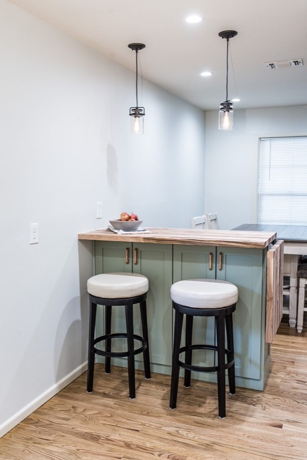
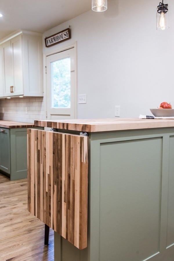
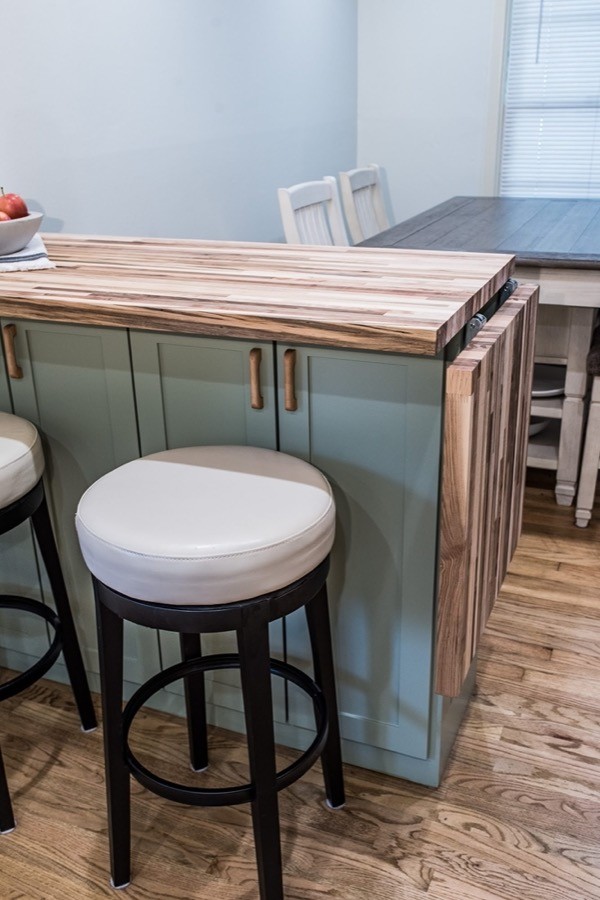
- Add extra counter space with a peninsula dividing the kitchen and dining room
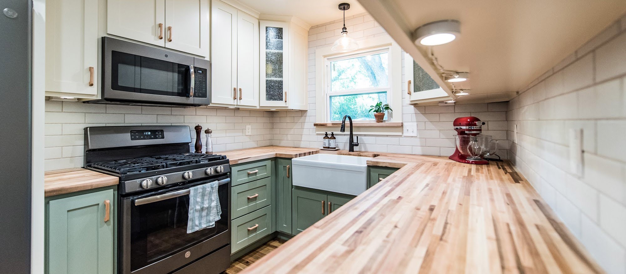
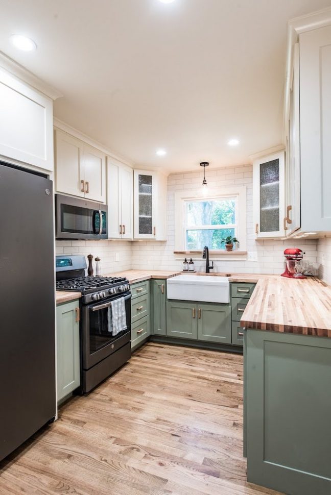
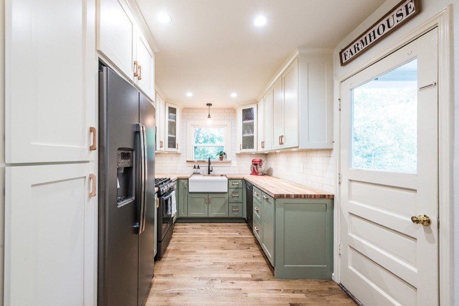
- Transform the aesthetic of the kitchen with colors and materials that made the space feel like home for our clients
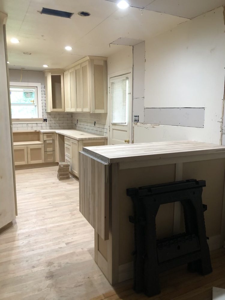
DURING
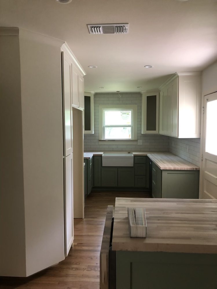
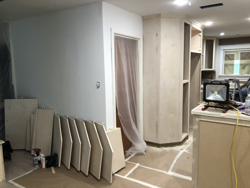
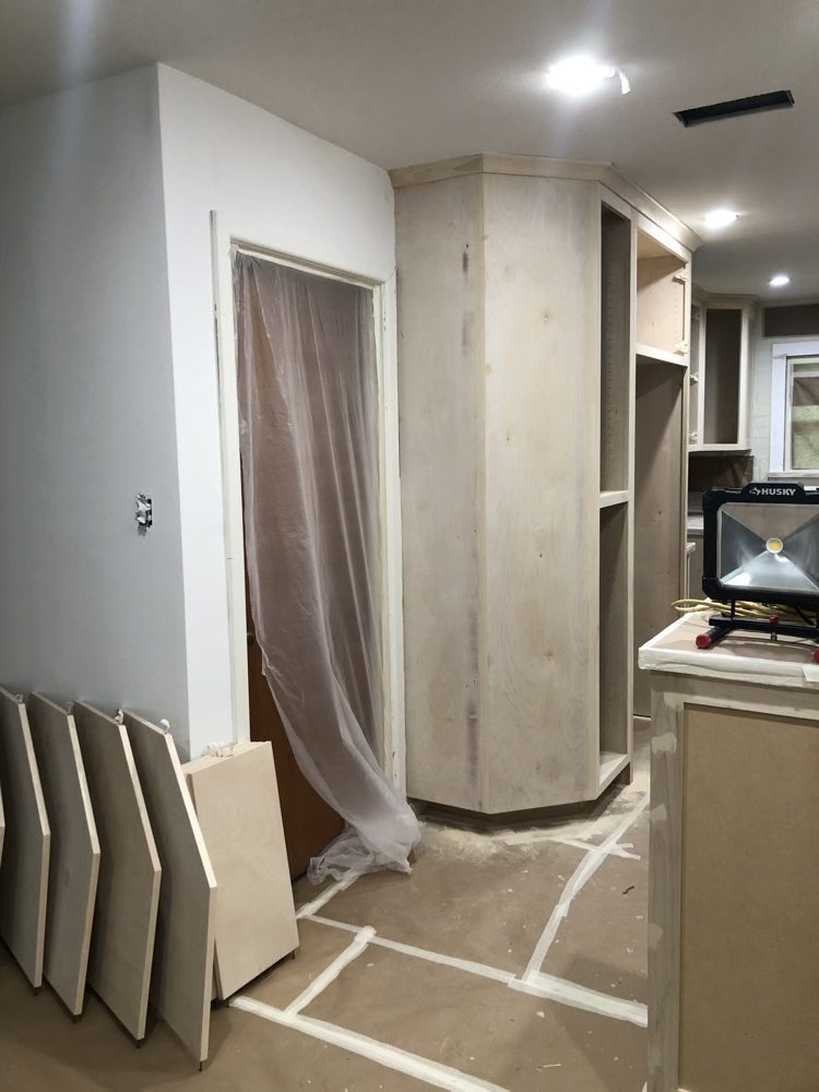
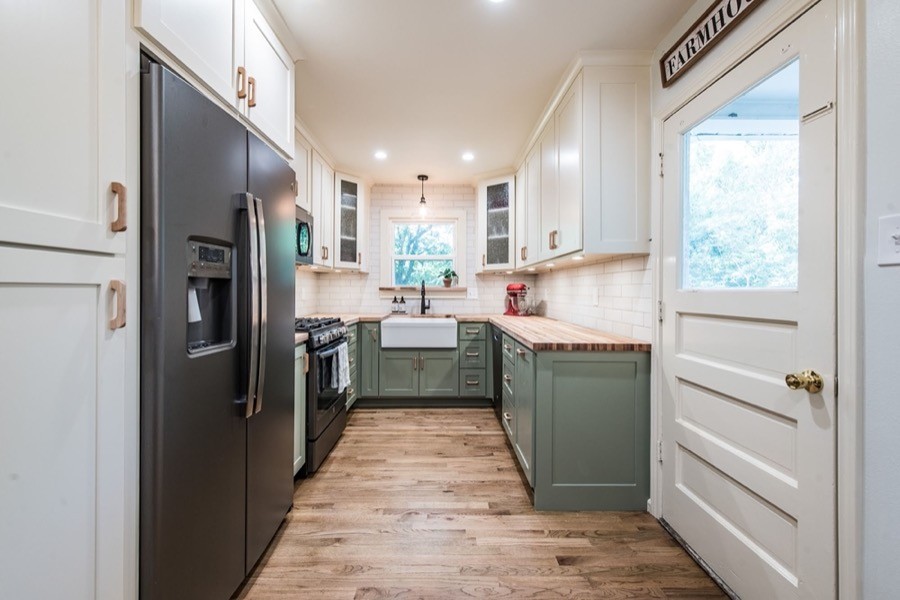
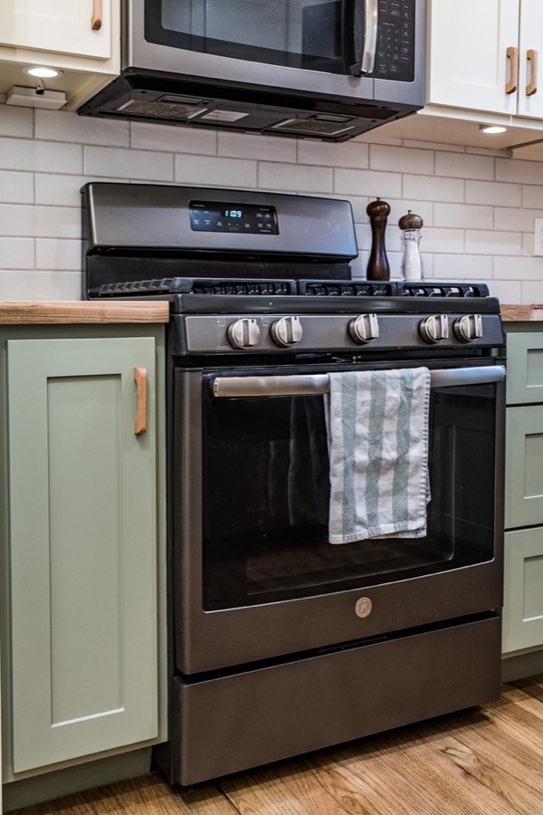
We began by removing the wall between the kitchen and the dining room and installed a beam in the ceiling to redistribute the load. In the new layout, we moved the refrigerator next to the range from its previous location by the back door. This change prevented these two bulky appliances from being across from one another in a narrow space, which was a major factor in the previous cramped feeling of the kitchen. The space next to the fridge was utilized as a pantry cabinet, adding much-needed storage.
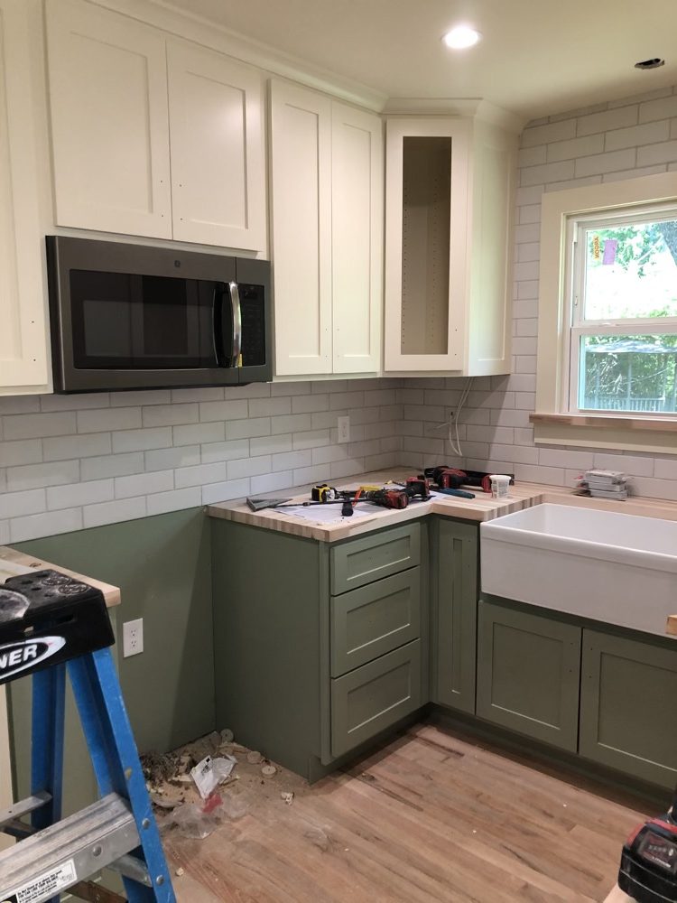
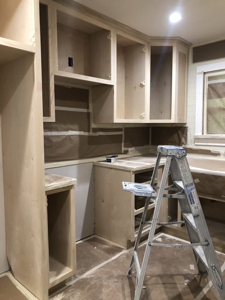
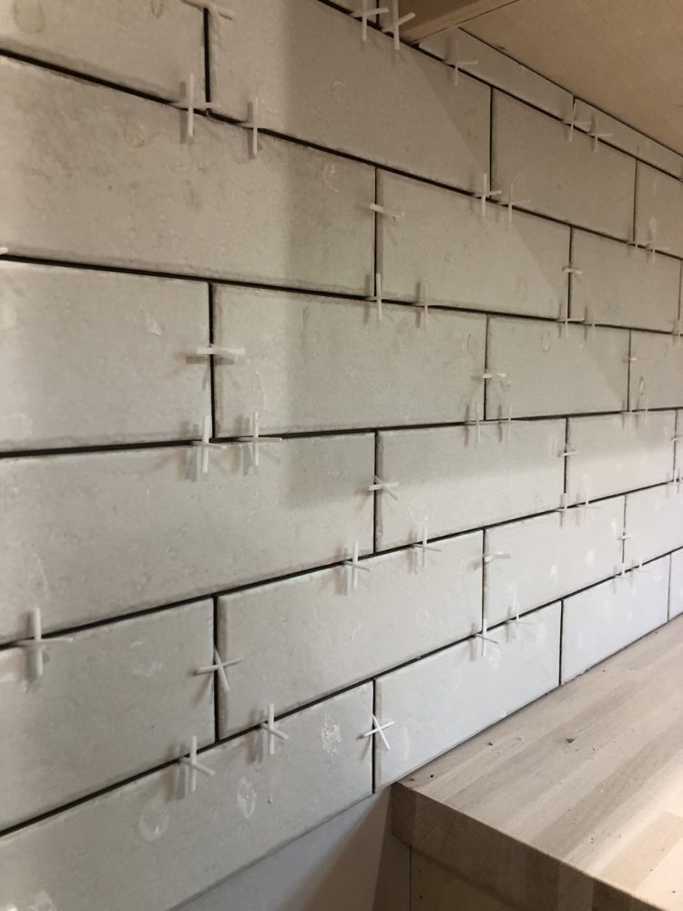
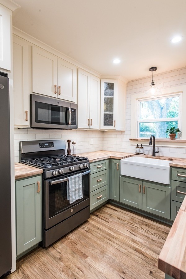
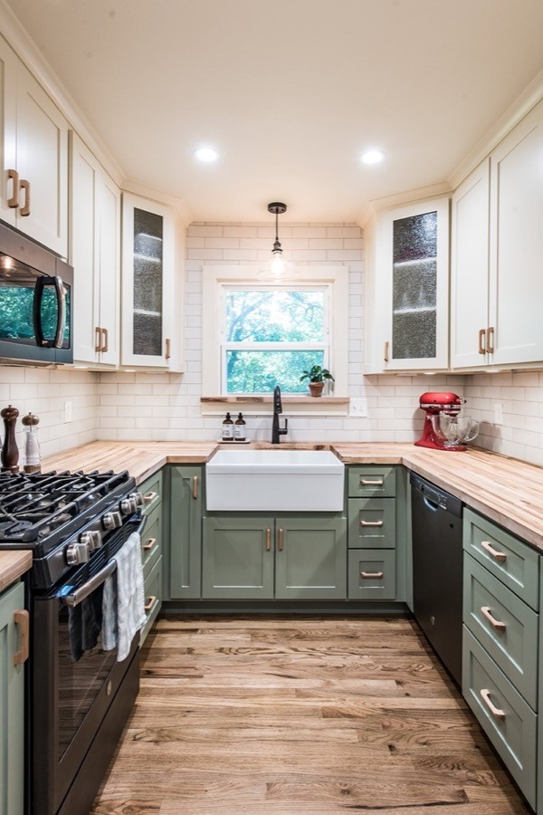
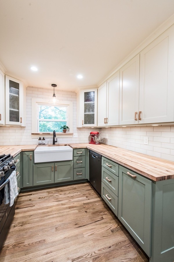
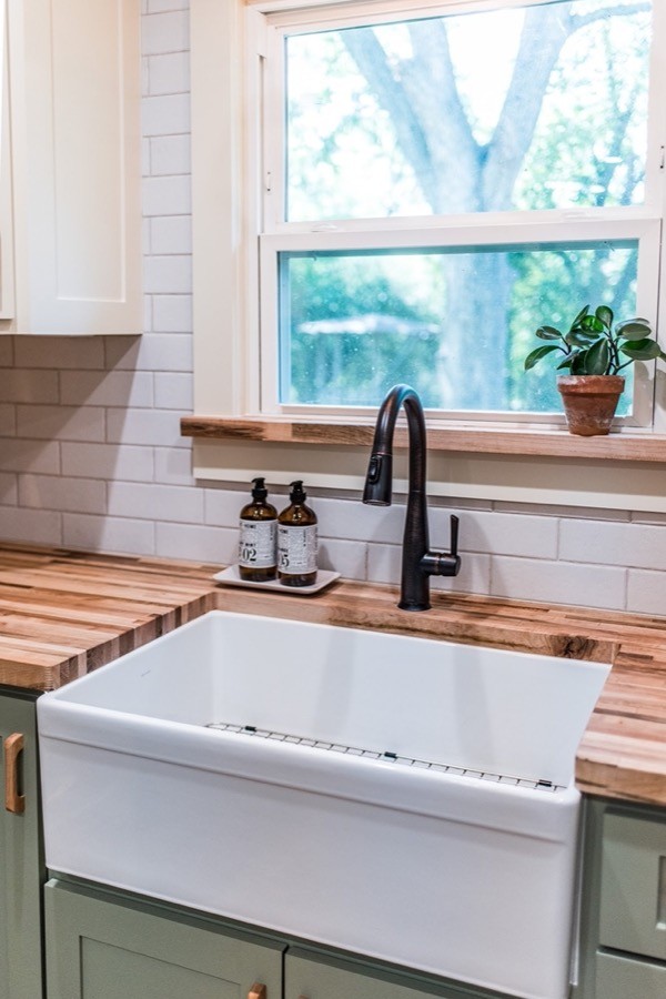
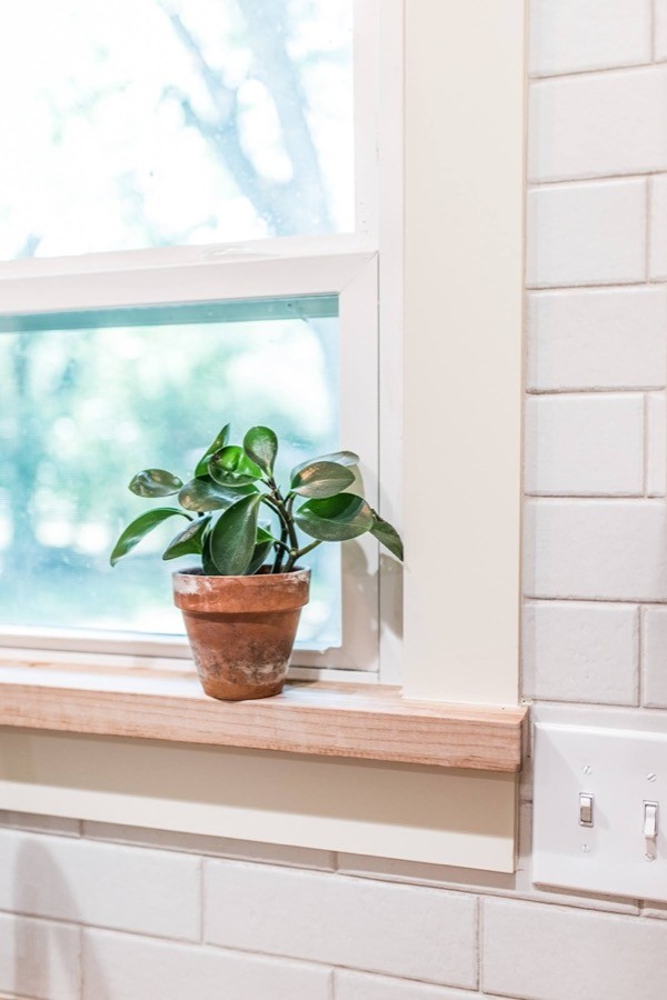
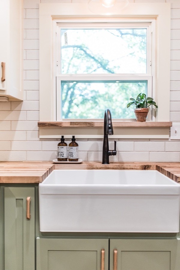
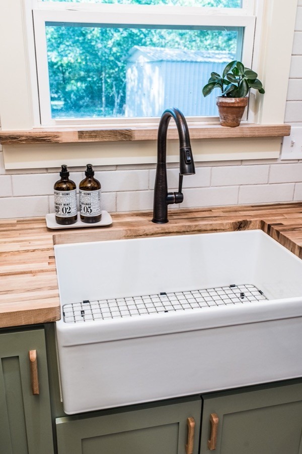
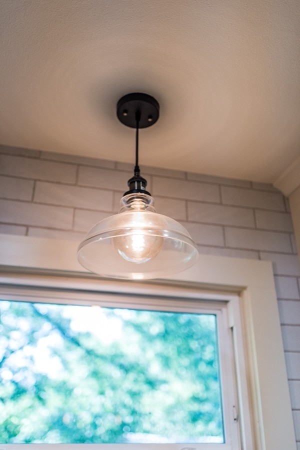
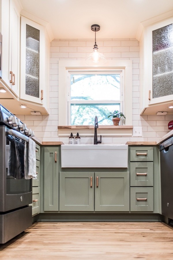
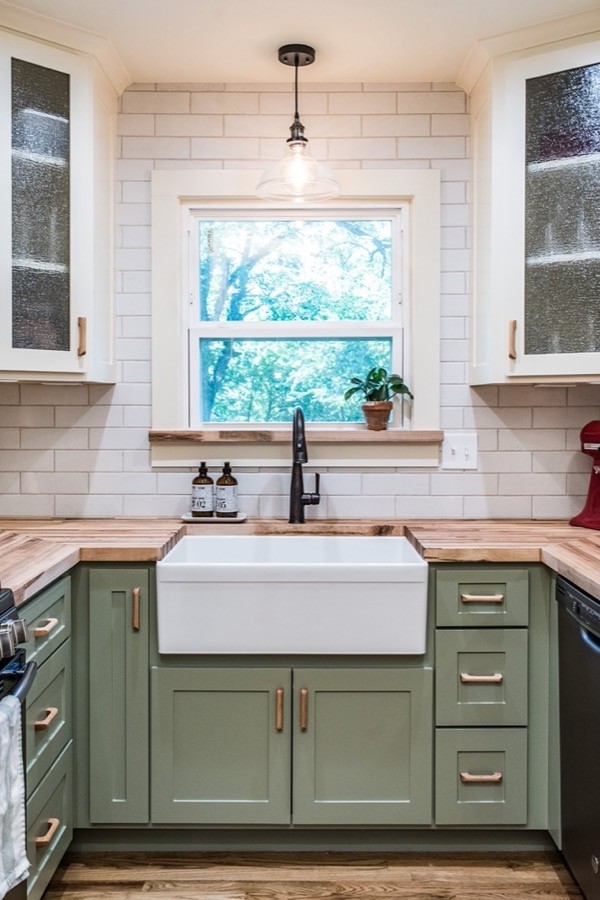
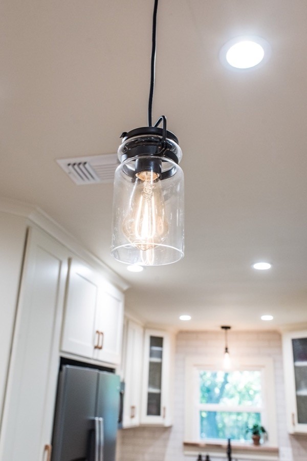
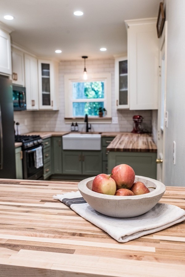
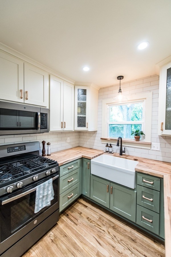
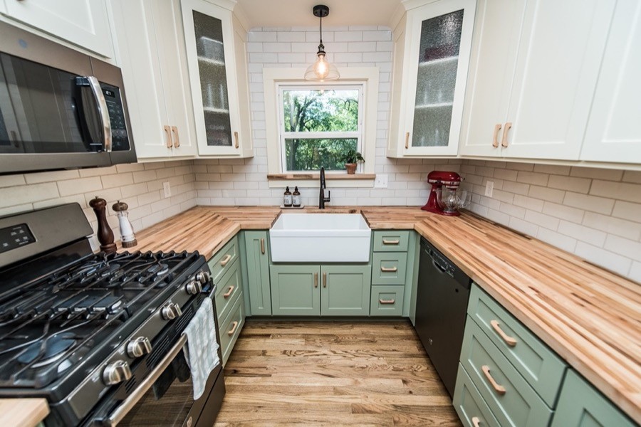
Even though the room was mostly white before, insufficient lighting made it seem dark. A major lighting update transformed the kitchen, including LED recessed can lighting, pendants over the sink and peninsula, and under cabinet lighting. We also replaced the window over the sink and eliminated the cabinets above it, opening up space around the sink and bringing in more sunshine. Extending the backsplash tile to the ceiling over the sink made this area the focal point of the kitchen.
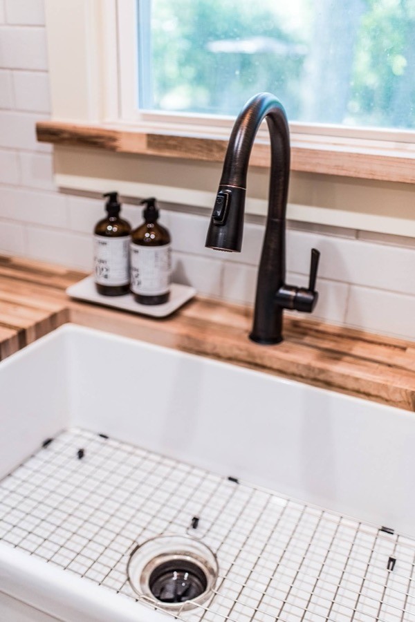
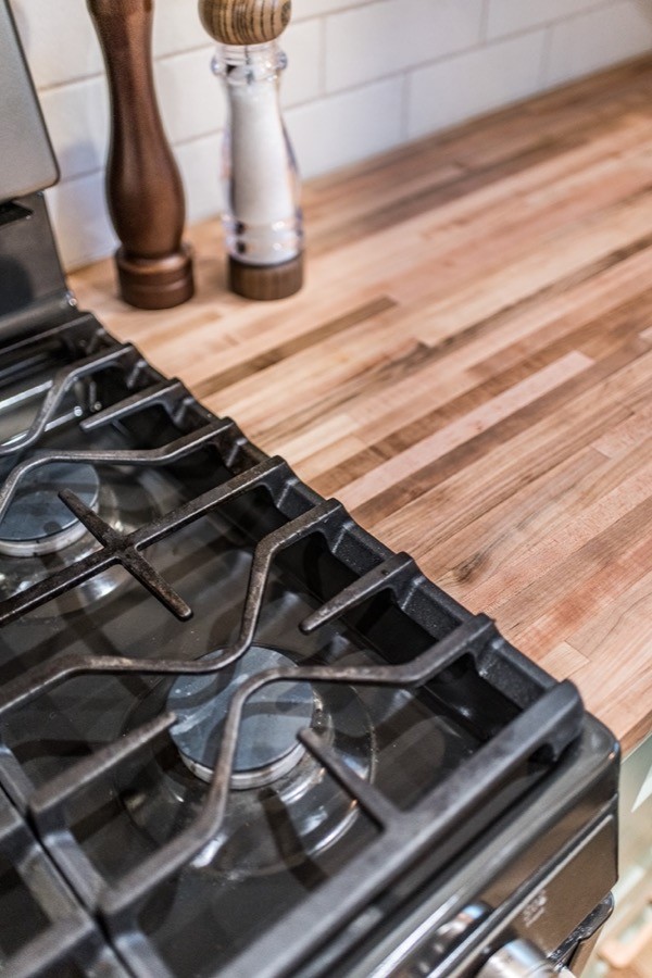
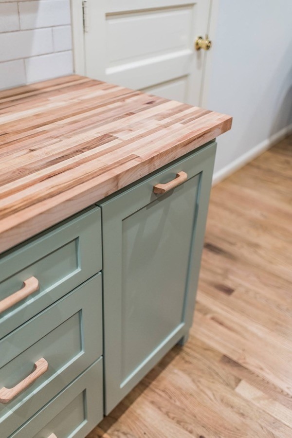
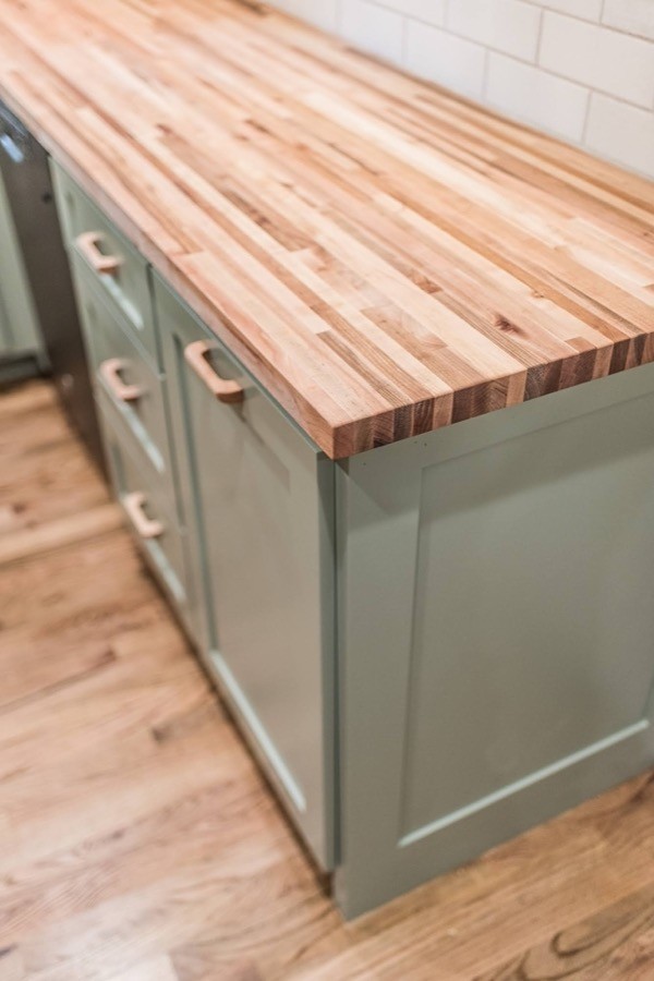
Our clients fell in love with the combination of butcher block counters and classic white Farmhouse sink, and this pairing suited their cottage kitchen wonderfully.
We asked the homeowner which aspect of the renovation was the biggest change was for them:
“Well, the room was gutted, so there were many big changes, but the most obvious and rewarding was raising the ceiling in the shower. The lighting has made a huge difference, as well as the more convenient wall outlet. The updated cabinets have also improved the overall ease of use. The shower niche looks good and keeps things organized.”
AFTER
Project Materials & References :
P A I N T :
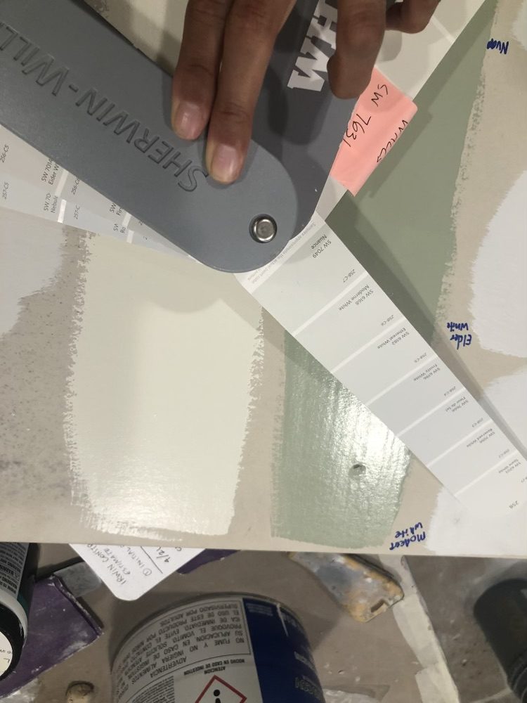
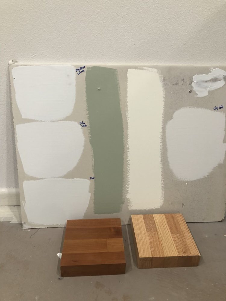
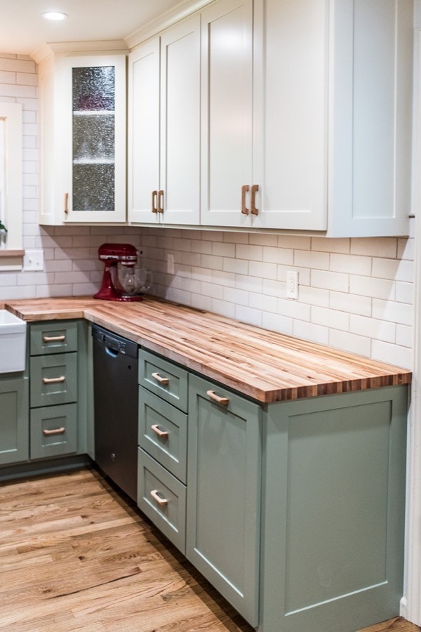
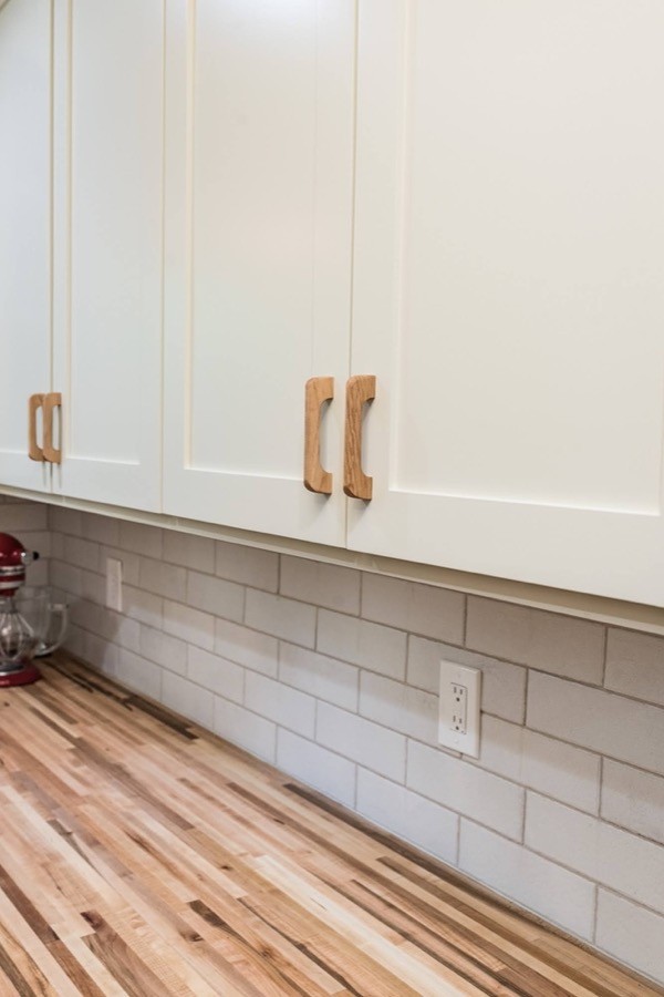
Upper Cabinets – Behr Ivory Lace (Sherwin Williams equivalent Casa Blanca)
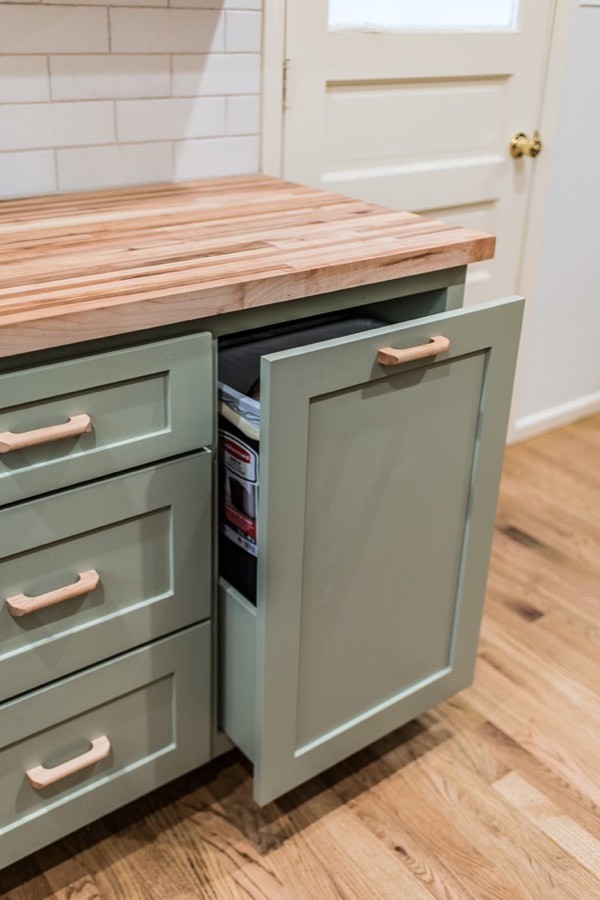
Lower Cabinets – Behr Bay Water (Sherwin Williams equivalent Clary Sage)
Ceiling, Trim, and Doors – Behr Ivory Lace (Sherwin Williams equivalent Casa Blanca)
Stain color for cabinets and barn door – Sherwin Williams – Dark Walnut
T I L E :
Backsplash – The Tile Shop
Grout – Nobe Pearl Sanded
F I X T U R E S :
Cabinets – Custom
Counter – Maple Butcher Block
Sink – Elkay Explore Farmhouse Apron Front Fireclay 30-in Sink, Gloss White
Search #sageandivorycottagekitchen on our Instagram | @irwin.construction
[instagram-feed]




Leave A Comment