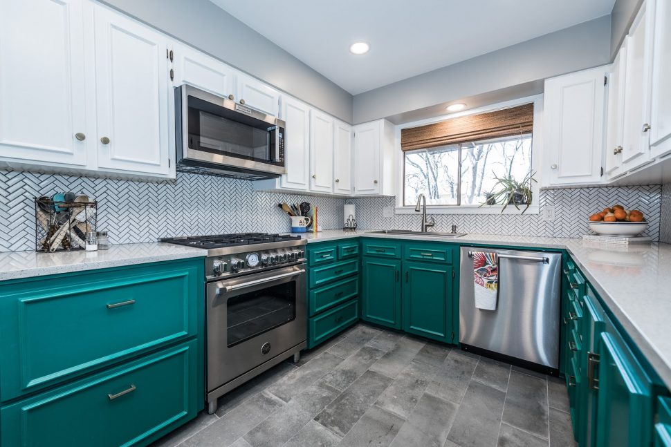
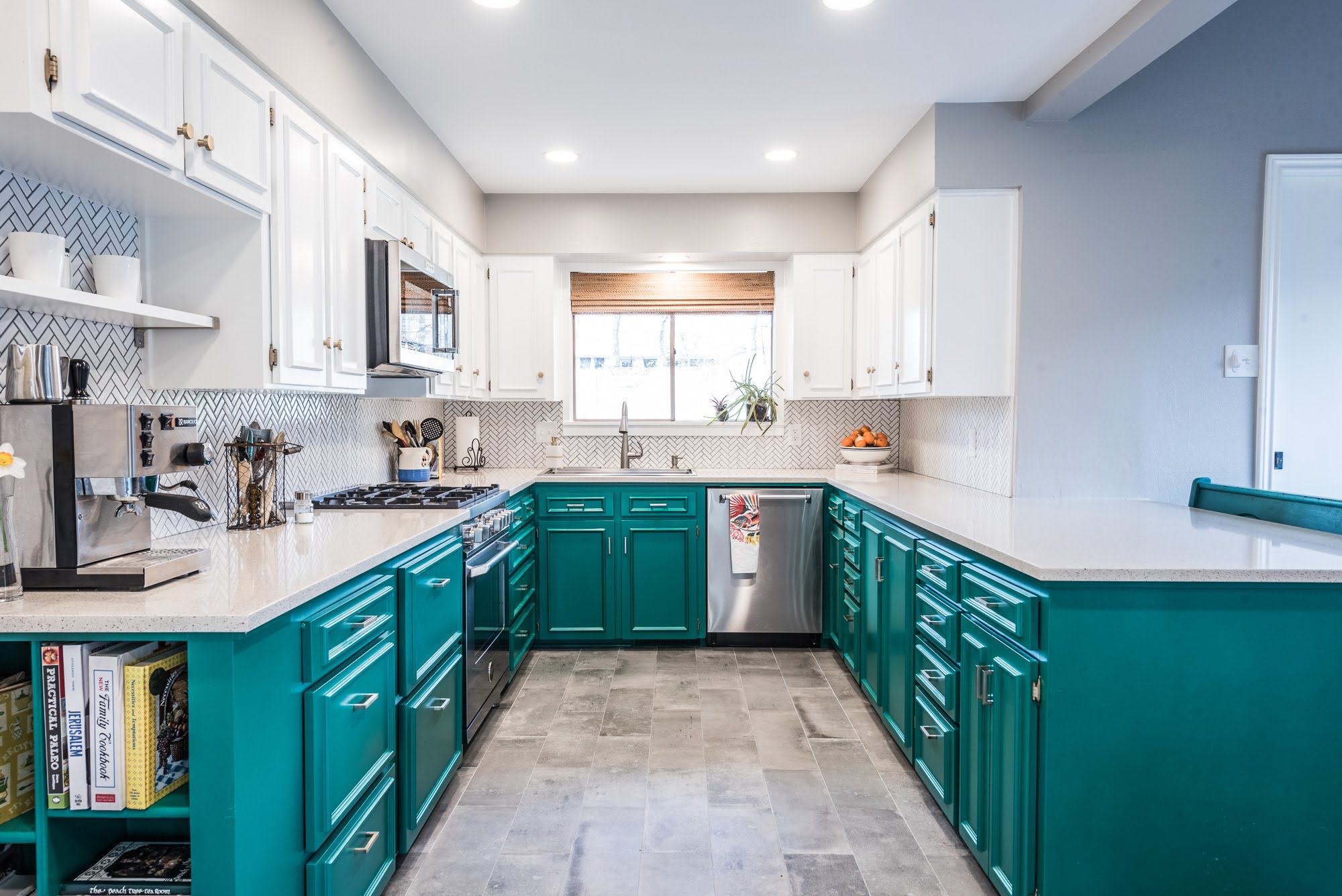
The Starboard and Brass kitchen earned its name from the materials used for the project. The paint color, Sherwin Williams Starboard, and the brass hardware on the cabinetry were so impactful in this kitchen glow up, that we knew it had to be a part of the project name!
Located in Denton, TX, this home was built in 1972 and had lots of character in other areas, but lacked that same character and charm in the kitchen.
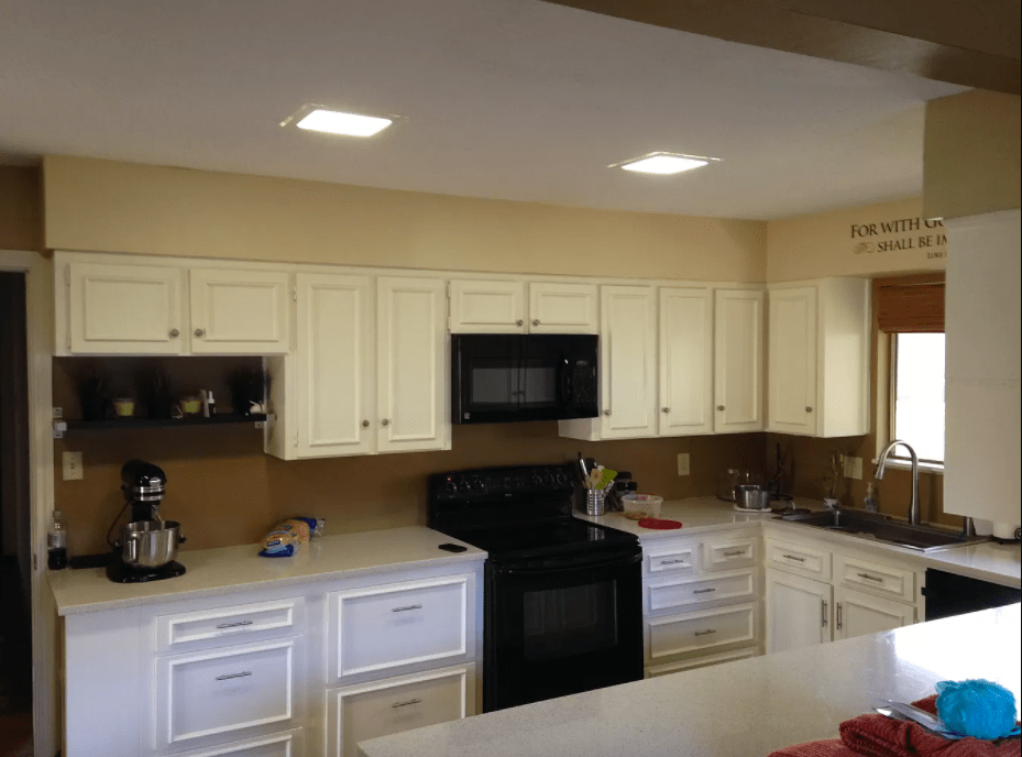
The kitchen space was functional for our clients as it was – it included plenty of cabinet space, natural light, a dining nook, and a small dining counter. However, the overall look was outdated and the neutral earth tones felt dark and dull. Their goal was to create a bright, clean, and fresh look to better match their design sense and personality. From the beginning, the plan was to go bold with green lower cabinets because this was a good fit for the homeowners: different, bright, and fun!
(See end of post for sources and materials)
B E F O R E
A F T E R
Before, the kitchen had all-white cabinetry and brushed nickel hardware that lacked interest for our clients. We decided to keep the existing countertops, as they had been recently updated and were in great shape.
See the before photos below for a “before before” of a past kitchen design!
[soliloquy id=”7922″]
The homeowner found her inspiration from a photo of another kitchen with deep, moody tones that featured green cabinets, so she knew she wanted to incorporate green cabinetry somehow. The green paint color we landed on was quite bright, so to balance that out we decided to paint the upper cabinets a clean white.
Although the original parquet floors were charming, they were also coming up in a few areas where there had been water exposure, so they were removed. While searching for floors that were lower maintenance than wood we landed on a concrete-look tile that wears well, looks great, and even has a semi-distressed surface so that dirt doesn’t show as easily.
One of the homeowners was a semi-chef in a former life and wanted a more controllable cooktop than the existing electric surface. We replaced the old range with a professional-grade range with dual fuel, and installed a new microwave to match.
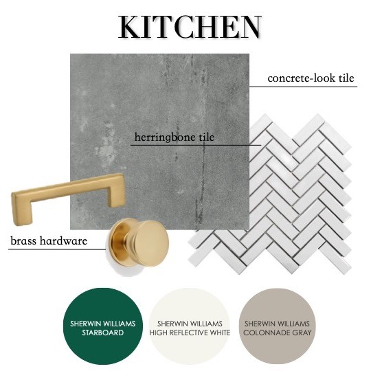
As part of the update, we removed the popcorn ceilings and added more recessed lighting to help brighten up the space. To complete the look, we installed new brass hardware and a white herringbone backsplash.
[soliloquy id=”7924″]
[FinalTilesGallery id=’130′]
After photos courtesy of Darby Kate Photography.
KITCHEN FLOOR – ELEGANZA VARESE, 8X24, GRIGIO (via ProSource)
KITCHEN FLOOR GROUT – DELOREAN GRAY
BACKSPLASH TILE – MSI RETRO BIANCO HERRINGBONE IN WHITE (via ProSource)
BACKSPLASH GROUT – DELOREAN GRAY
BACKSPLASH TRIM – JOLLY EDGE SCHLUTER, BRIGHT WHITE
UPPER CABINETRY COLOR – SW HIGH REFLECTIVE WHITE
LOWER CABINETRY COLOR – SW STARBOARD
WALL COLOR – SW COLONNADE GRAY
RANGE – Bertazzoni Professional Range Duel Fuel in Stainless Steel
Microwave – KitchenAid Microwave Hood Combination Model KMHS120SS
SINK FAUCET – Moen Essie Single-Handle Pull-Down Sprayer Kitchen Faucet
CABINET KNOBS – Amerock Blackrock 1-5/16″ Diameter Cabinet Knob
DRAWER PULLS – Hickory Hardware Skylight Collection Pull, 3 Inch Center to Center, Elusive
You might also like:
-
Serene Azure Bathroom -
The Redemption House -
Mid-Century Modern Bathroom


Leave A Comment