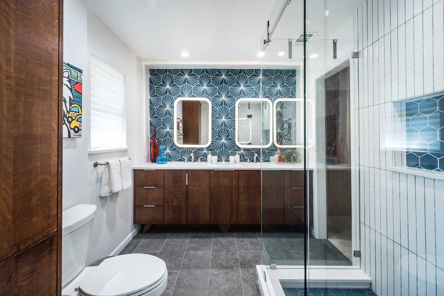
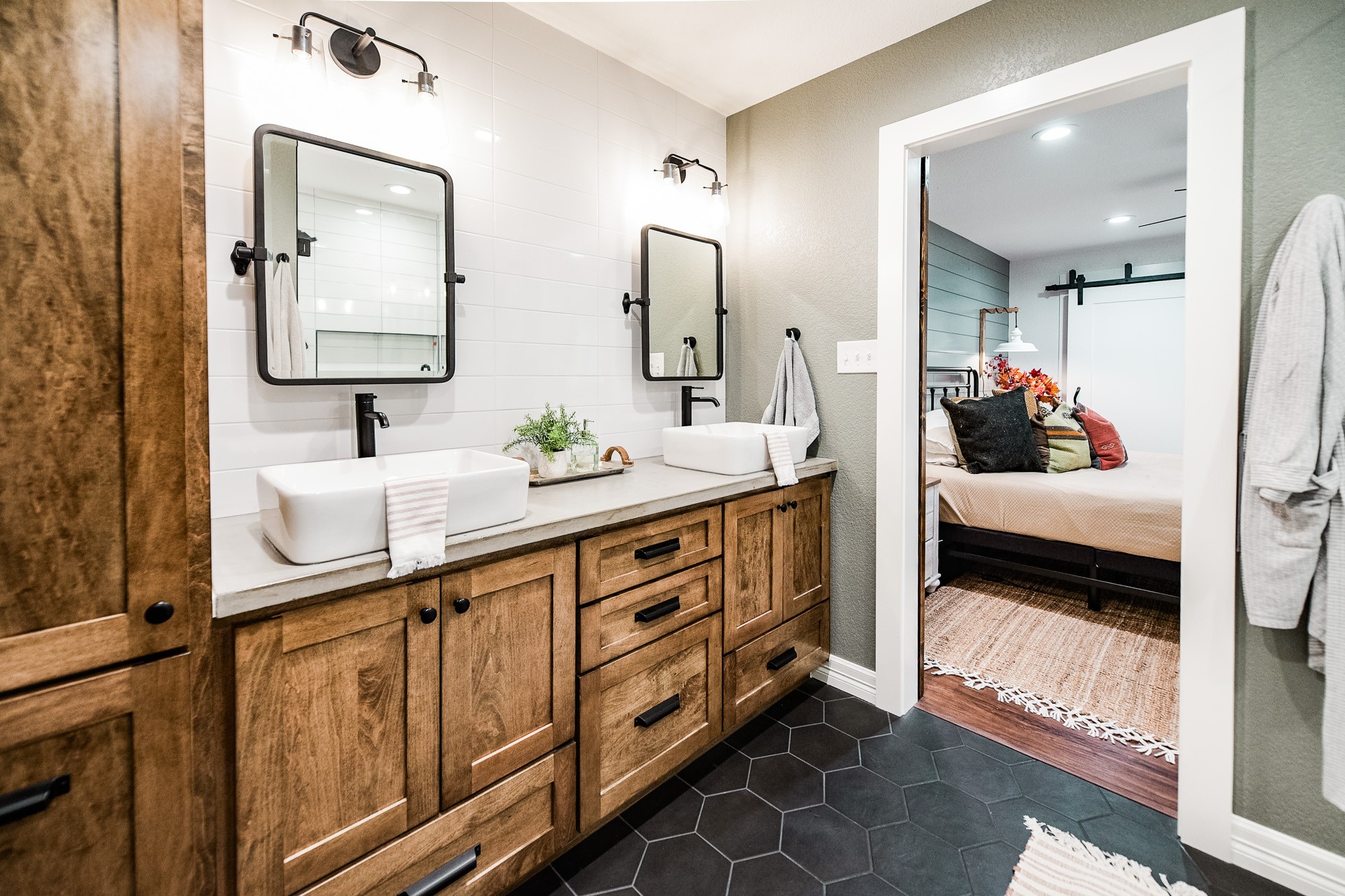
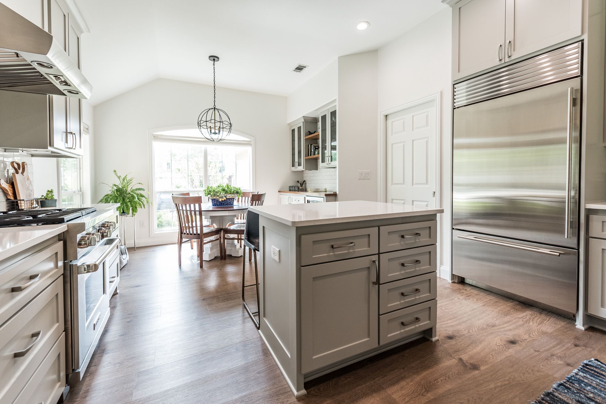
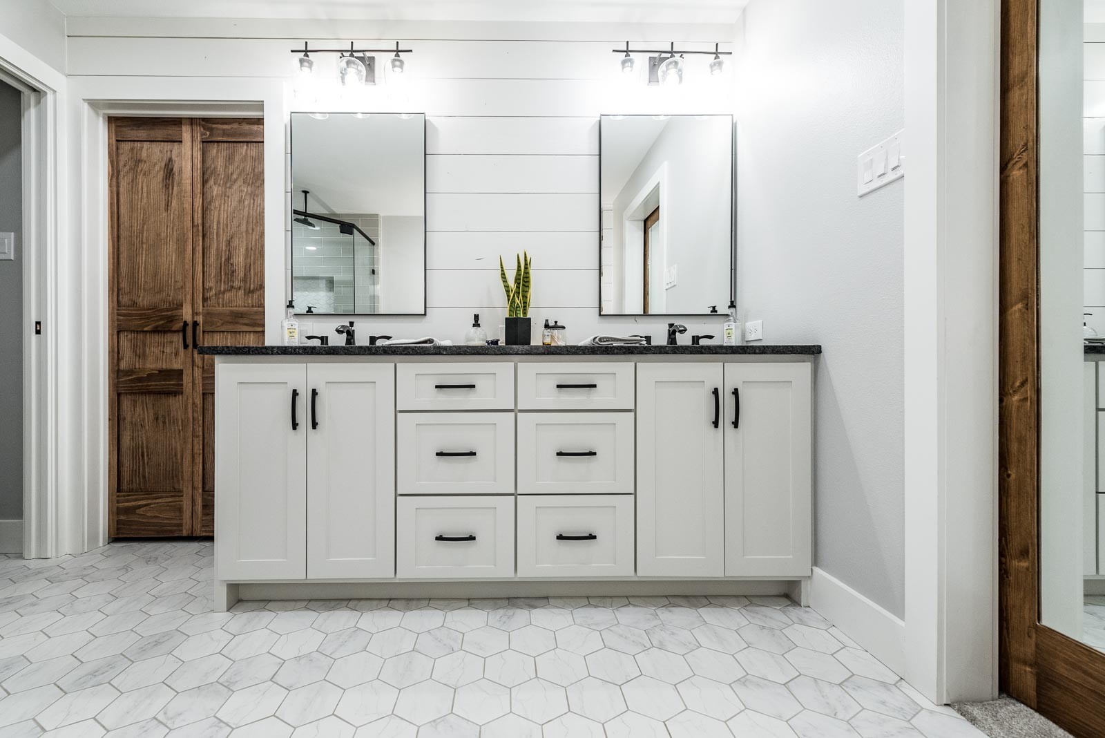
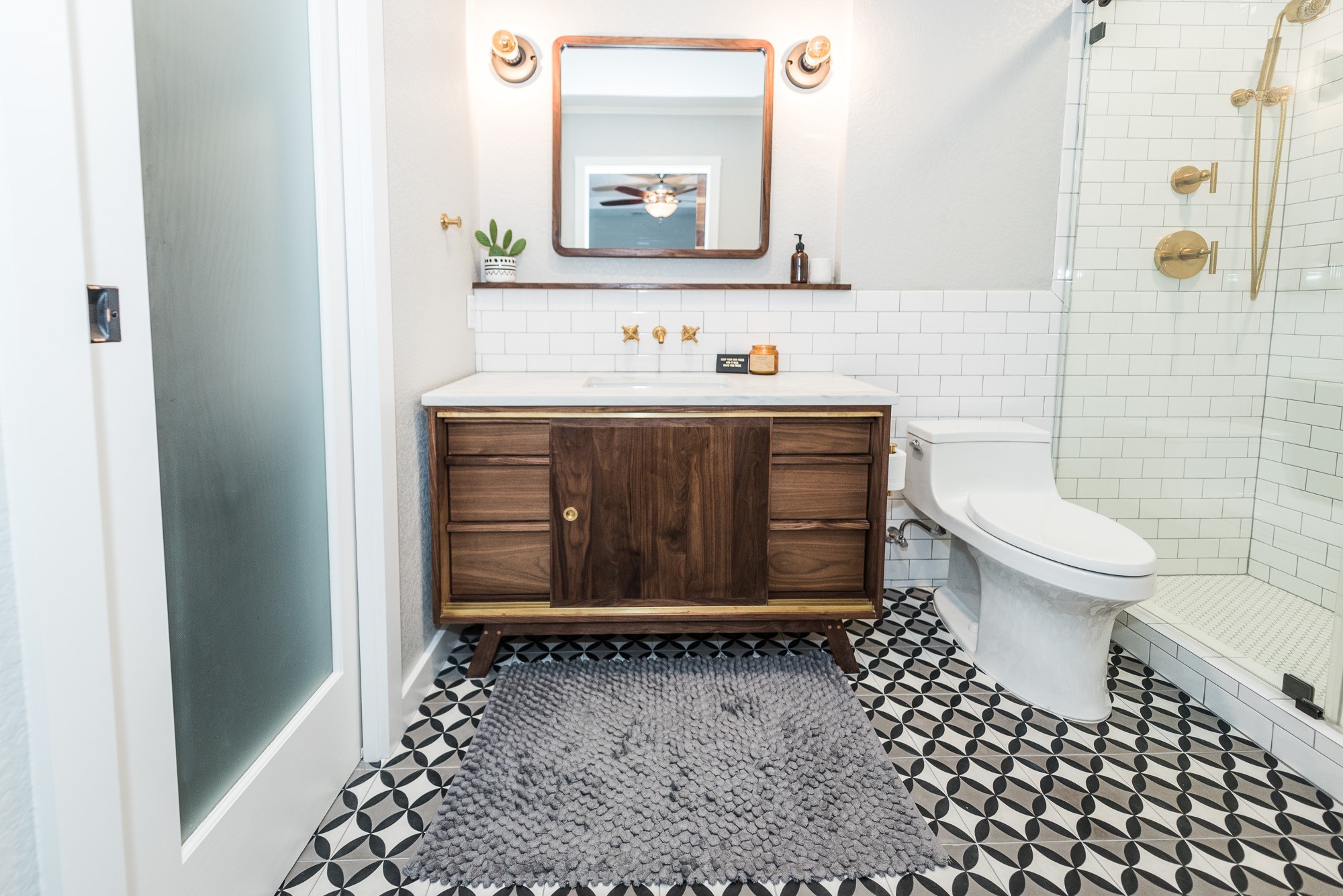
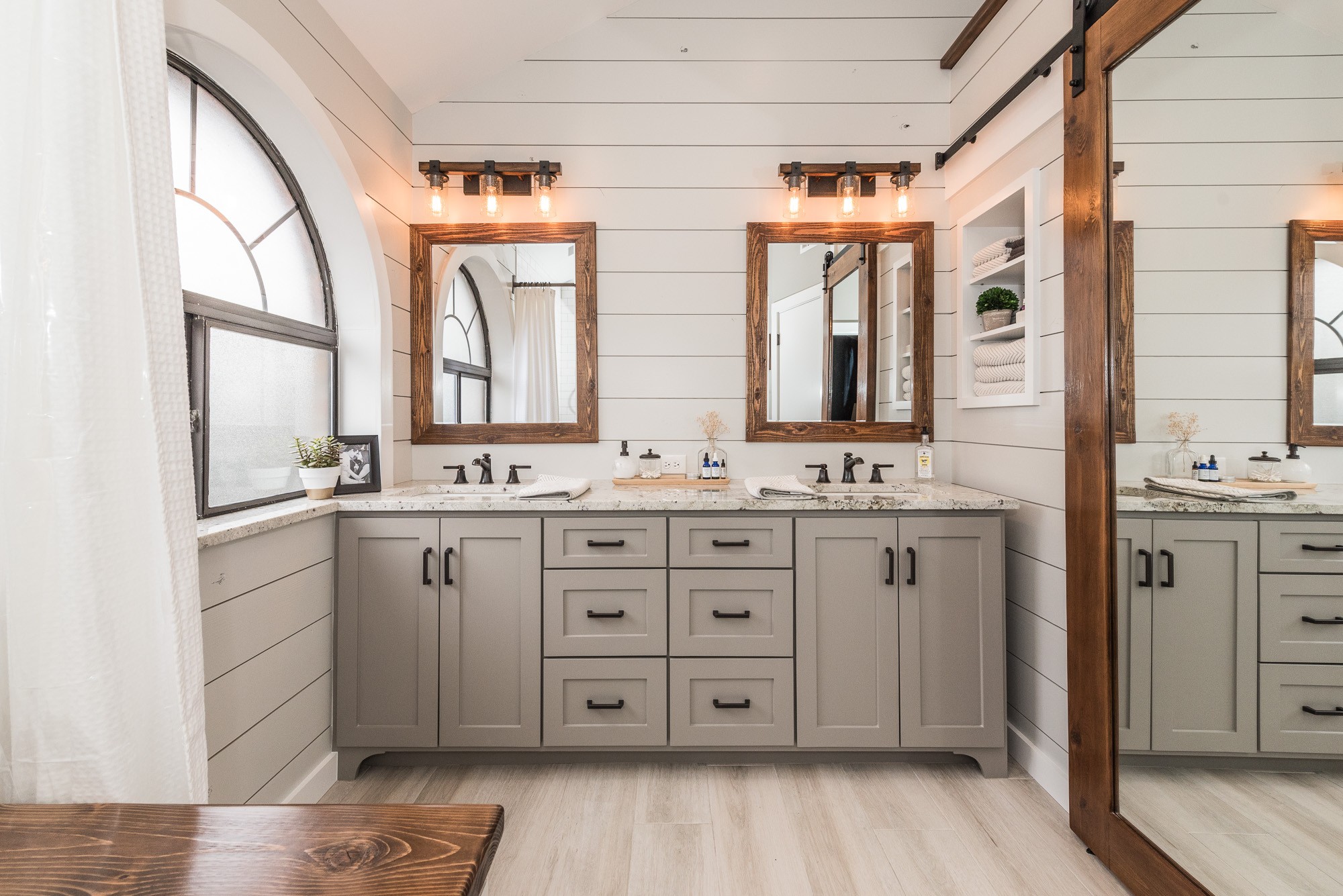
This project was especially exciting as it was our own master bathroom! While the room had great bones, the design was decades out of date (cultured marble and seashell sinks!). The tiled wall enclosing the tub/shower cut the room in half, making it feel small and cramped. The vaulted ceiling added great interest, but the design didn't utilize its potential as a feature in the room. We had ample counter space on the long vanity, but cabinet storage was lacking due to the outdated vanity cutout. While we appreciated the closet storage space, the old sliding door had been removed and the curtain separating the closet from the bathroom made the transition feel cluttered.

