The Grateful Estate
INTRO
This beautiful historic home was long owned and occupied by one of the sweetest most welcoming clients we’ve ever had. Located in the heart of Denton, TX, “The Grateful Estate” is named after the owner’s hospitable and uncanny ability to make our crew feel like family. The name is also a nod to her positive disposition. Although life may serve you difficult experiences, you can choose to practice gratitude. This home-owner was renovating her whole house to make it more hospitable to others and allow her to host, entertain and serve others, – even after a difficult season. Which of course, we loved and admired her for!
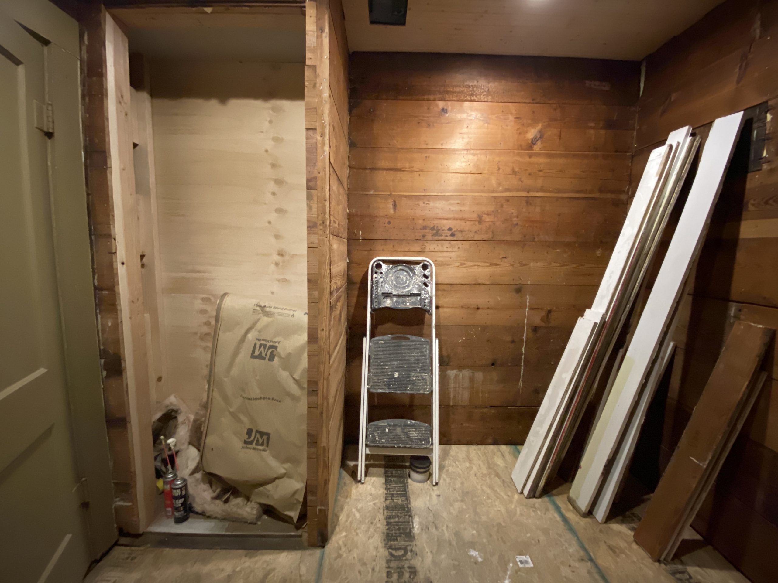
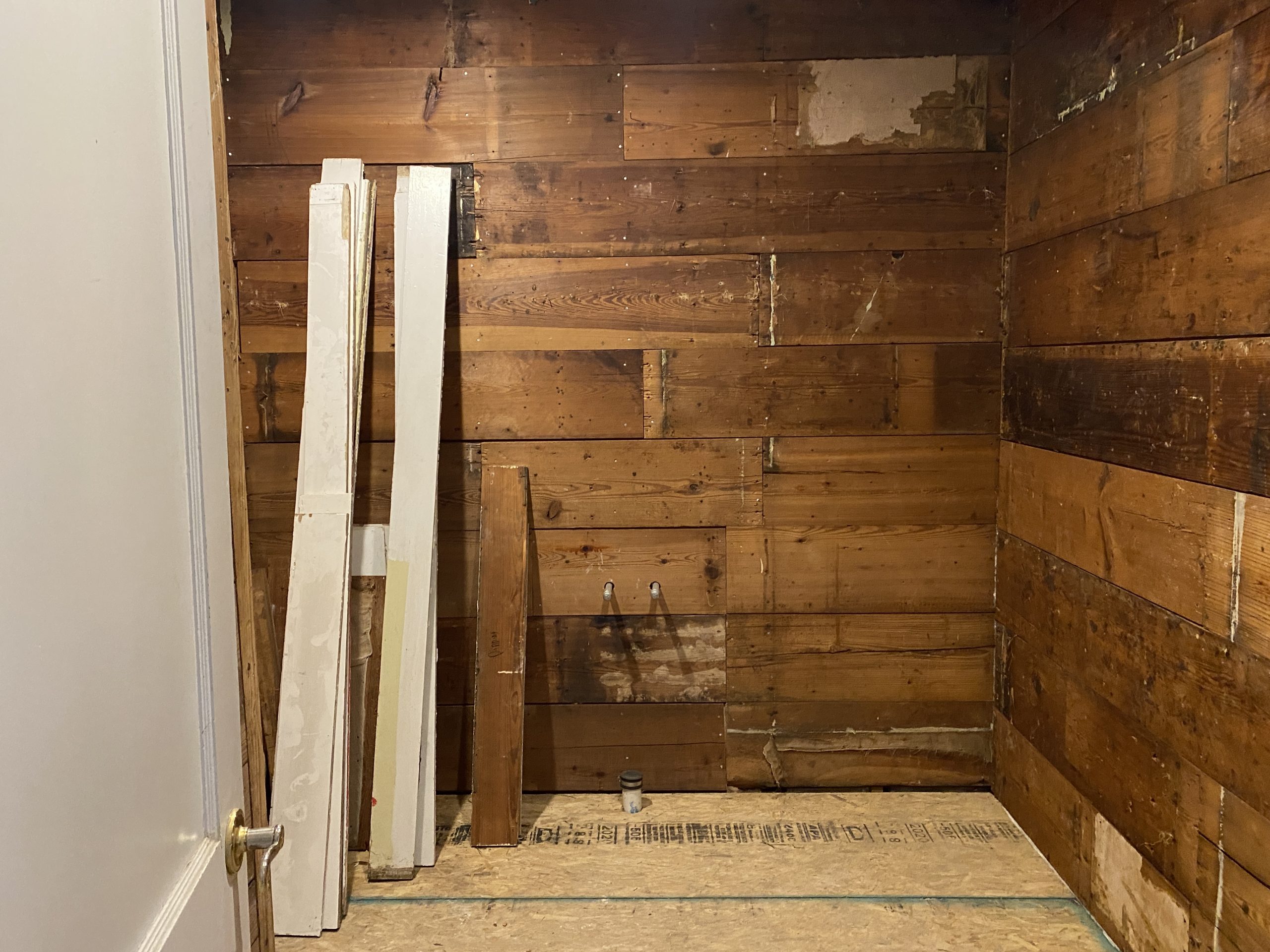
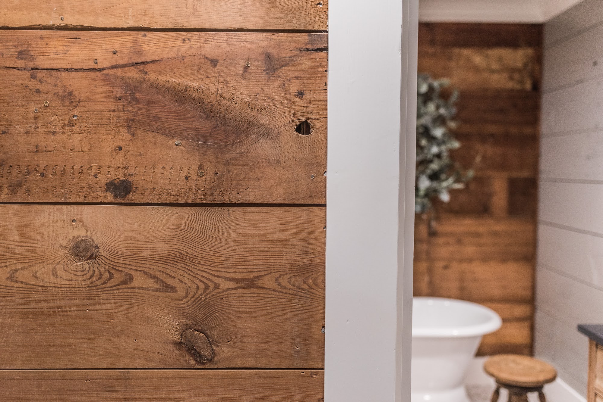
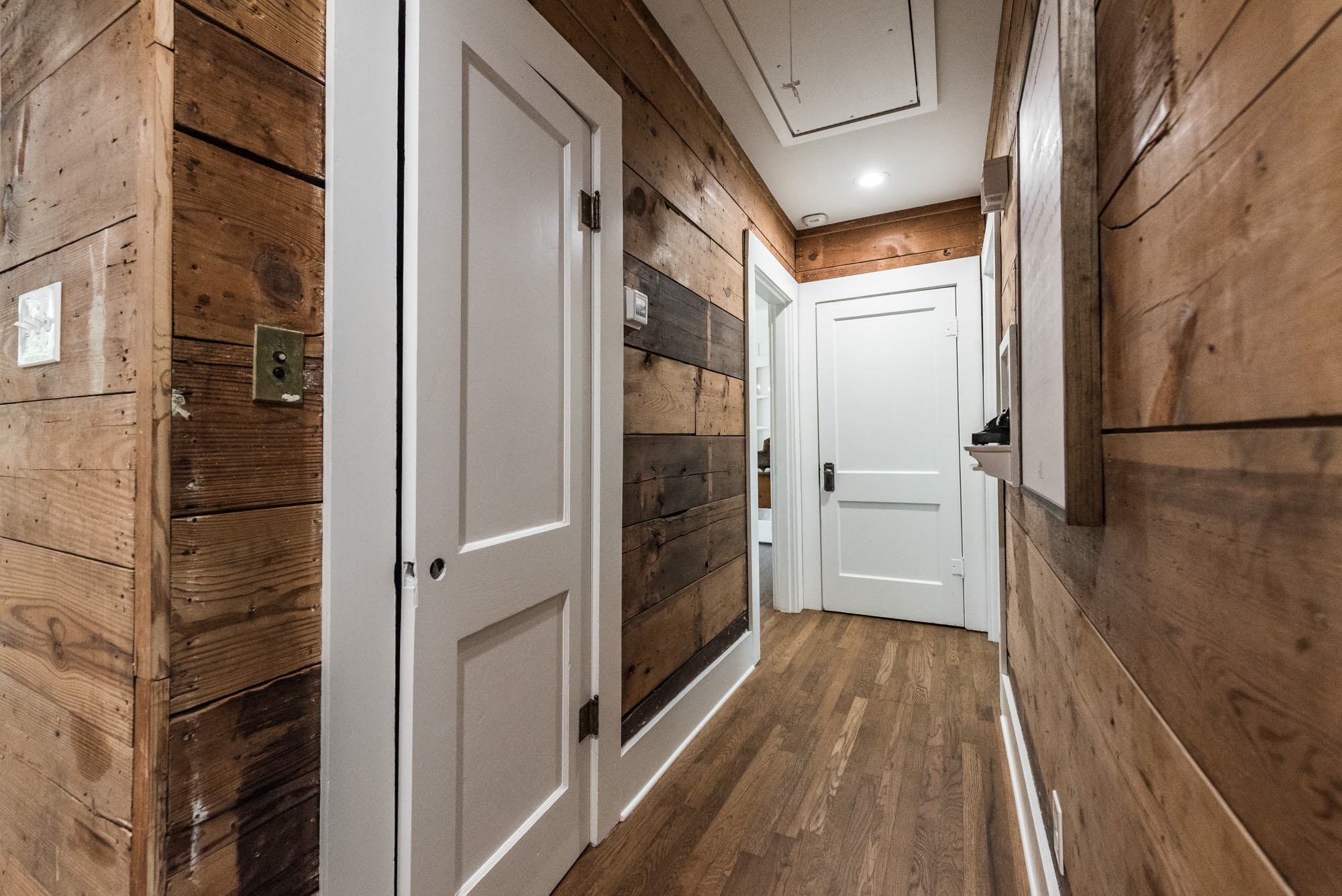
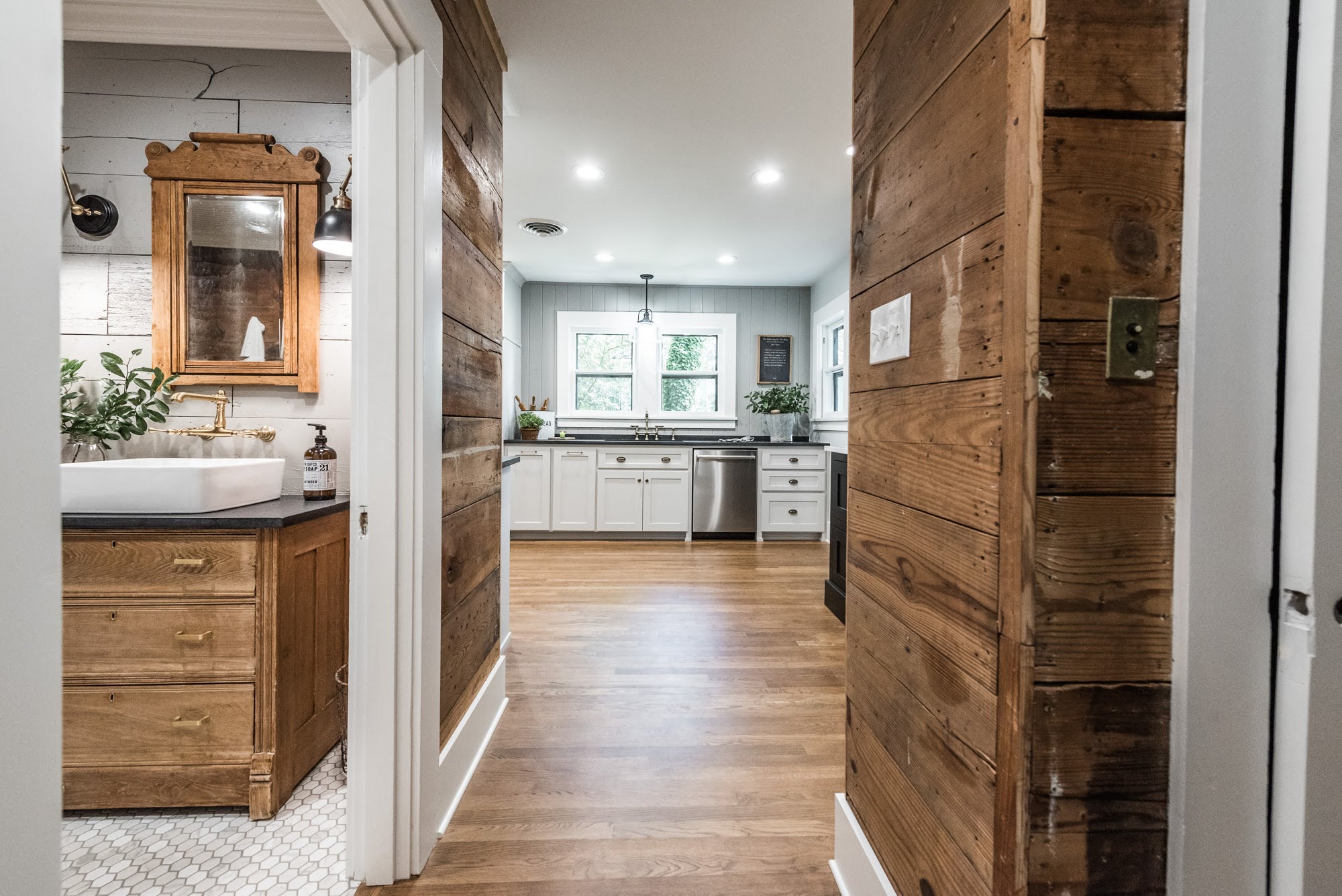
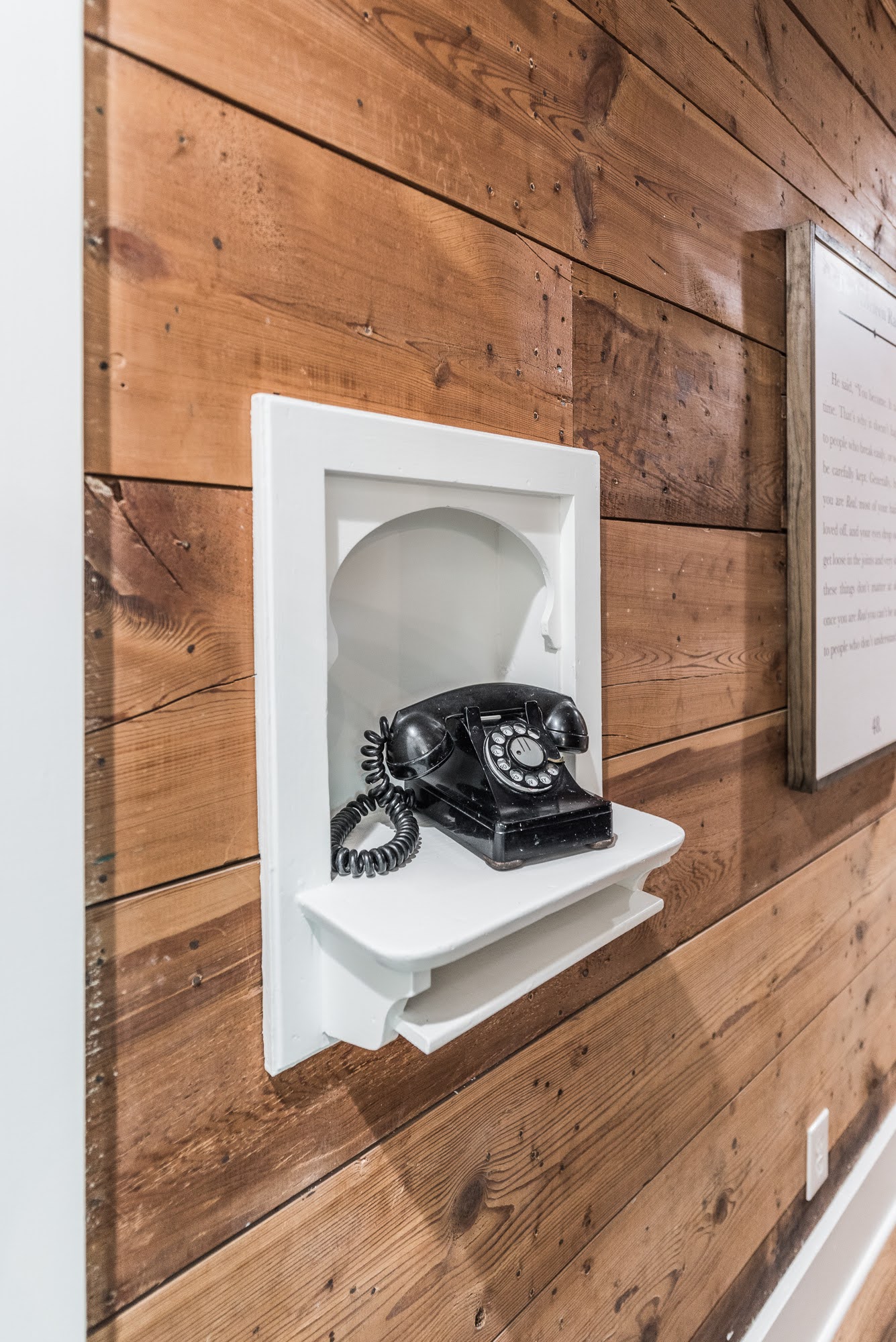
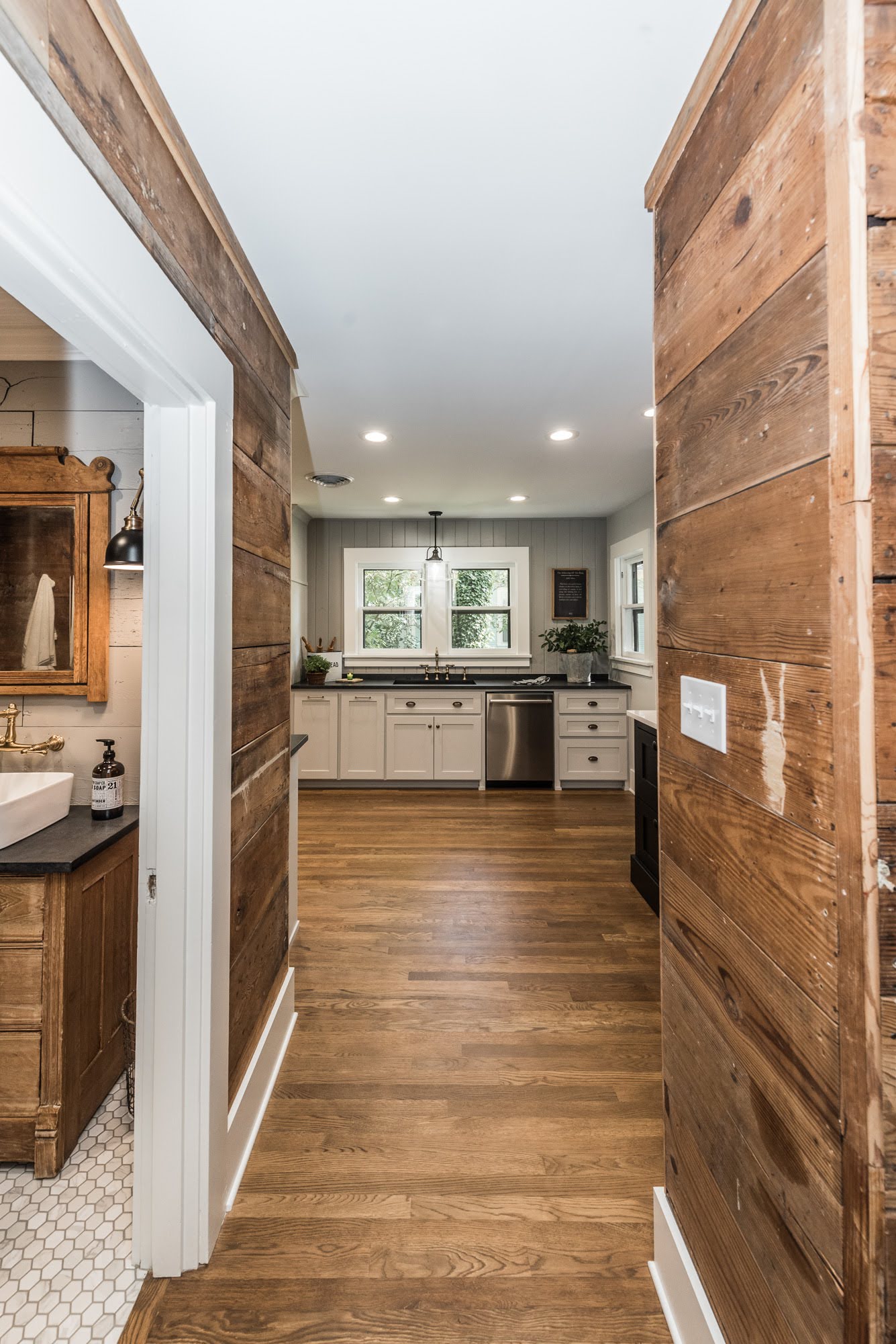
This beloved pier and beam cottage-style home was ready for some major updates and we’re so grateful she trusted us for this expansive project. As with many aged homes, they can face some challenges and surprises, and one of the greatest reveals for this project was discovering gorgeous original shiplap planks behind the aged sheetrock. We refinished, stained (and painted) the 12” shiplap in different spaces throughout the residence to infuse historic charm and character.
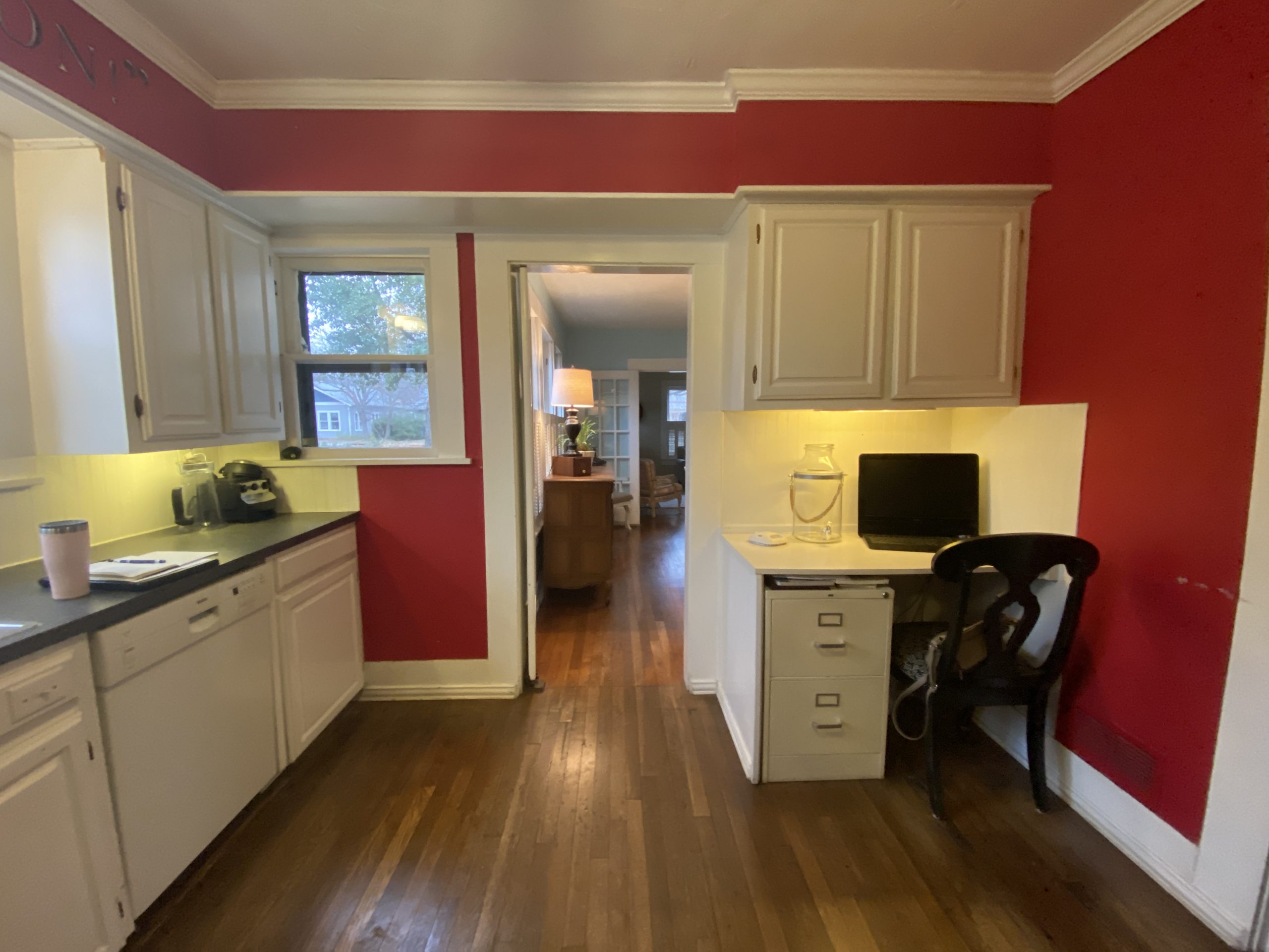
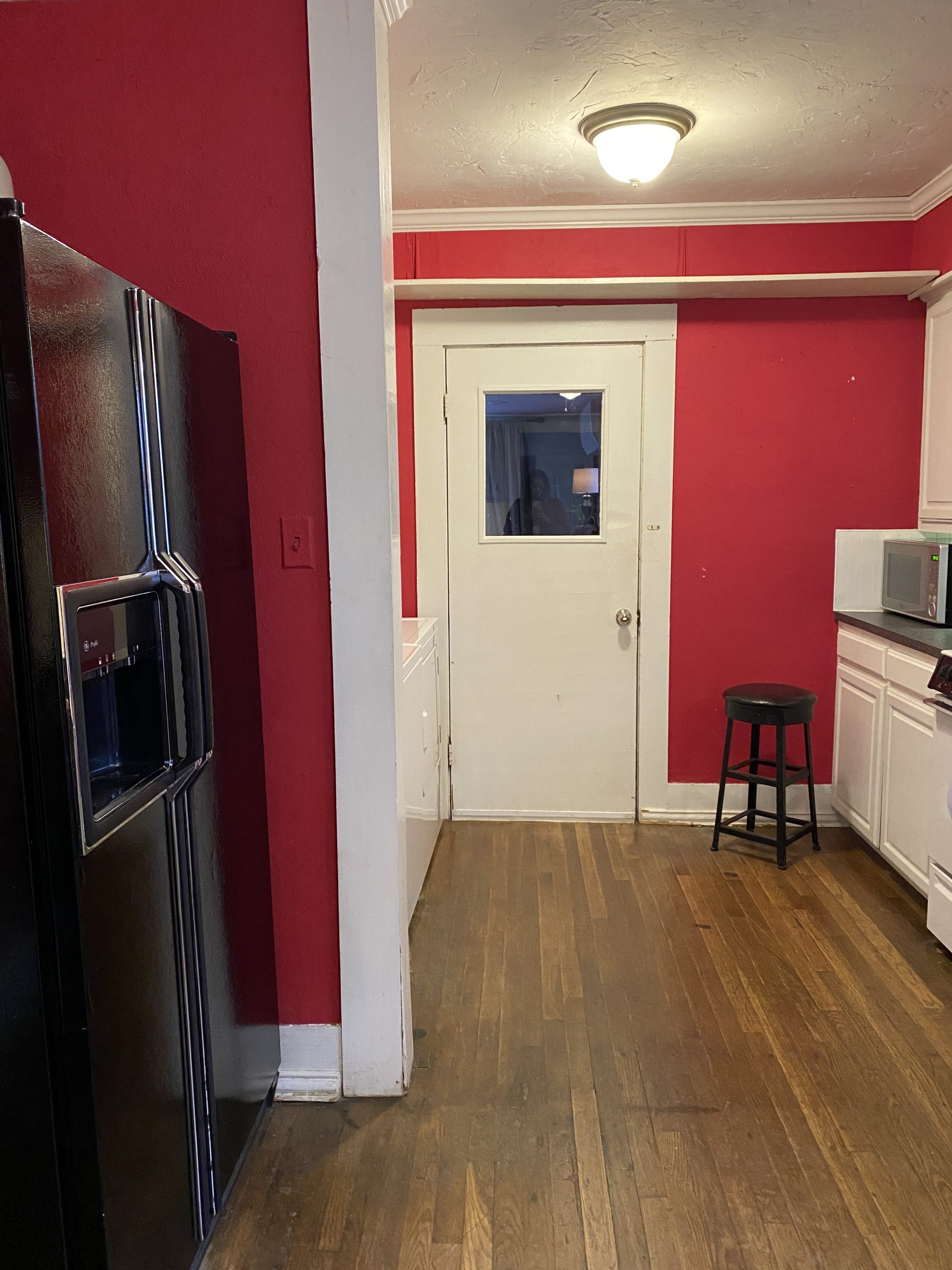
The goal of The Grateful Estate kitchen remodel was to open-up the layout of the kitchen by removing the wall dividing the washer and dryer area from the current kitchen. We also planned to modify the hall closet into a space for a stackable washer and dryer, and relocate the appliances. We knew updating the windows and adding lighting would make an immediate-significant impact on the aesthetic of the home. The home already had gorgeous hardwood flooring that we intended to refinish and restore its original beauty and character. Every room got refreshed paint which really made a big visual impact as well. Our plans for the bathroom were to relocate fixtures and update the vanity and bathing area and make it a soothing, relaxing space to enjoy and get ready in.
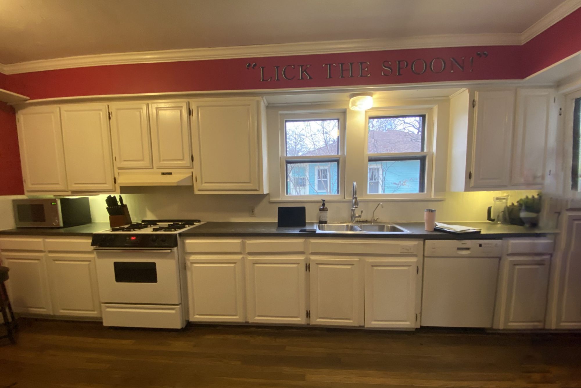
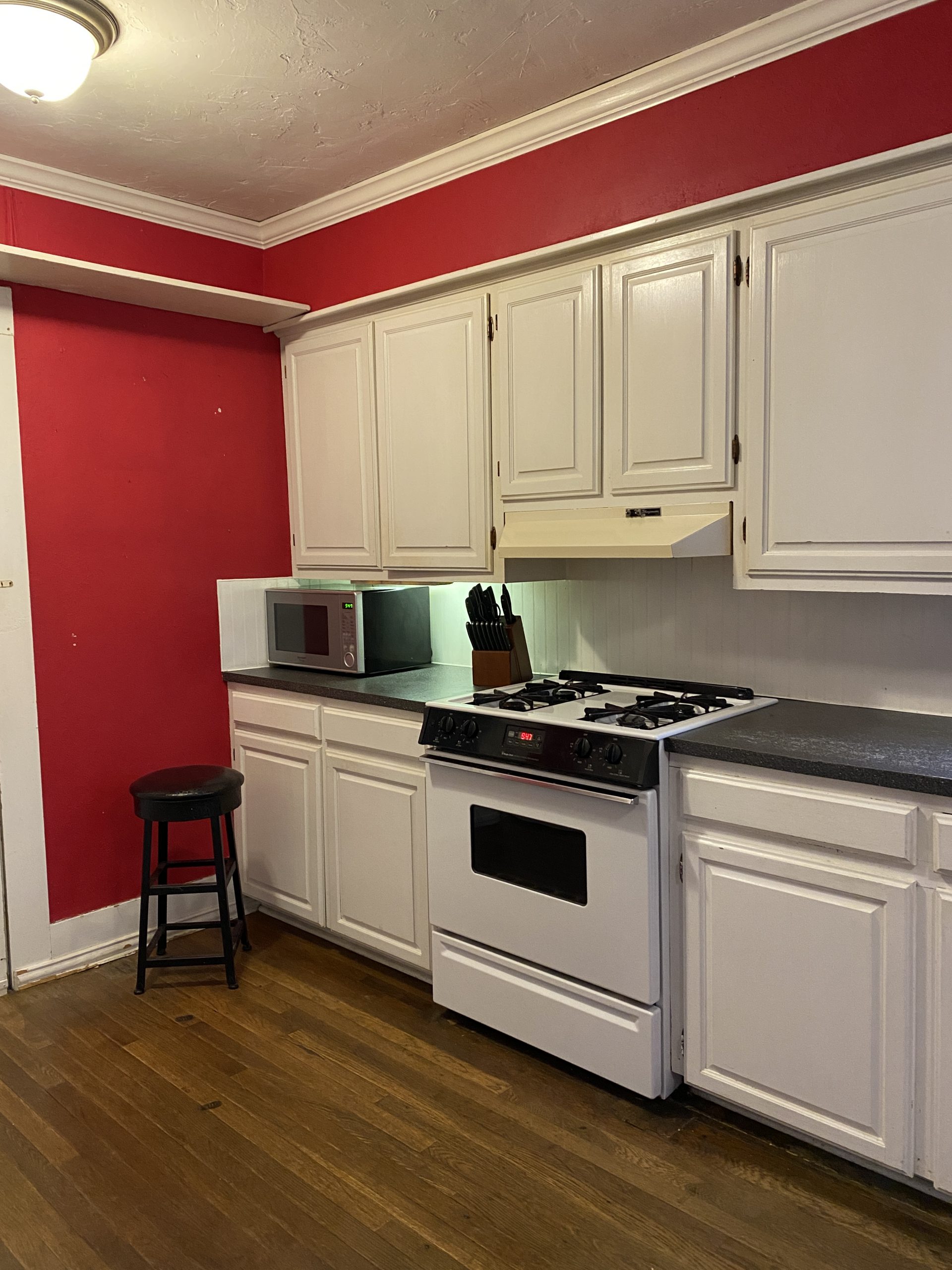
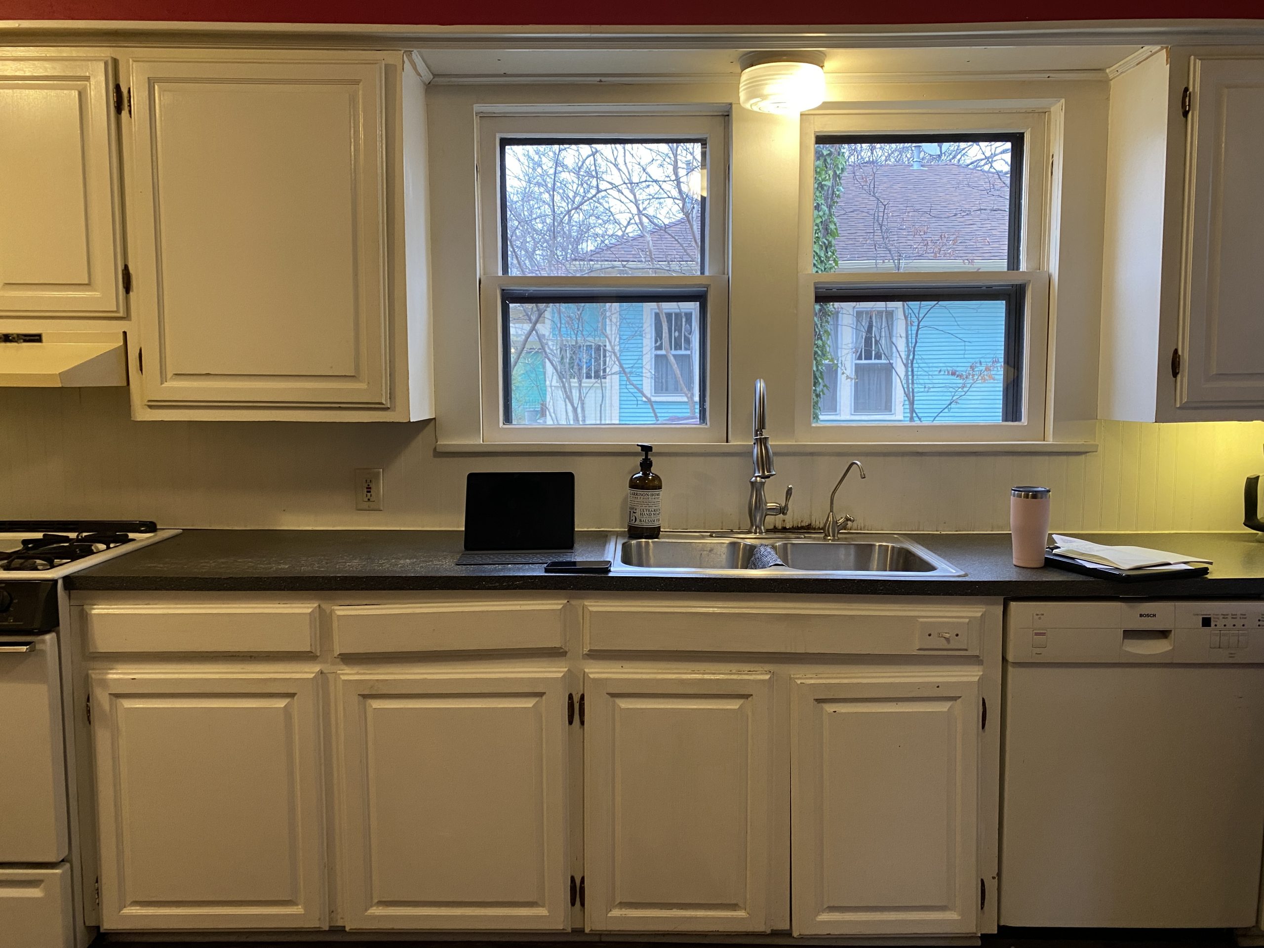
BEFORE
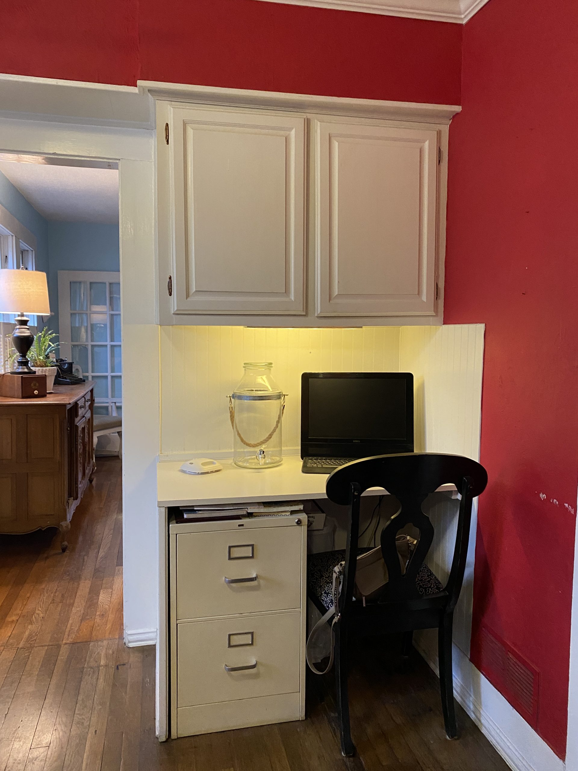
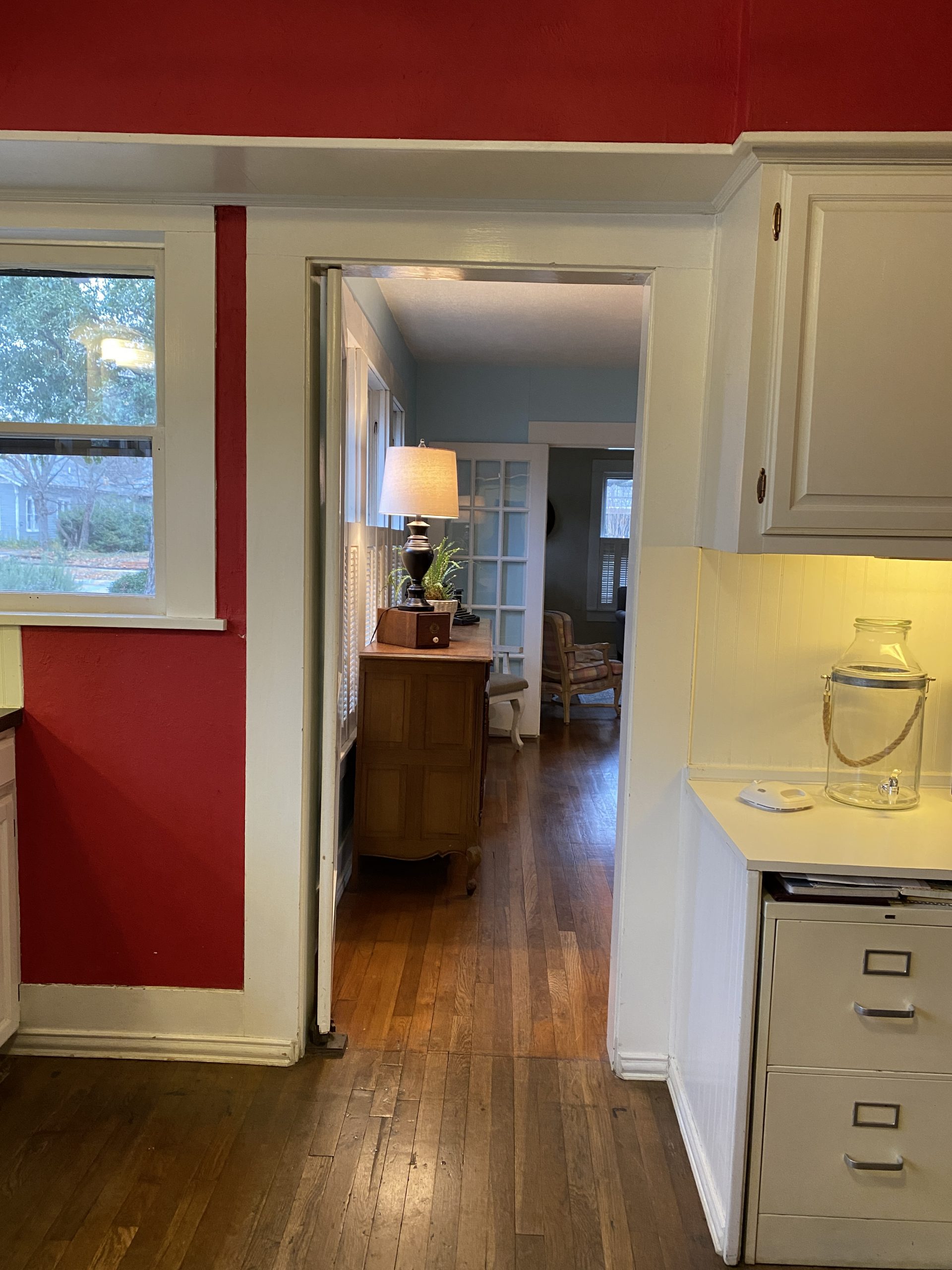
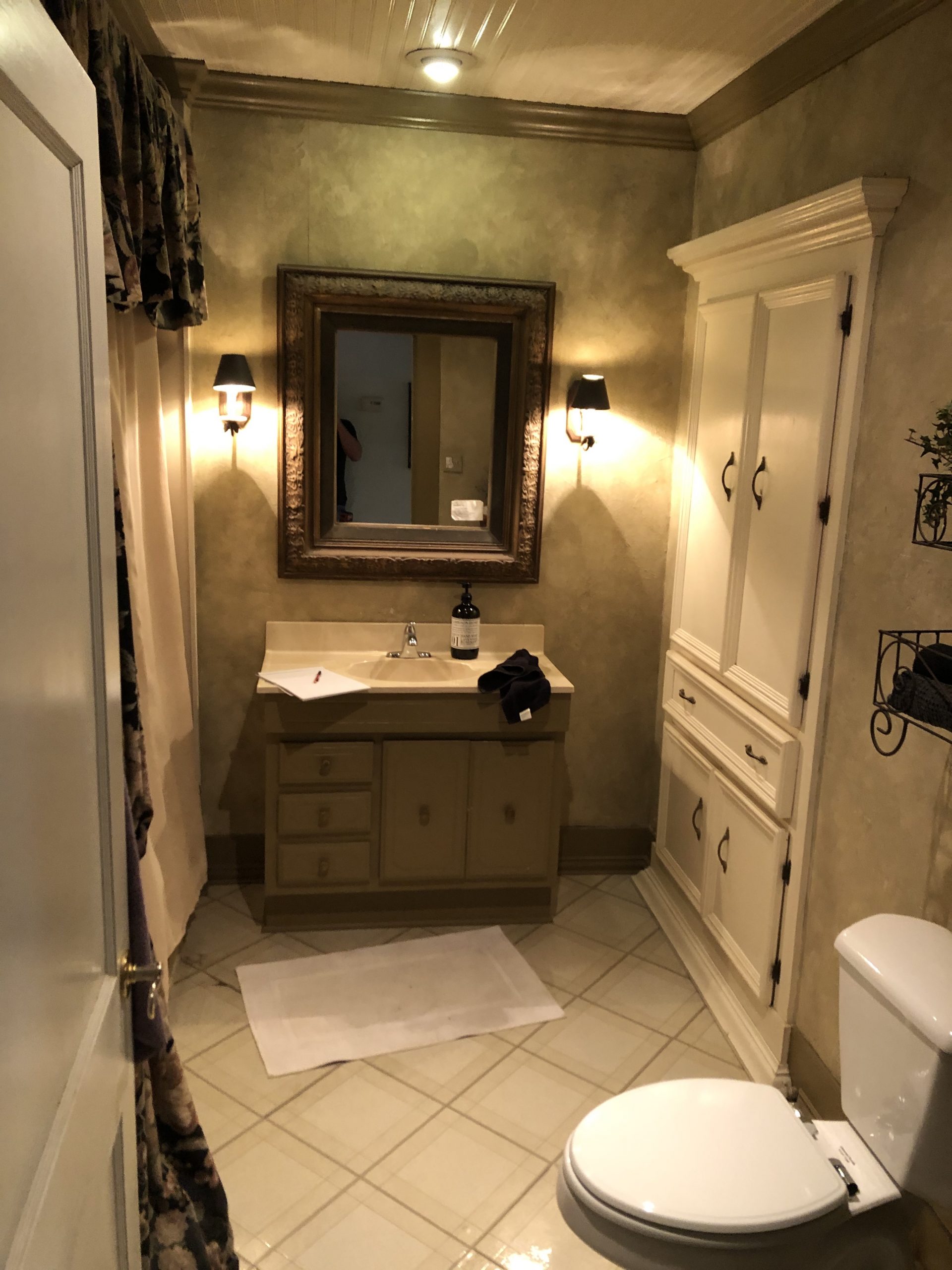
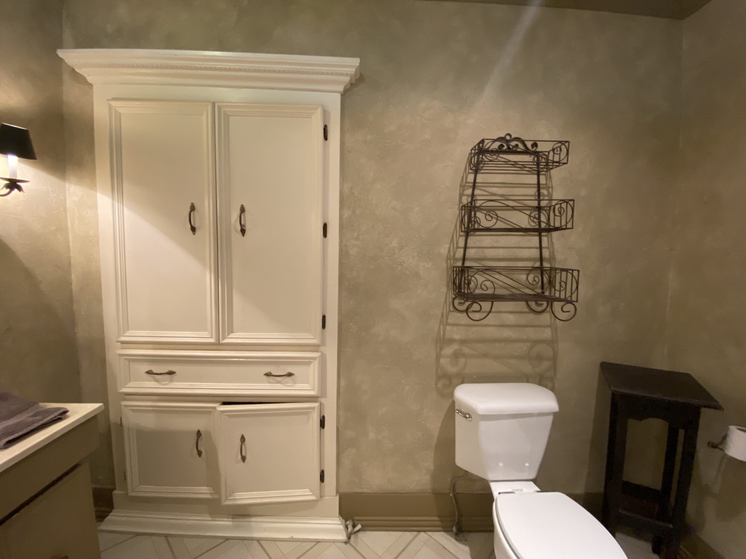
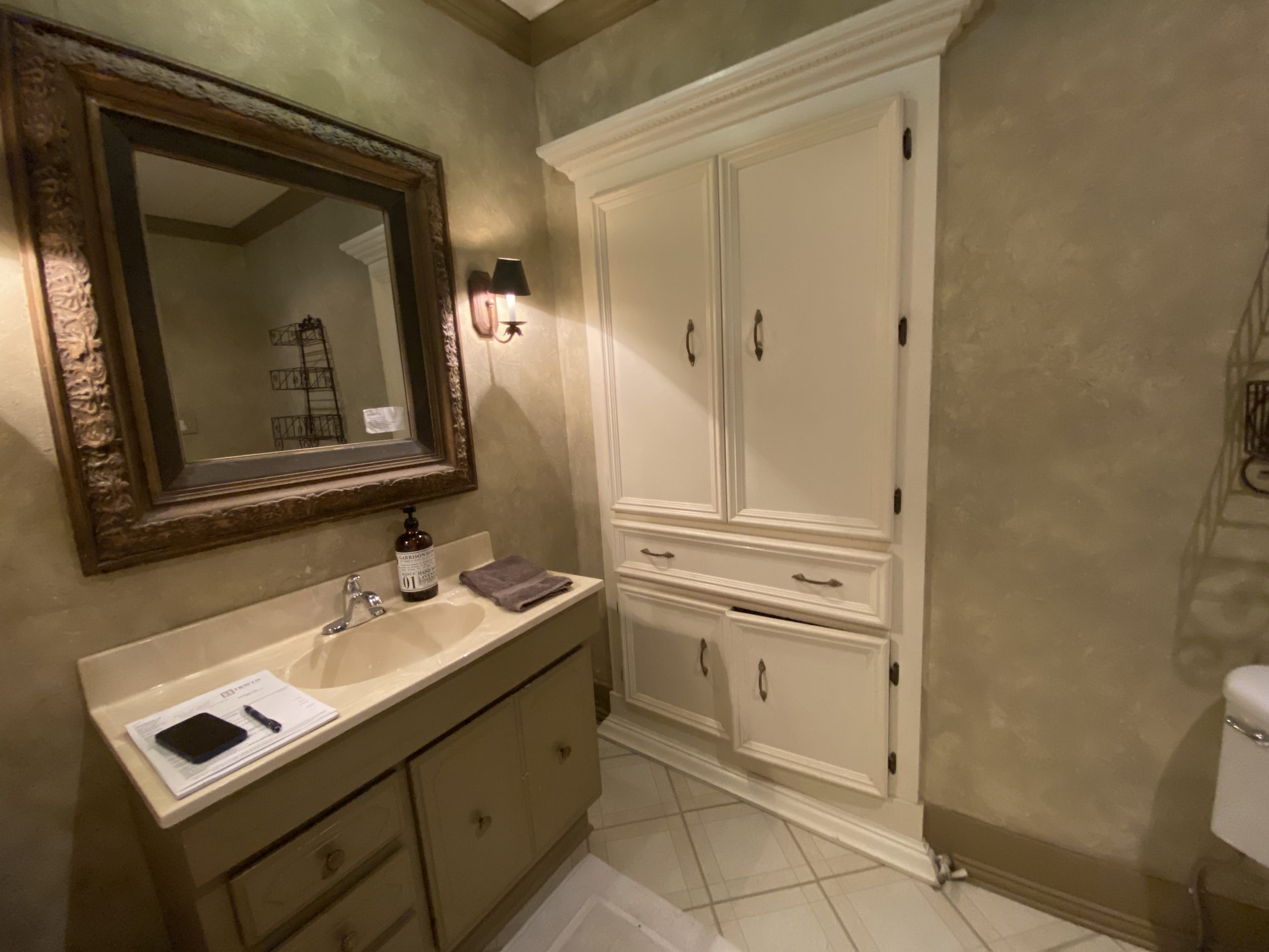
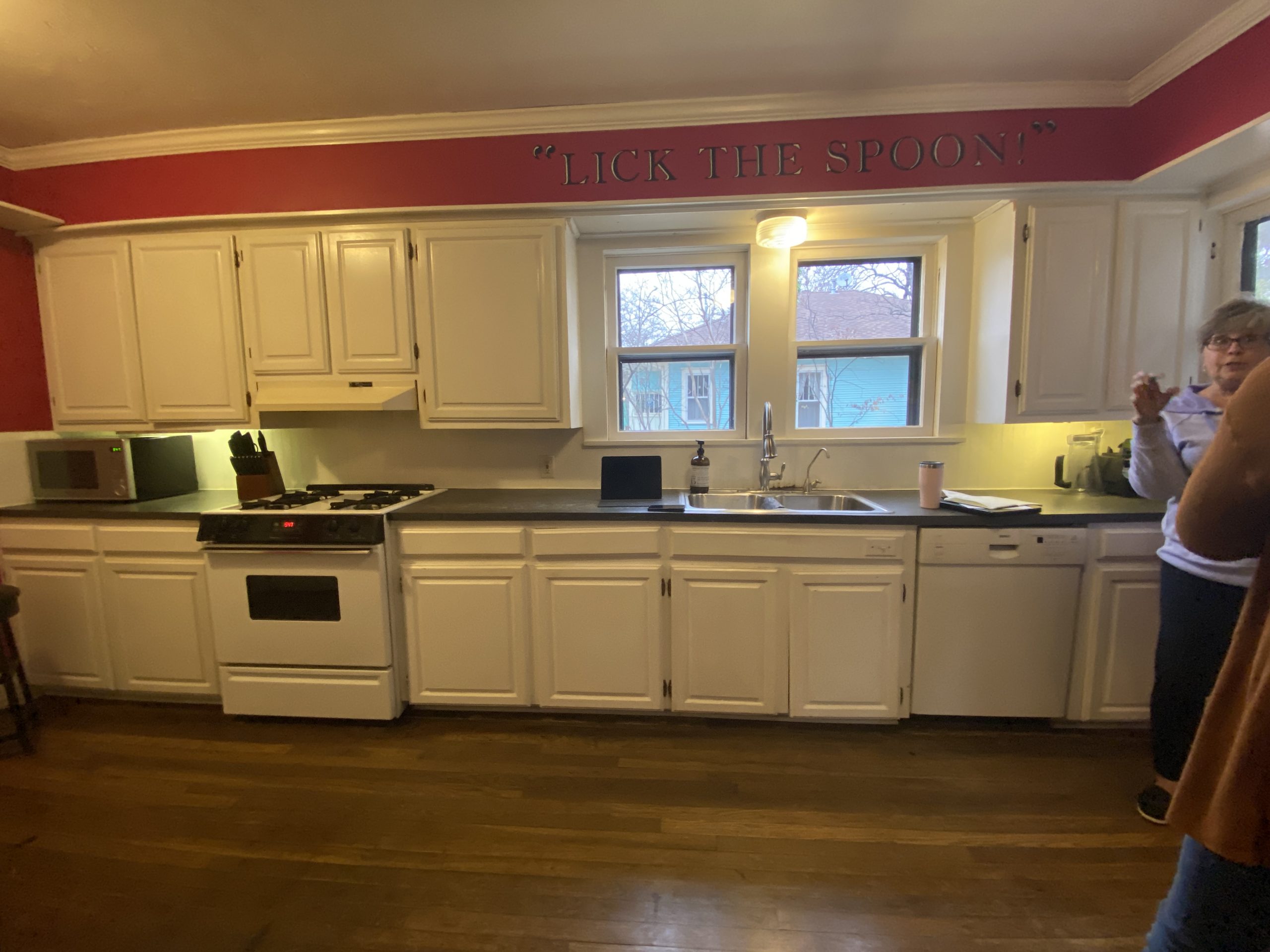
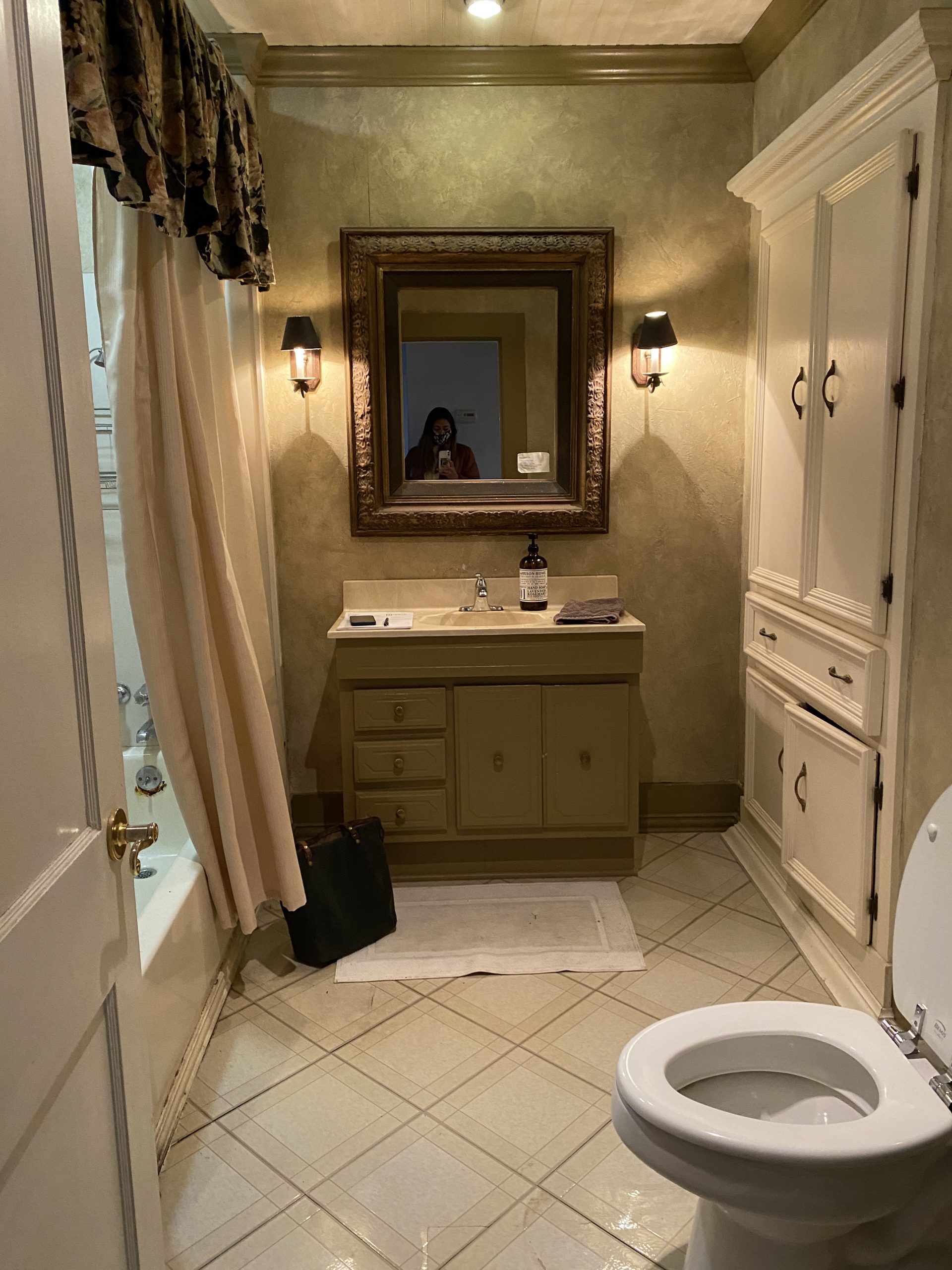
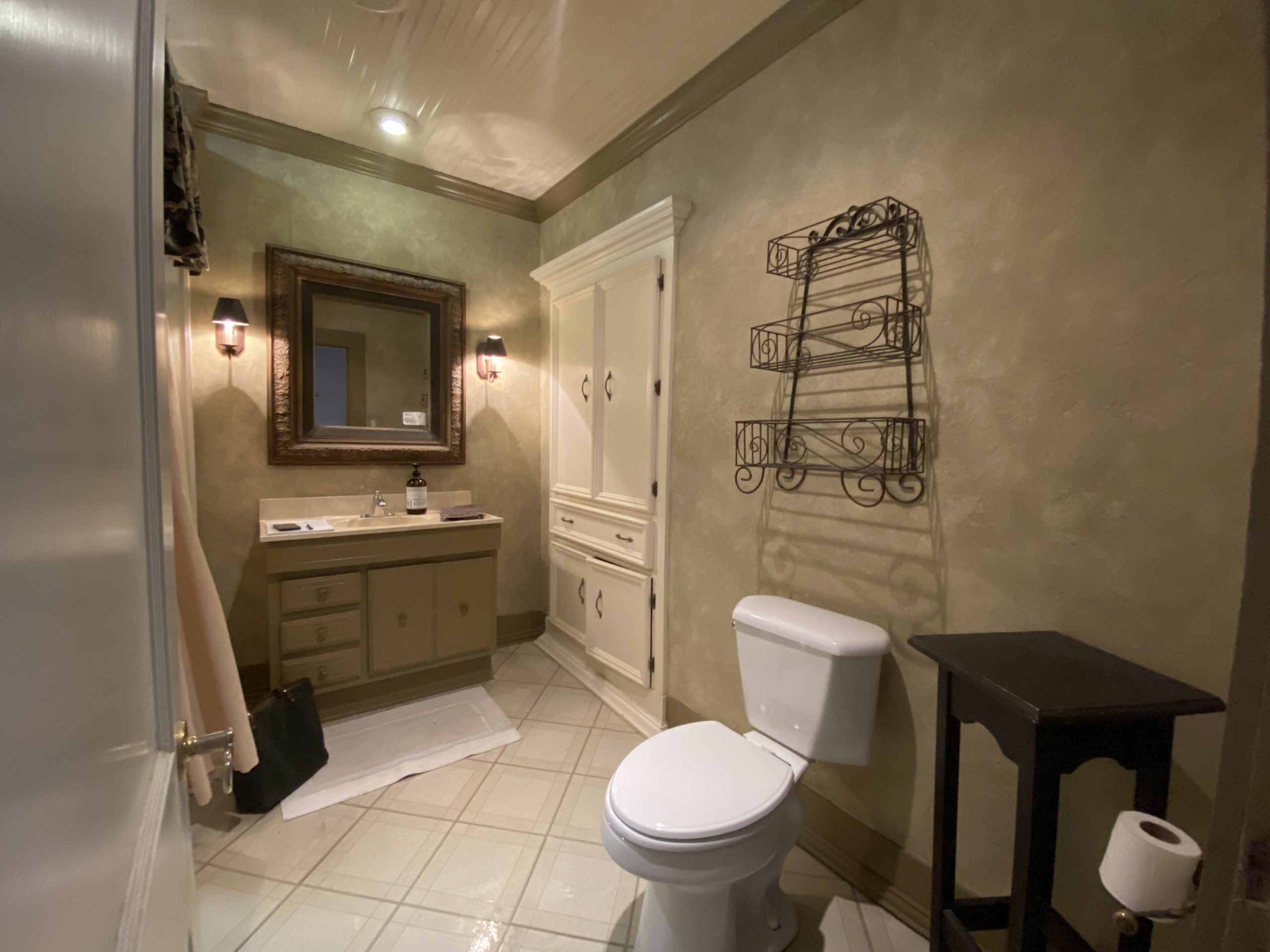
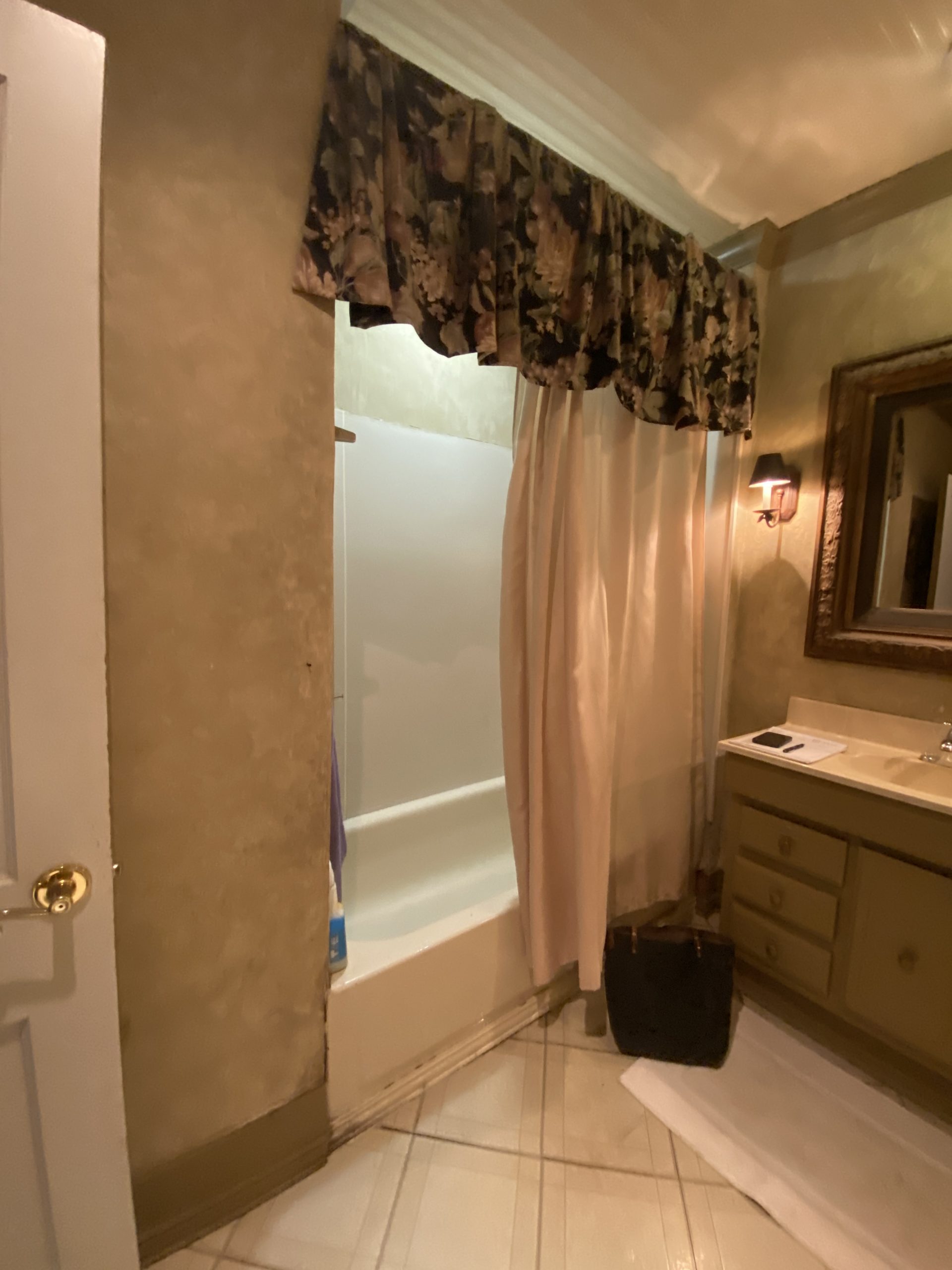
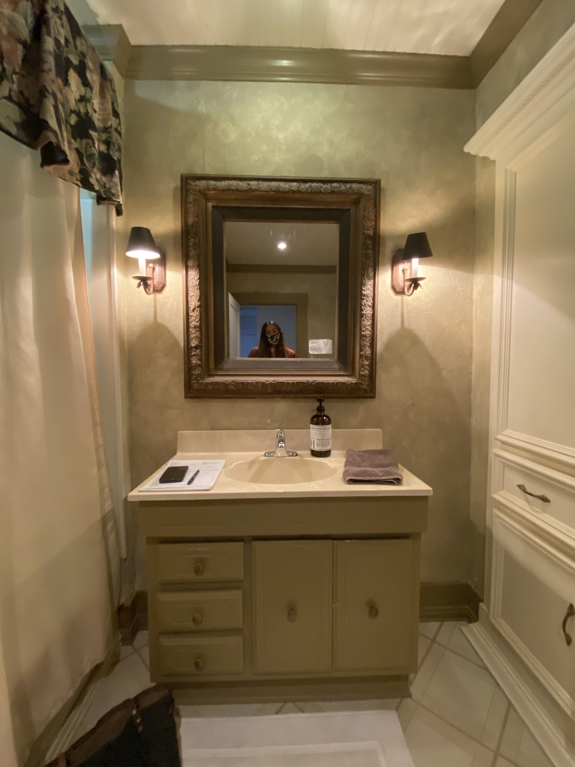
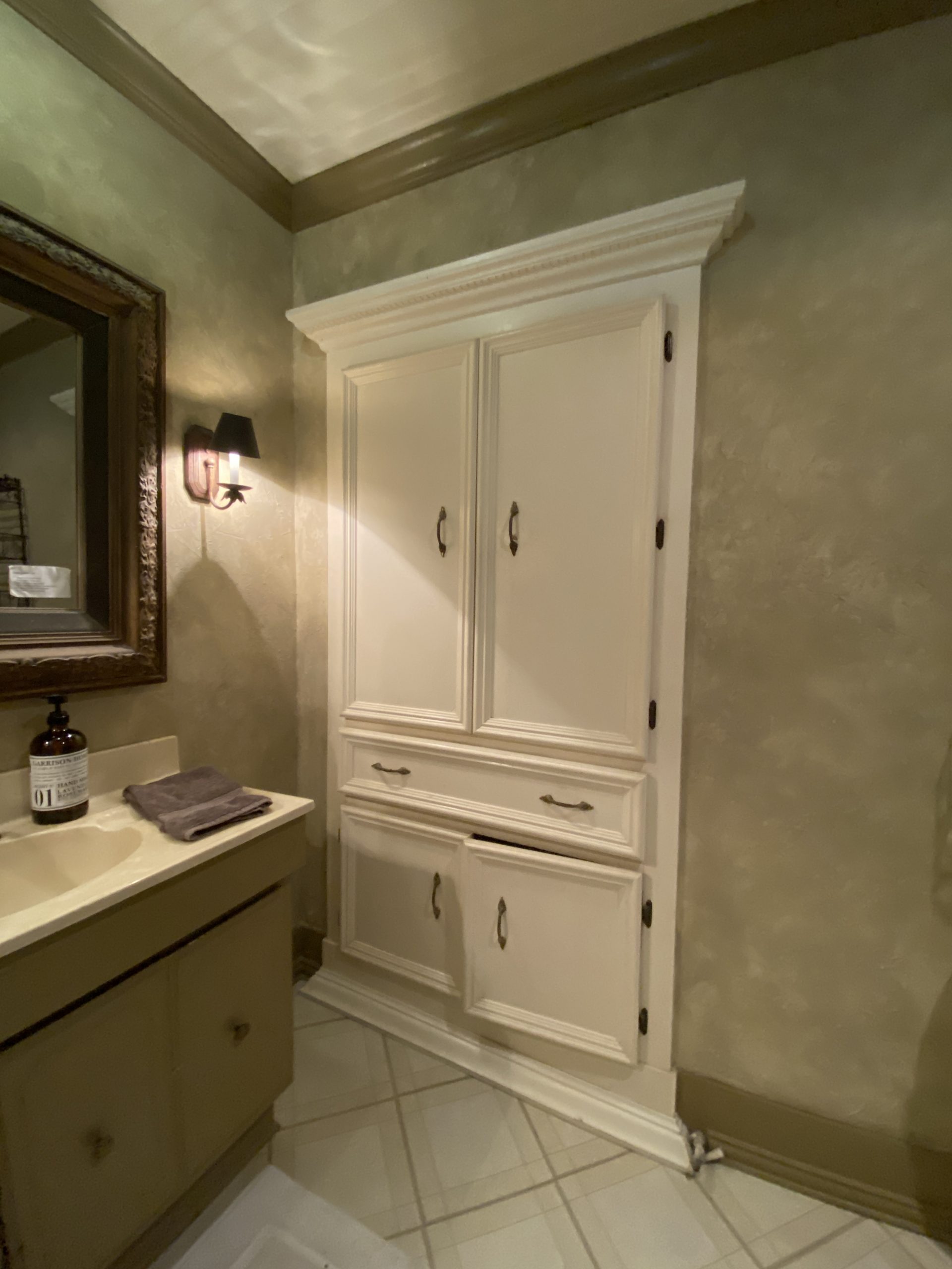
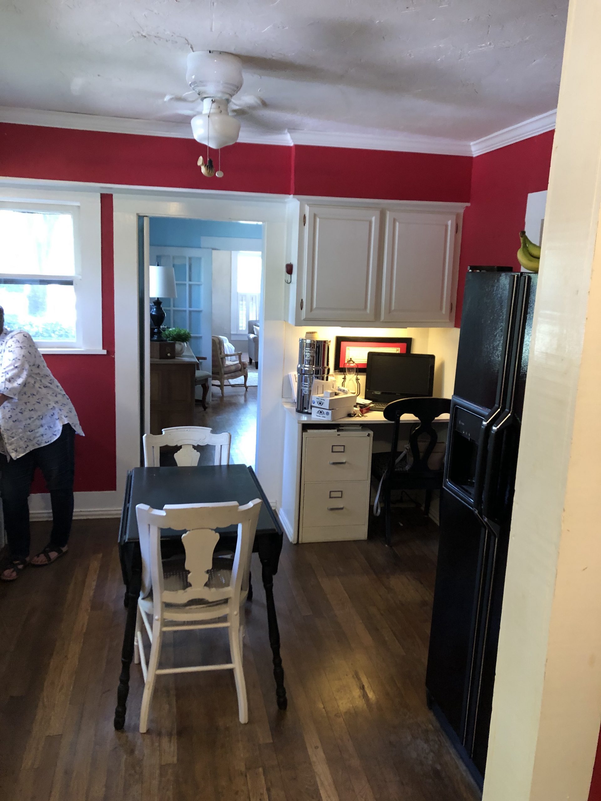
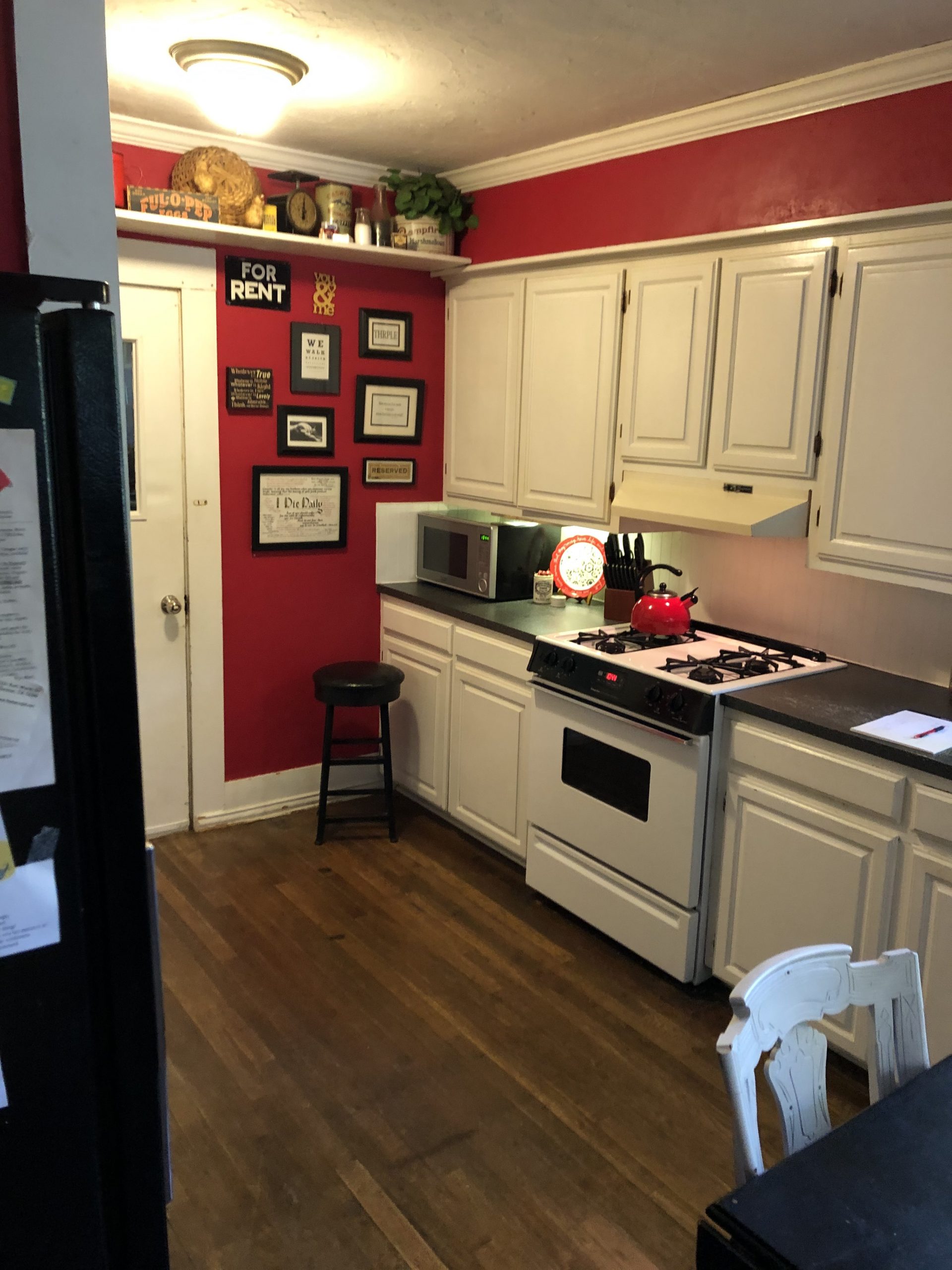
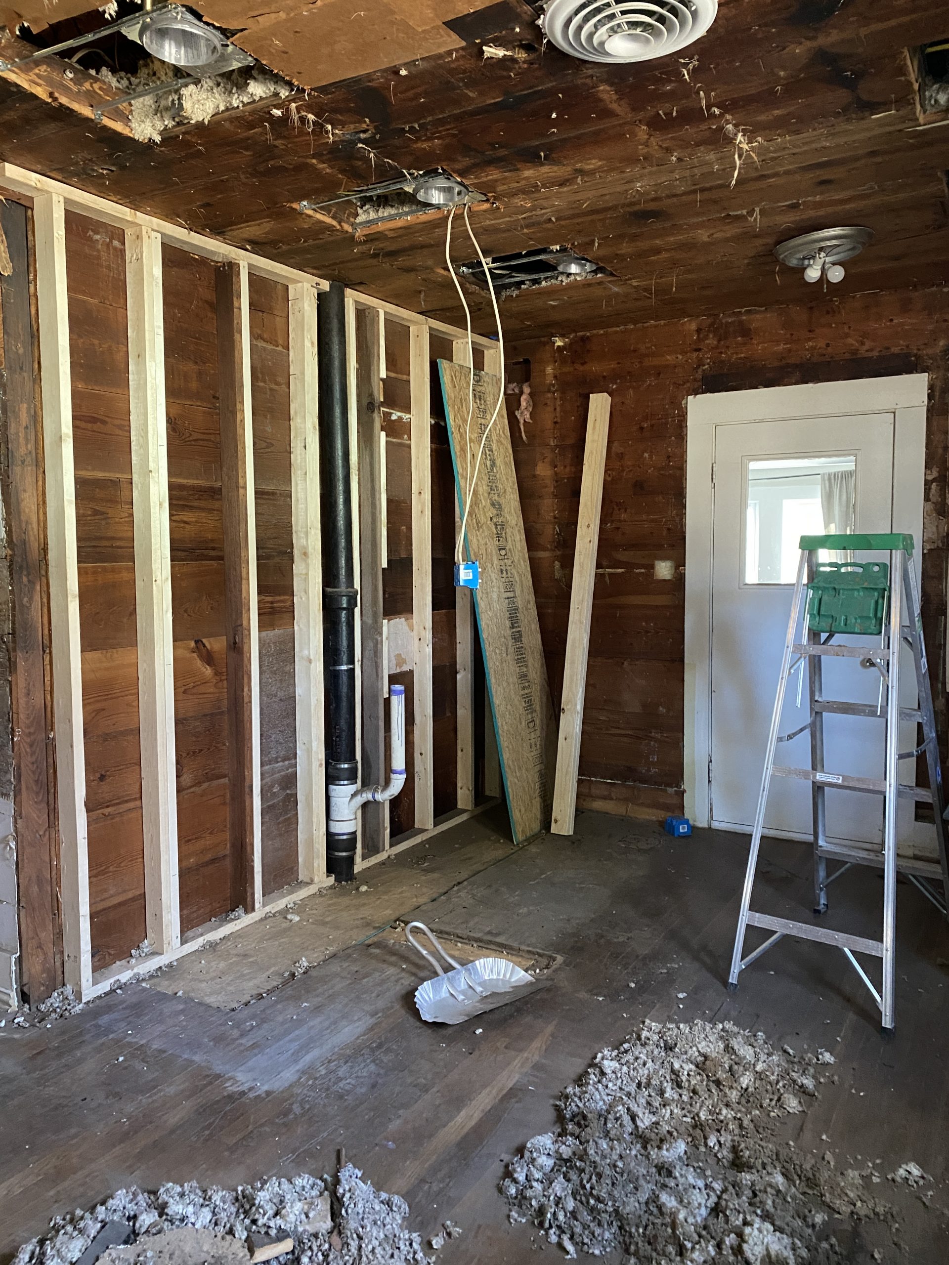
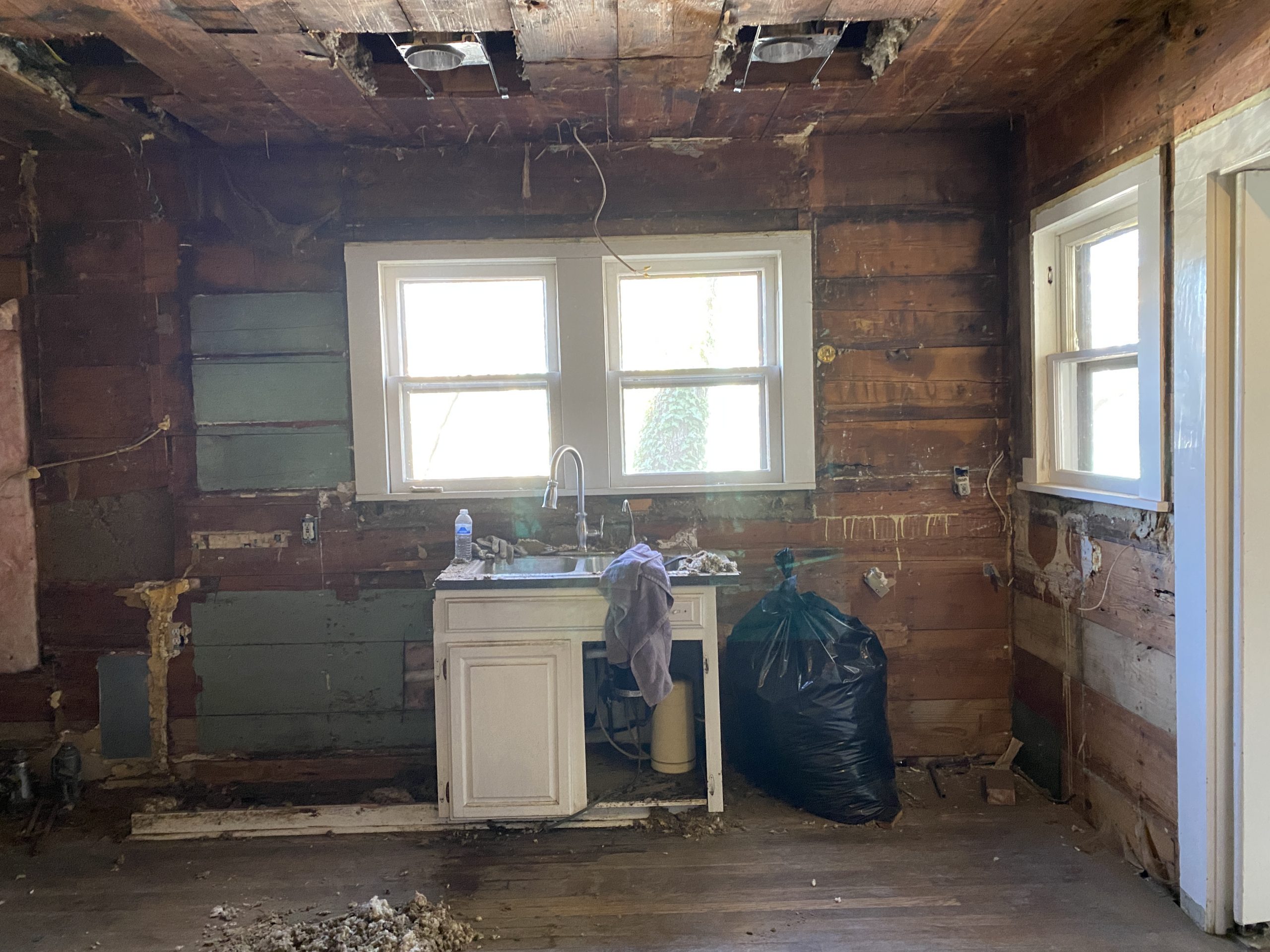
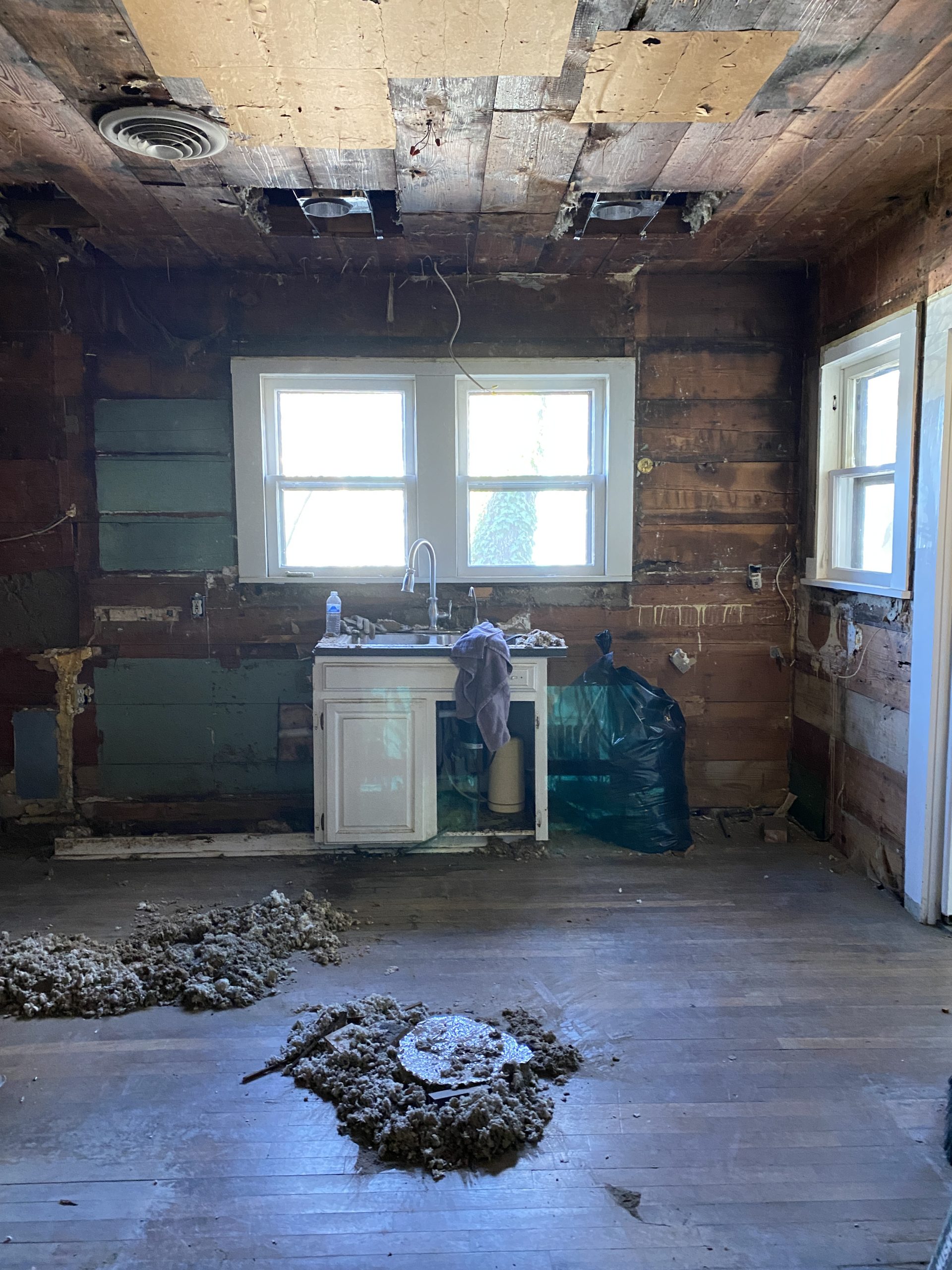
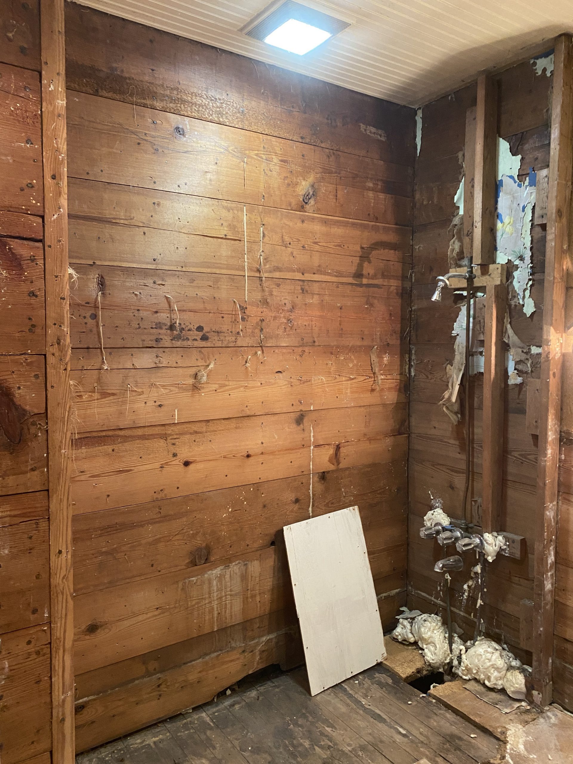
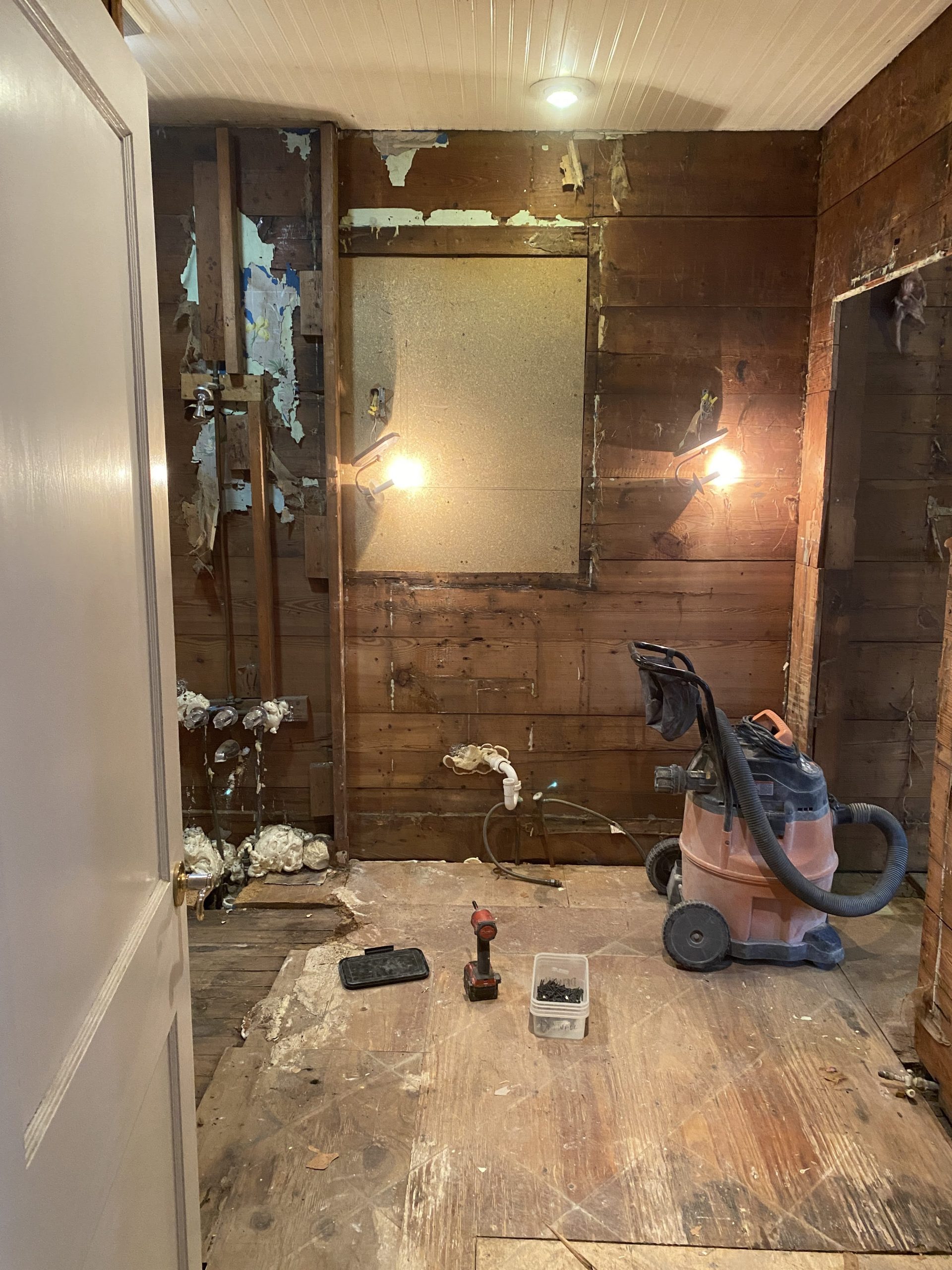
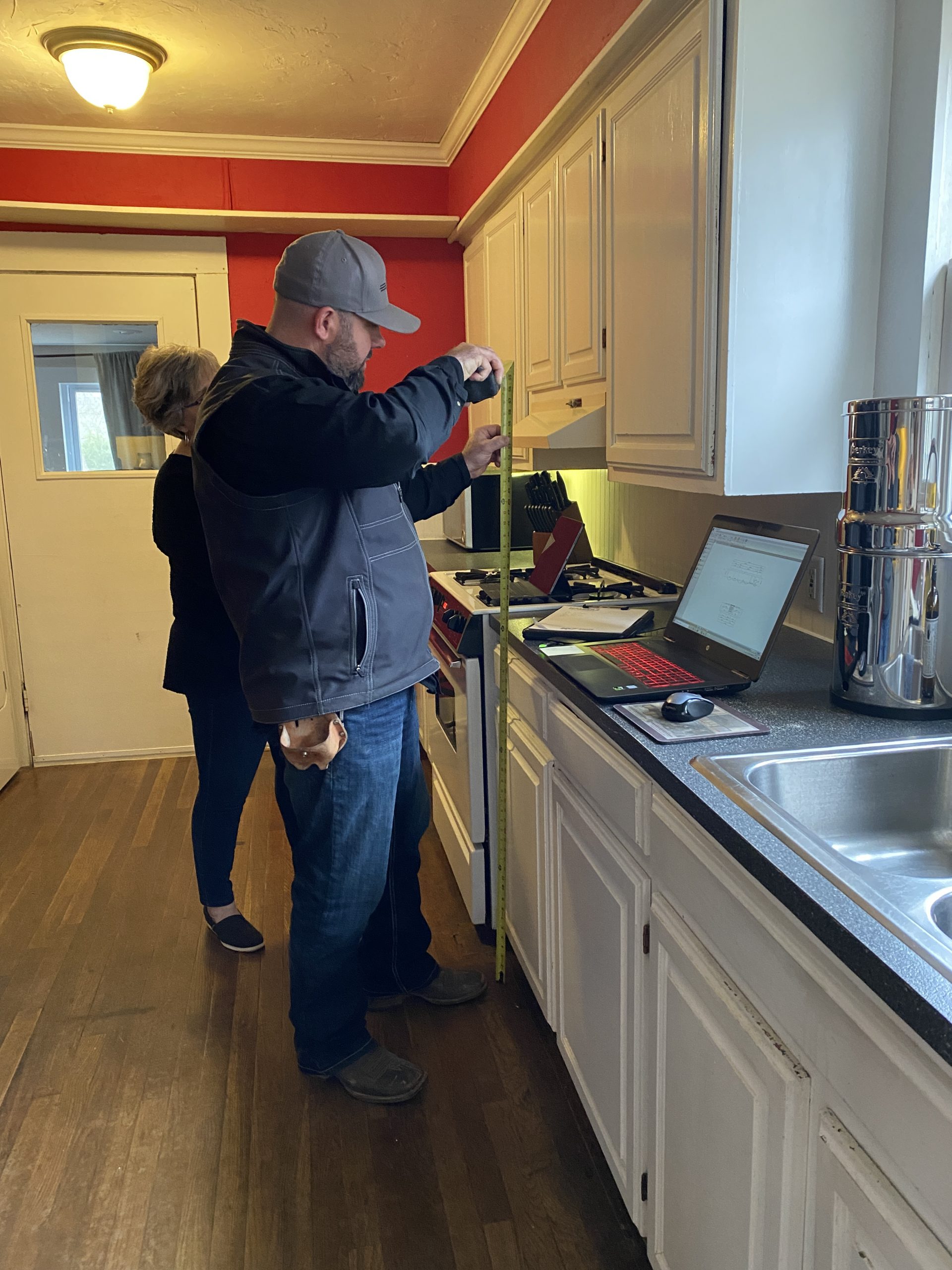
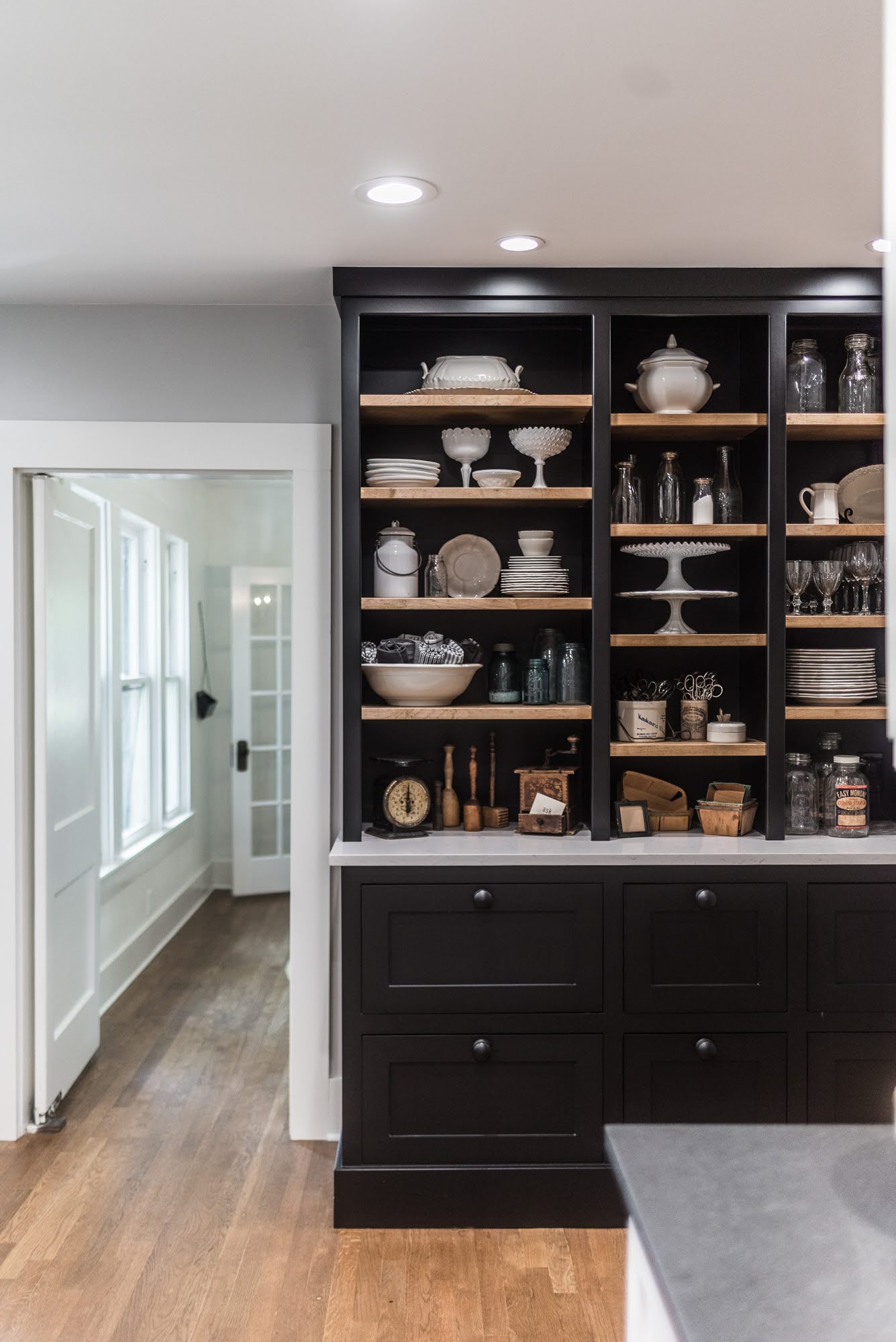
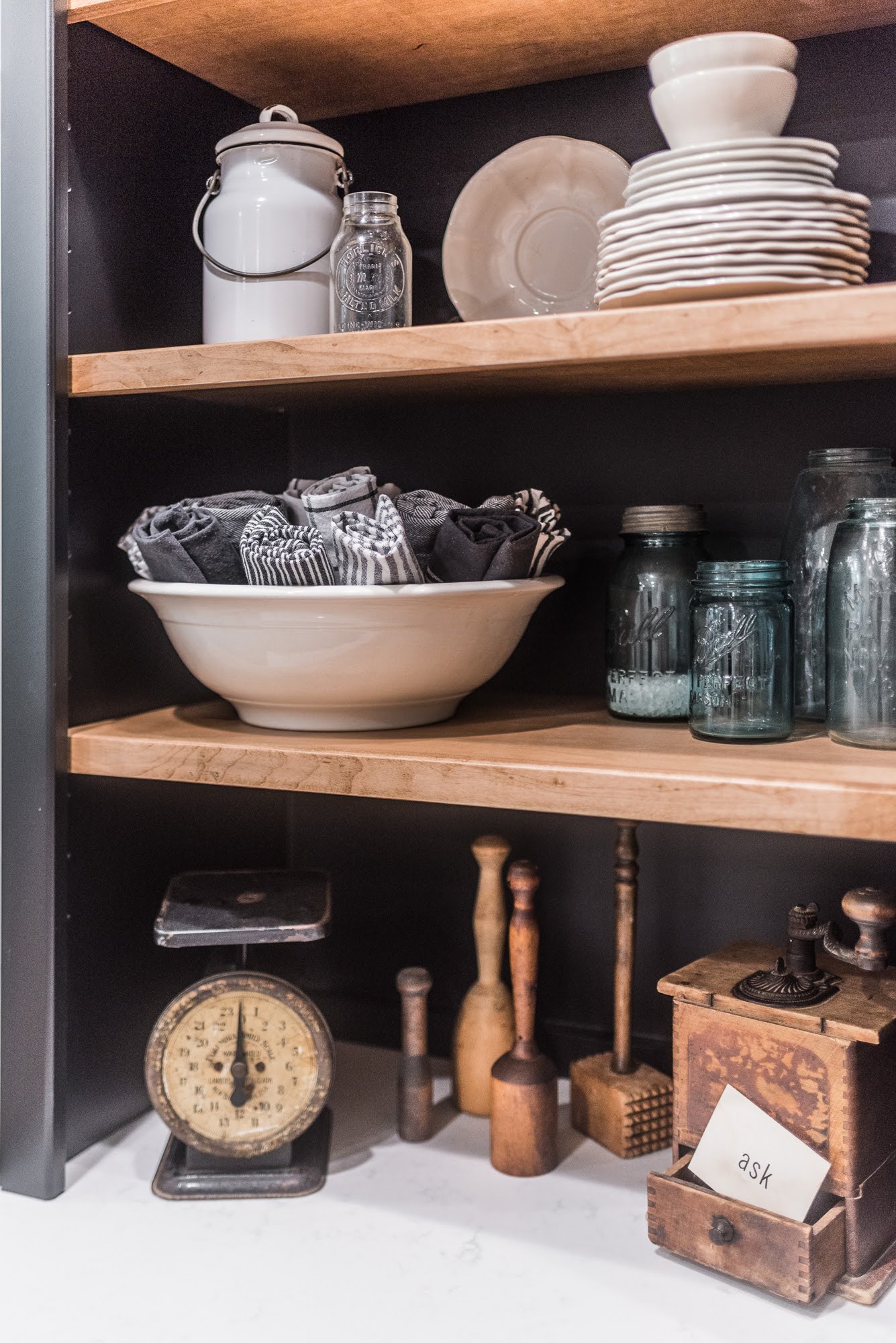
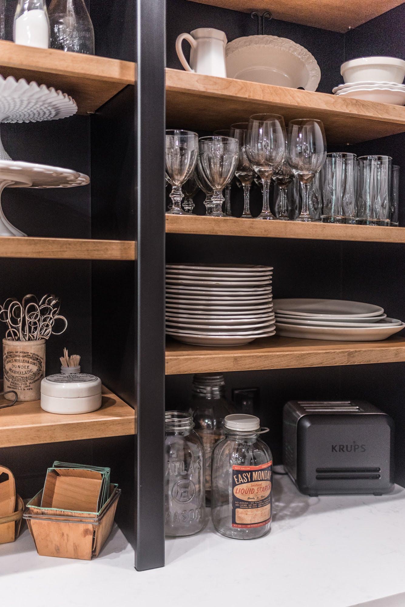
Though we kept the hardwood flooring, the dark red walls of the kitchen mixed with the flooring left the room feeling too dark and heavy. With this in mind, we decided we wanted to bring in some more light into the kitchen. More storage was desired and the client wanted to showcase an amazing collection of dishes and kitchenware. The bathroom felt cramped and off balance and our main goal here was to relocate some items and create a more aesthetically pleasing design look.
DURING
The Kitchen
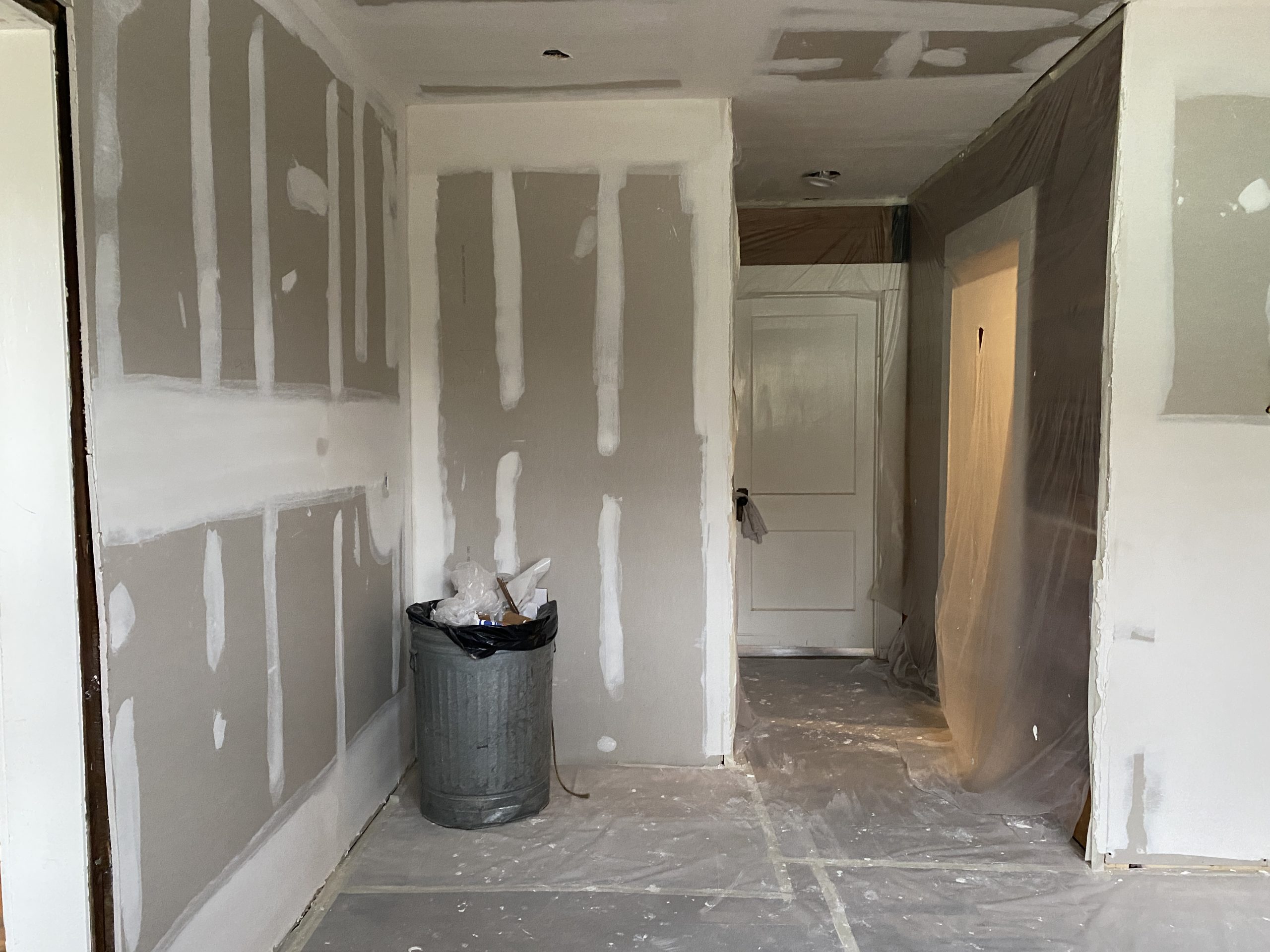
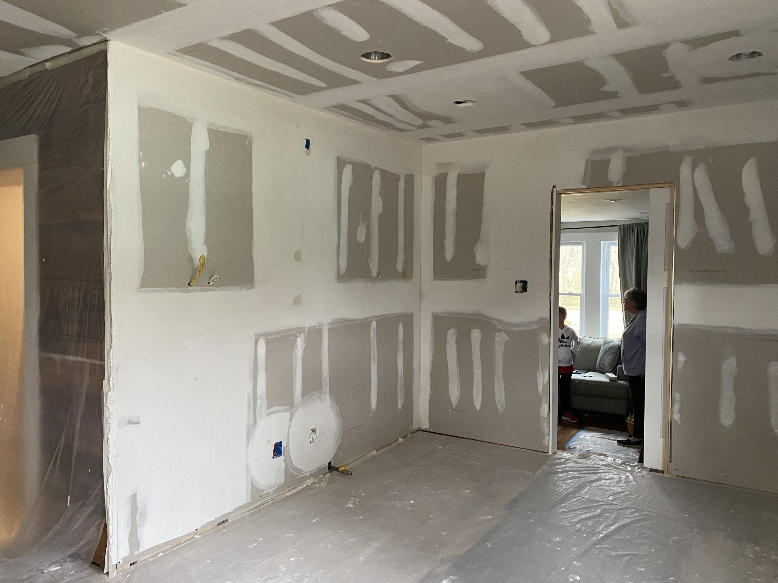
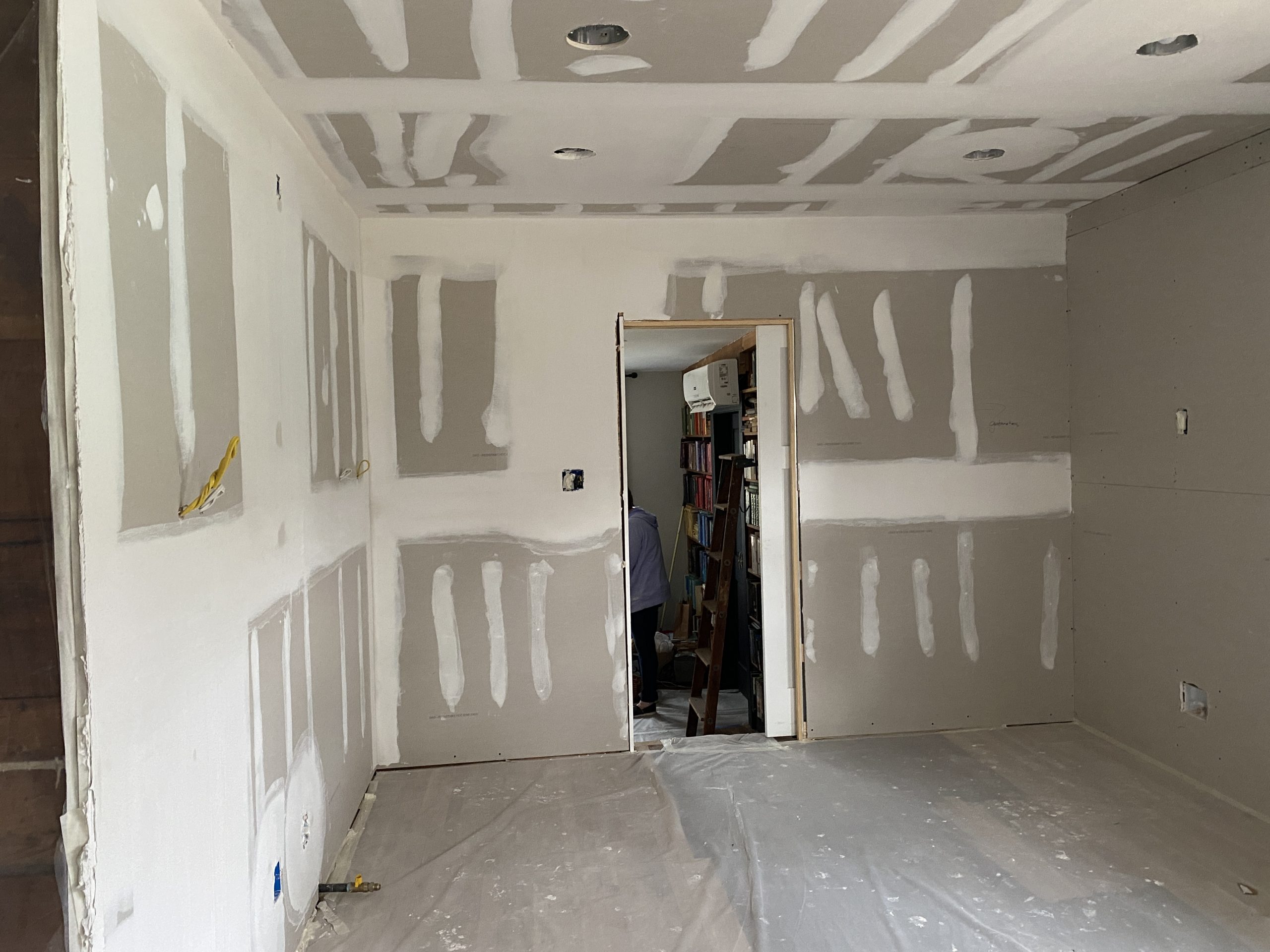
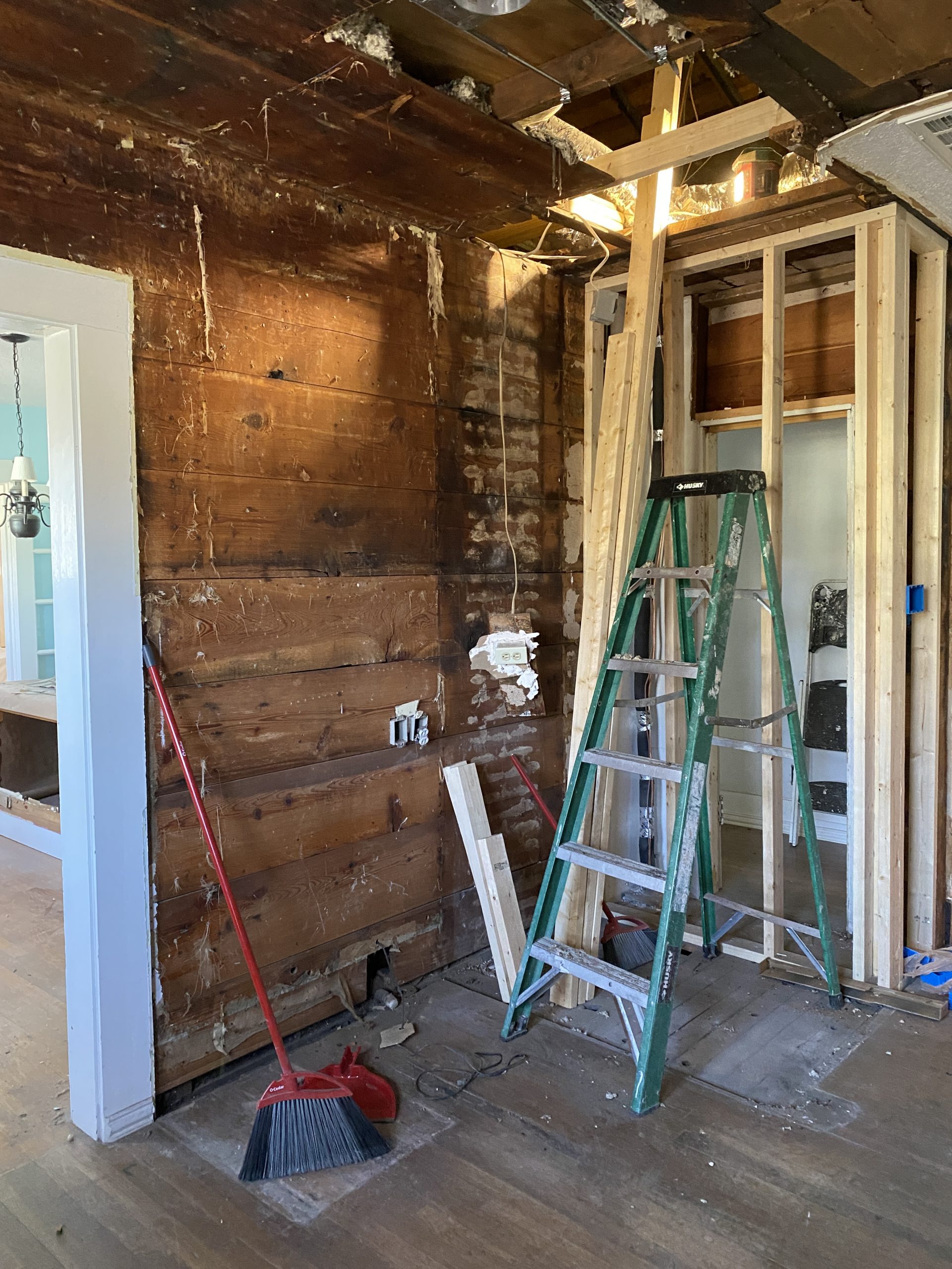
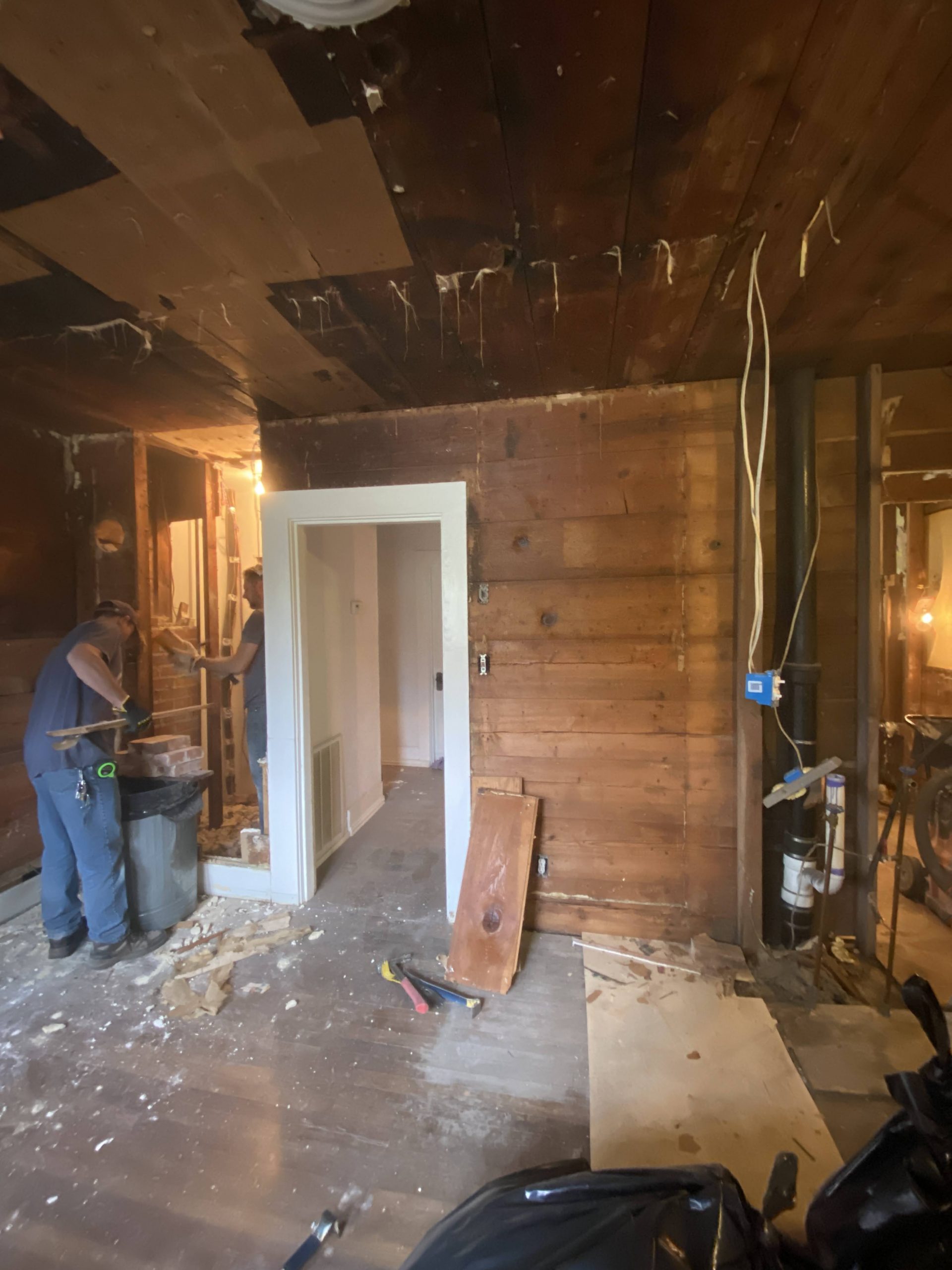
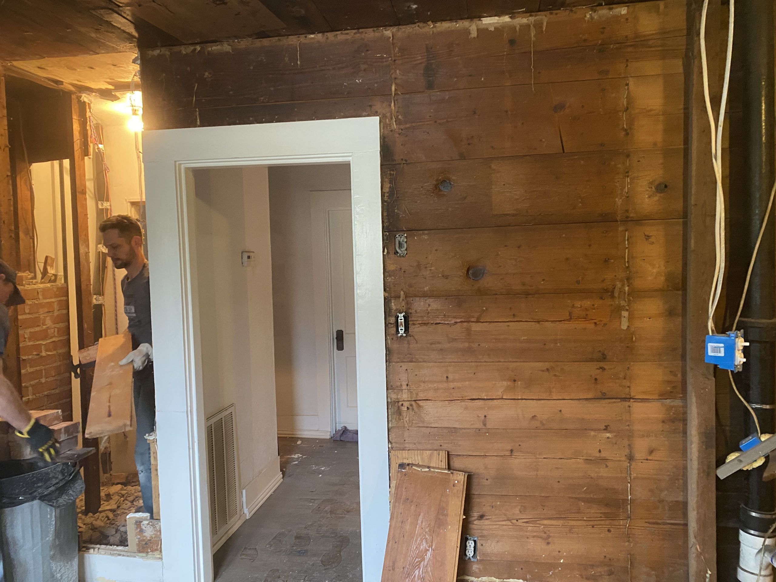
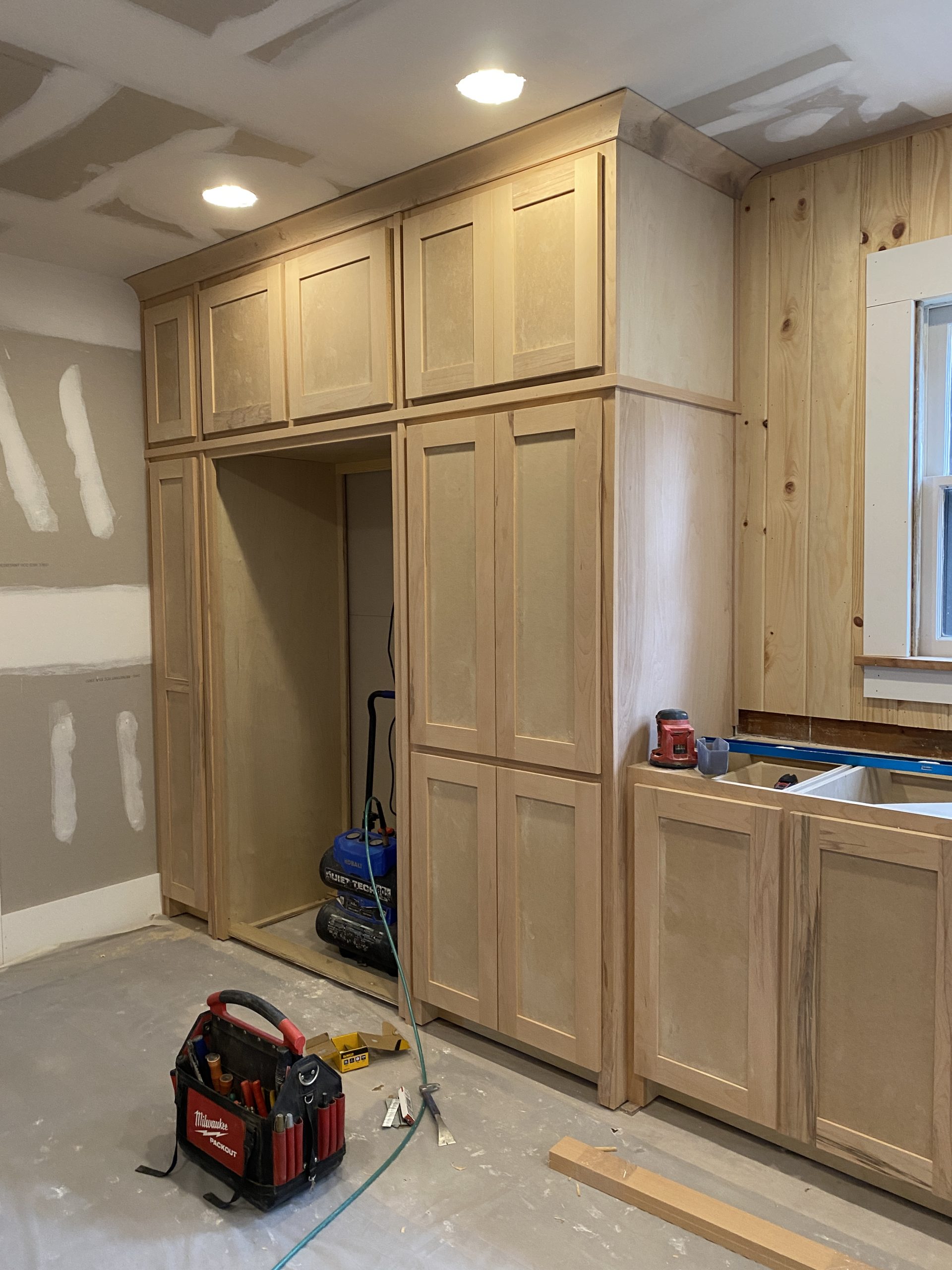
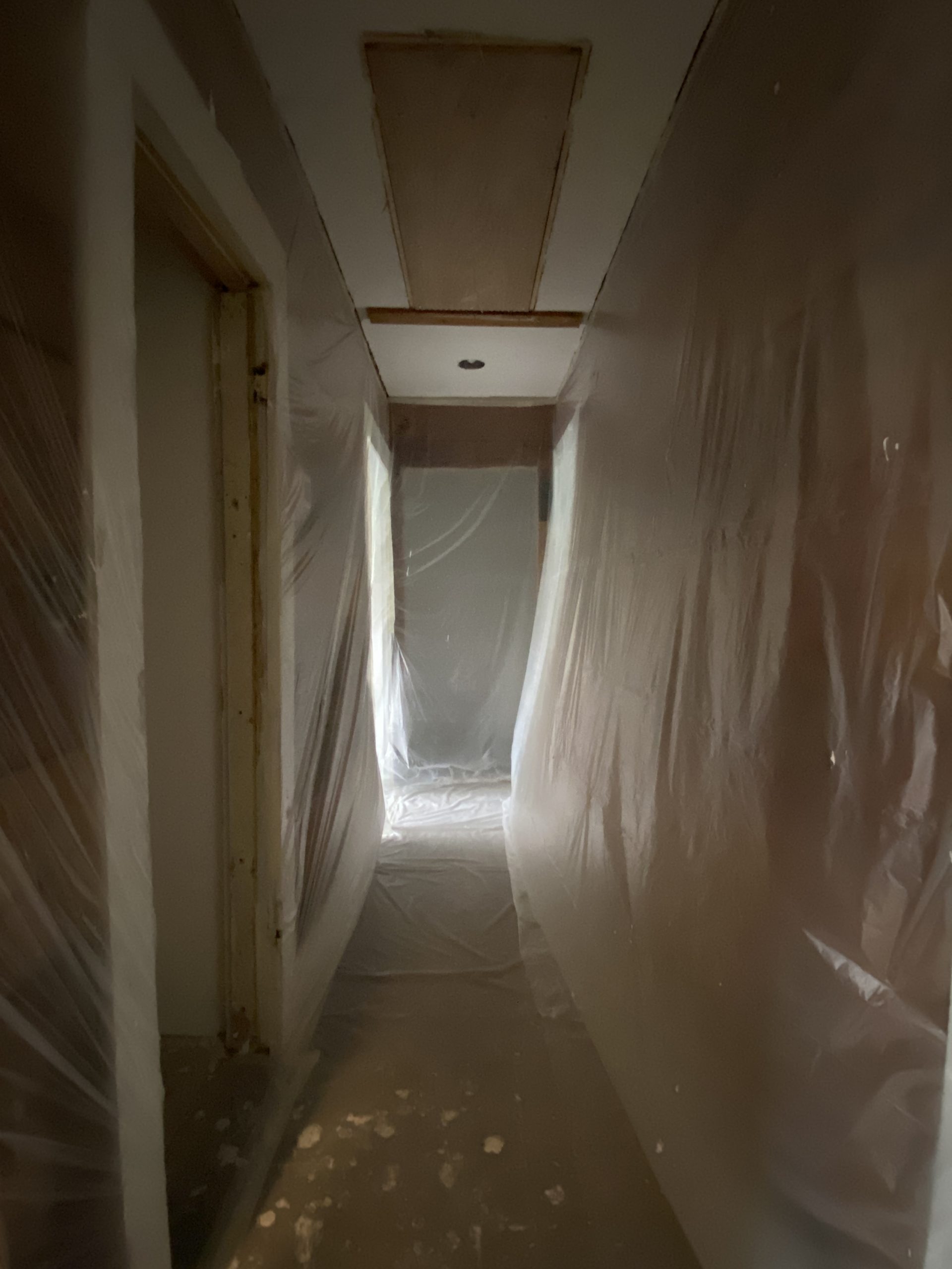
We began the kitchen remodel by removing the wall dividing the washer and dryer area from the current kitchen layout. The hall closet was then modified into a space for a stackable washer and dryer and the appliances were relocated. We also closed off the ceiling in the hallway.
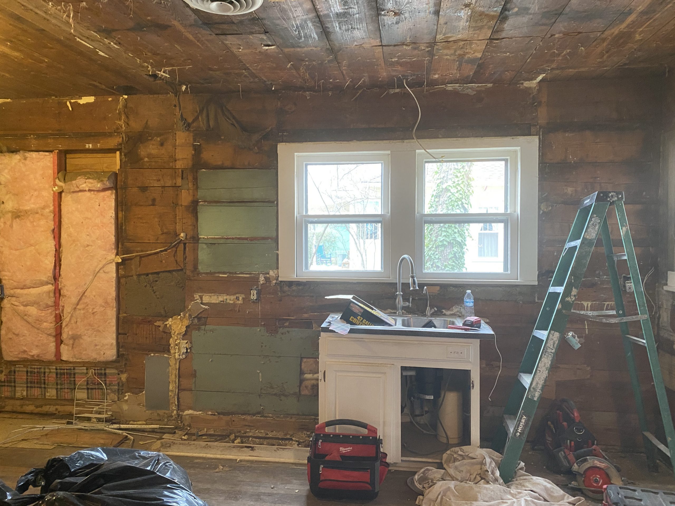
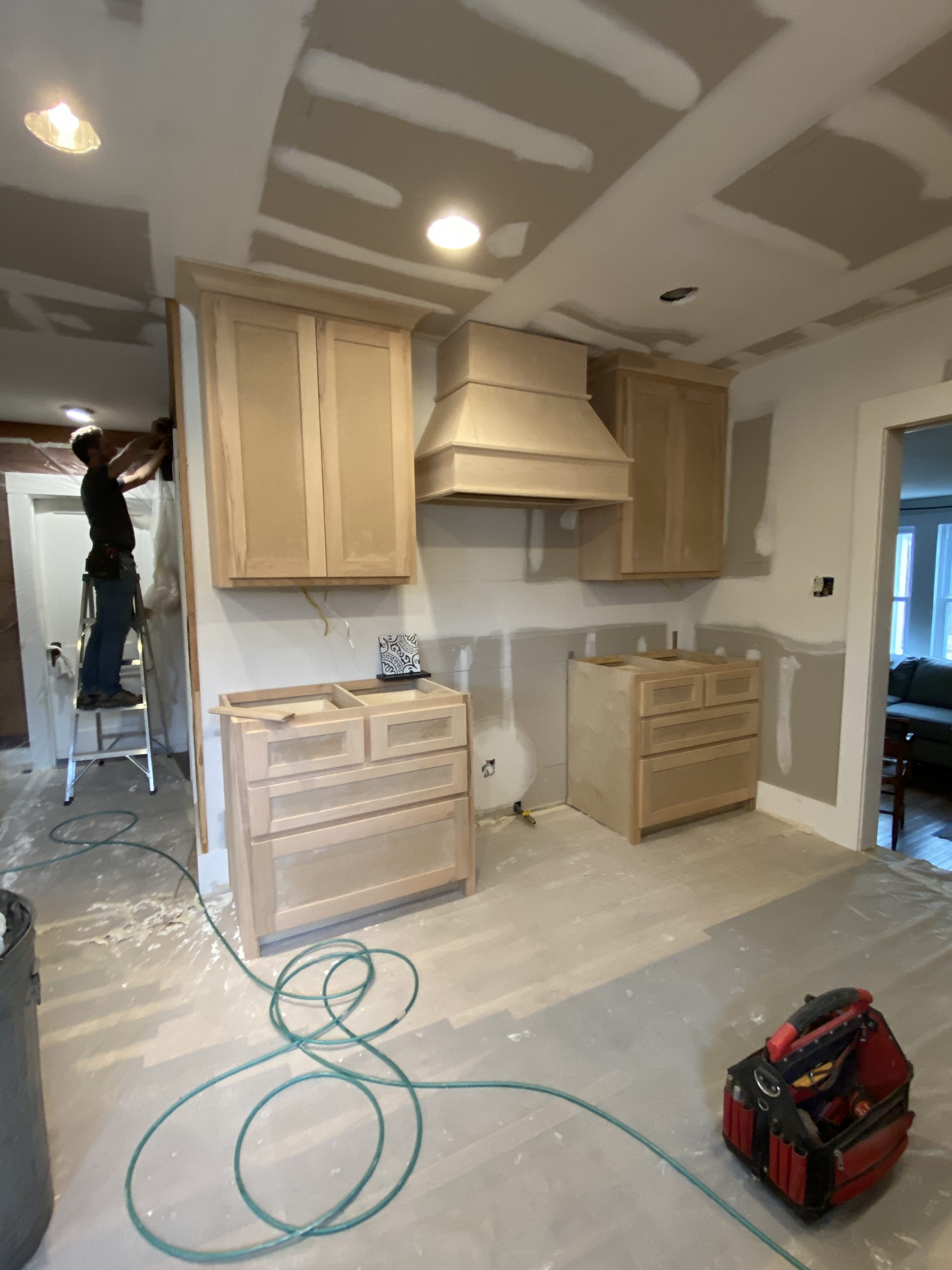
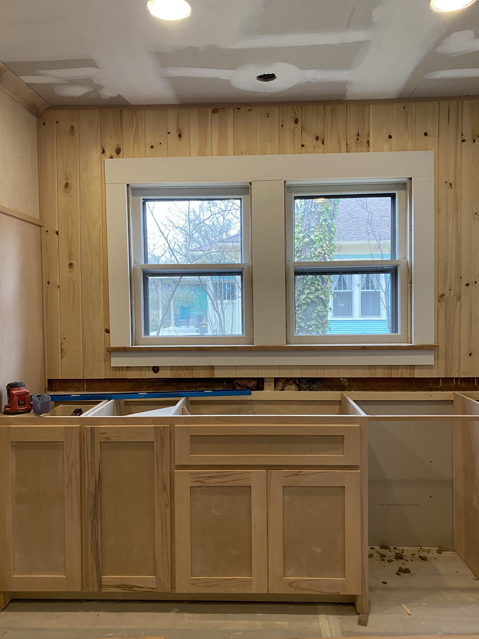
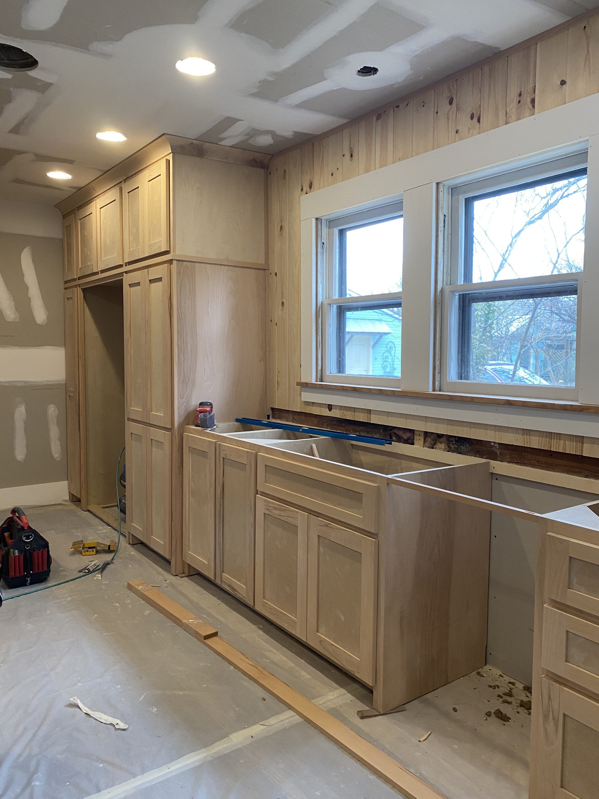
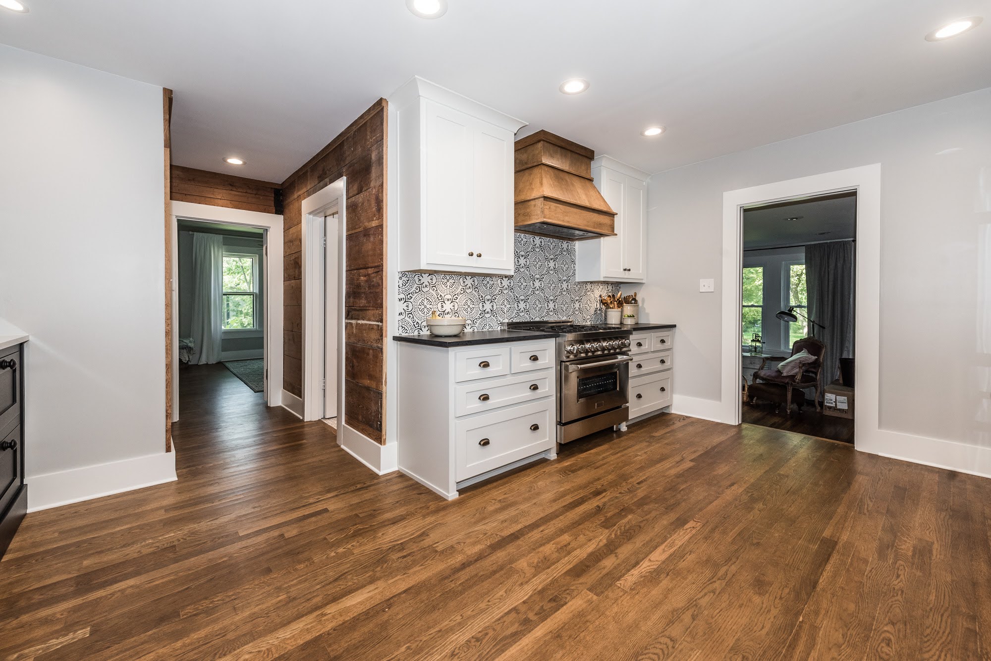
The original kitchen cabinets, backsplash, and countertops were all removed, as were the furr downs. We framed out the wall in order to create a solid plane for new cabinetry on the oven side of the kitchen. The back door in the kitchen was replaced with a 32″ pocket door.
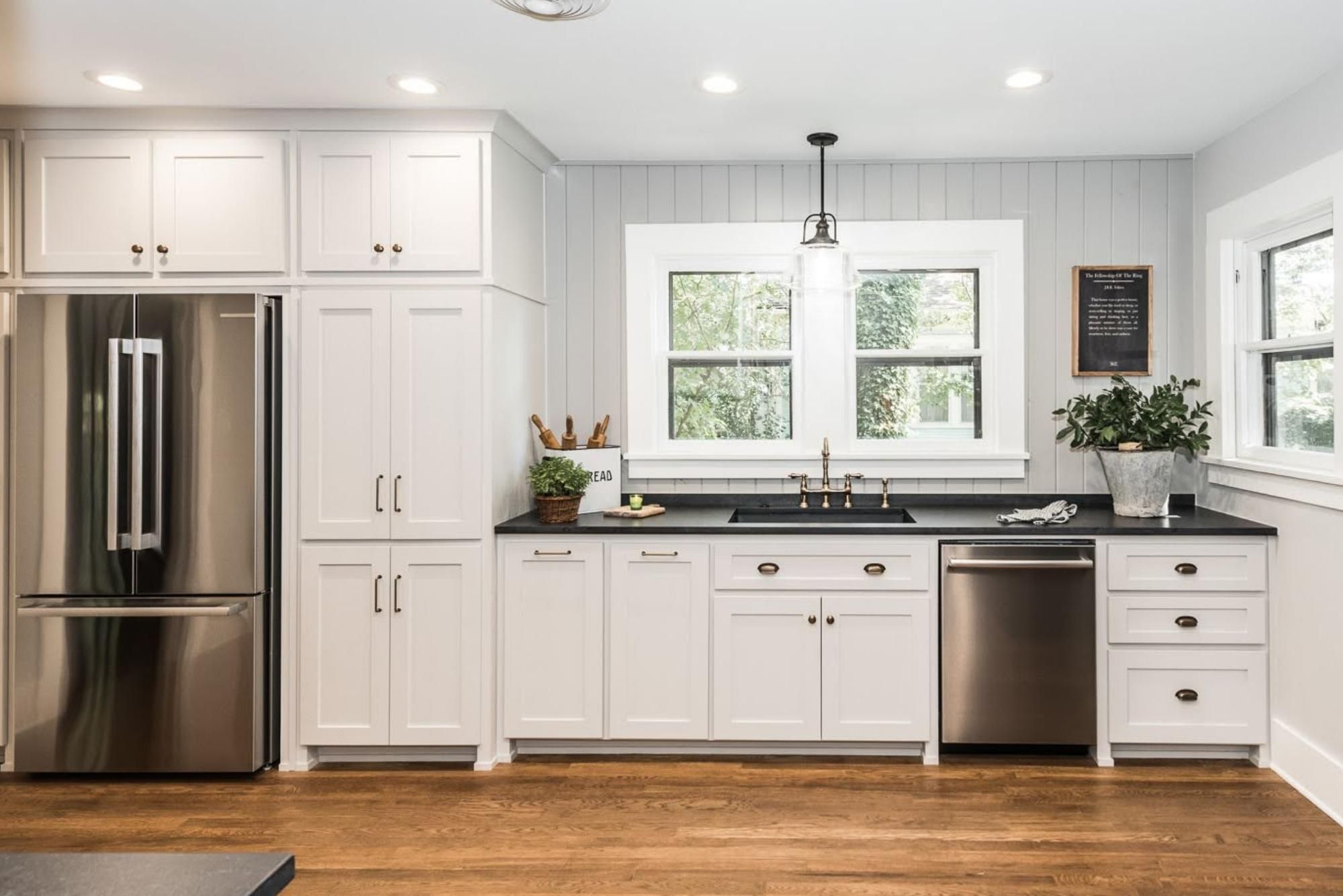
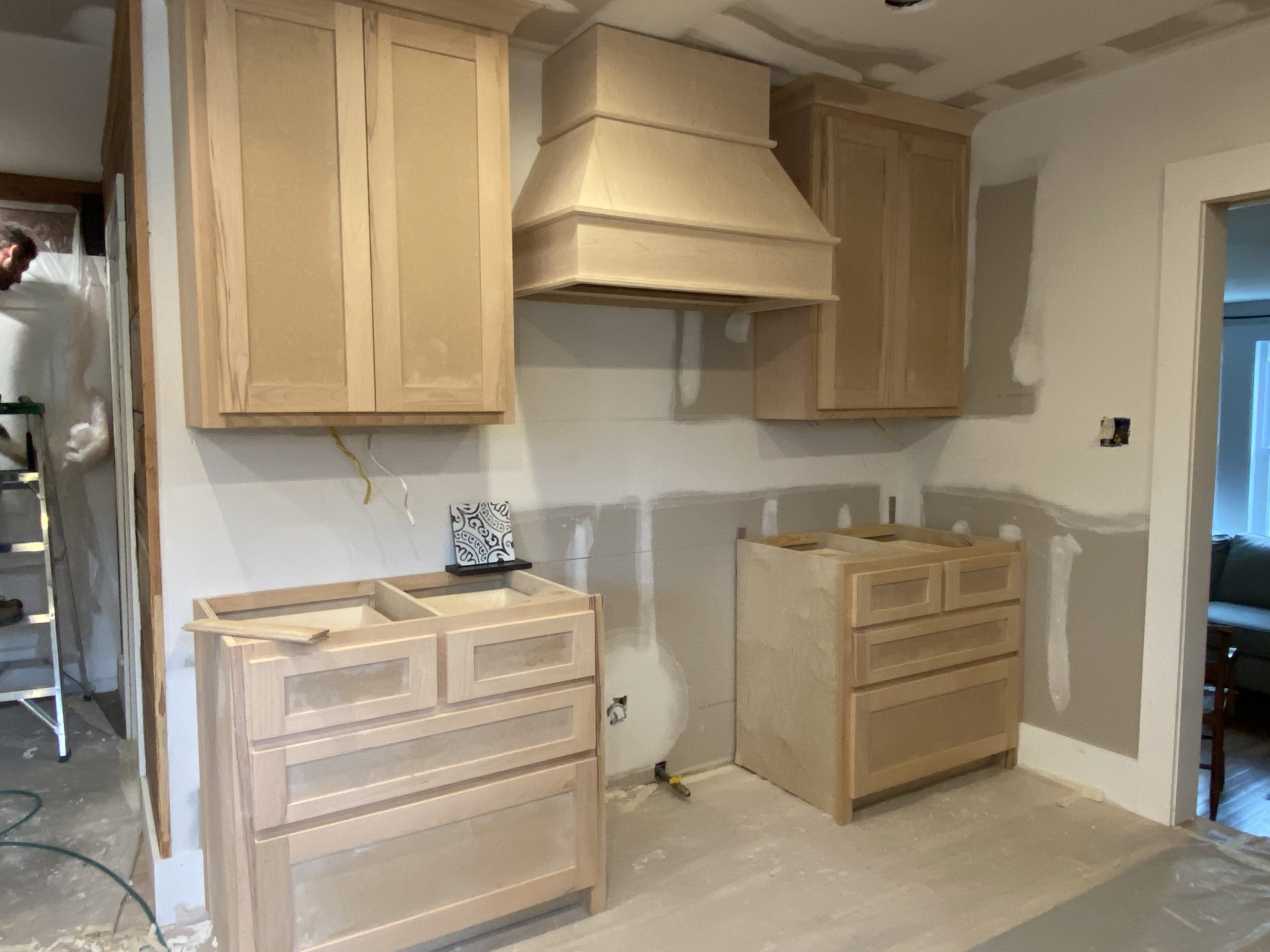
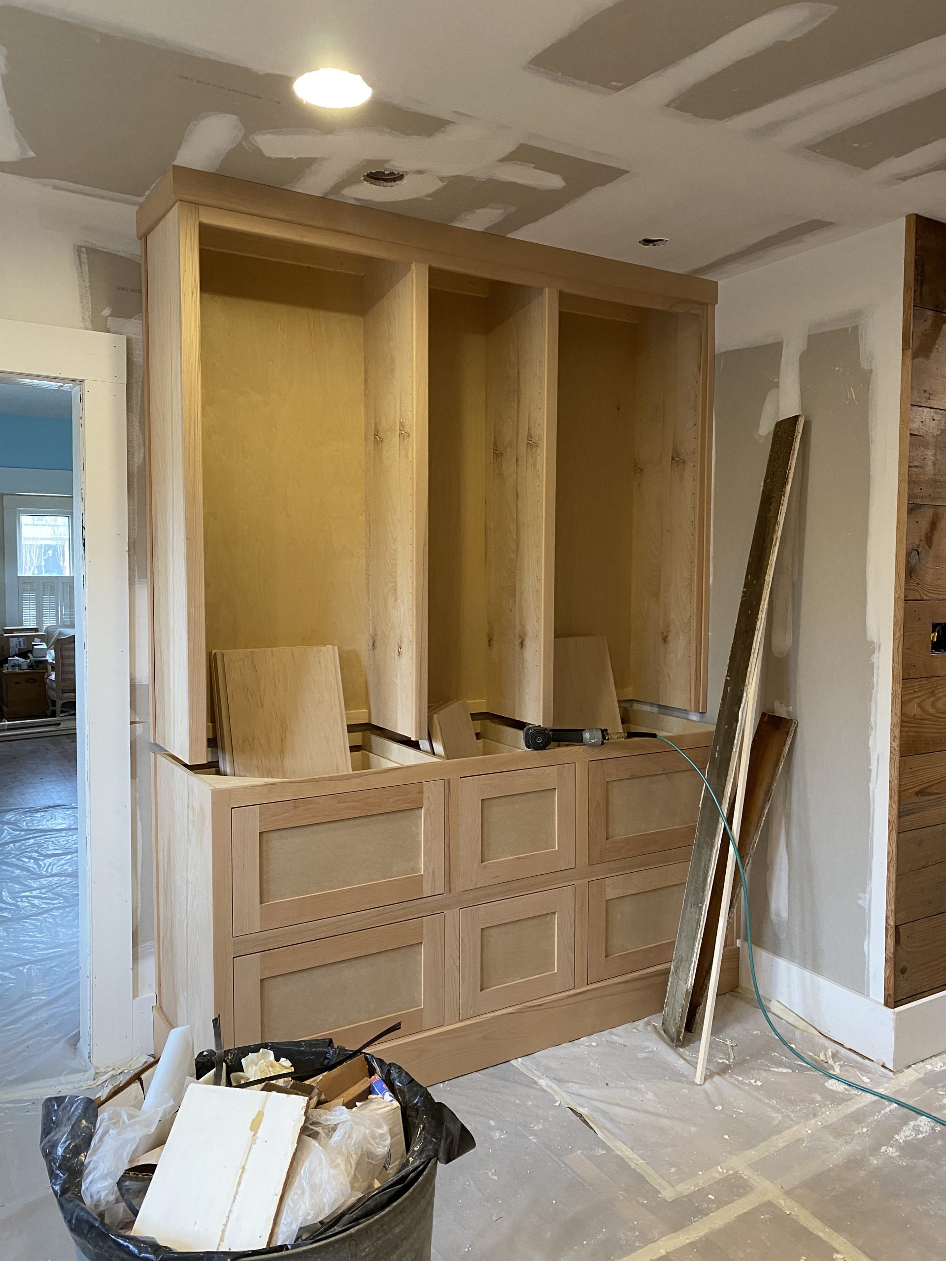
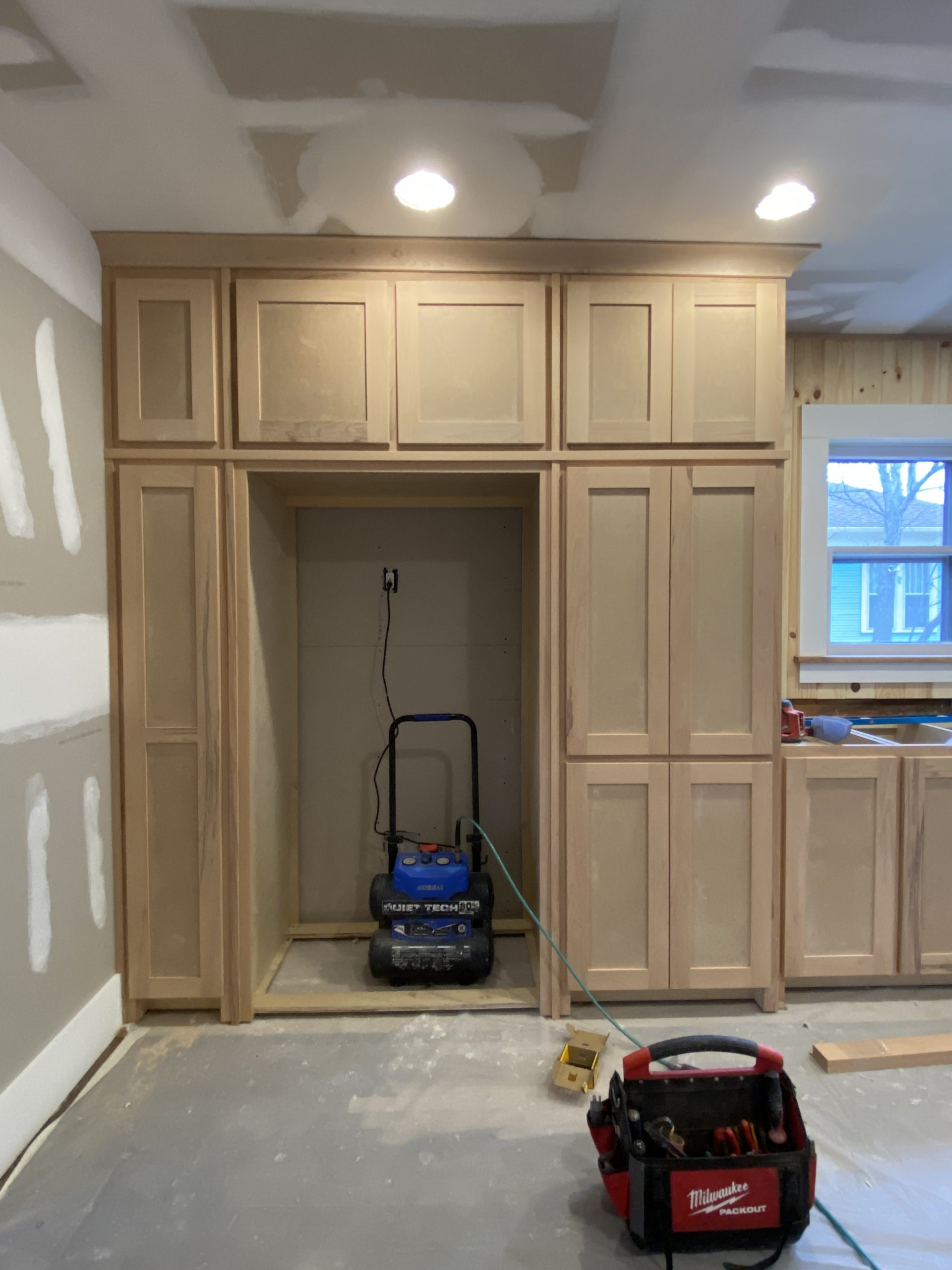
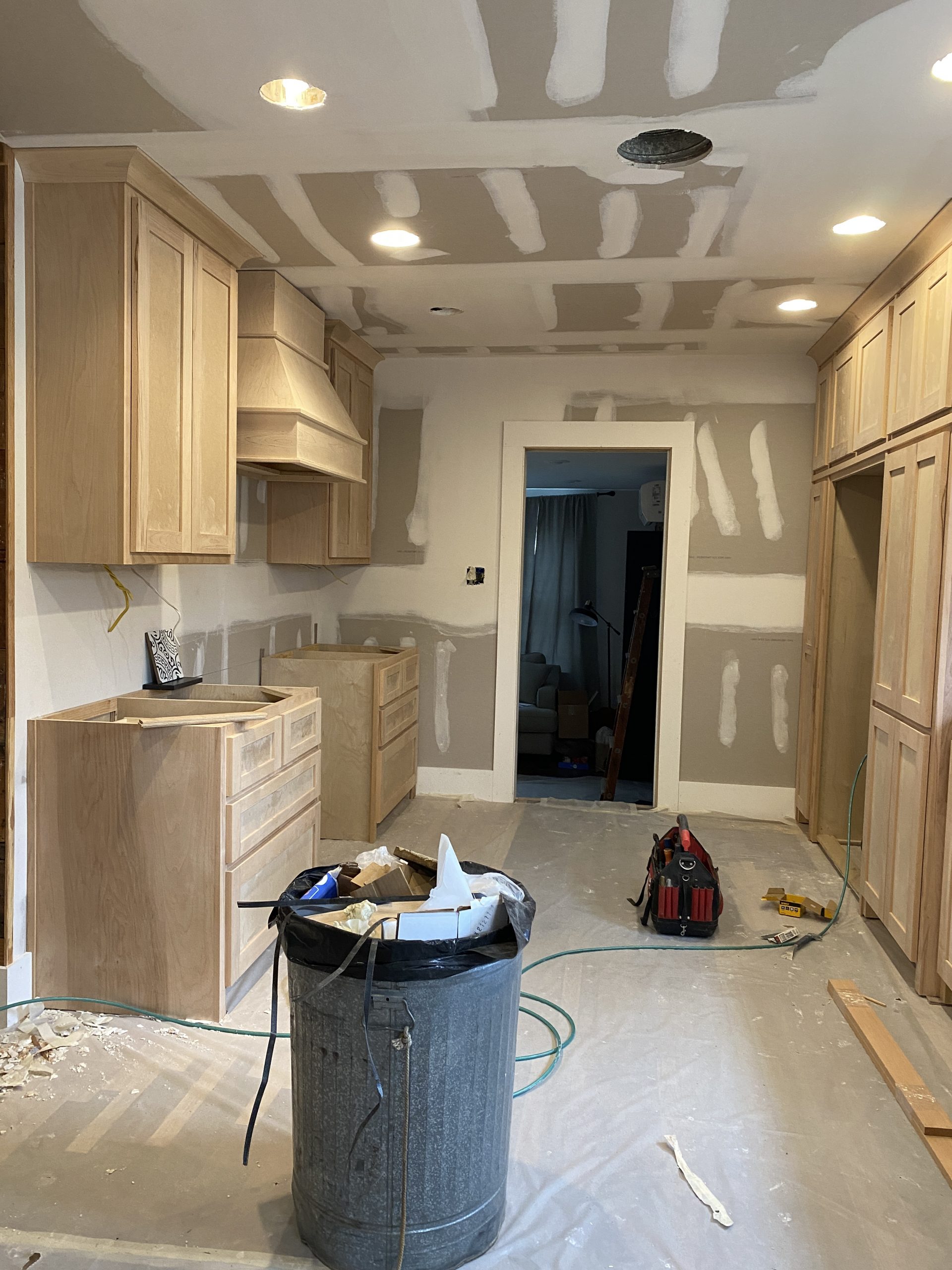
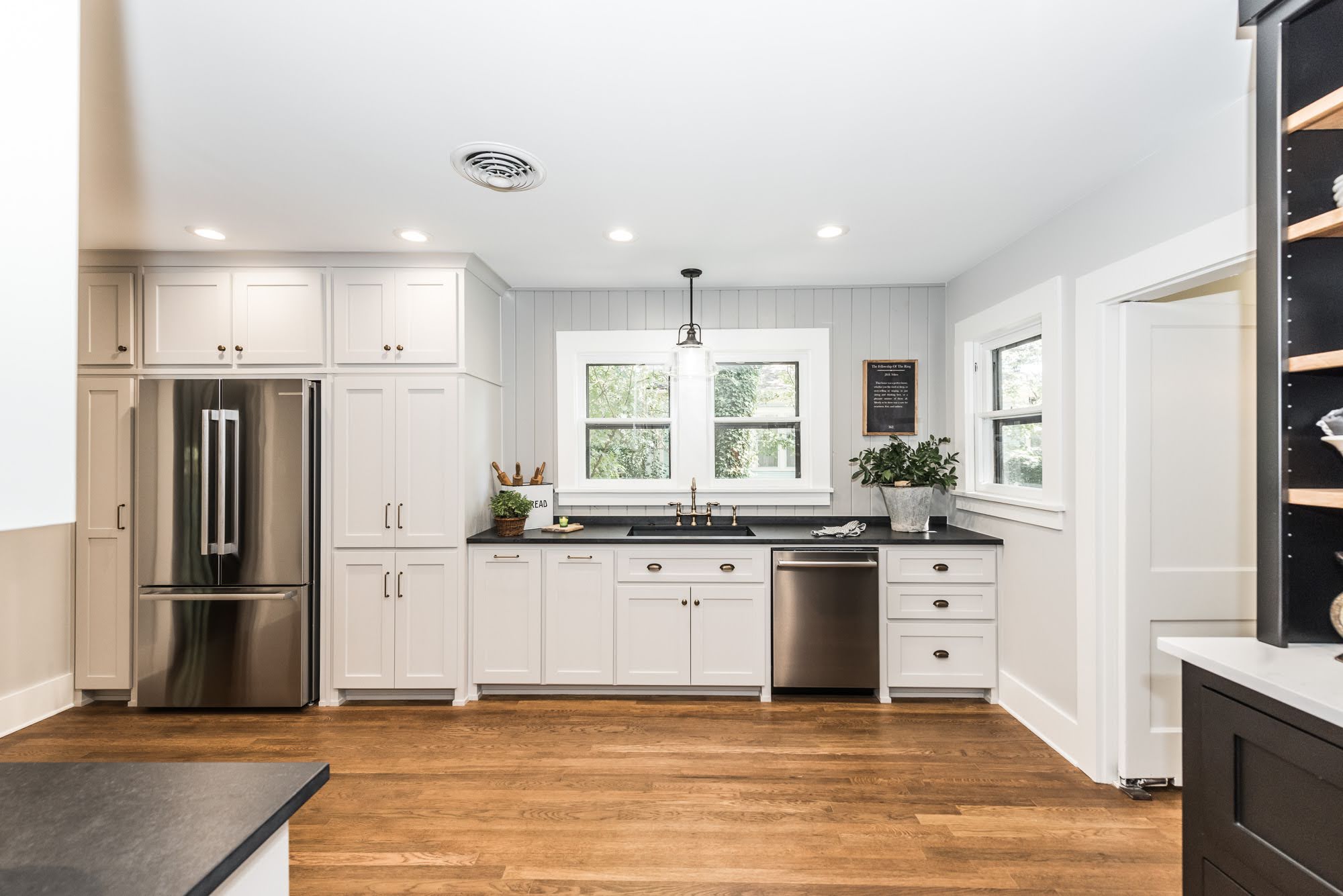
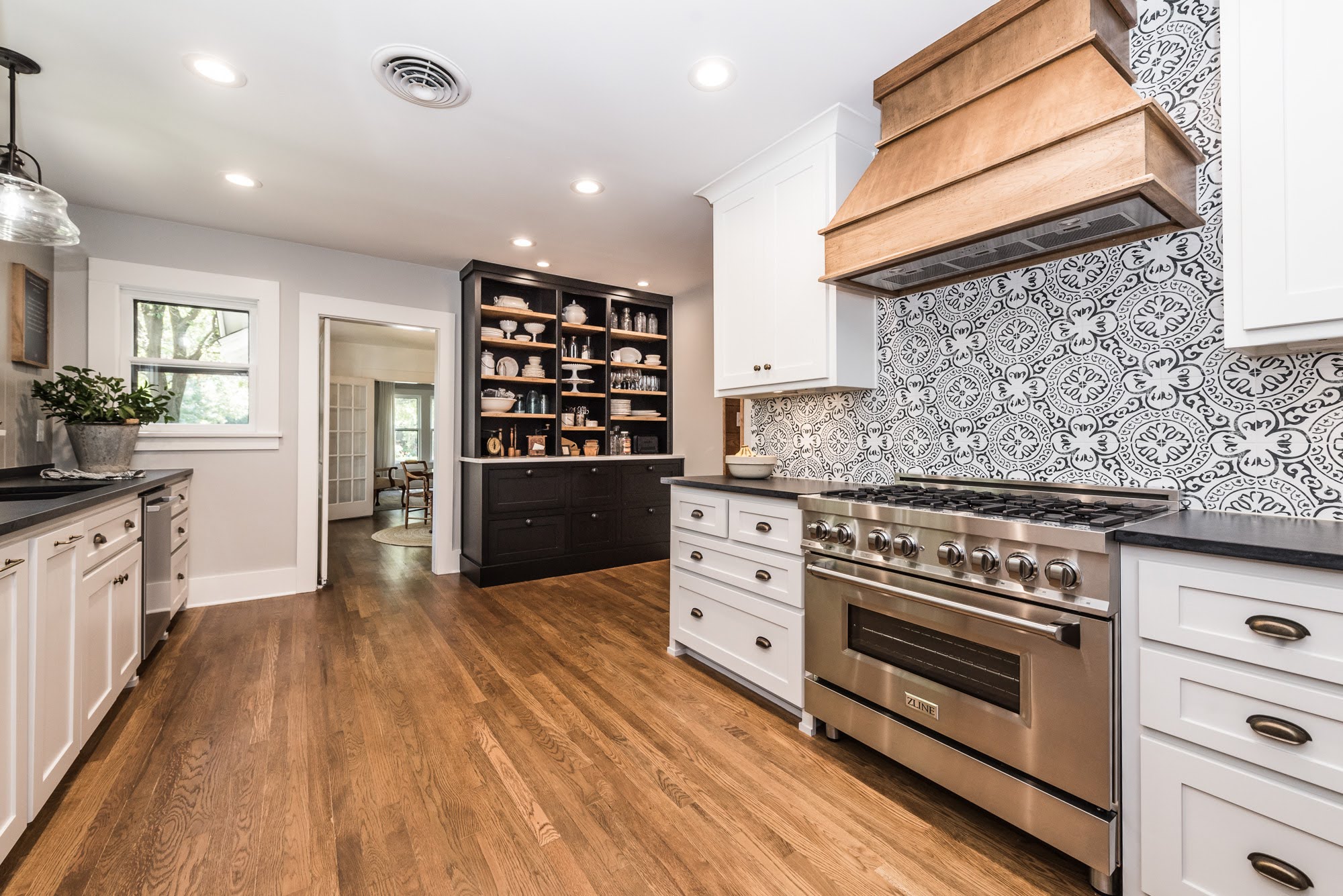
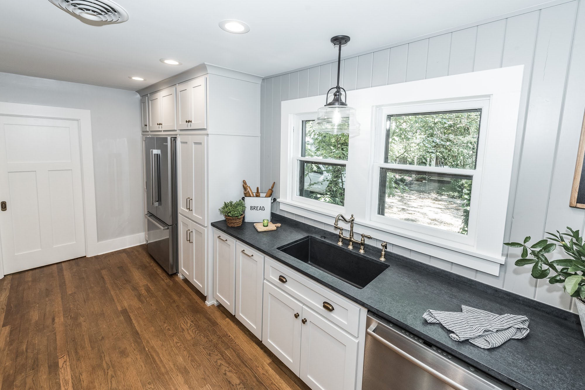
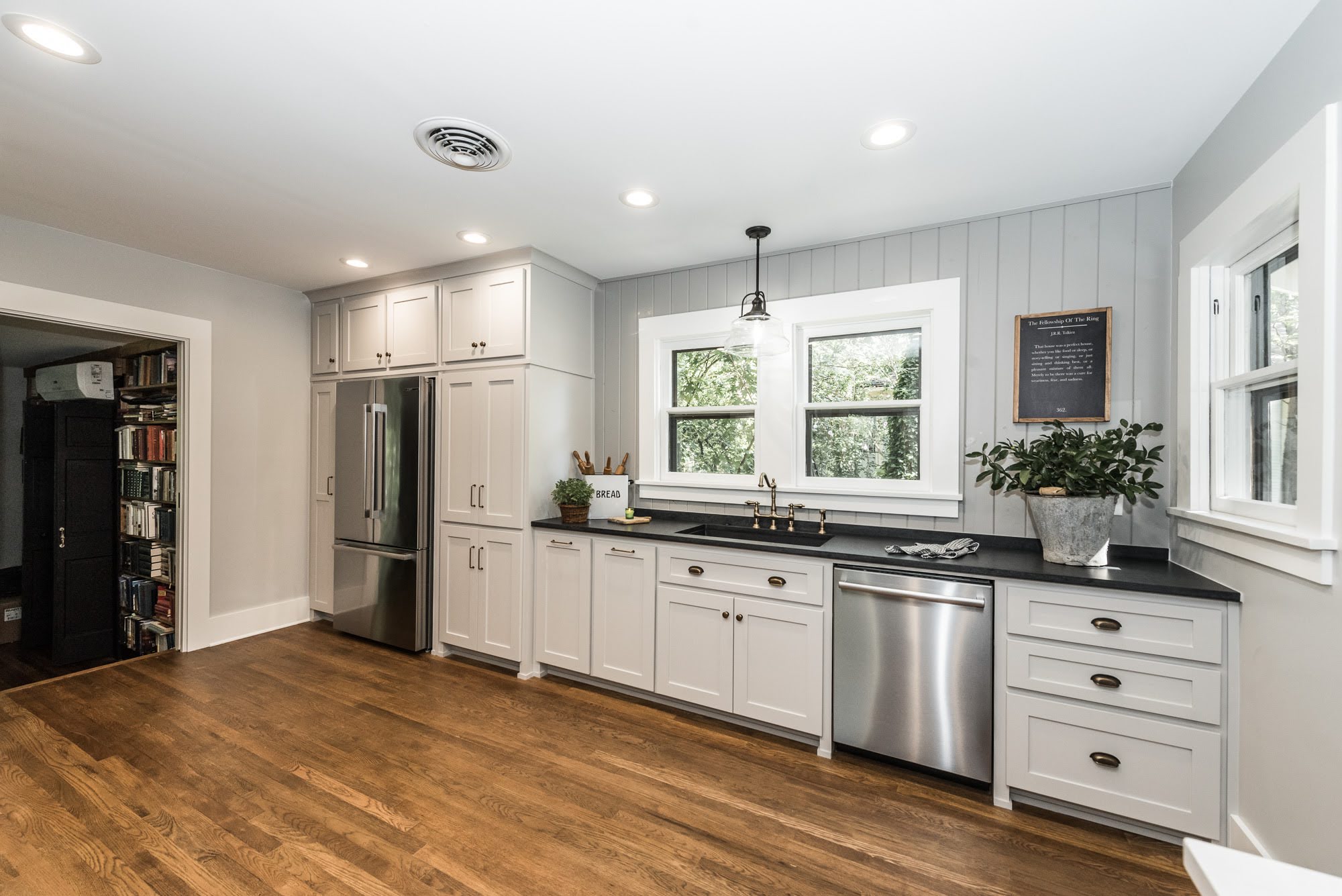
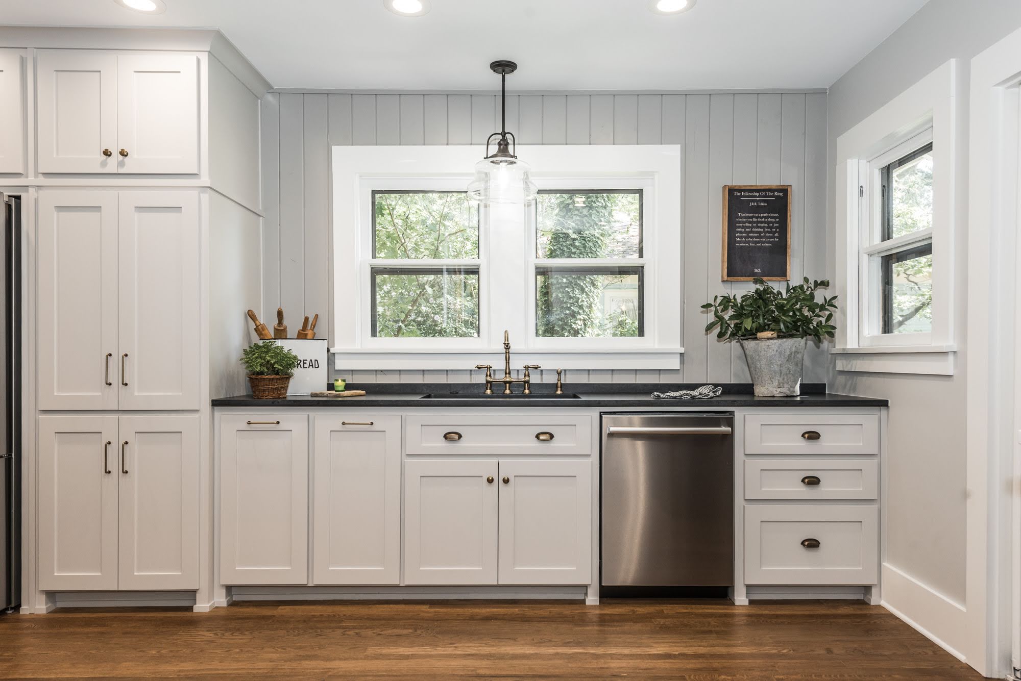
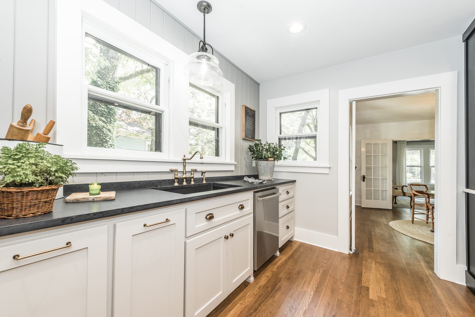
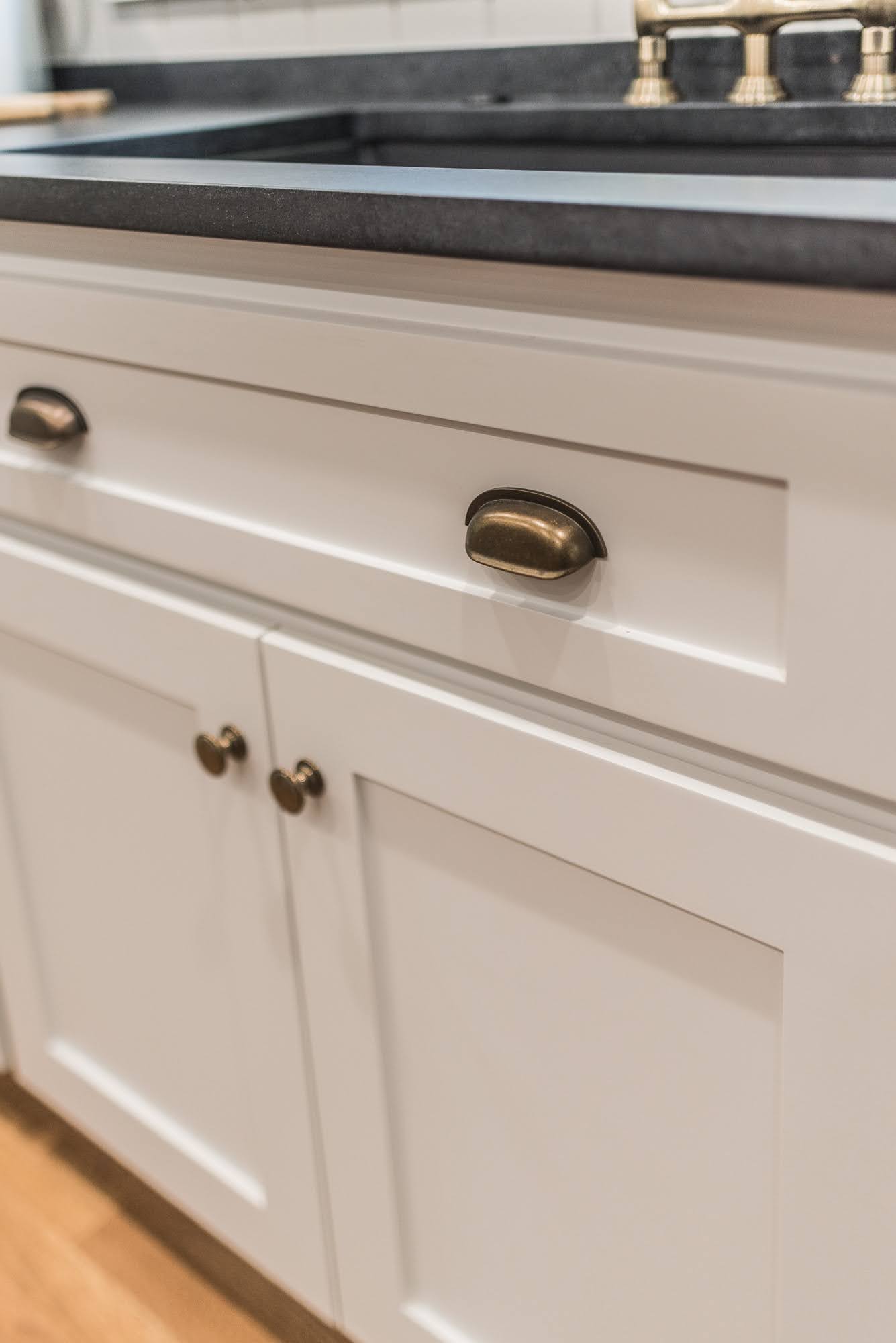
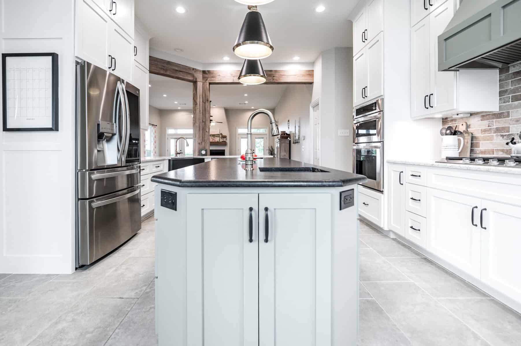
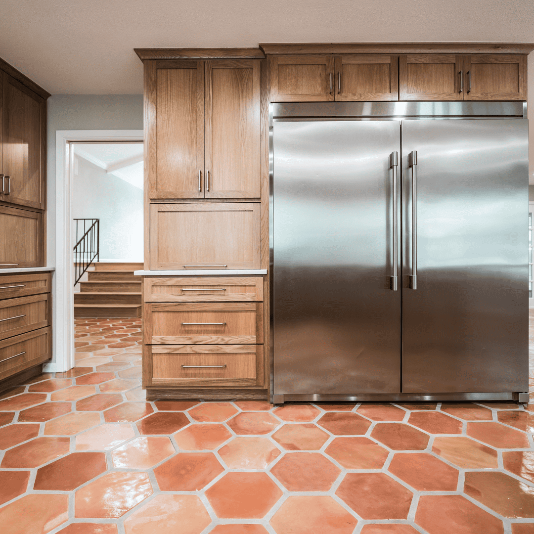
Custom cabinets were installed to allow for more storage. We extended the cabinets to the ceiling, increased the depth, and wrapped the refrigerator with storage. We also added a utility cabinet to the left of the fridge to house items like the broom, mop, and cleaning supplies: keeping them close, but hiding the mess… win-win! We improved the kitchen work triangle by swapping the placements of the stove and the refrigerator, which would allow for a less crowded workspace that had better flow. The original fridge was replaced with a brand new counter-depth, French-door refrigerator in stainless steel. Very nice!
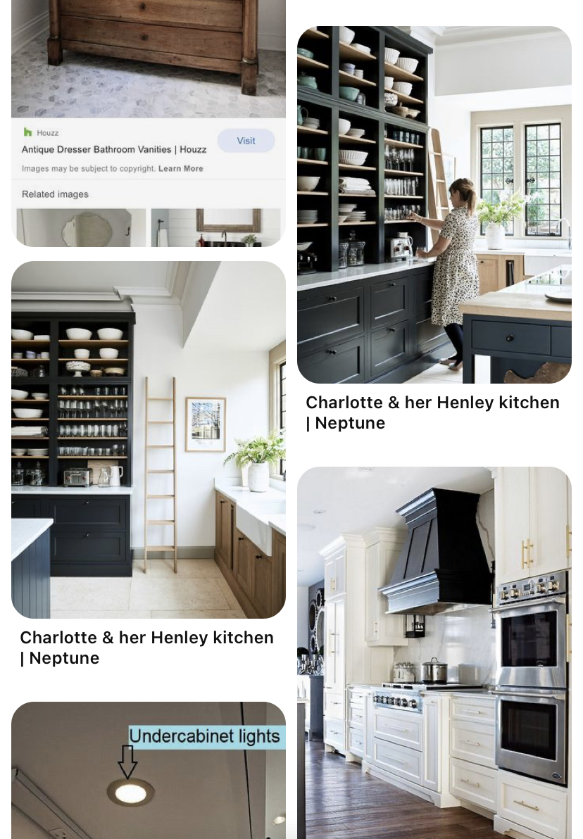
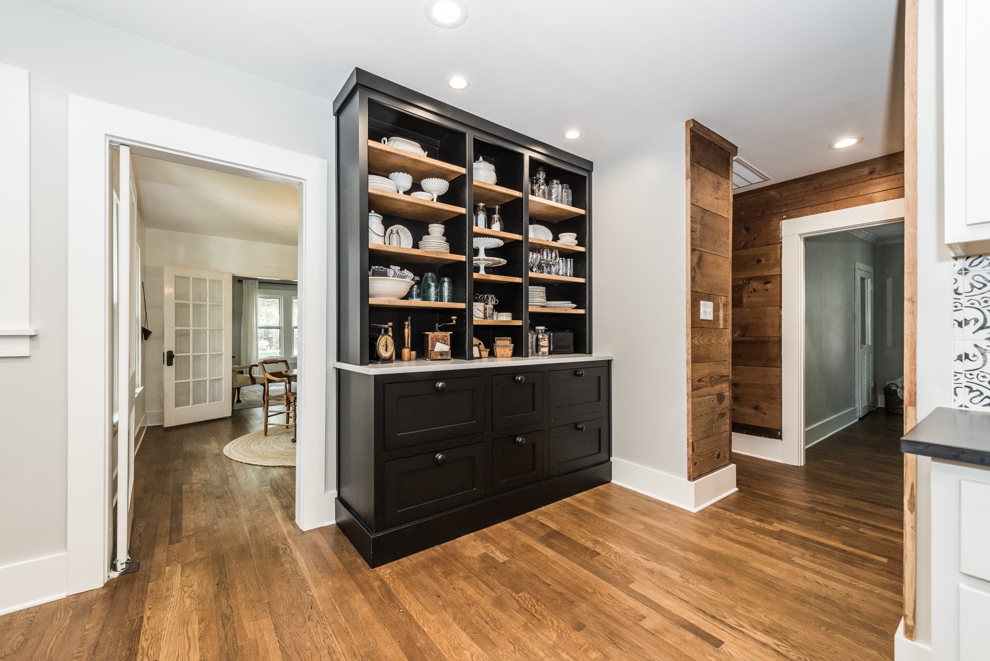
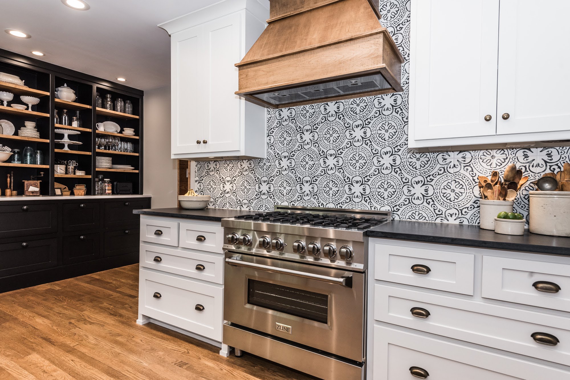
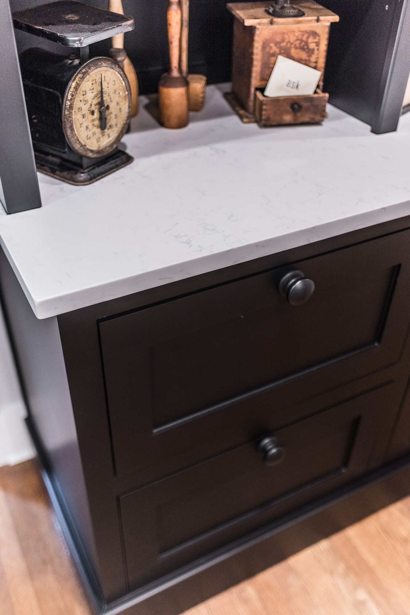
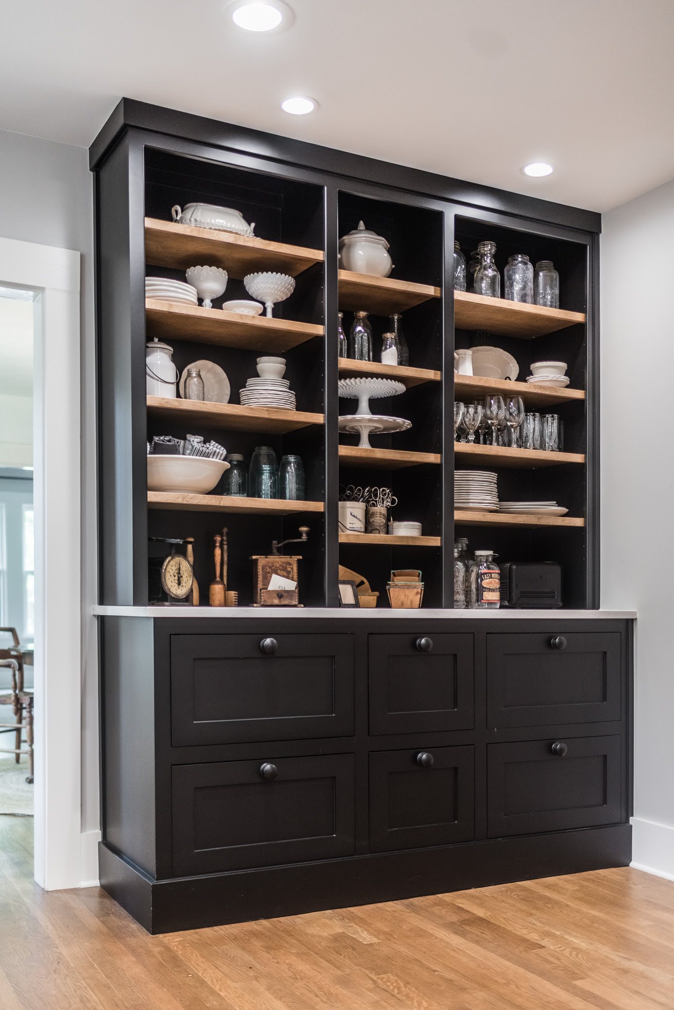
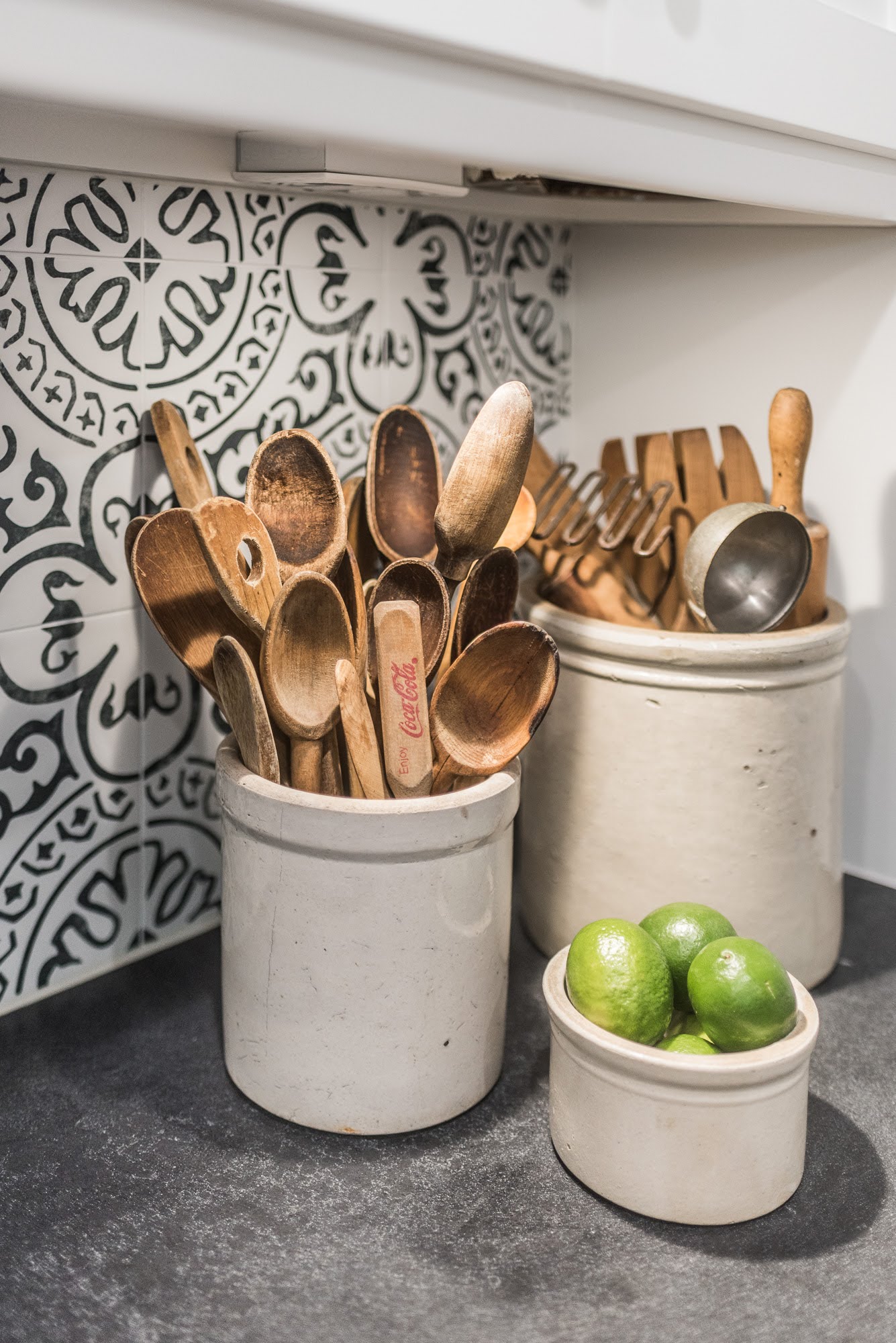
The focal point of the kitchen design was a sizable custom hutch, painted in a rich black color that proudly showcases an extensive collection of kitchen dishes, pieces, and wares. The color contrast adds a magnificent pop to the space and is such a unique addition. The shelving was custom stained to match a sample the client provided. The hutch counter was finished with a beautiful Carrera white marble. So pretty!
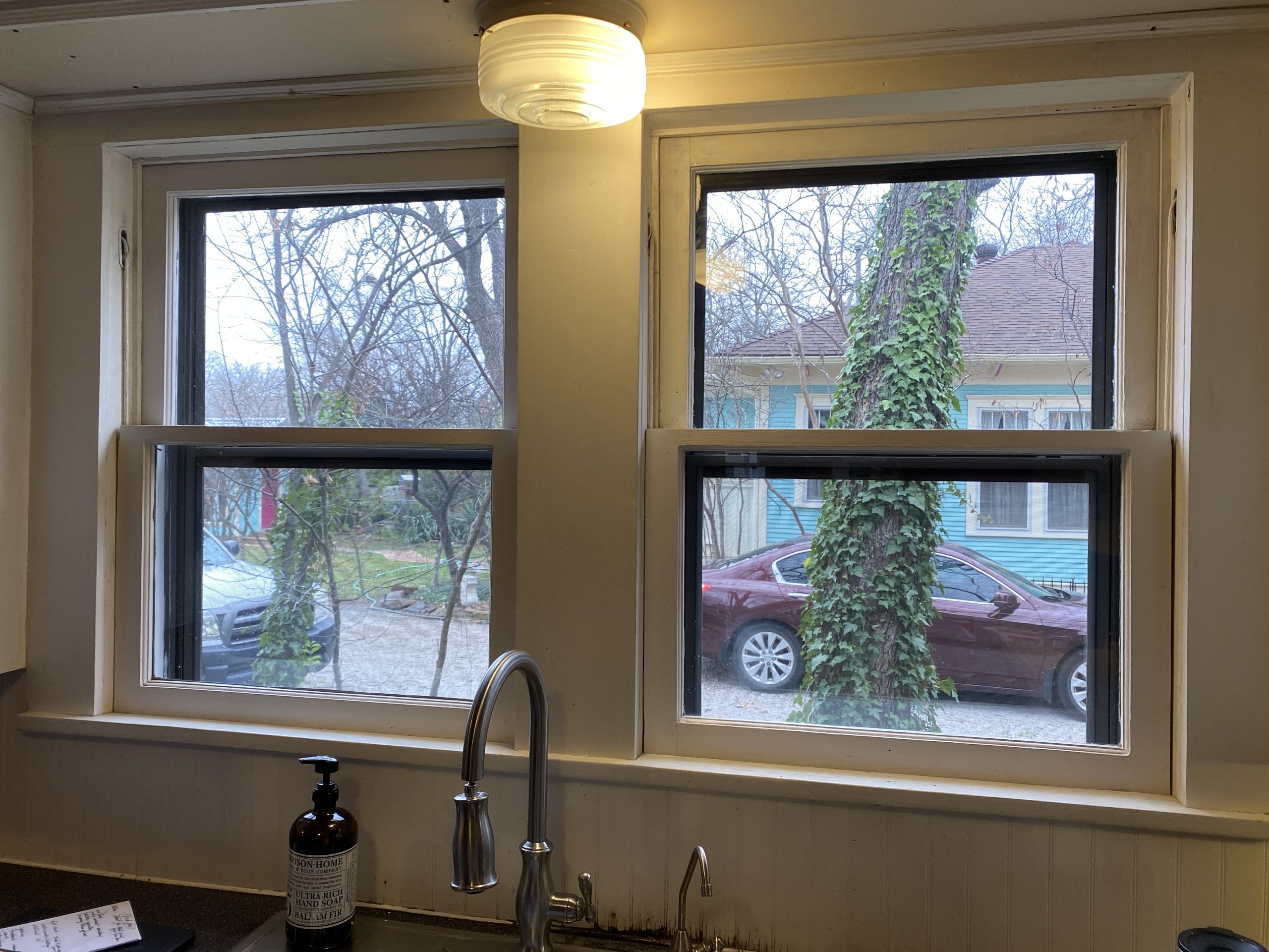
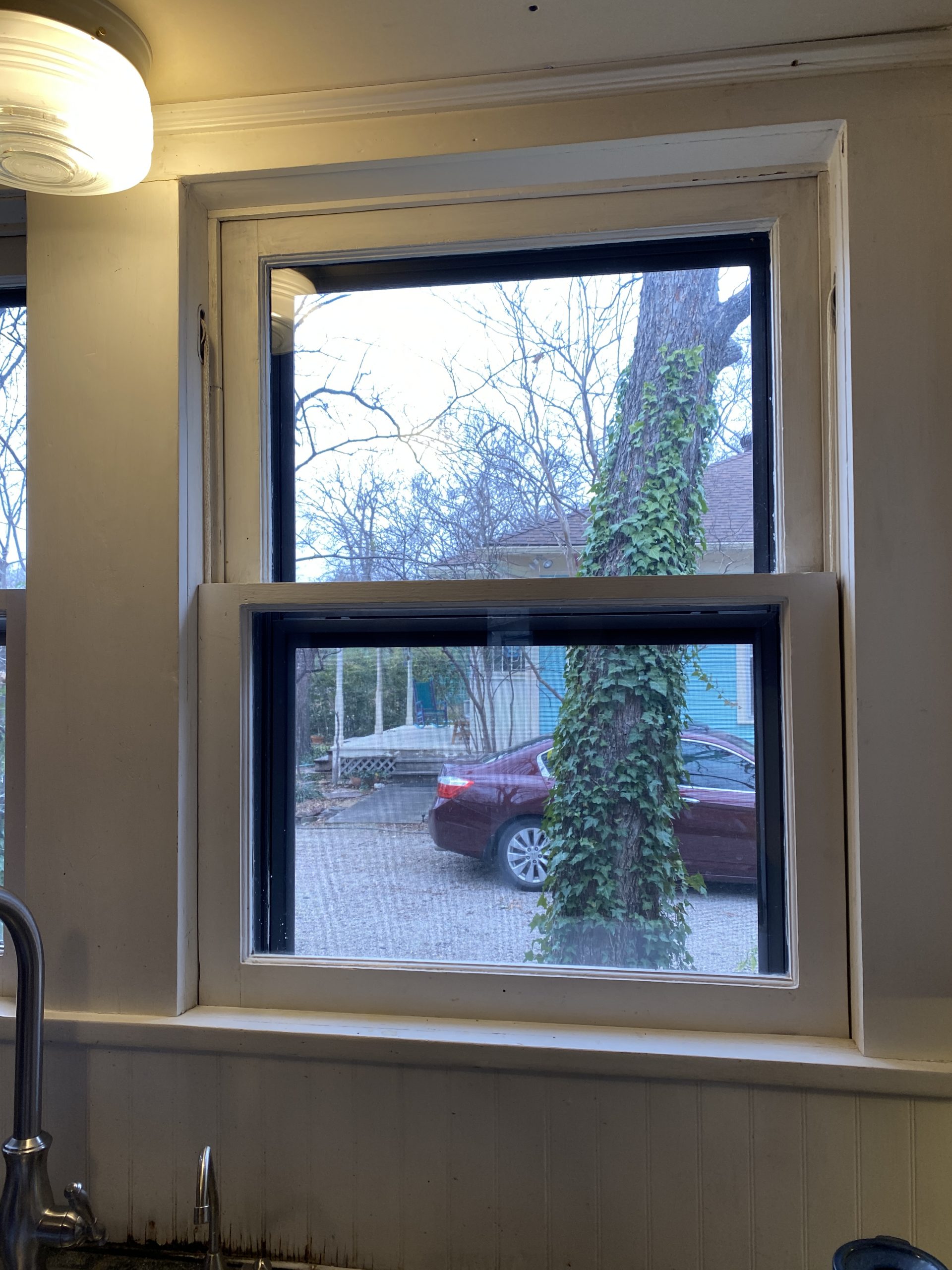
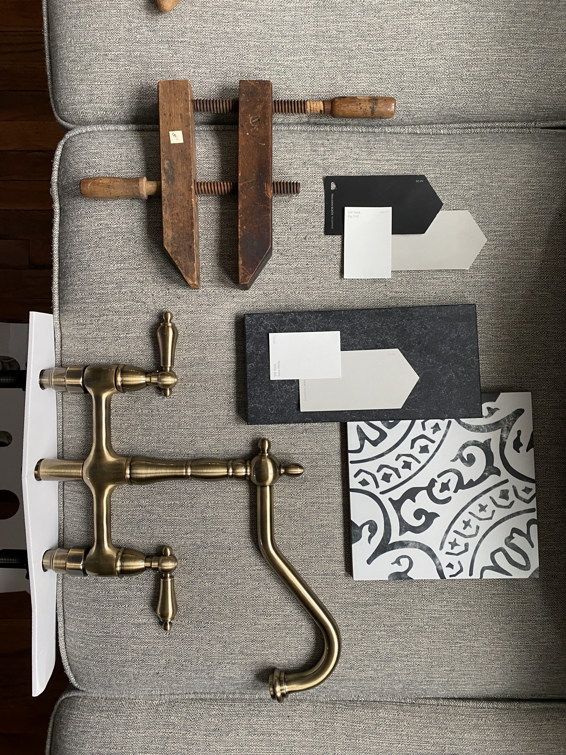
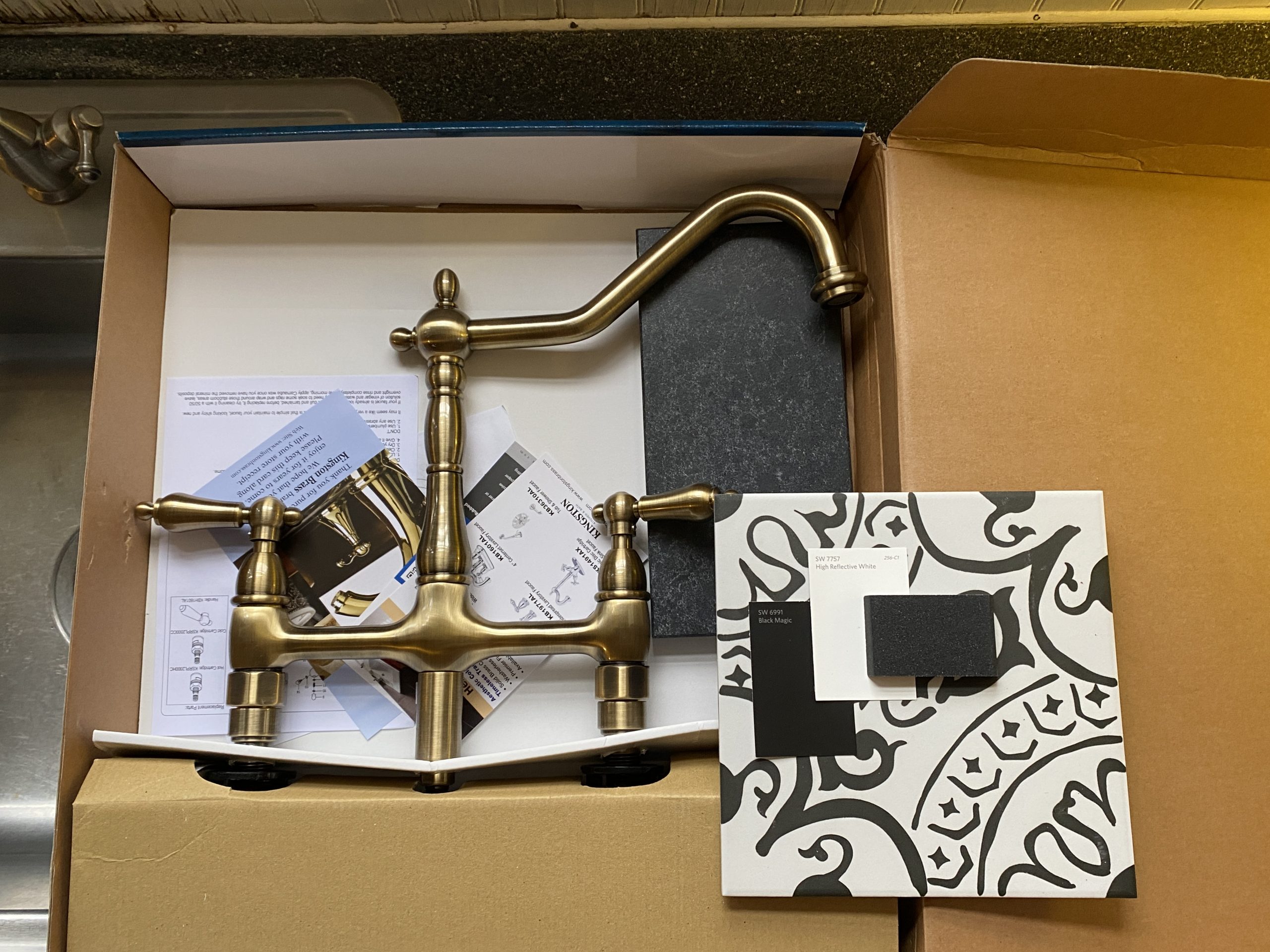
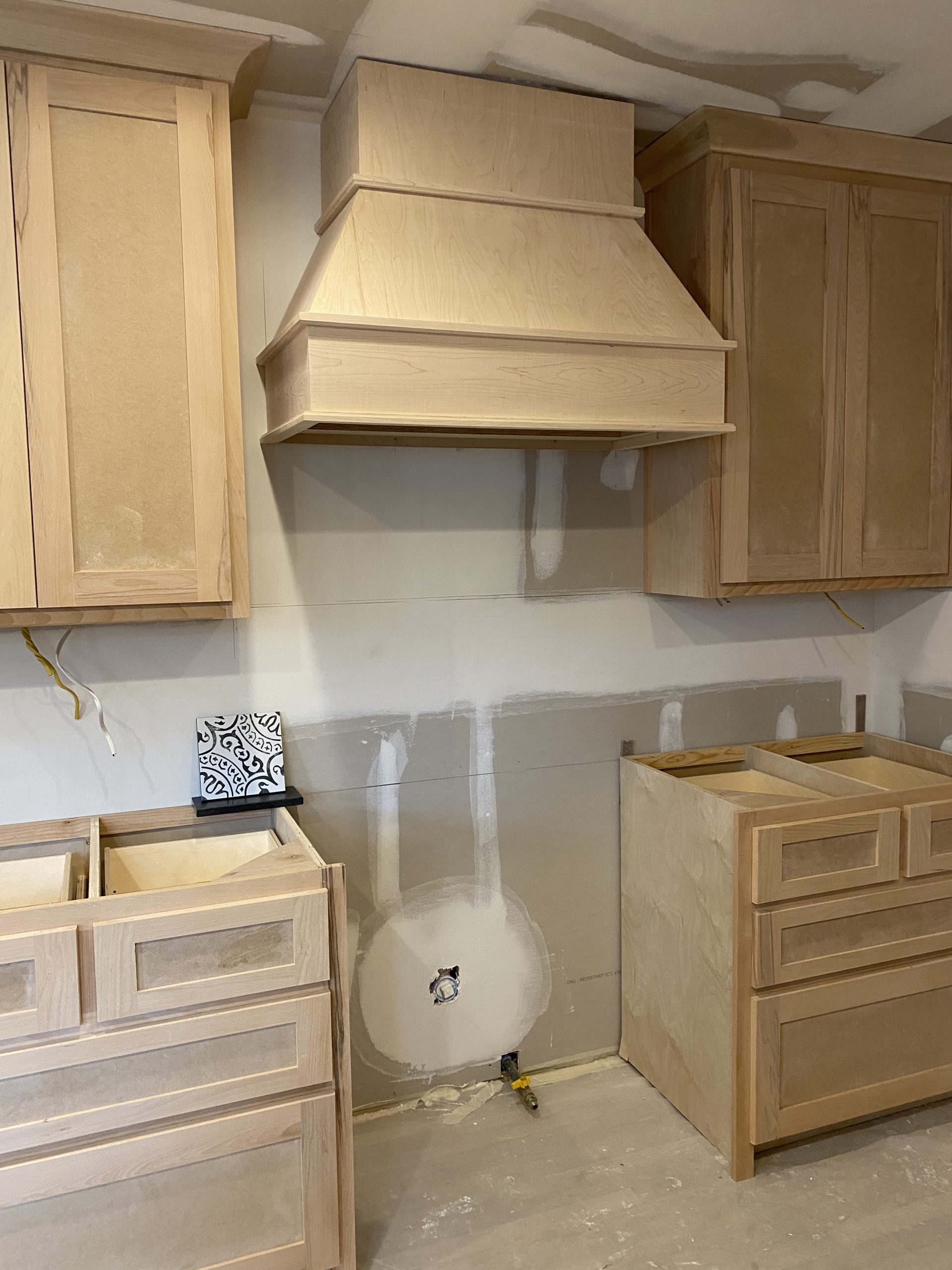
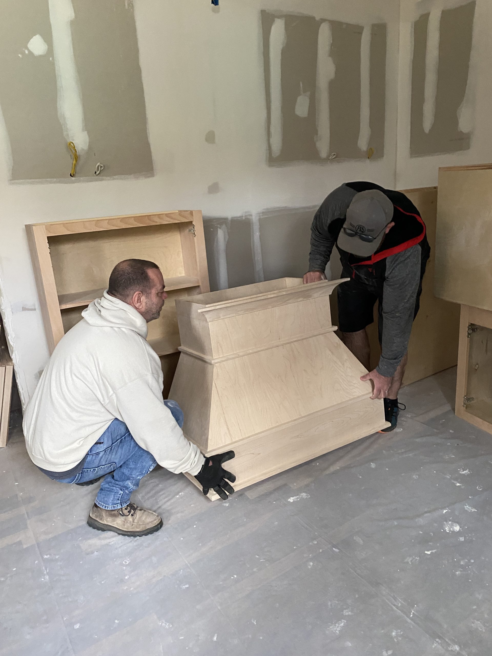
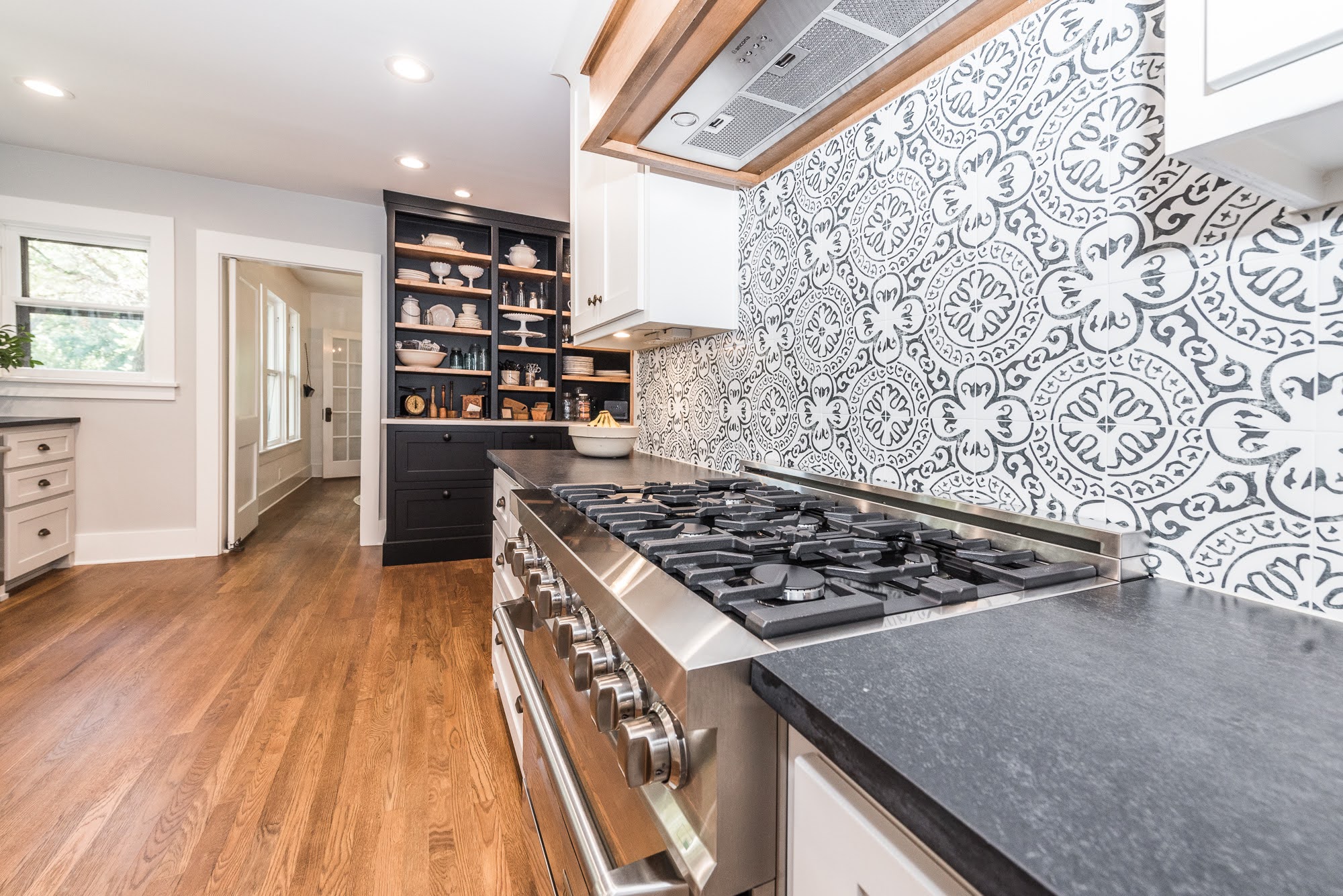
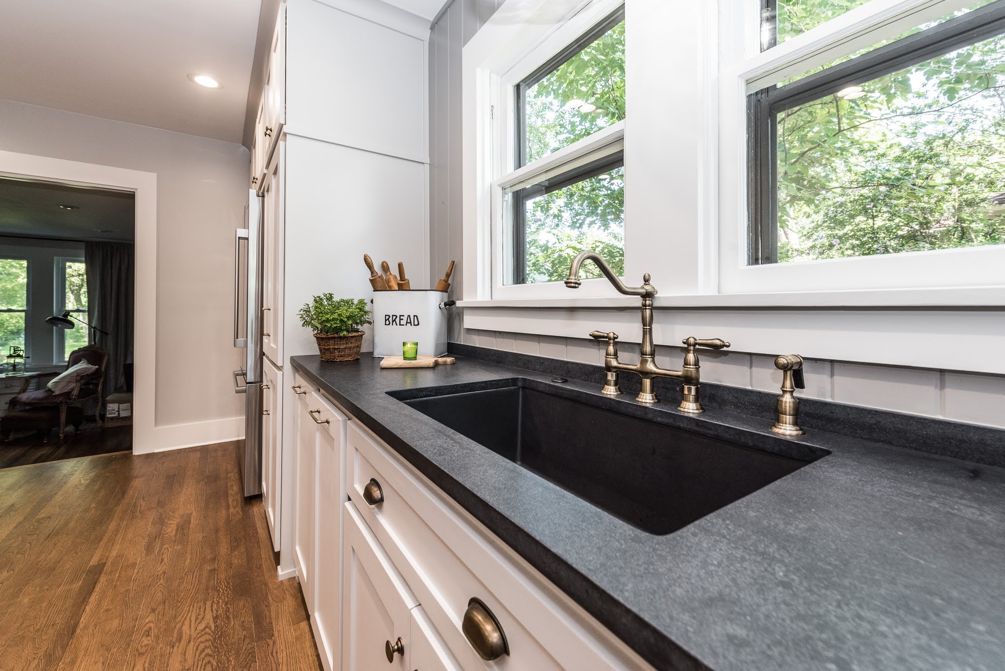
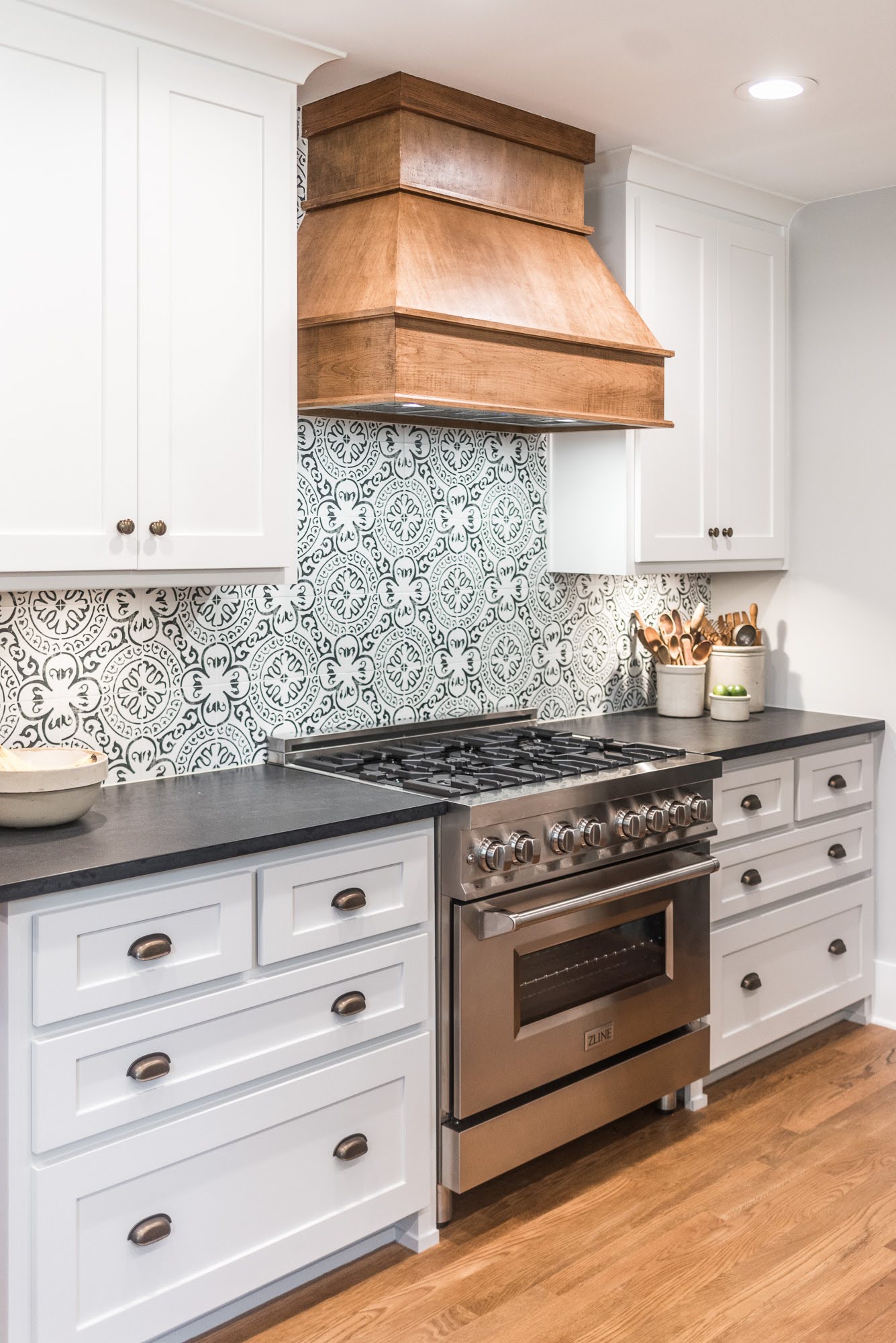
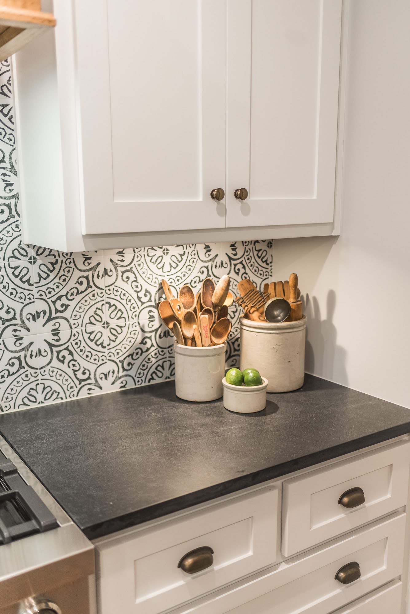
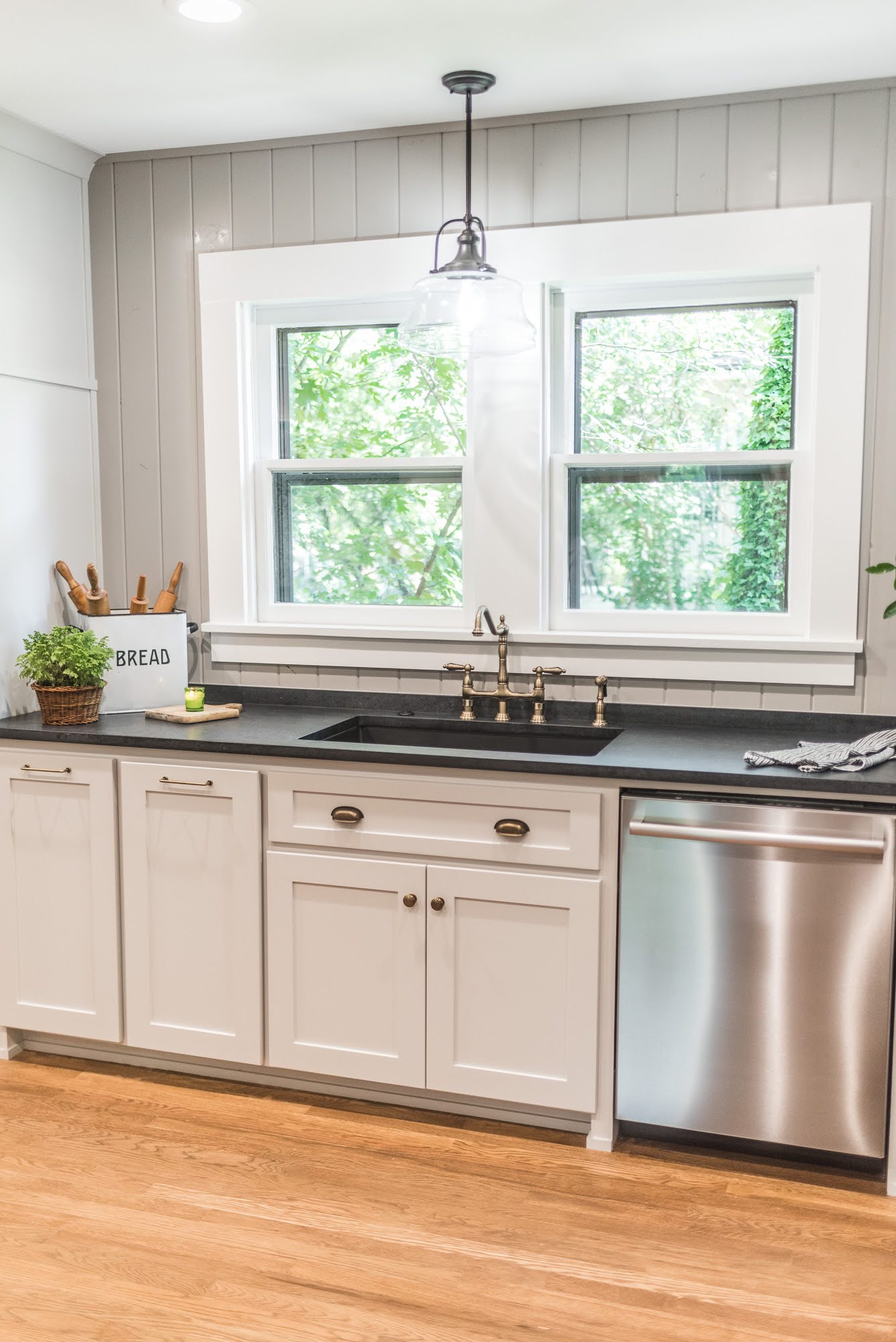
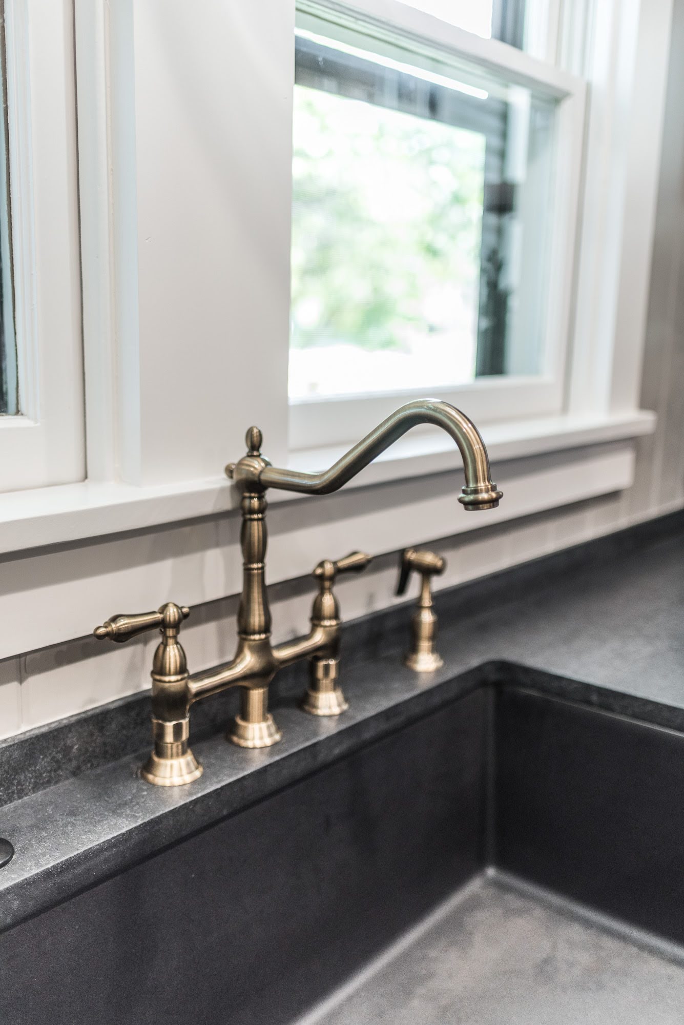
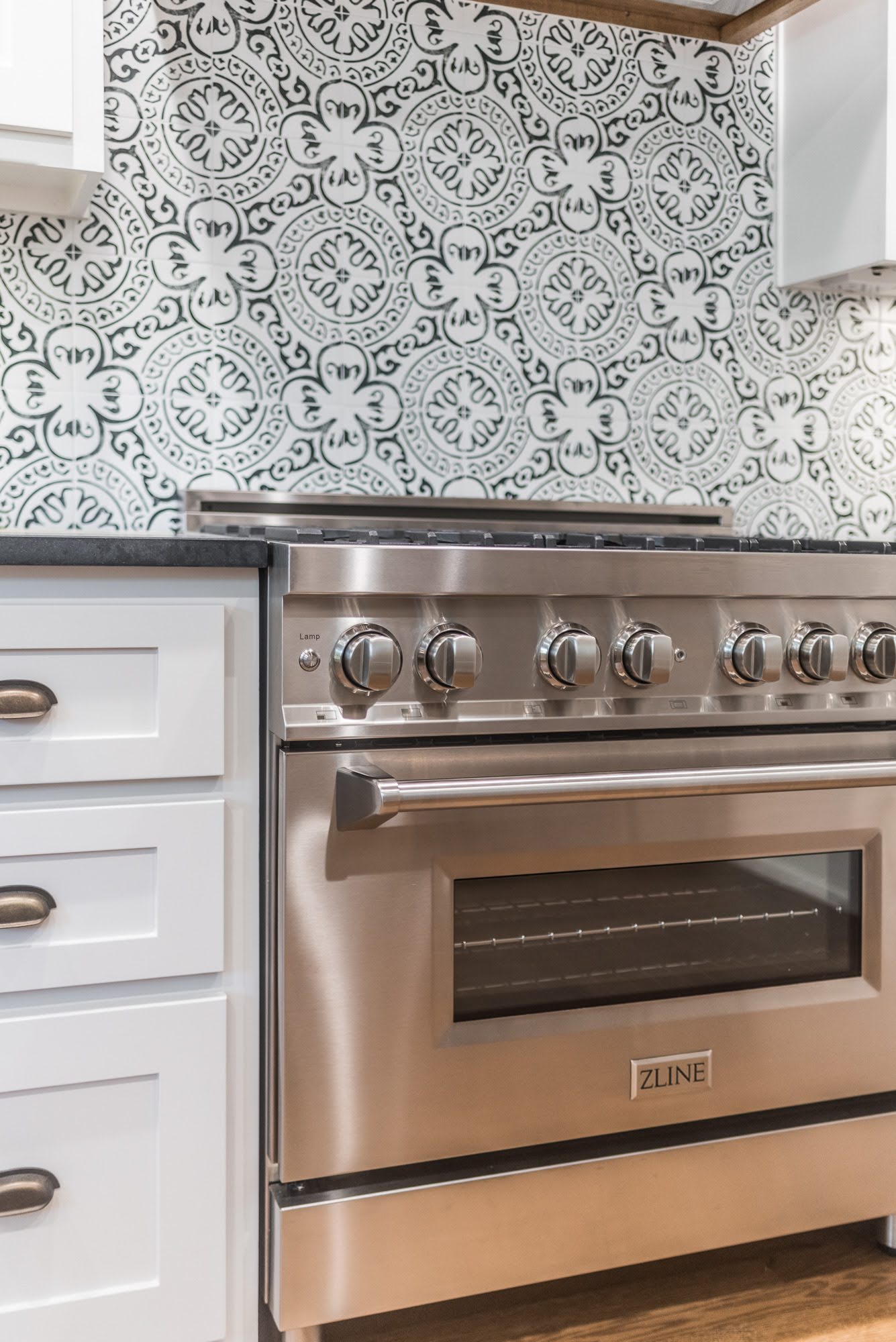
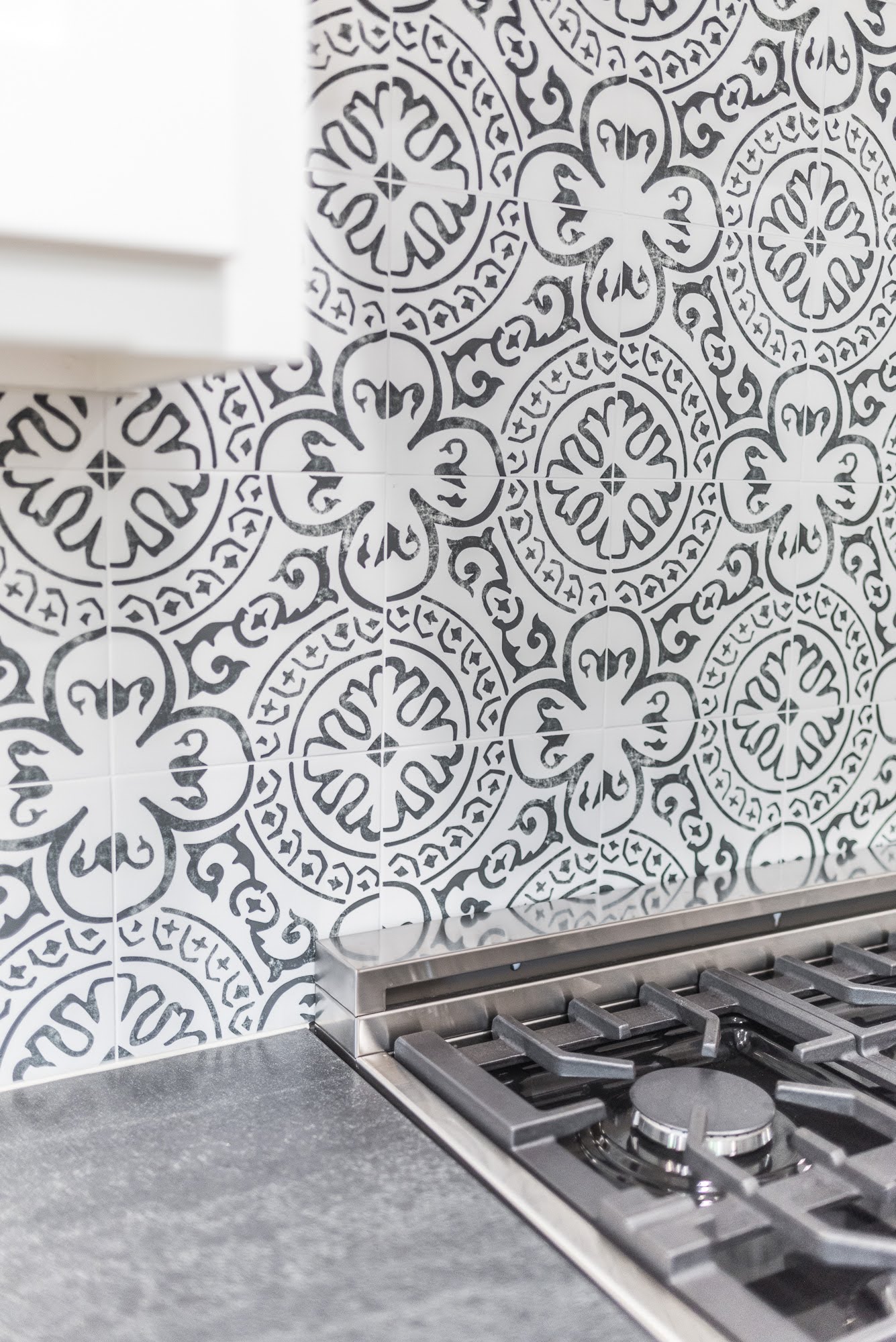
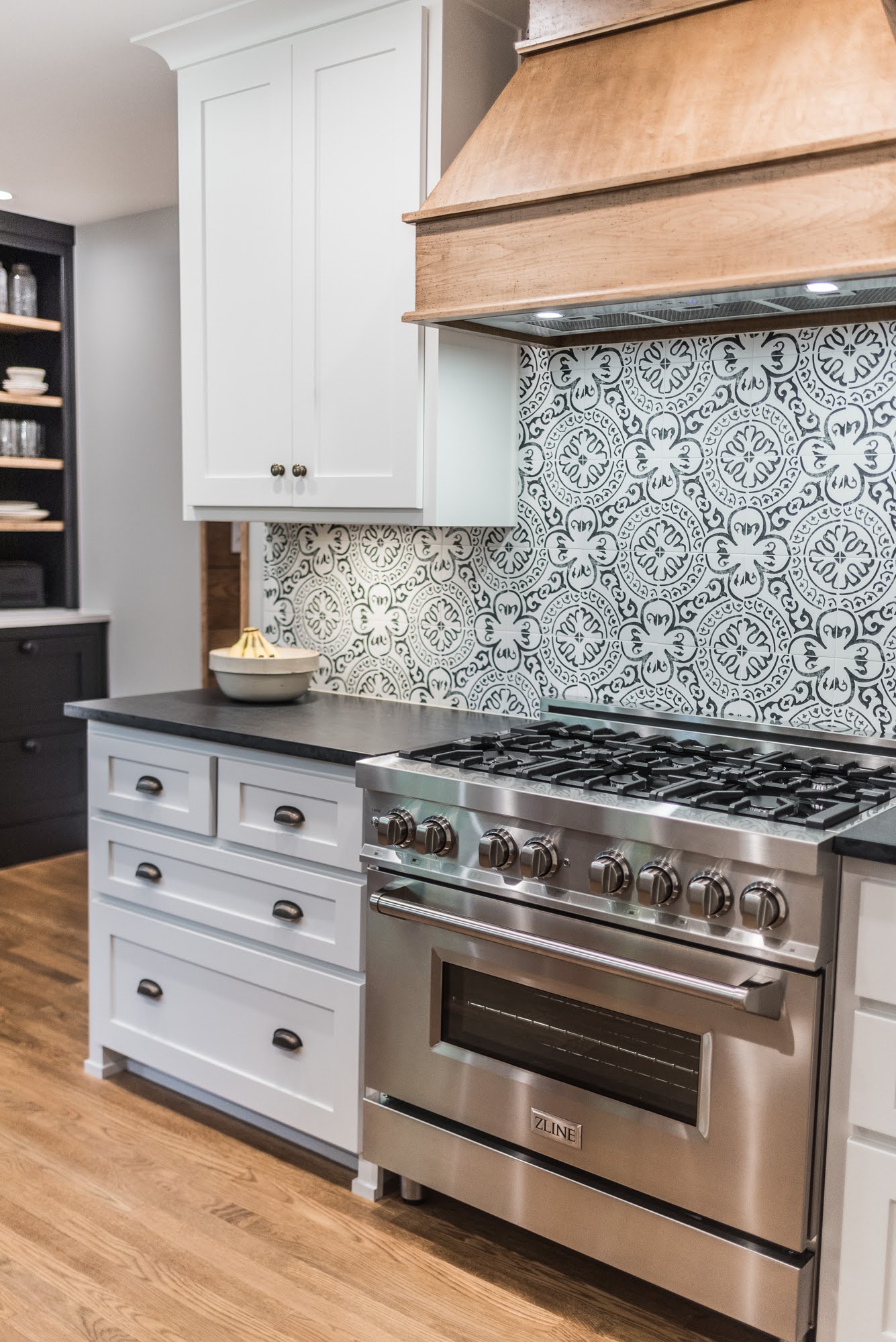
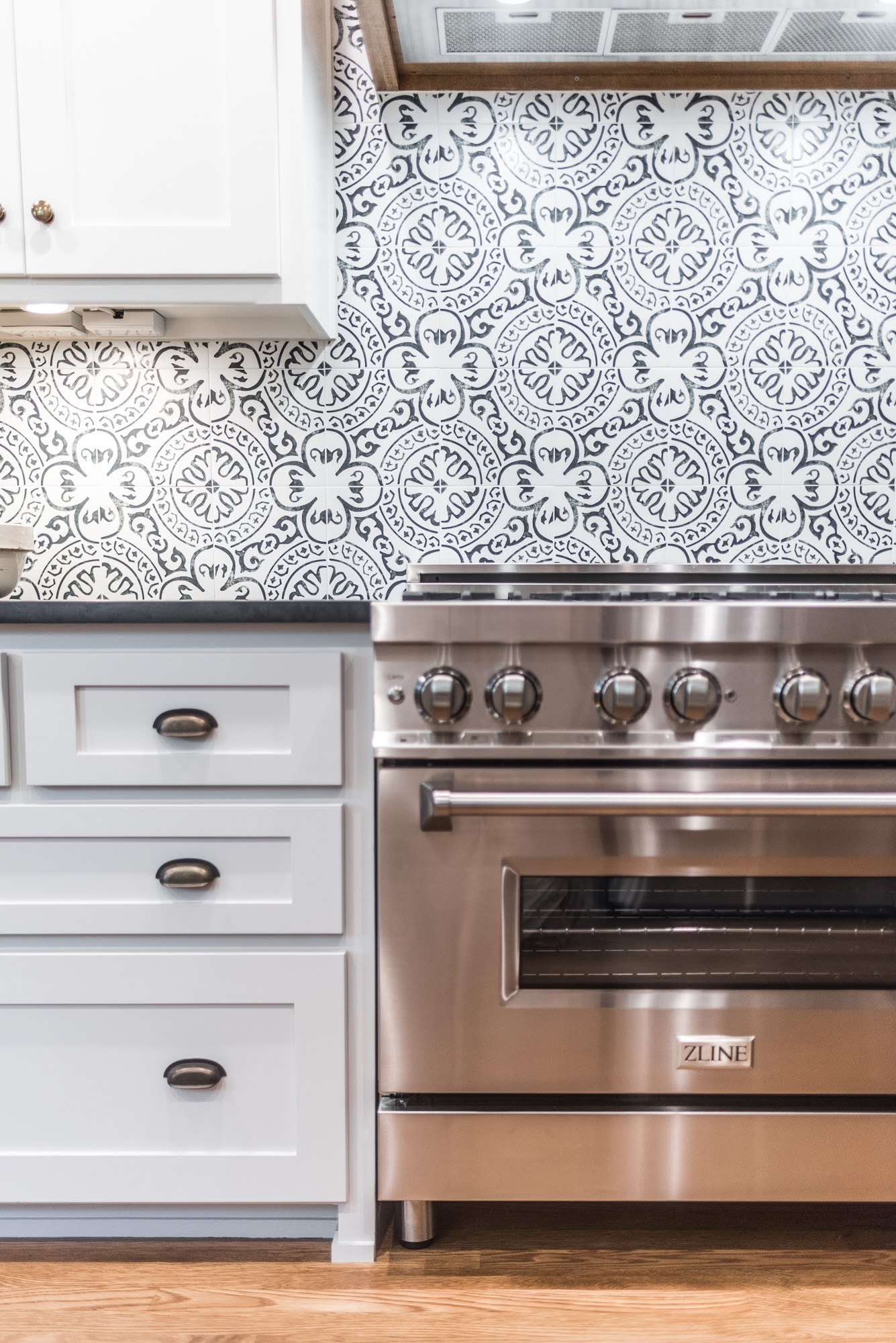
The specialty patterned cement-tile backsplash behind the stove was a powerful secondary focal point of the kitchen design adding fun, interest, and personality to the brand-new kitchen remodel. The stove was adorned with a custom-built range hood and stained to compliment the floors. The traffic flow through the area was greatly improved and the view out the newly cased sink window could make one even desire to be washing dishes!
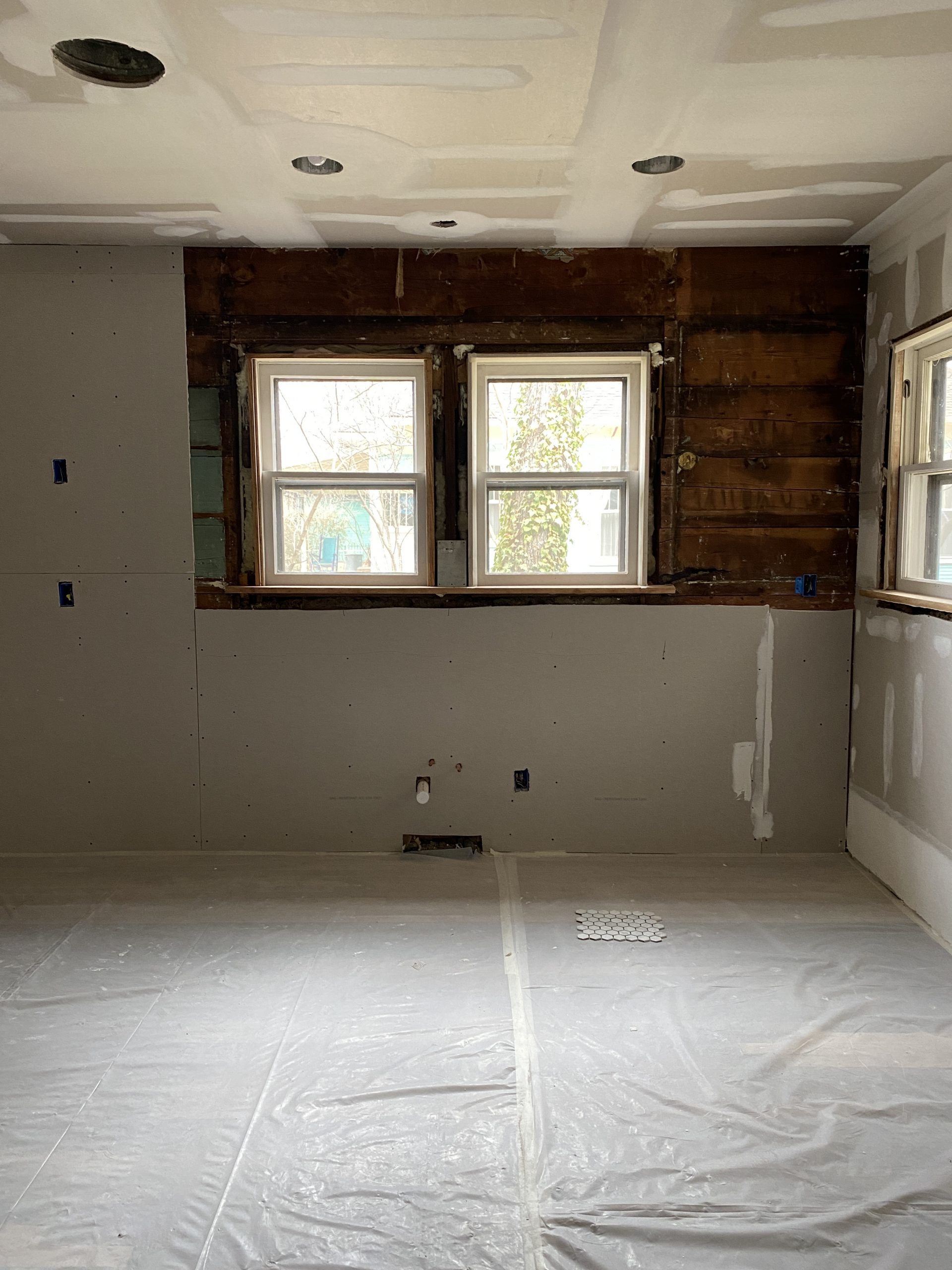
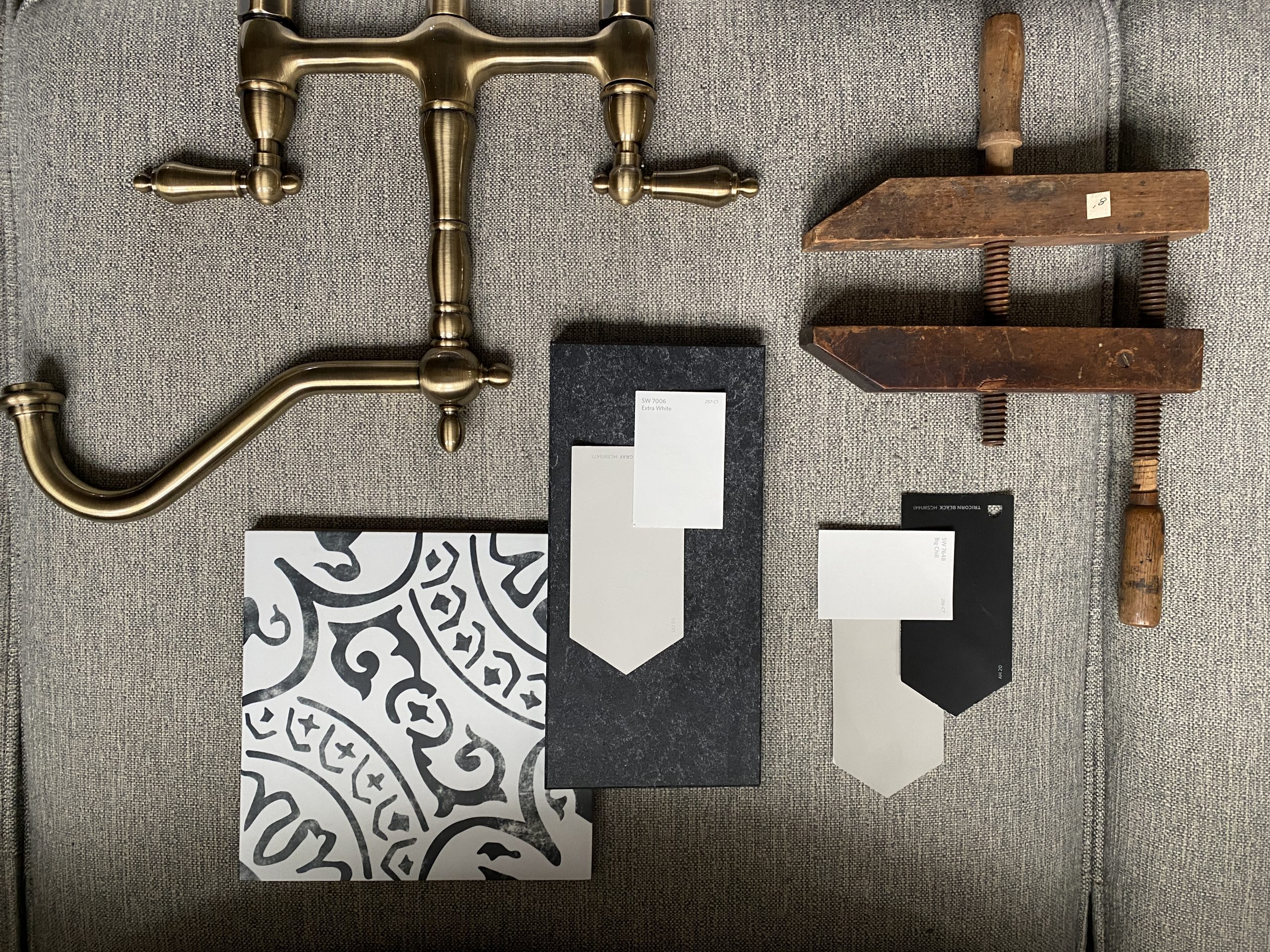
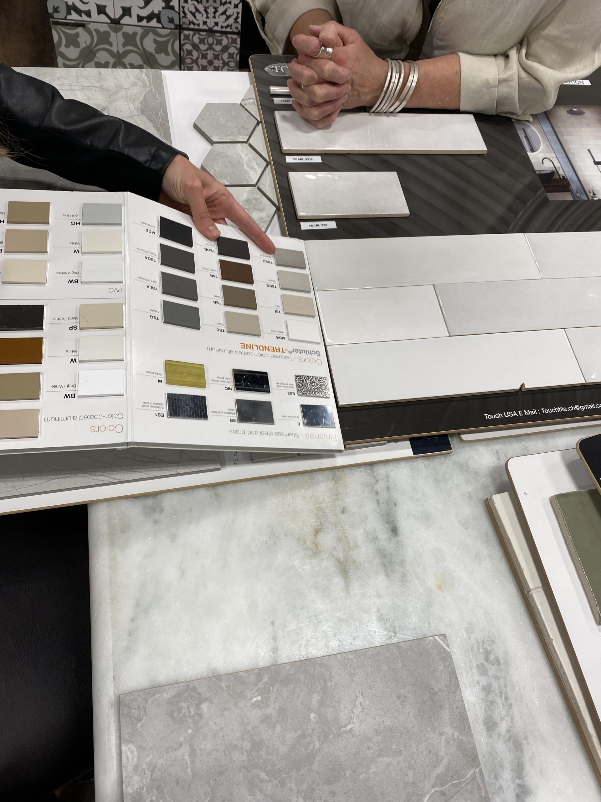
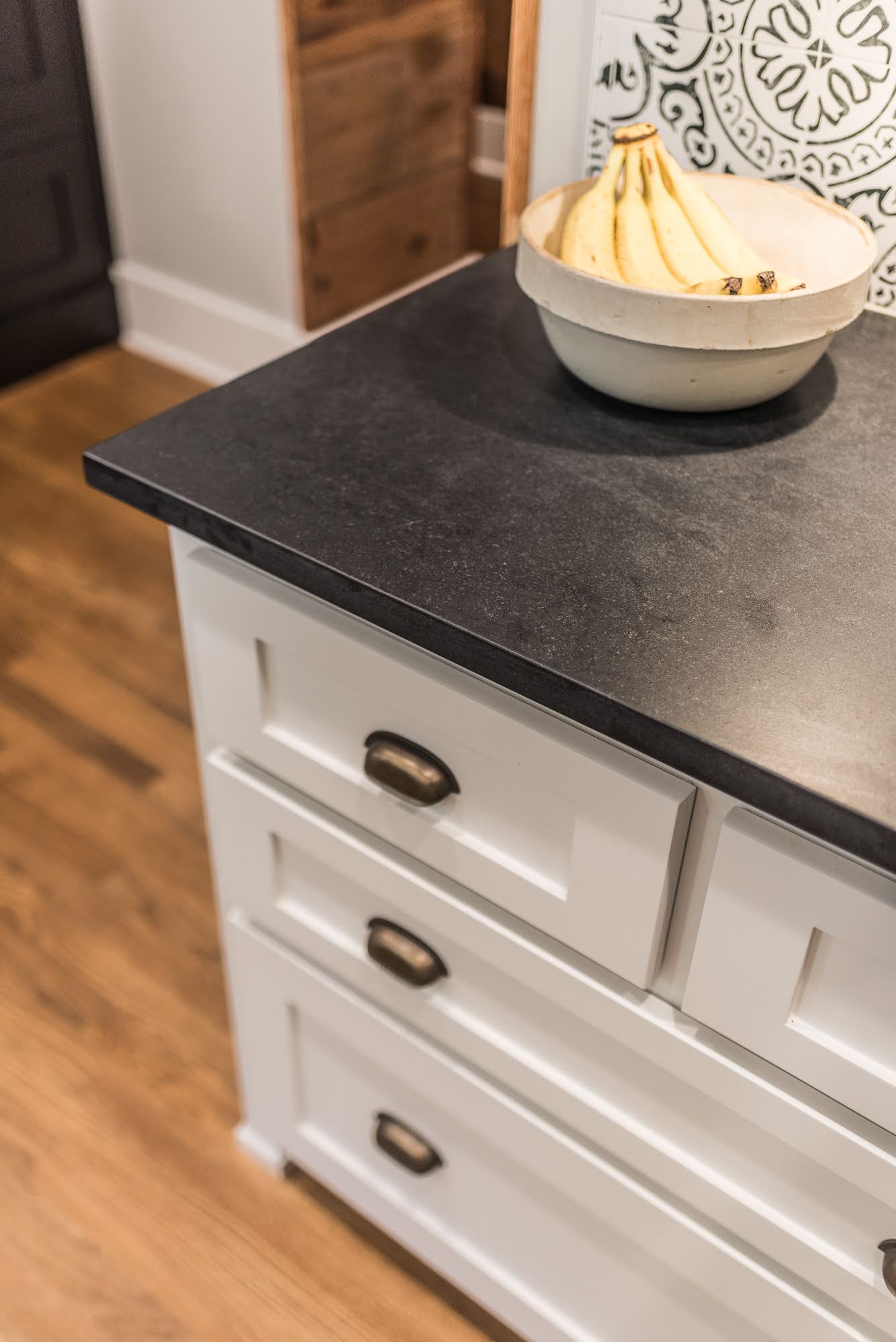
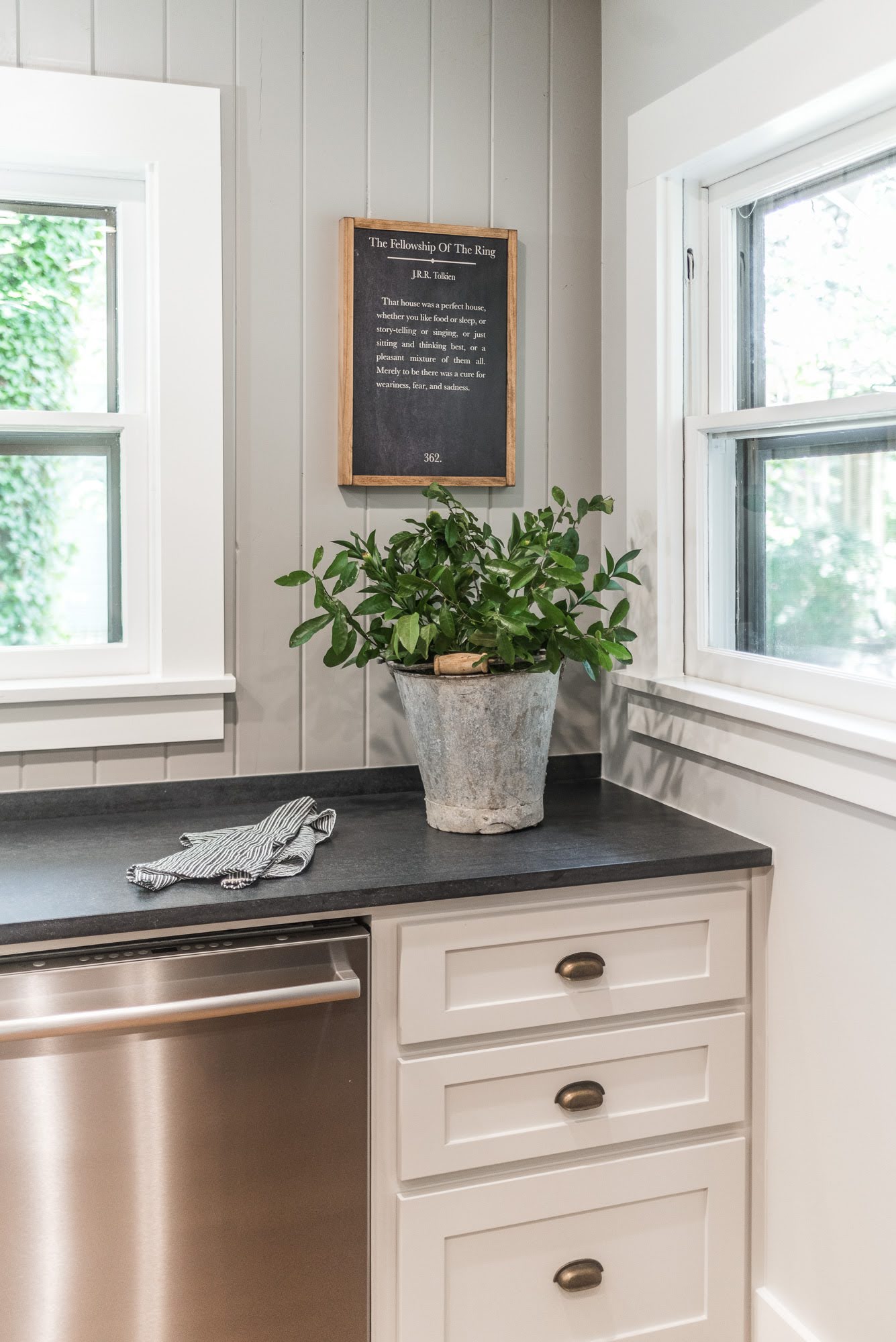
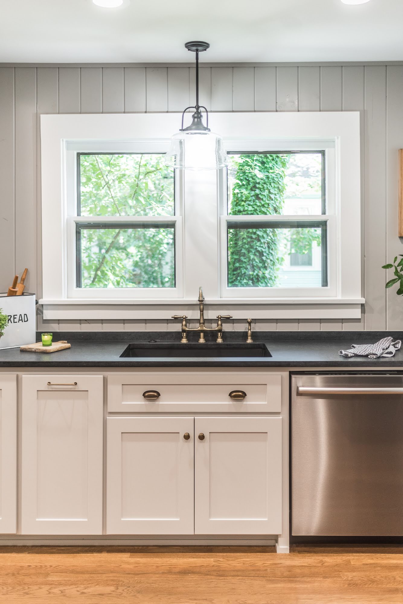
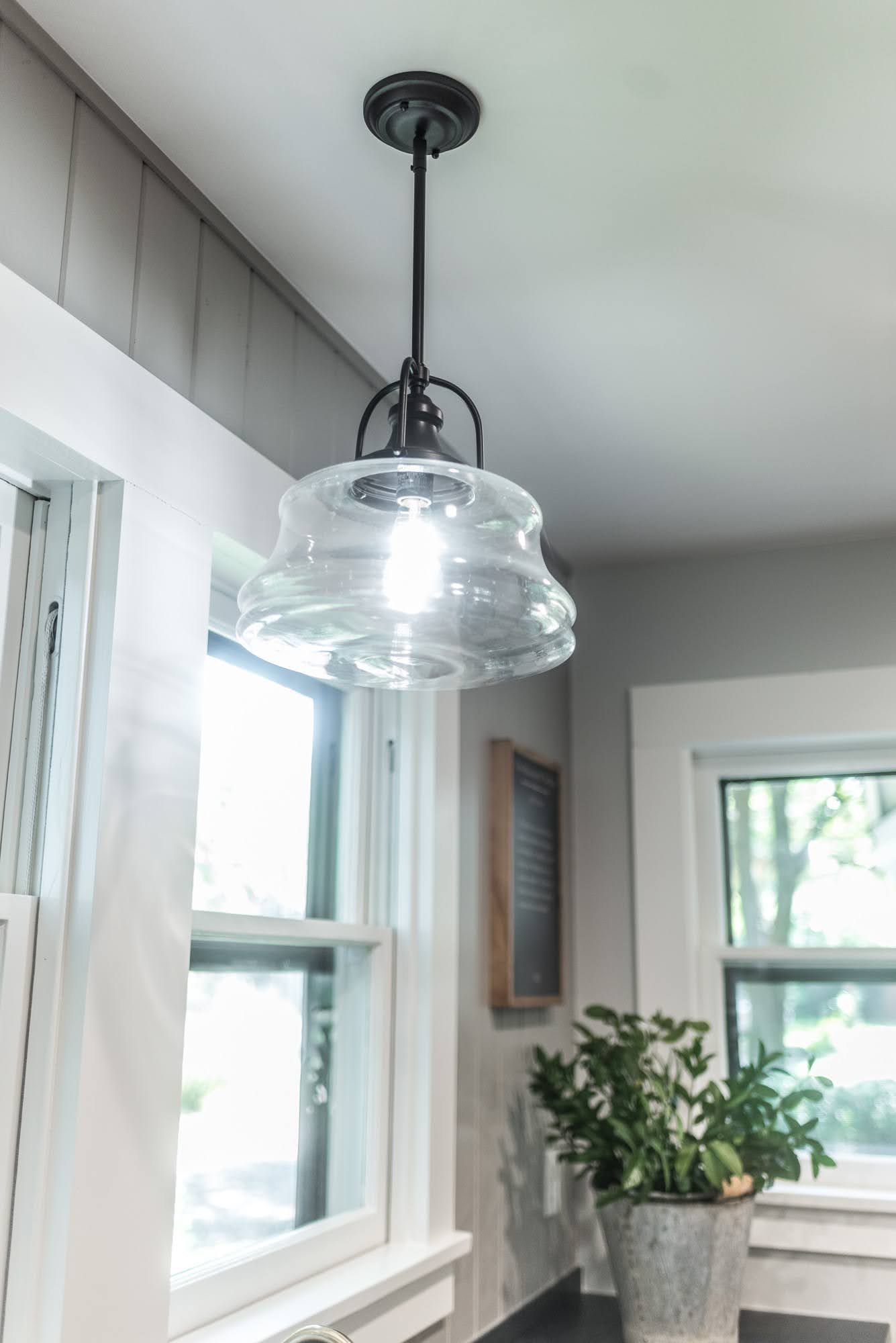
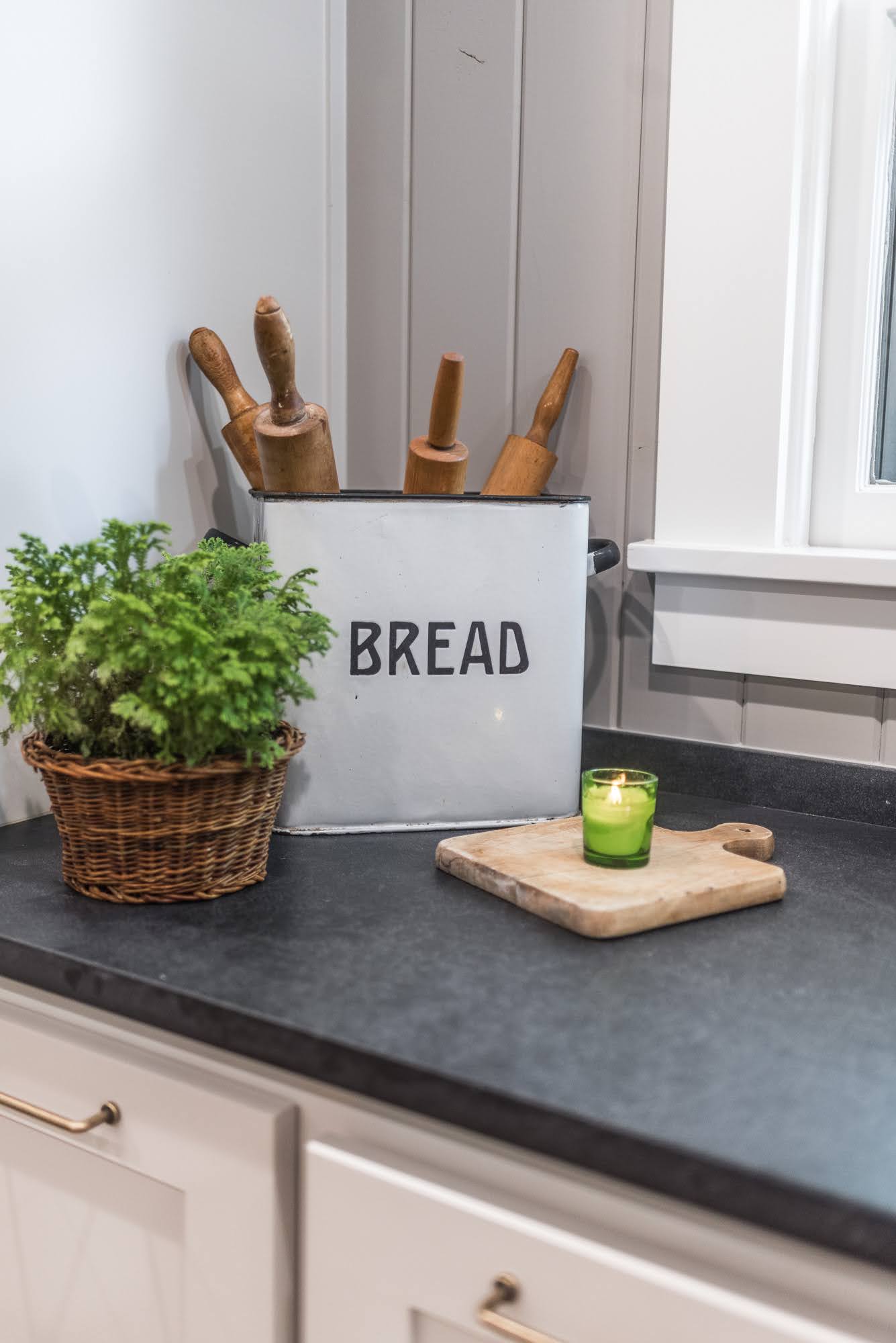
In order to brighten the room, we rebuilt the windows to allow more natural light into the space. We updated the lighting of the room to include canned lights mounted on the ceiling and one pendant light mounted above the sink. The walls were repainted in Sherwin Williams, “Big Chill” in eggshell to further enhance the lighter look. For the main countertops, we chose a Caesarstone in Black Temple – Natural with a square edge profile. We installed custom millwork on the backsplash and sink wall as well as trimmed all the new windows throughout the residence.
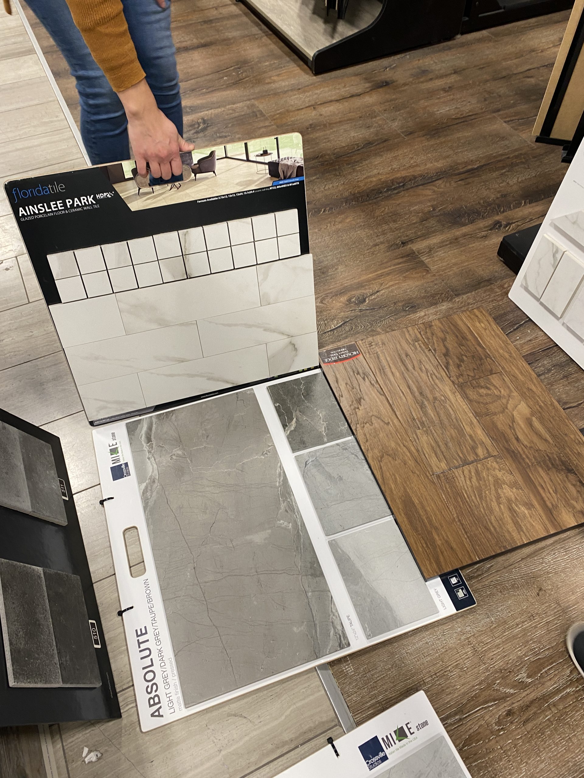
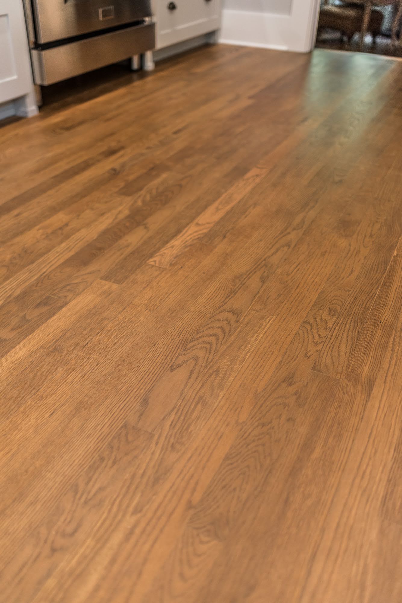
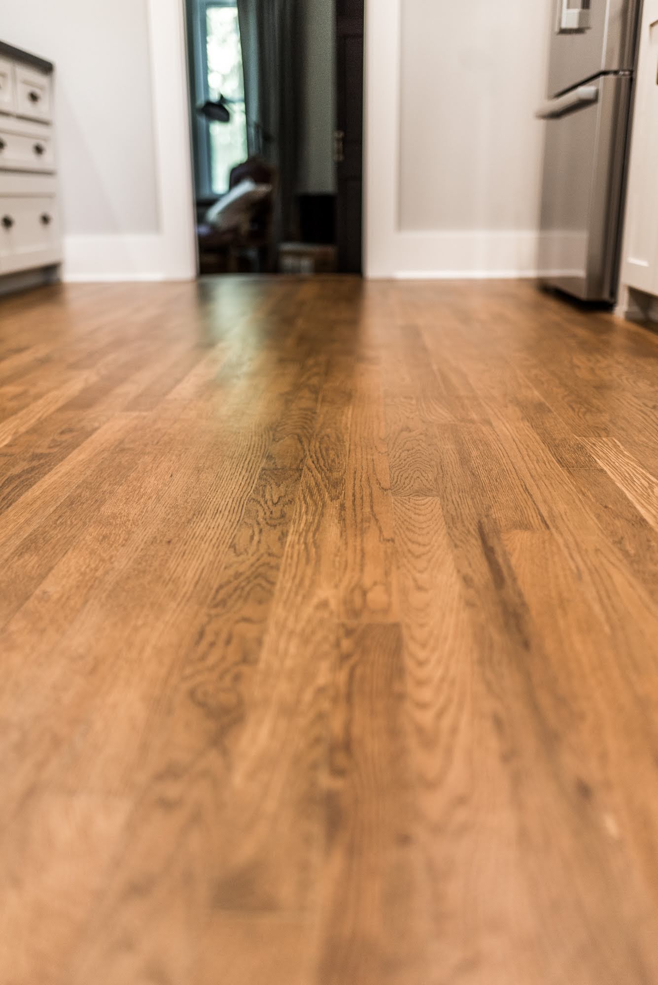
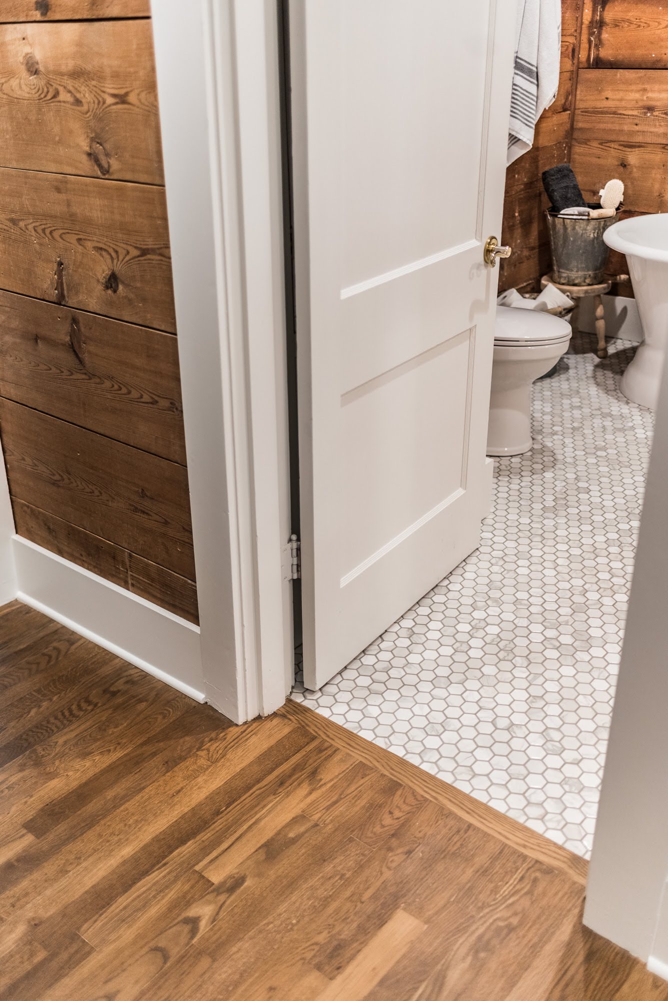
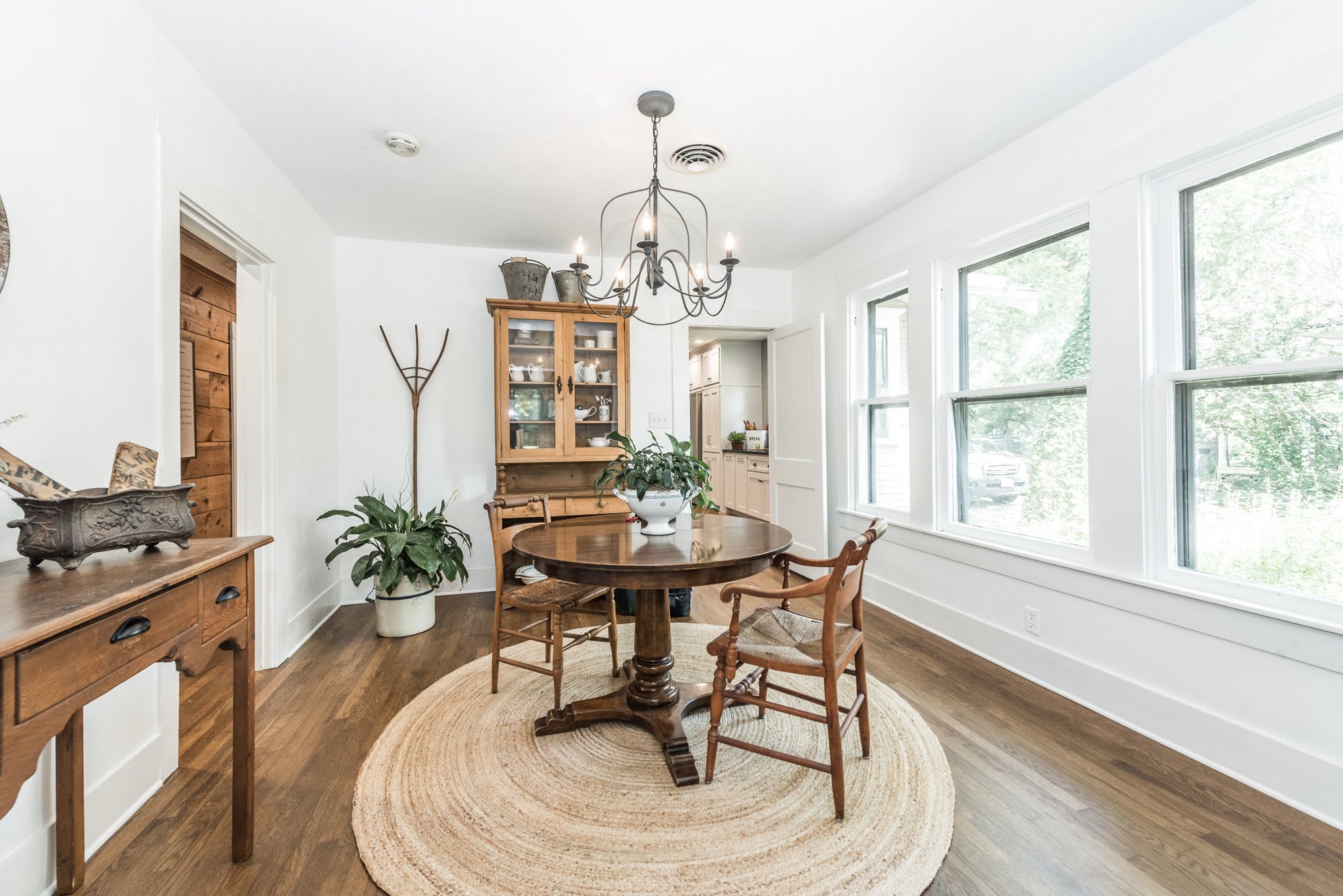
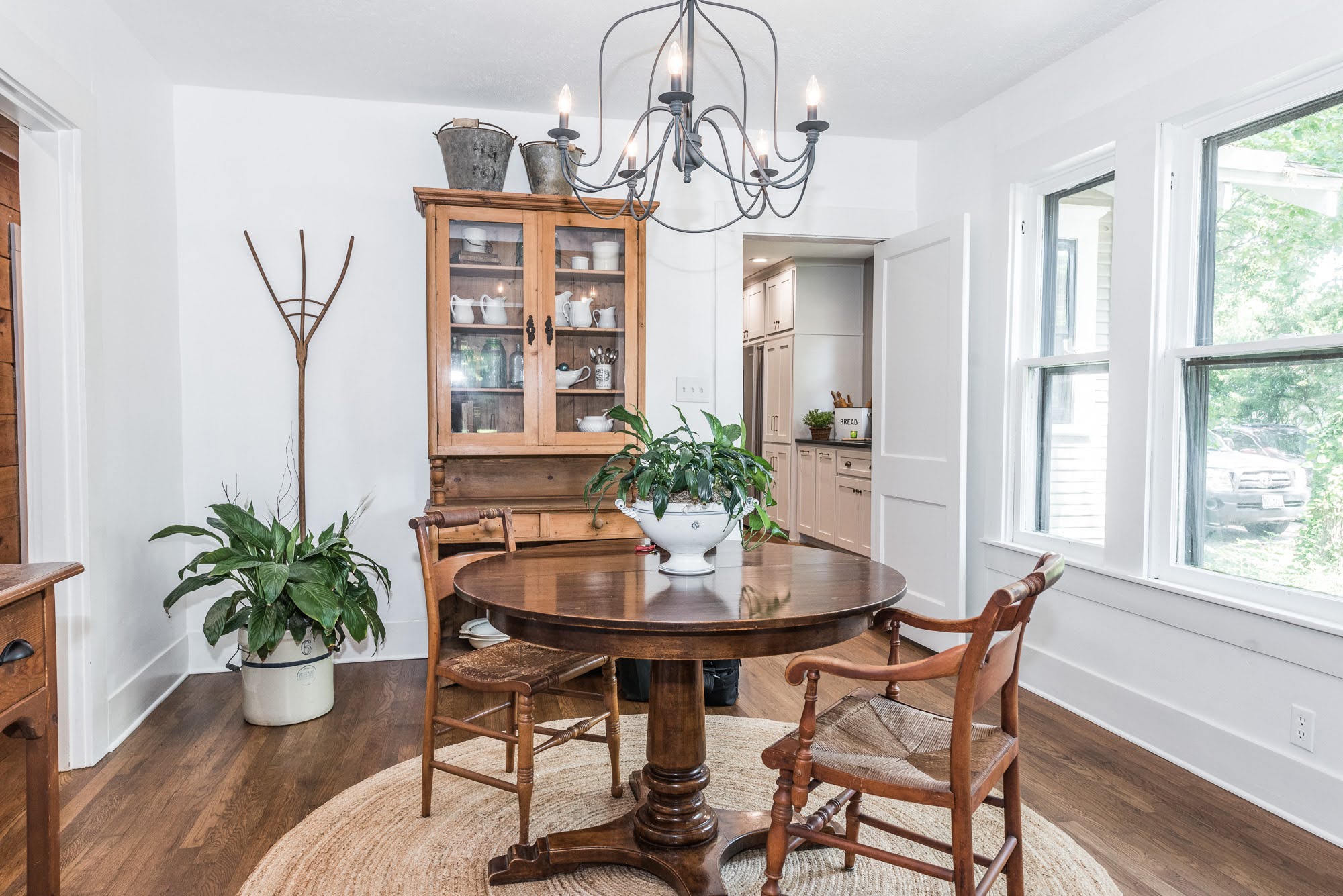
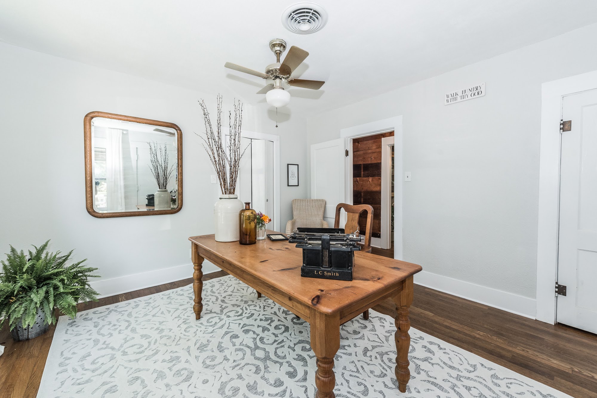
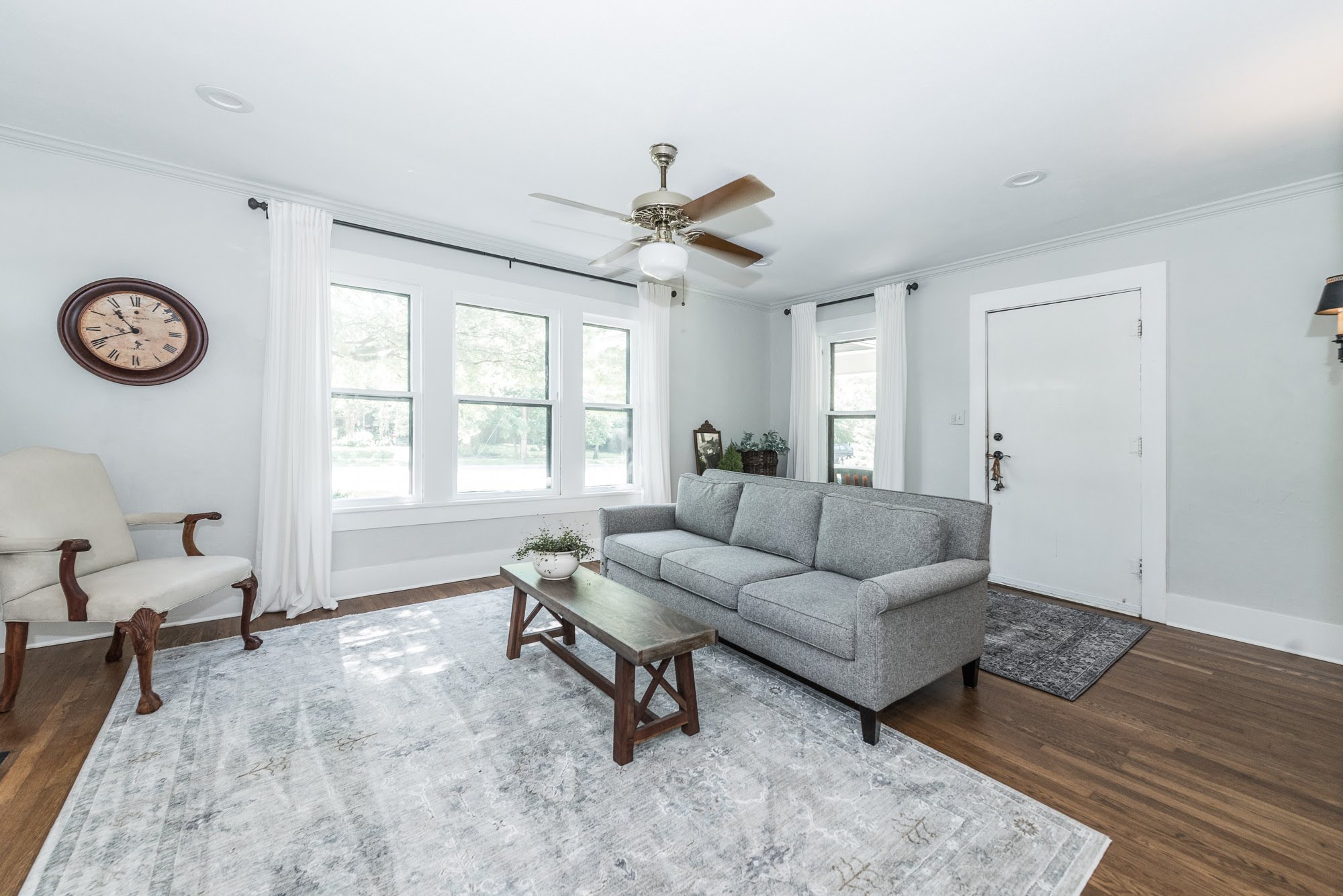
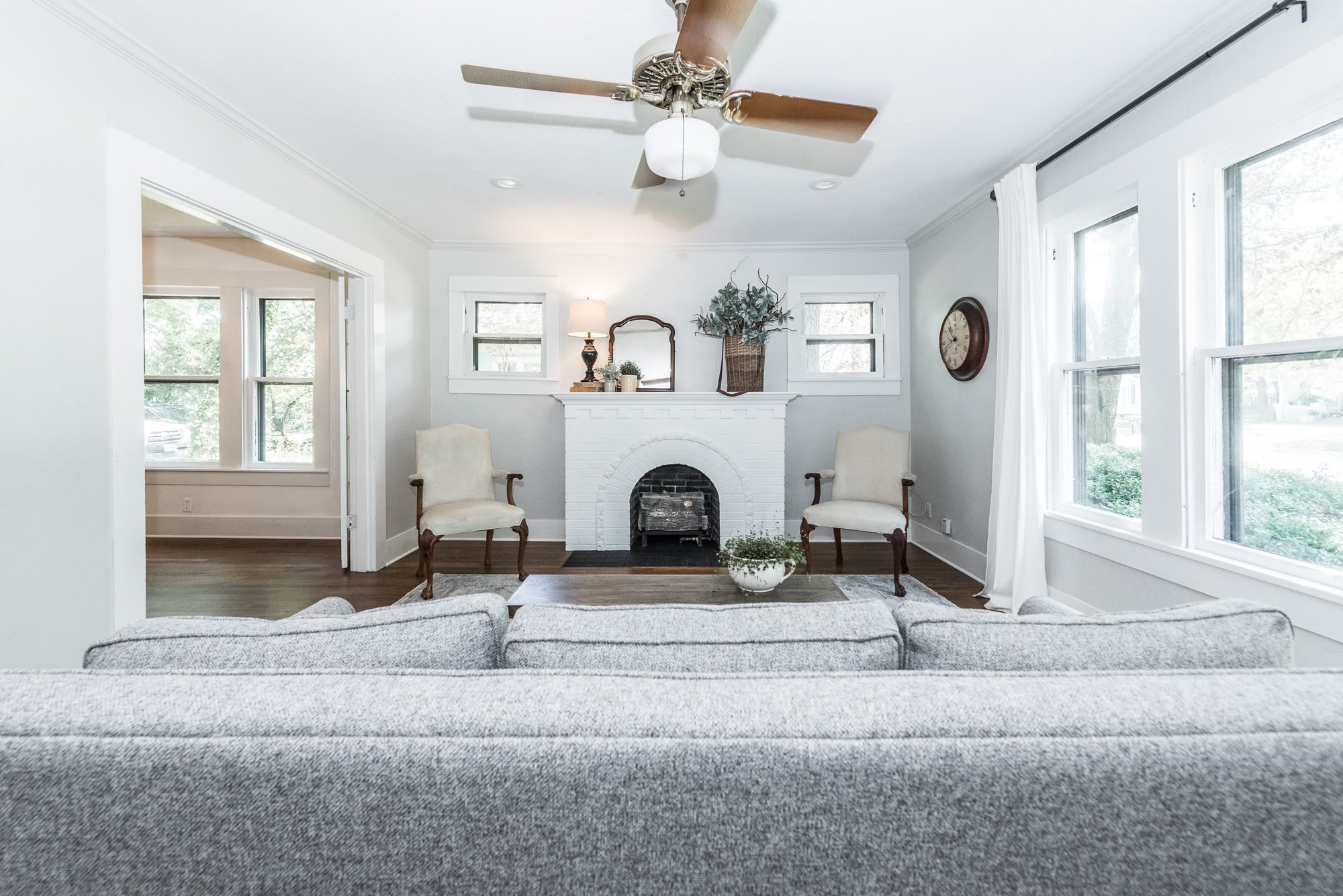
The amazing hardwood floors were sanded, stained, and sealed (water-based) in the living room, dining room, hallway, two bedrooms, and kitchen.
Bathroom
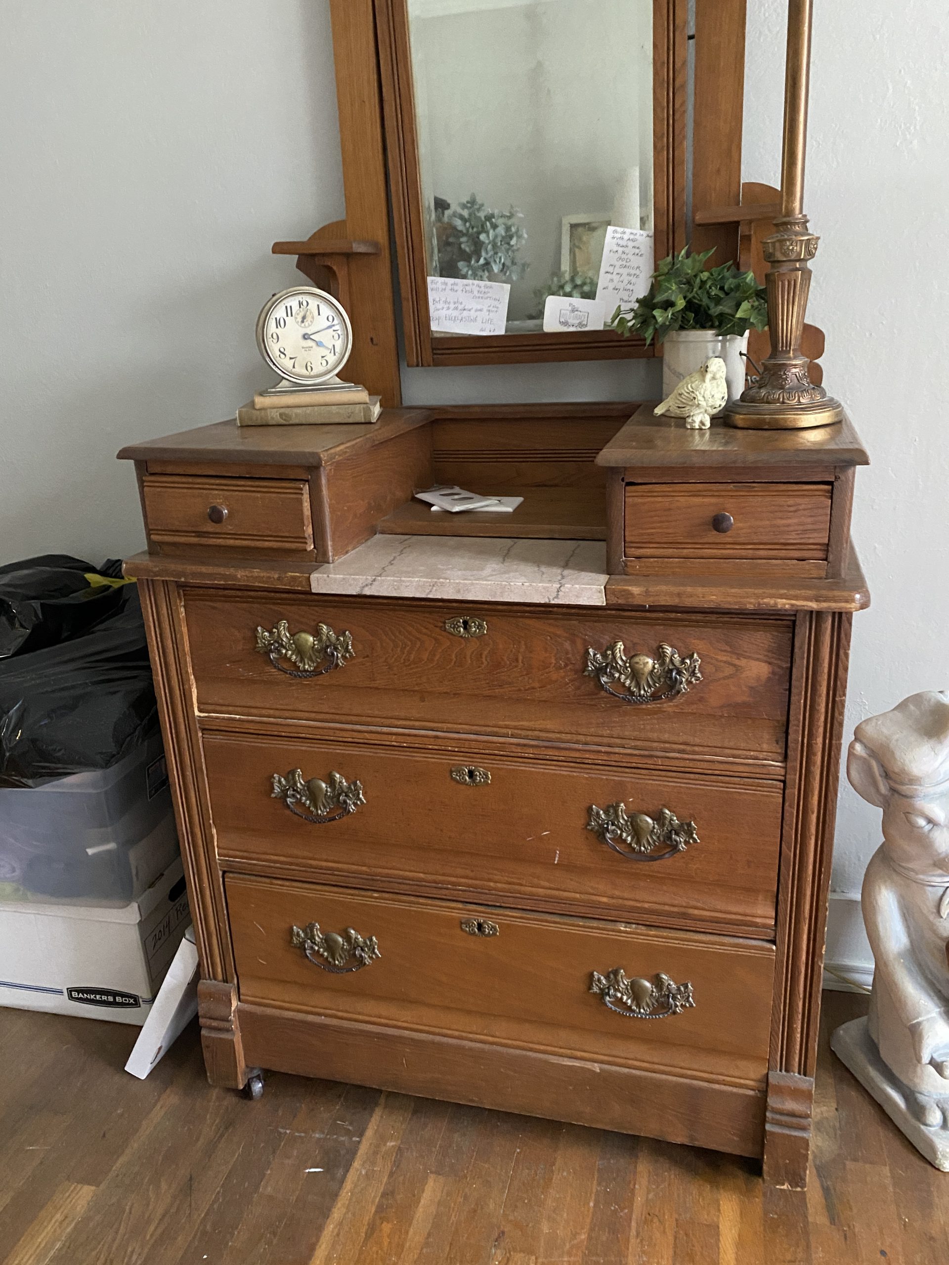
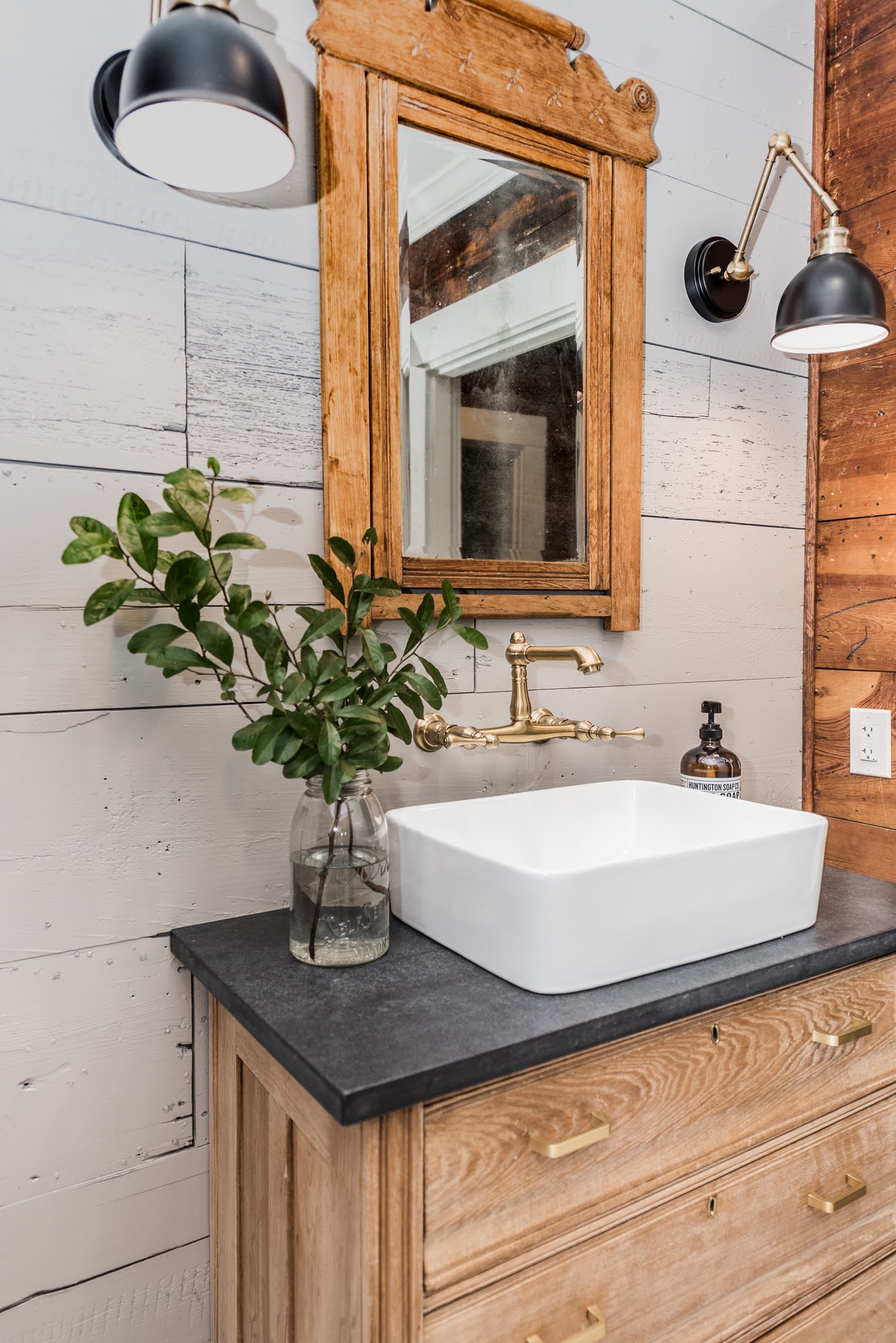
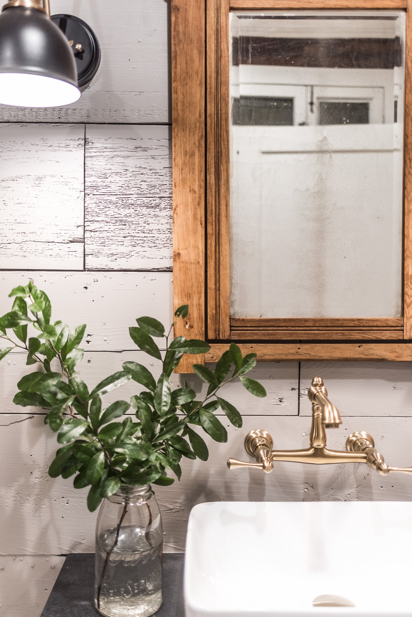
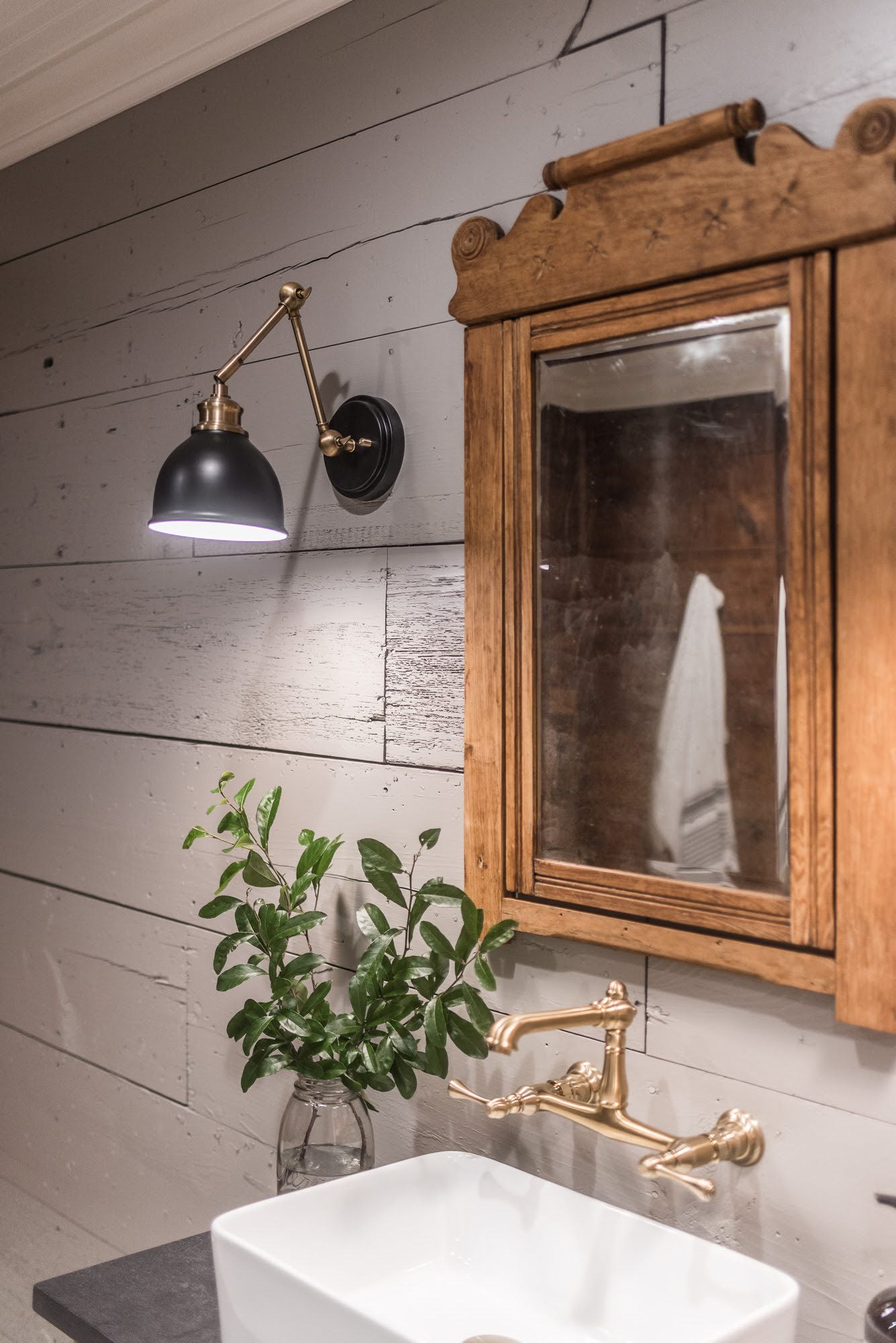
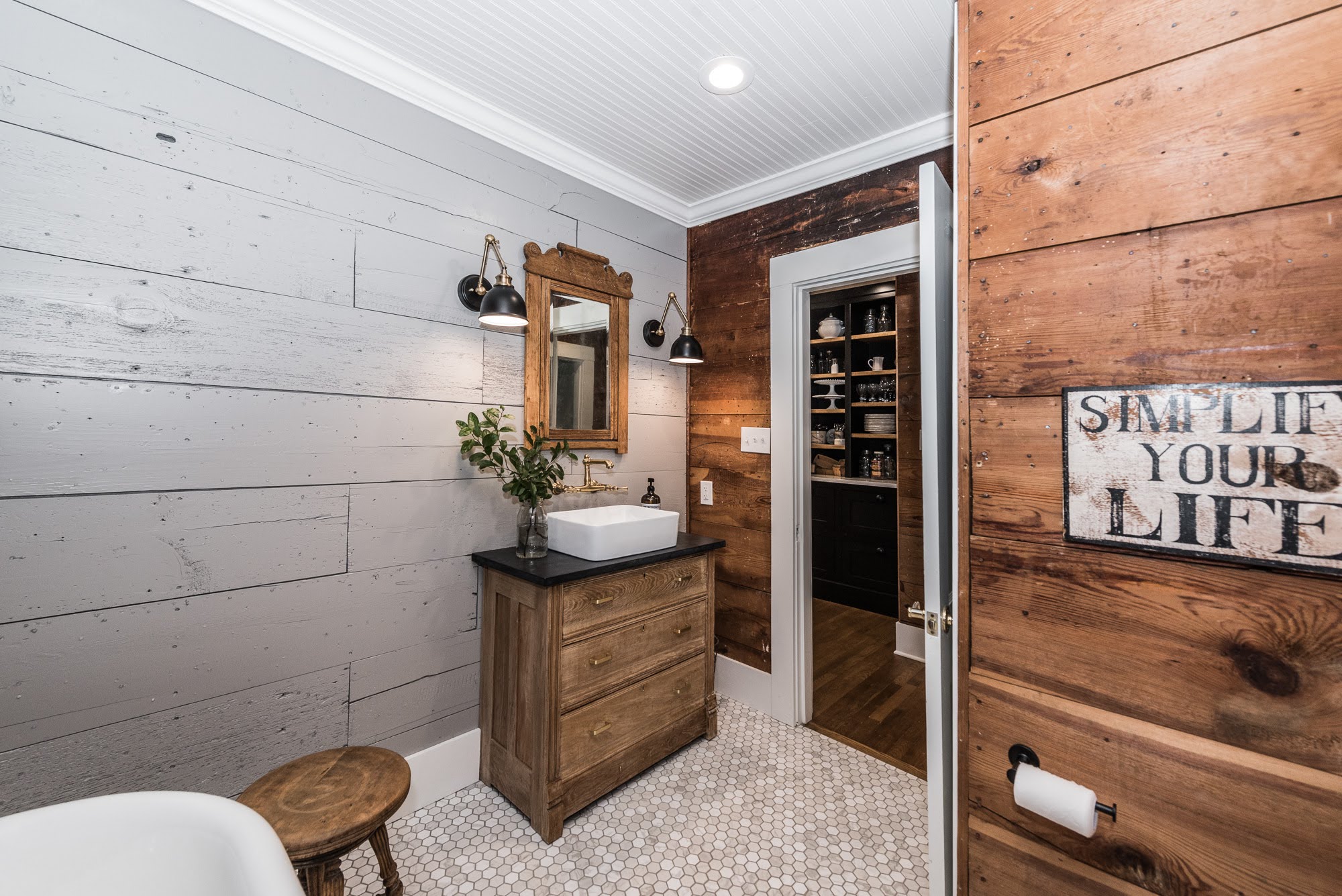
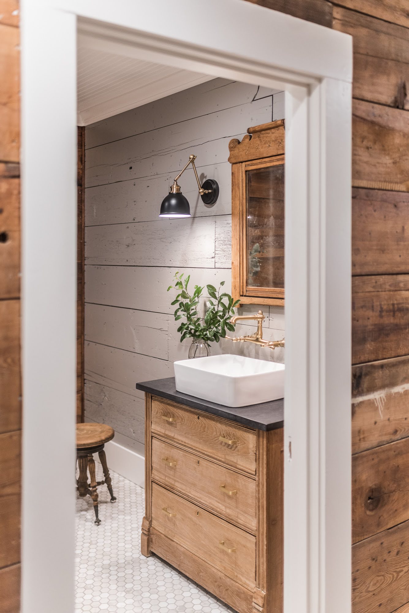
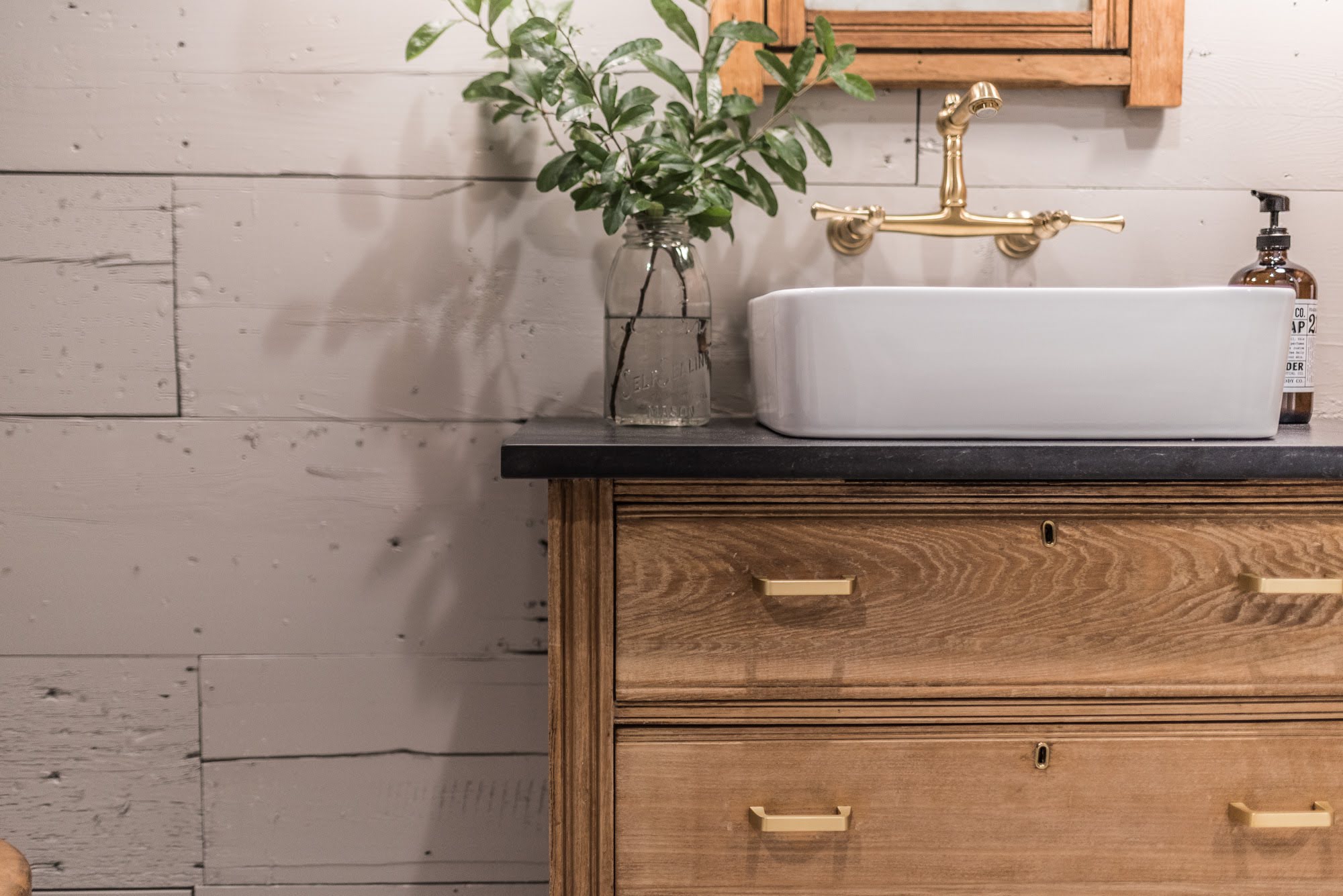
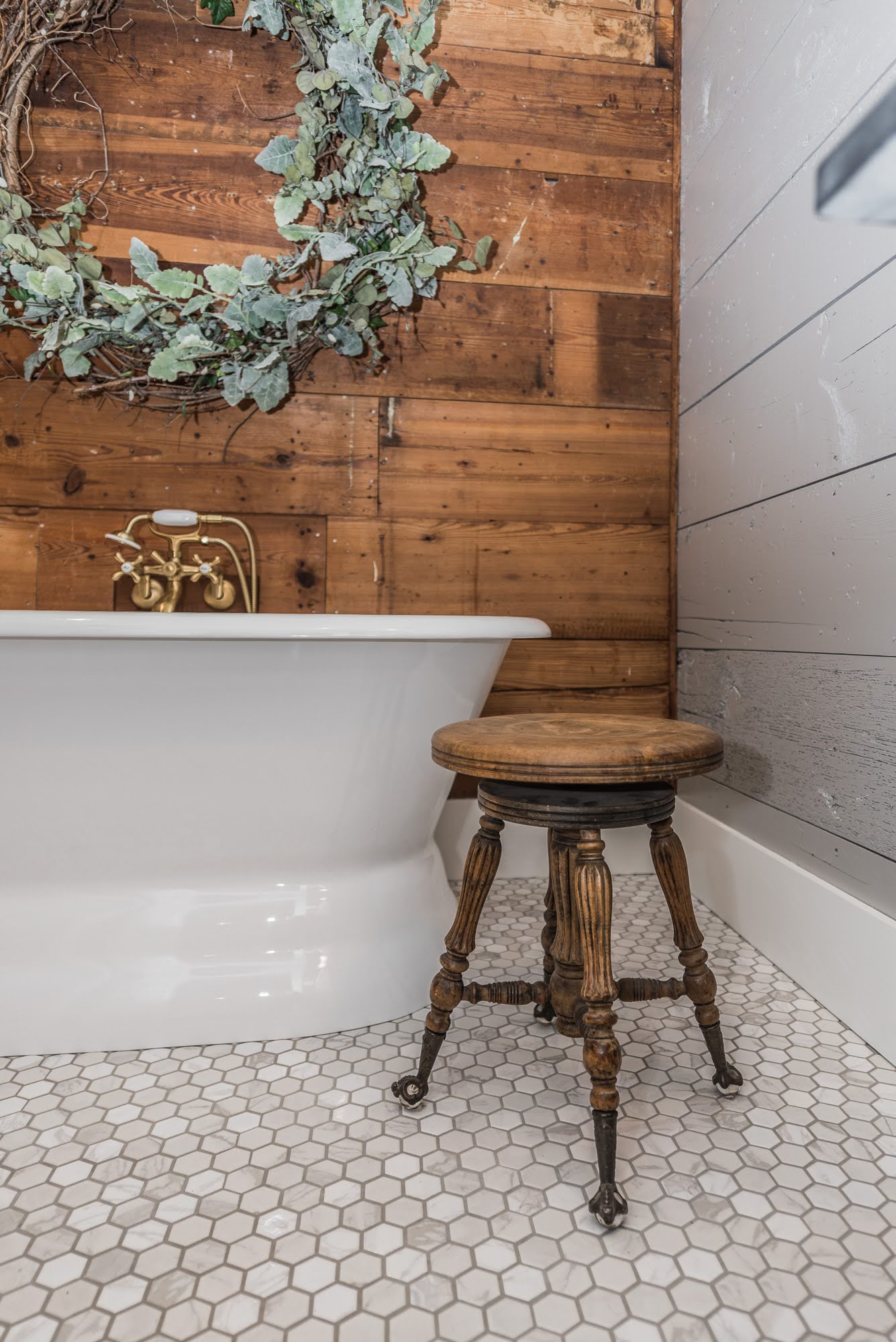
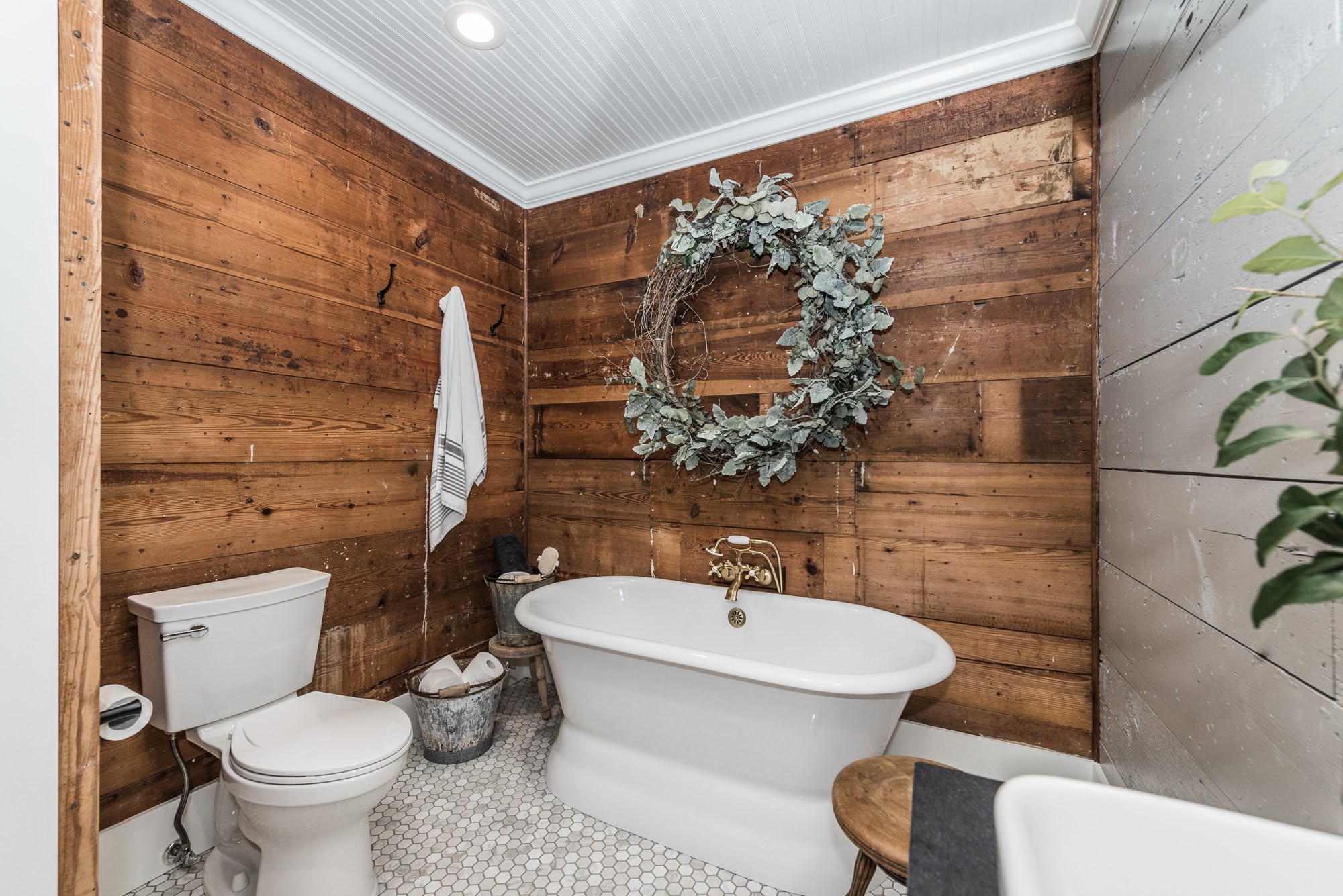
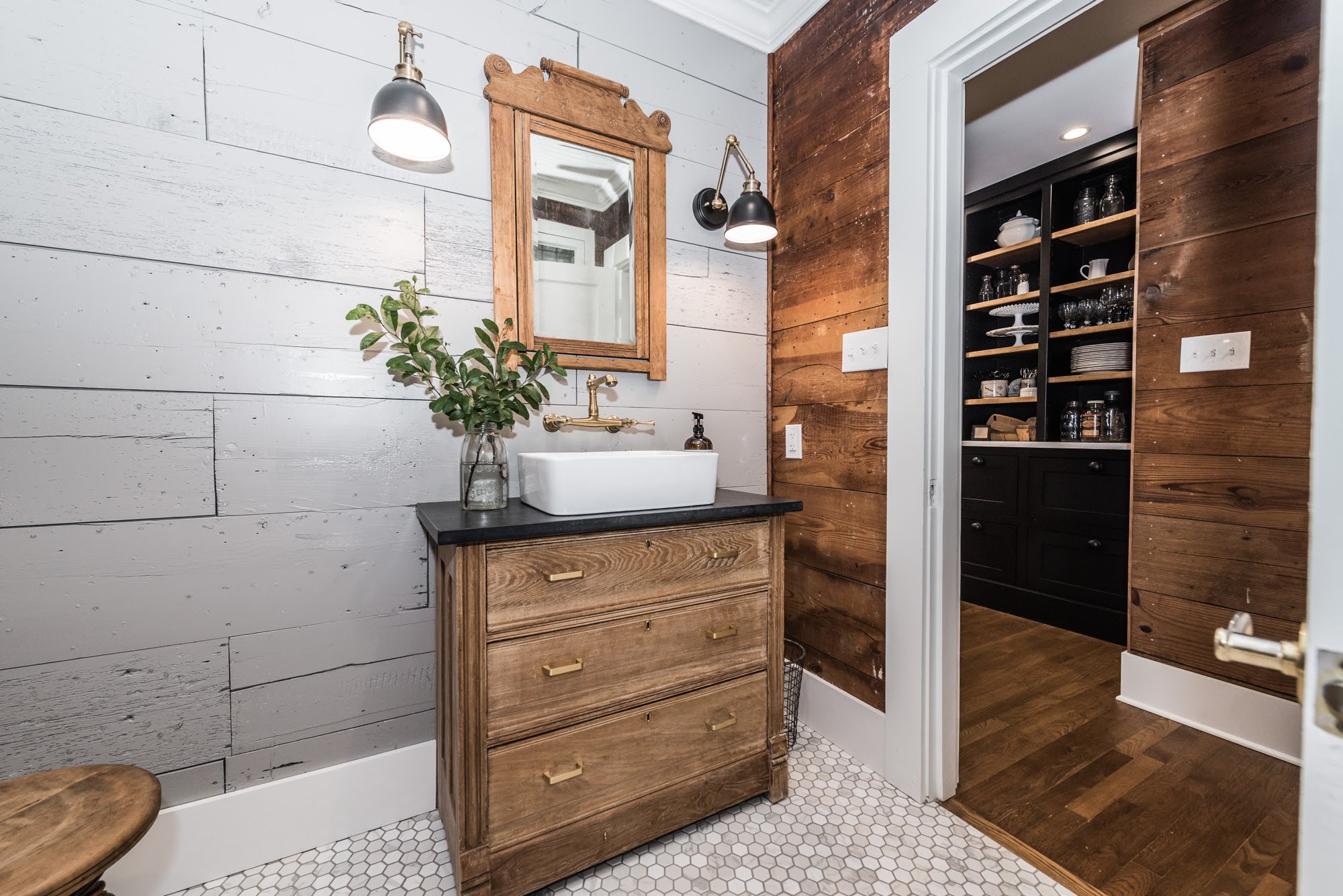
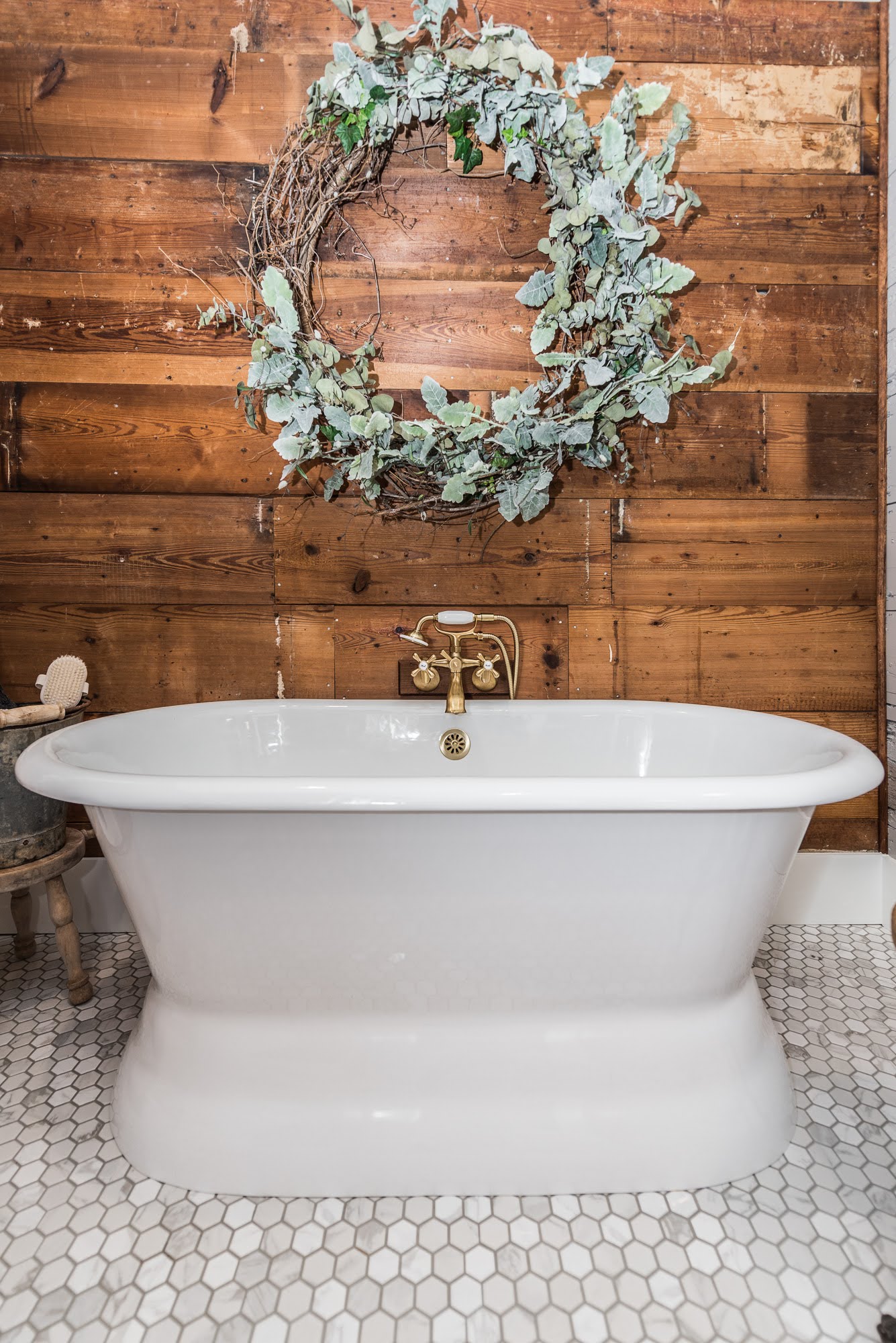
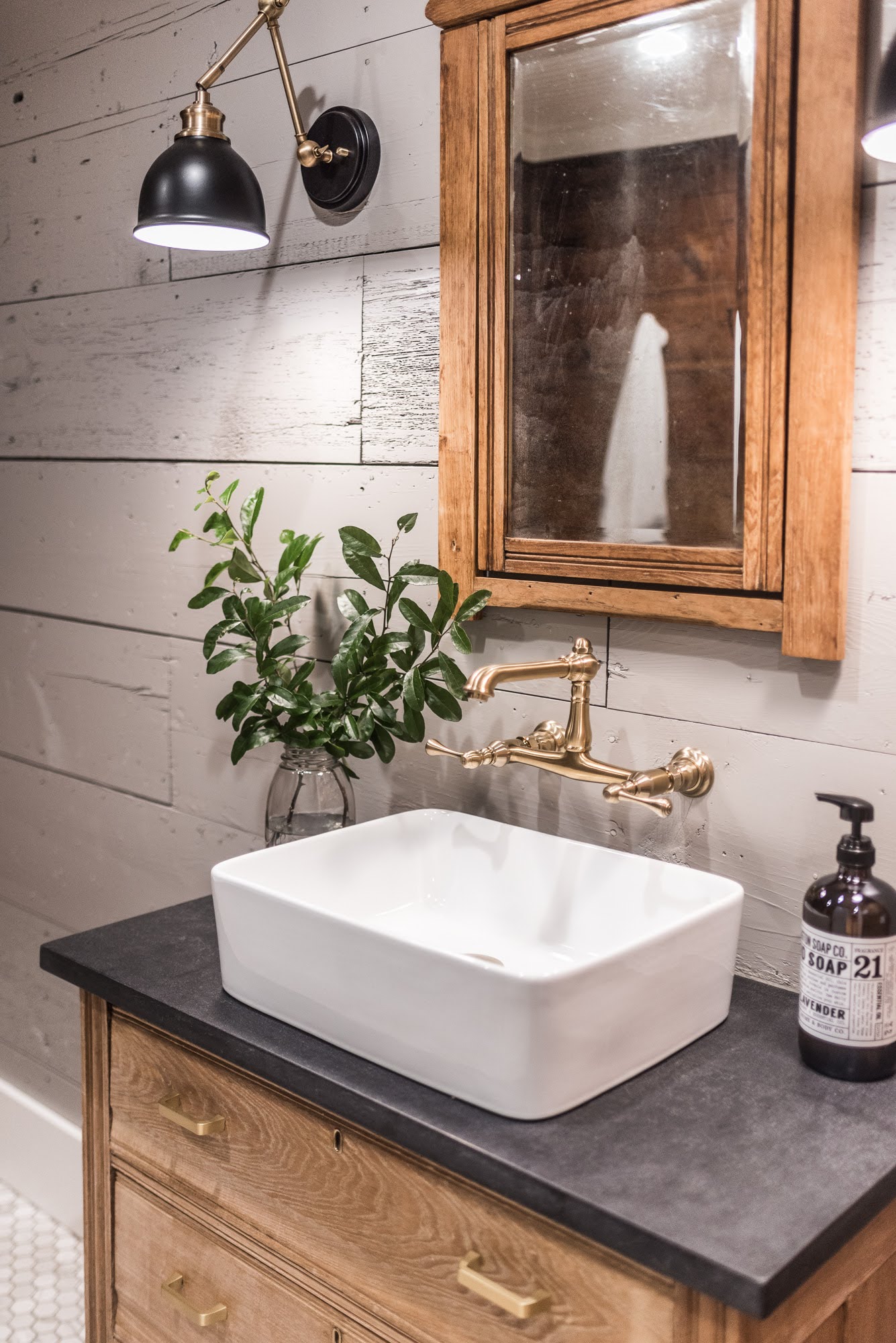
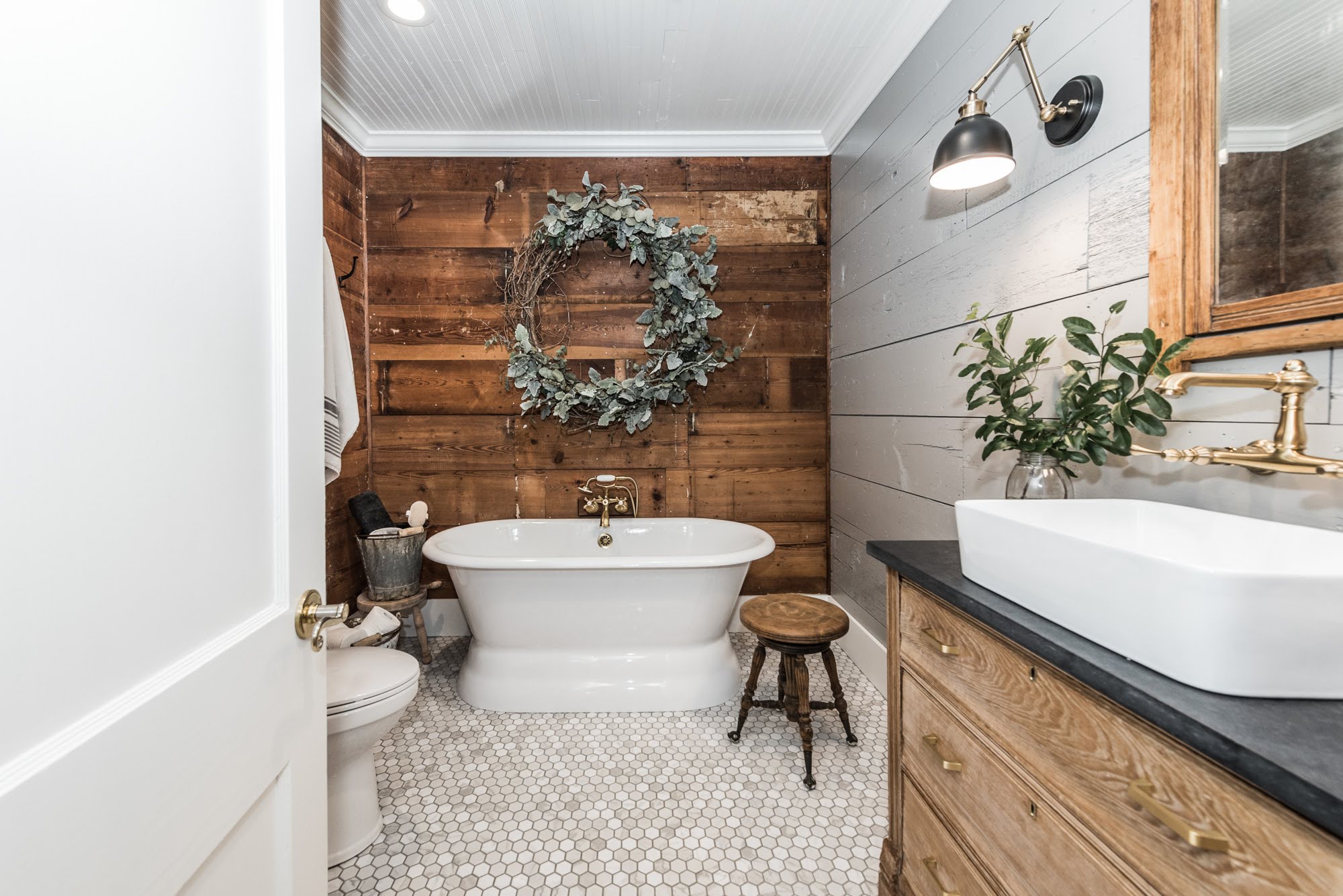
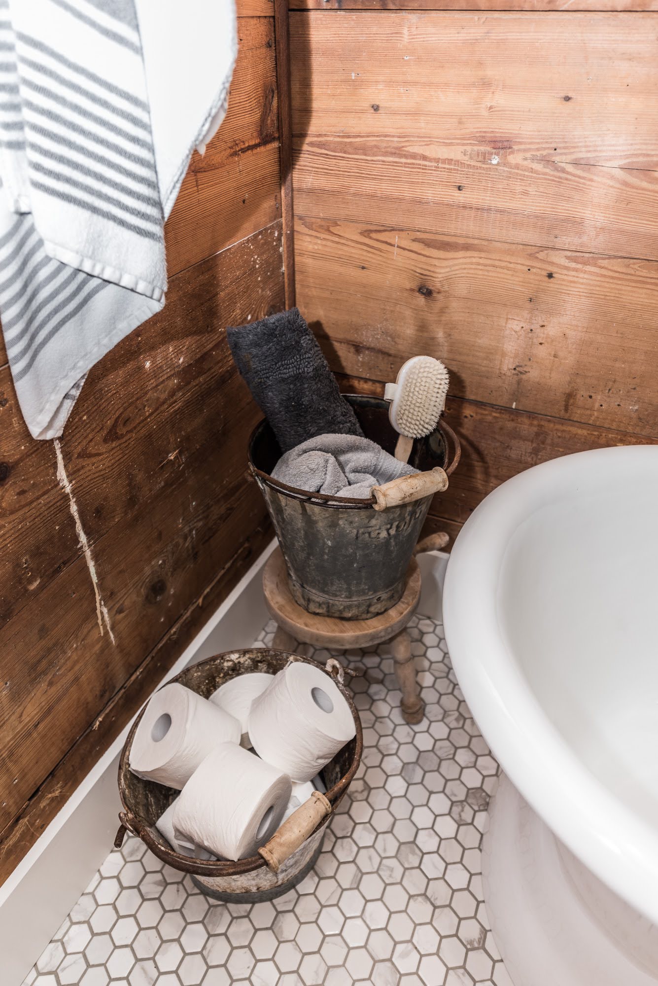
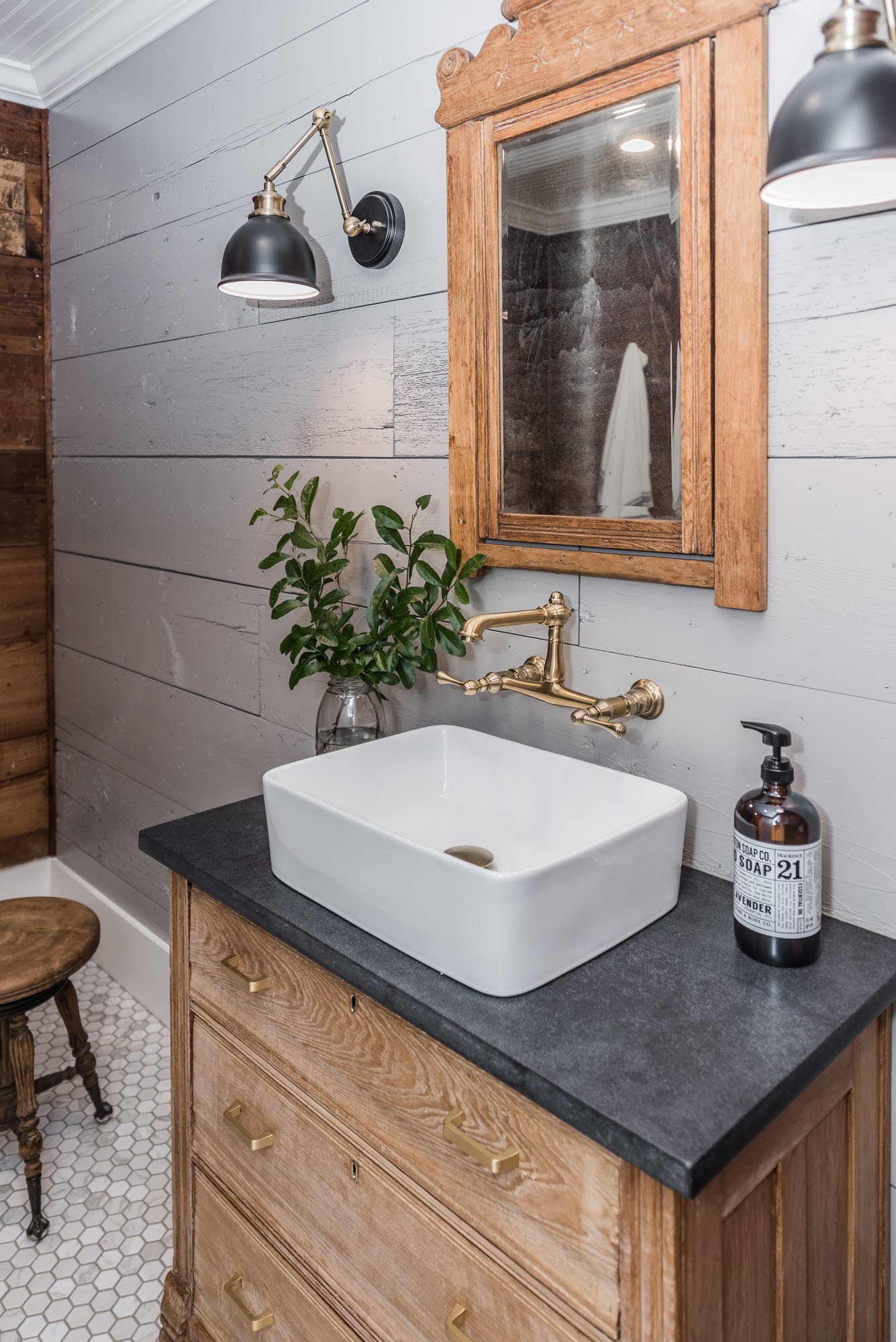
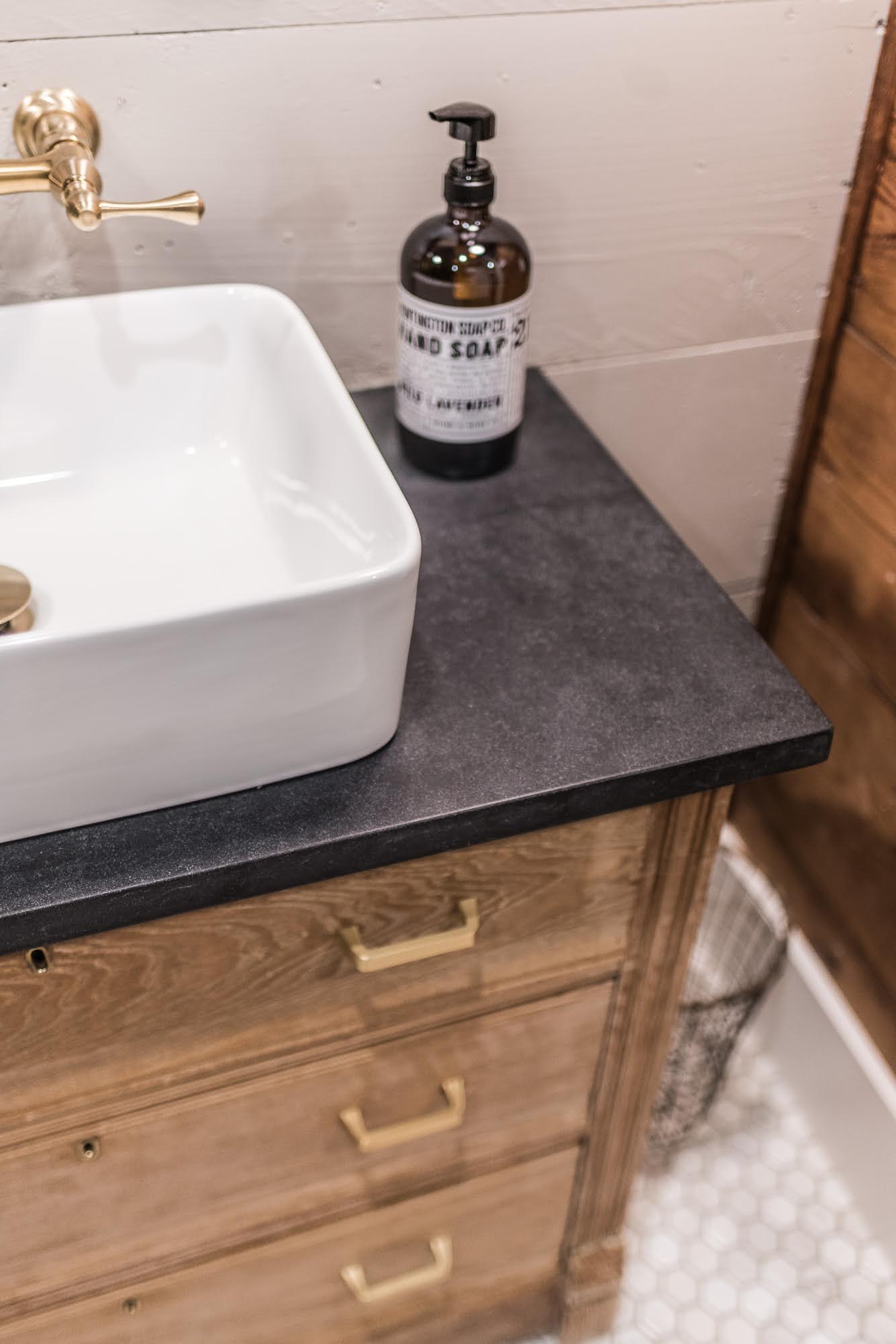
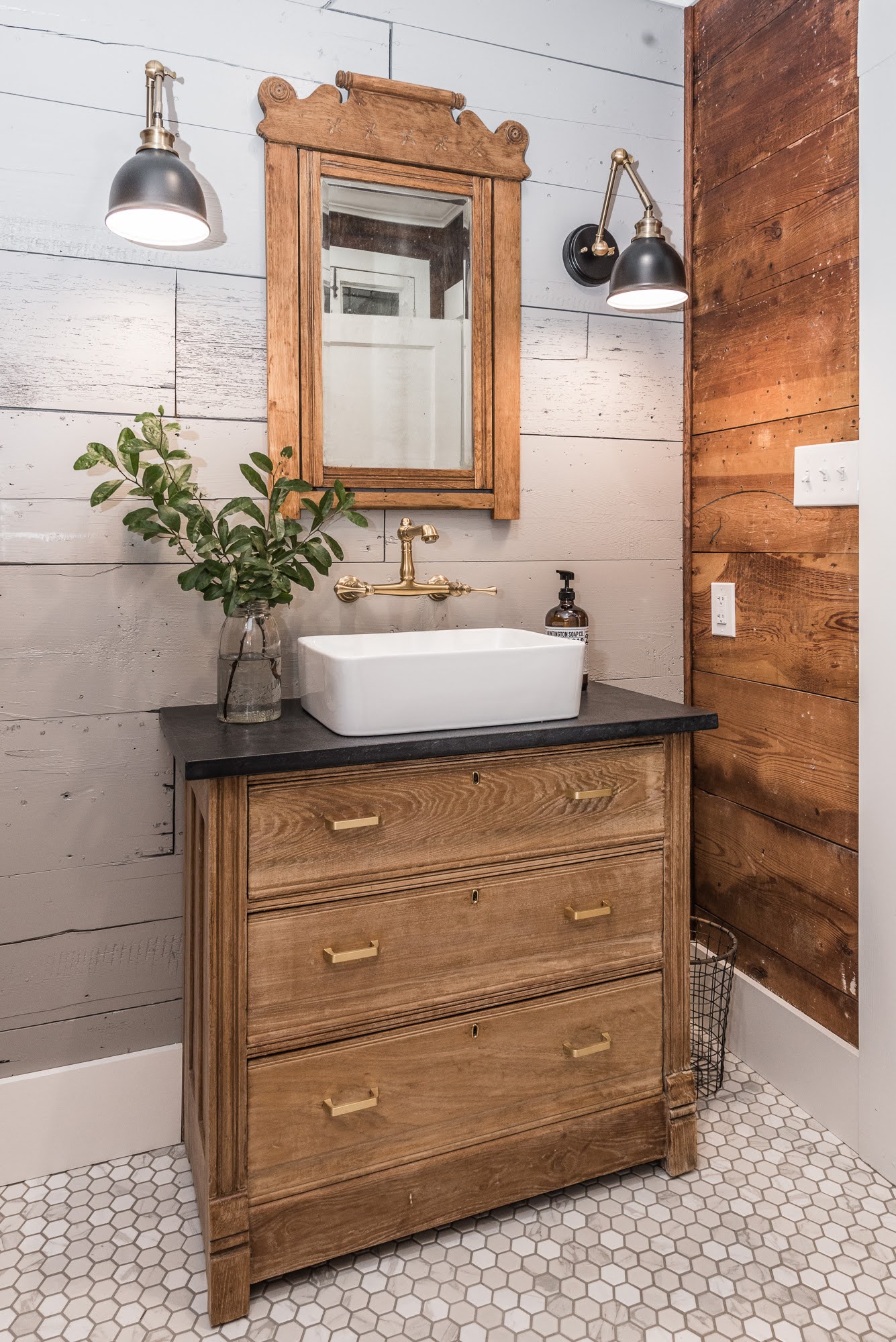
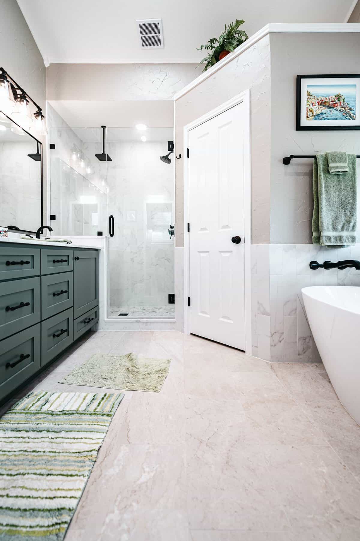
We transformed the bathroom completely! This is the primary bathroom in this small historic home, so we wanted it to become a statement. The preexisting tub/shower combo, vanity, cabinets, and flooring were removed (everything). We started fresh by installing a cast iron freestanding tub instead of a shower. The toilet was relocated. It was the perfect space to use the historic shiplap in a refreshed way. The client sourced a vintage dresser and repurposed it as a vanity that she refinished herself, and then we helped with the installation along with the light fixtures. Isn’t it fabulous?!
AFTER
Once the project was completed, the kitchen became bright and spacious and the bathroom was transformed into a unique, relaxing vintage spa-like environment. Overall, this project involved a significant amount of work to update and modernize the kitchen, bathroom, and several living spaces. We were able to achieve the client’s goals for brightening the home as well as adding a so much more functional layout. The new (and old materials) packed a big punch and the overall transformation was dramatic. We are so excited to share the final result of this complete home renovation!
Project Materials & References :
P A I N T :
Upper Cabinets – Sherwin Williams Extra White
Lower Cabinets – Sherwin Williams Repose Gray
Hutch – Sherwin Williams Tricorn Black
Trim, Ceiling, and Doors – Sherwin Williams Extra White
V-Groove Backsplash and Bathroom Shiplap – Sherwin Williams Pussywillow
Walls – Sherwin Williams Big Chill
O T H E R :
Main Counter – Caesarstone Black Temple Quartz with Natural finish (via ProSource)
Hutch Counter – Carrara White Quartz
Faucet – Kingston Brass
Vent Hood – Ancona
Fridge – Bosch
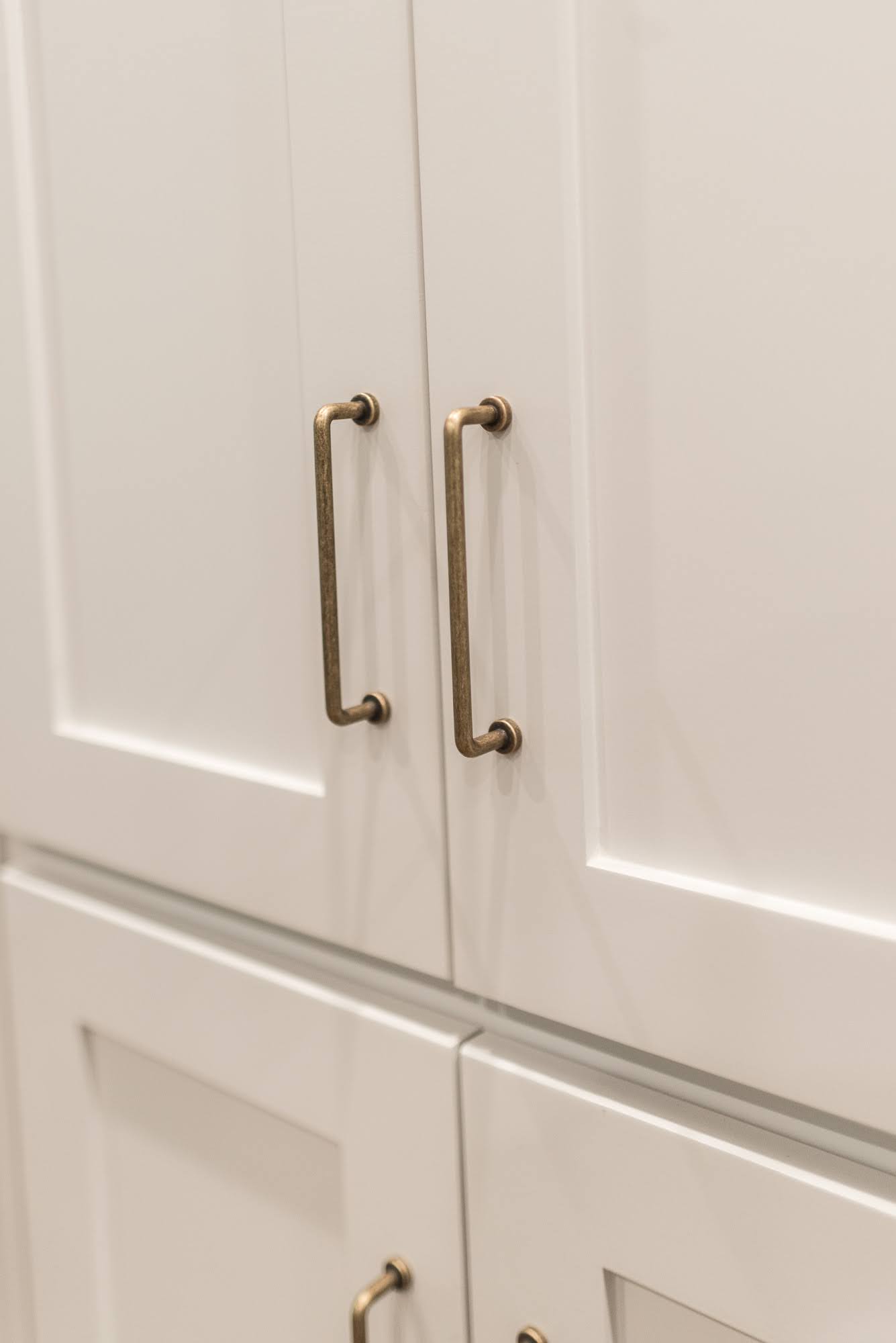
Cabinet Hardware – Similar
Search #thegratefulestate on our Instagram | @irwin.construction
[instagram-feed]




Leave A Comment