The Thundercrest House was built in the late 1980s and is located in Denton, Texas. Our clients are both very creative and had already put their design skills to work renovating many areas of their home. However, the bathrooms, kitchen countertops, and kitchen backsplash remained dated and didn’t flow well with the rest of the house.
Our goal for the bathrooms was to focus on the items that would result in the largest change in aesthetic – the floor tile, countertops, and fixtures. Our clients also wanted a custom shower with a glass enclosure in the master bathroom in place of the combination bathtub/shower.
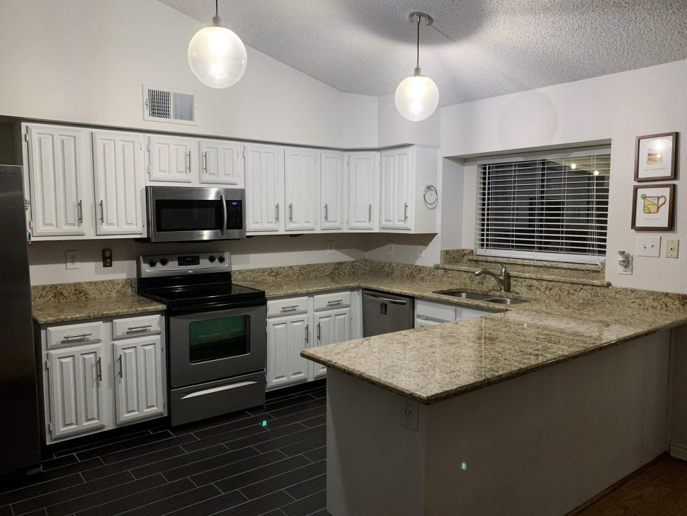
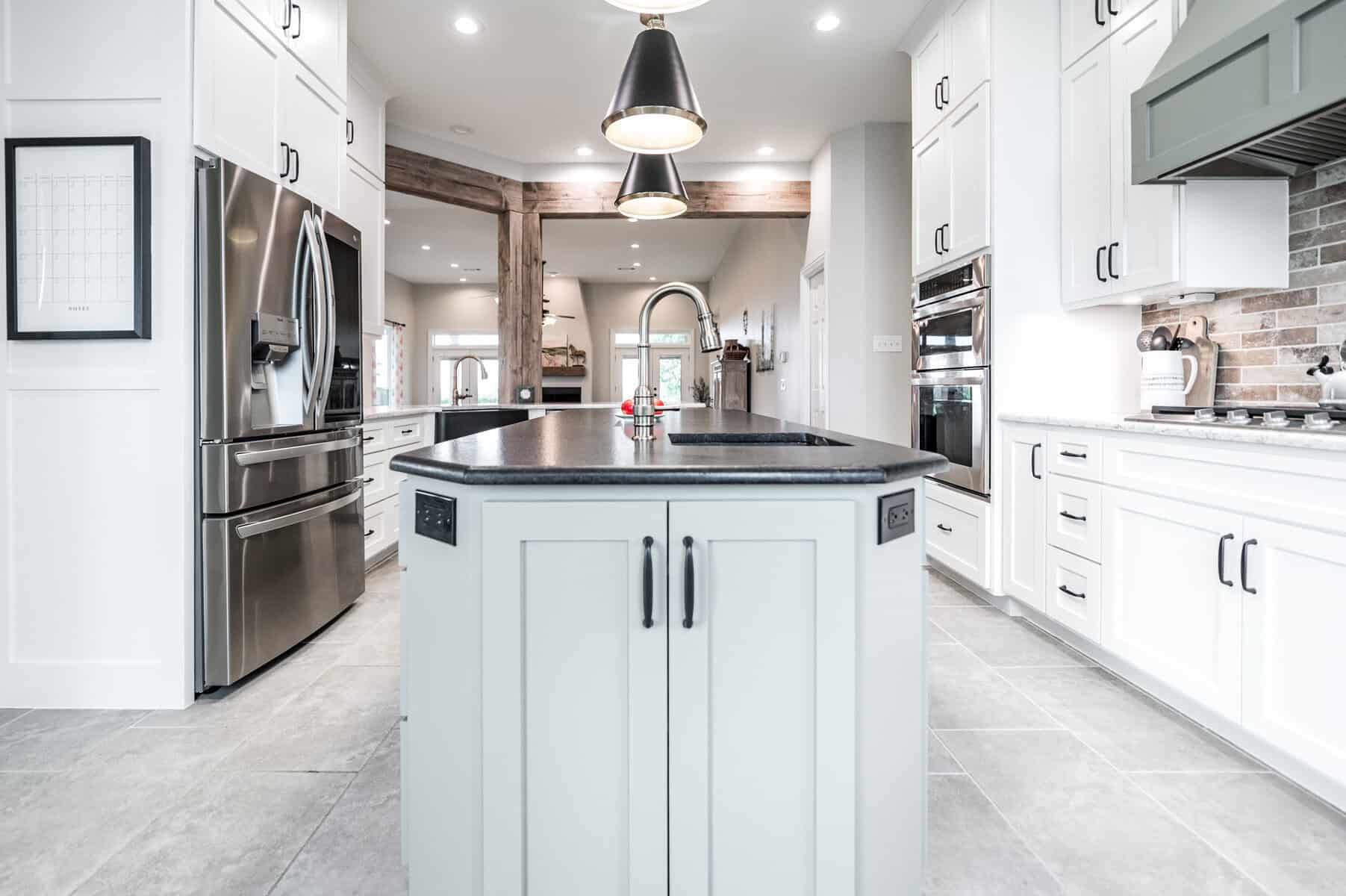
The kitchen work focused on replacing the granite counters and curb backsplash that didn’t work with our clients’ color scheme and design for the house.
(See end of post for sources and materials)
MASTER BATHROOM
B E F O R E
A F T E R
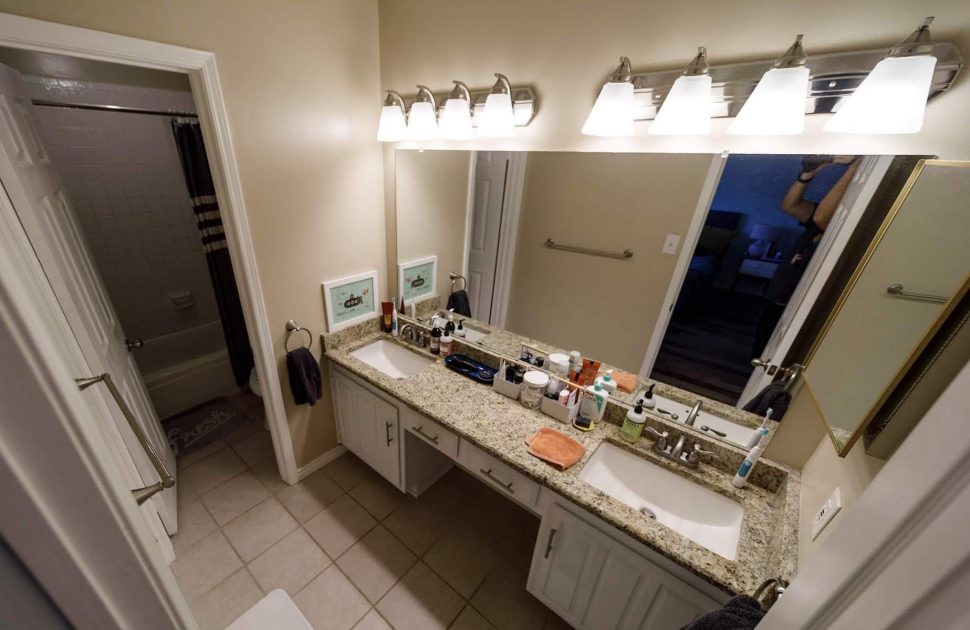
The bathroom floors were tiled in 12×12 beige tile, and the shower incorporated 4×4 textured ceramic tile. While the vanity counter was granite, its gold undertones combined with the beige of the floor tile to give the bathroom a dated feel. The bathtub was not practical for our clients, as they desired a more open, spacious shower without a shower curtain.
[soliloquy id=”5522″]
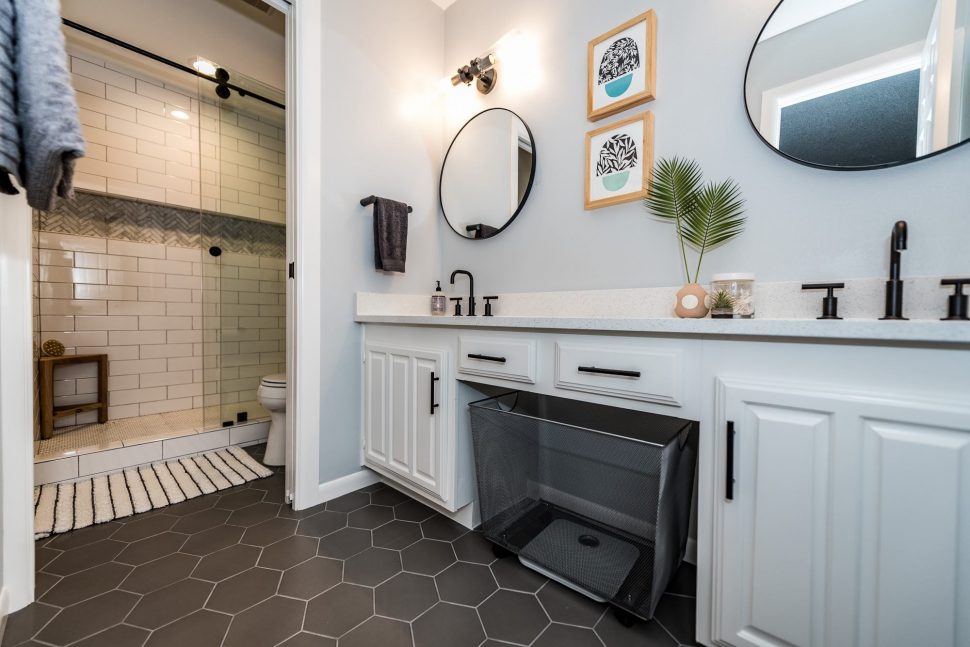
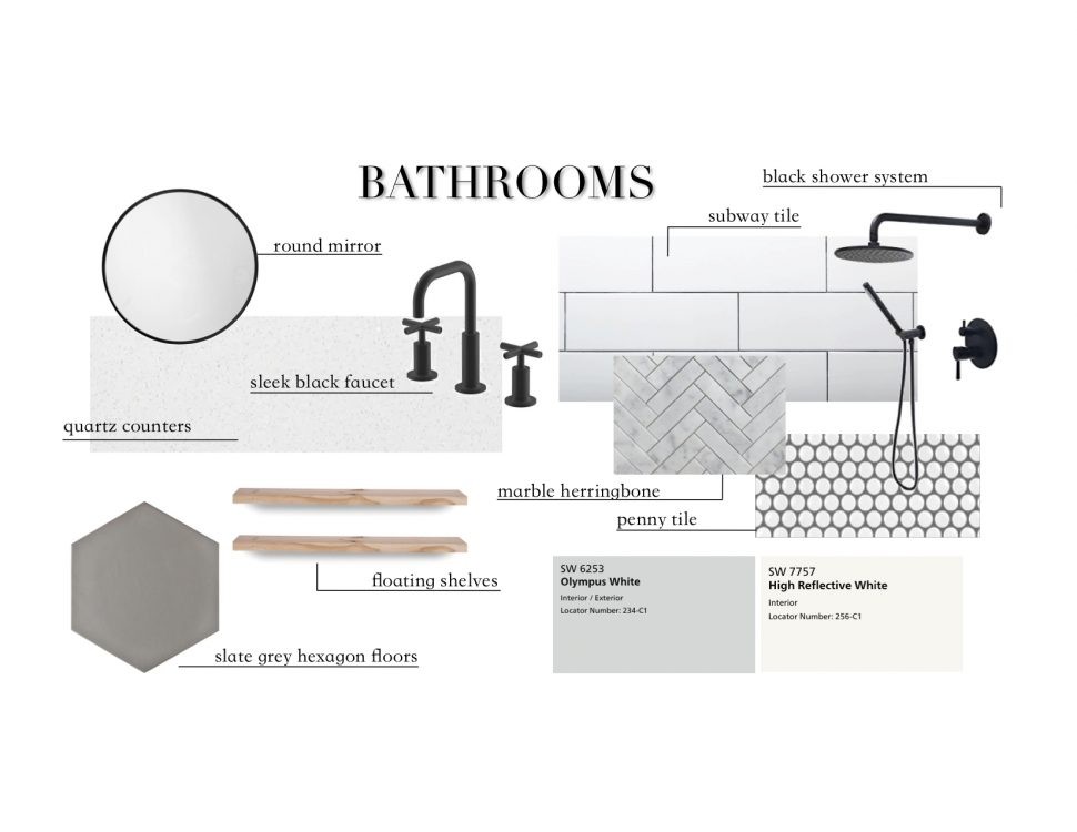
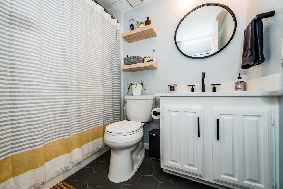
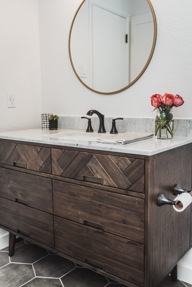
The design plan for the bathrooms included a white, black, and gray color palette with light wood accents. Fun shapes were incorporated throughout to bring texture and interest to the neutral design. In the master, rectangular subway tile was paired with round penny tile and herringbone-lay tile in the shower area. Both bathrooms featured larger format matte hexagon tile on the floor, as well as round mirrors.
To save space in the master bathroom, we installed a pocket door between the vanity and shower areas. We also used a sliding glass door on the shower instead of a hinged door. White quartz replaced the granite on the vanity counters, lightening up each bathroom.
[soliloquy id=”5528″]
[FinalTilesGallery id=’109′]
GUEST BATHROOM
B E F O R E
A F T E R
[FinalTilesGallery id=’110′]
KITCHEN
B E F O R E
A F T E R
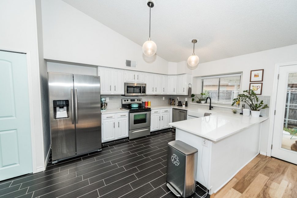
Our clients had updated all the flooring in the kitchen and living room previously, but felt the gold-toned granite counters didn’t work well with the rest of the space.
[soliloquy id=”5546″]
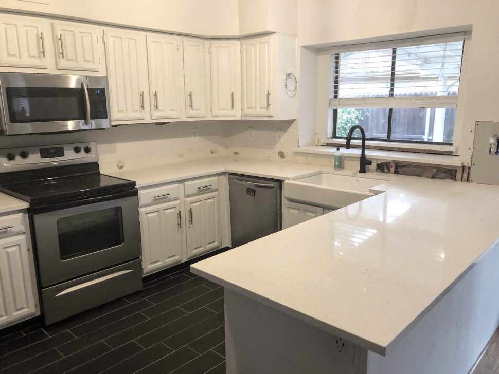
In a quick refresh we modified the existing cabinets for an apron-front sink, installed white quartz counters, and a light gray subway tile backsplash. This space is a perfect example of how a relatively small change can make a big difference!
[FinalTilesGallery id=’111′]
Before photos provided by client.
After photos courtesy of Darby Kate Photography.
BATHROOMS
COUNTERS – QUARTZ MASTER WHITE SPARKLE
BATHROOM FLOOR TILE – SPEARTEK 7″ HEXAGON PORCELAIN TILE IN SLATE GRAY
SHOWER FLOOR TILE – FLORIDA TILE MOSAICART EPIC M12 PENNY TILE IN WHITE
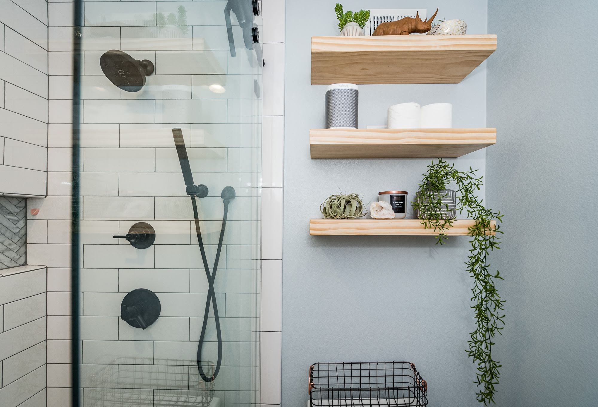
SHAMPOO NICHE TILE – TESORO METROPOLITAN WHITE CARRERA HONED HERRINGBONE MOSAIC
SHOWER WALL TILE – ARIZONA TILE 4X12 SUBWAY TILE IN WHITE GLOSSY
WALLS – SHERWIN WILLIAMS OLYMPUS WHITE
CABINETS, TRIM, DOORS, CEILINGS – SHERWIN WILLIAMS HIGH REFLECTIVE WHITE
KITCHEN
COUNTERS – QUARTZ MASTER WHITE SPARKLE
BACKSPLASH TILE – INTERCERAMIC IC BRITES 2 1/8 X 8 1/2 TILE IN SMOKE
You might also like…
The Open Door House 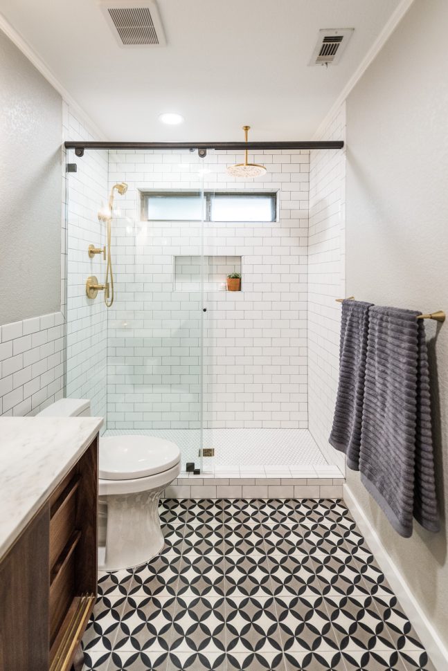
Mid-Century Modern Bathroom The Redemption House
The Open Door House – Before & After



Leave A Comment