WhiteOakKitchen
INTRO
Welcome back to our blog! We are showcasing one of our favorite kitchen projects, White + Dark Night Kitchen. You may recognize some features in this remodel. That is because this kitchen was actually done at the same location as our White Oak Marble Master Bath project! We are so happy to share with you the results of this continued renovation. Let’s take a look together!
BEFORE
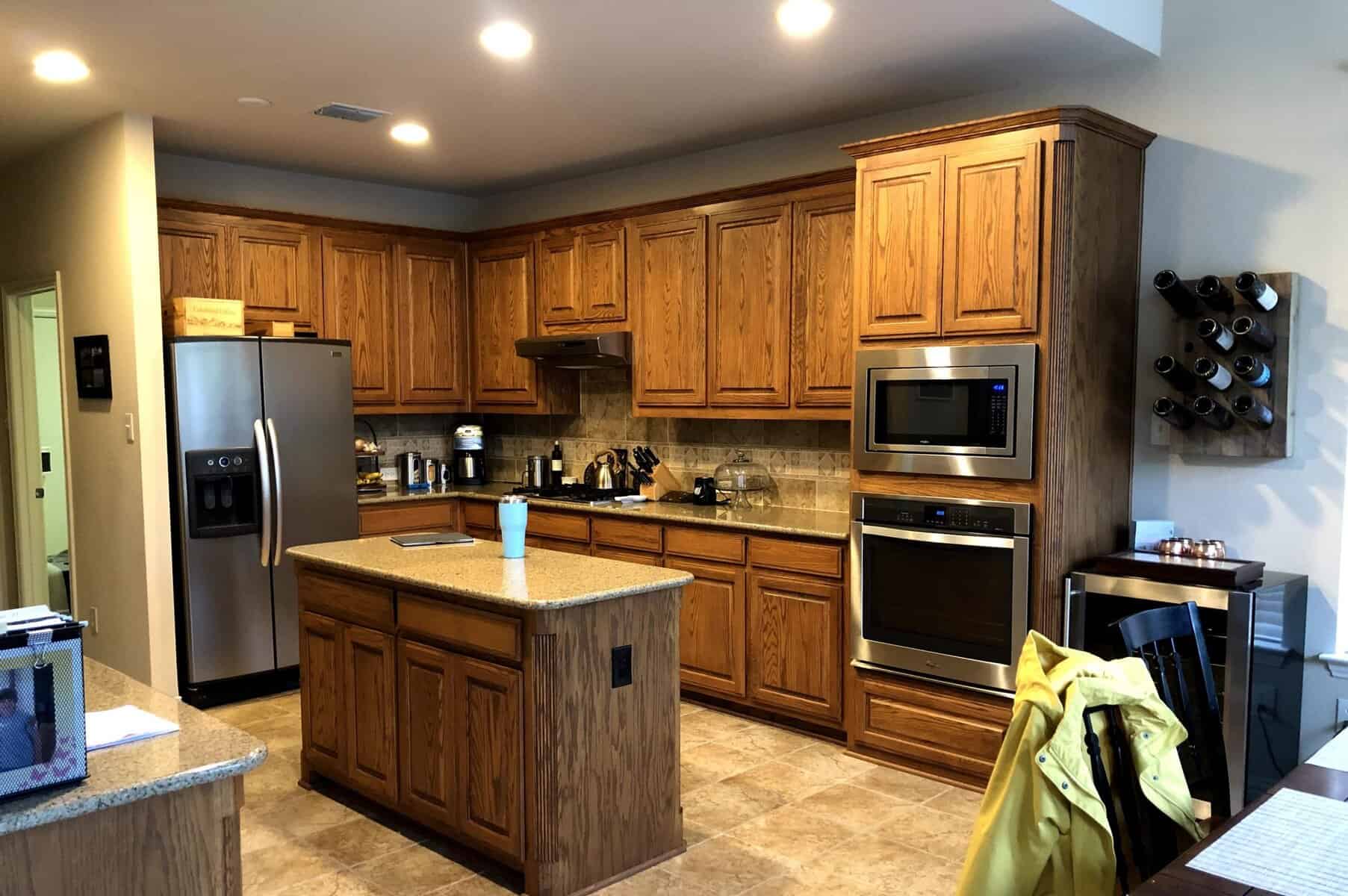
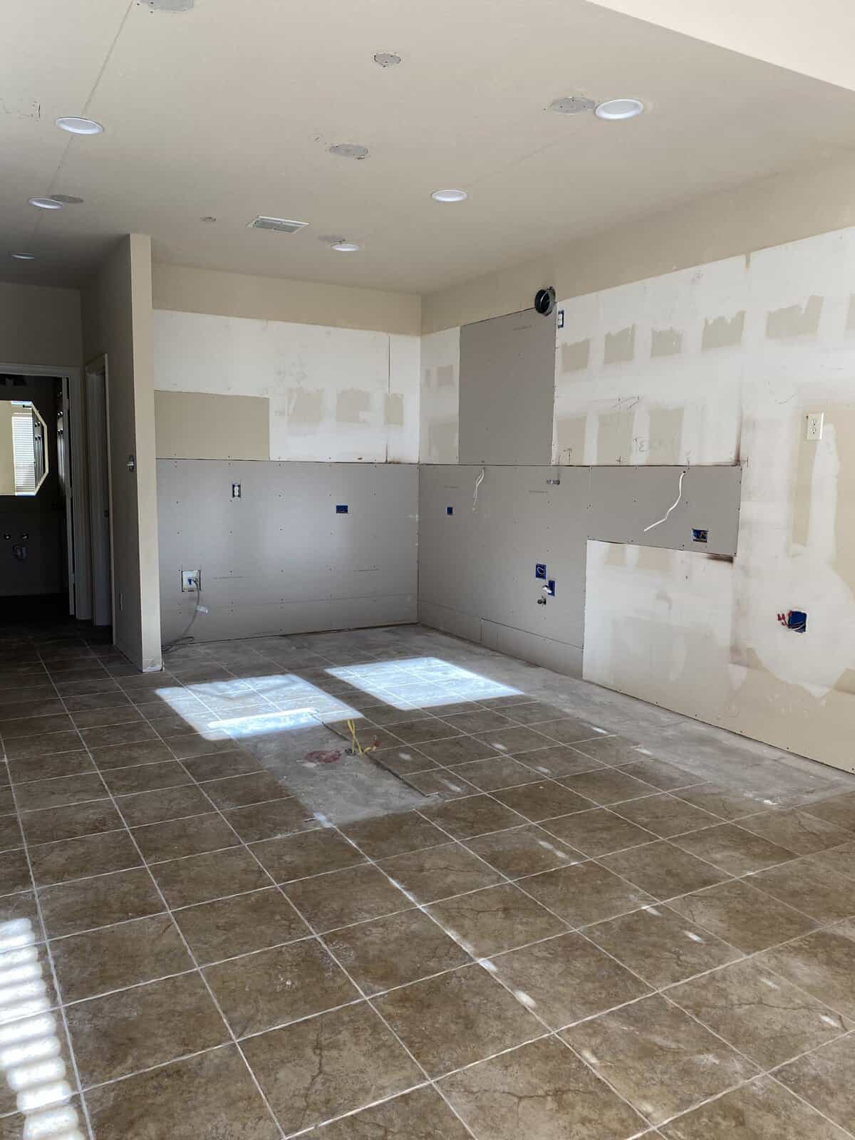
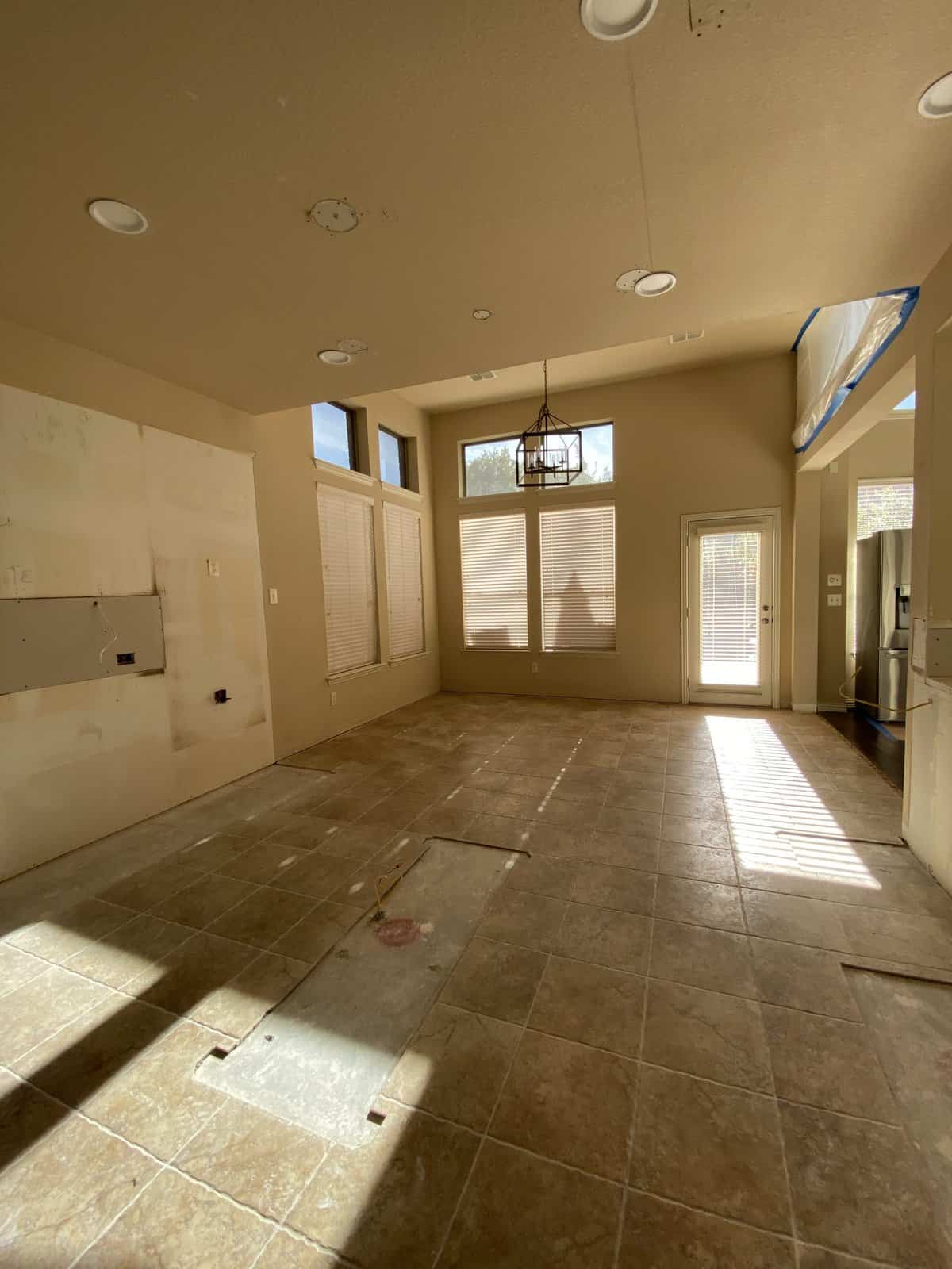
The original kitchen layout consisted of heavy dark stained cabinets and a bi-level peninsula that limited functionality. Our goal for this remodel was to keep the same general footprint and layout of the kitchen, but update and elevate the design aesthetic. We also wanted to increase the storage space by extending the new cabinets towards the ceiling and enlarging the island. These goals gave us a great baseline for creating a new kitchen that would be as beautiful as it is functional.
DURING
We gave the kitchen a major facelift by removing the current cabinets and modifying the two-tiered bar to be counter height. New custom paint-grade cabinets were installed to replace the dark stained original cabinetry. We extended the new cabinets to the ceiling to provide more storage space.
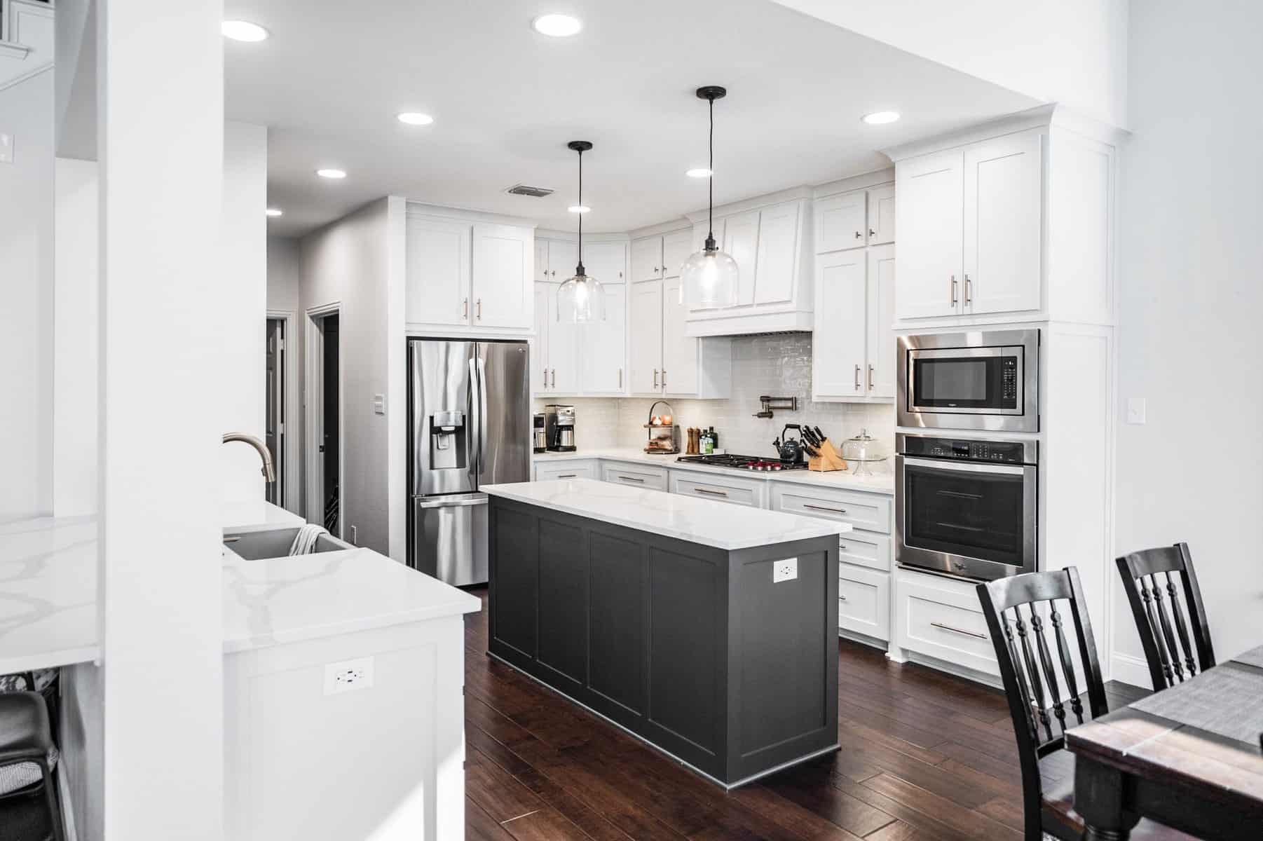
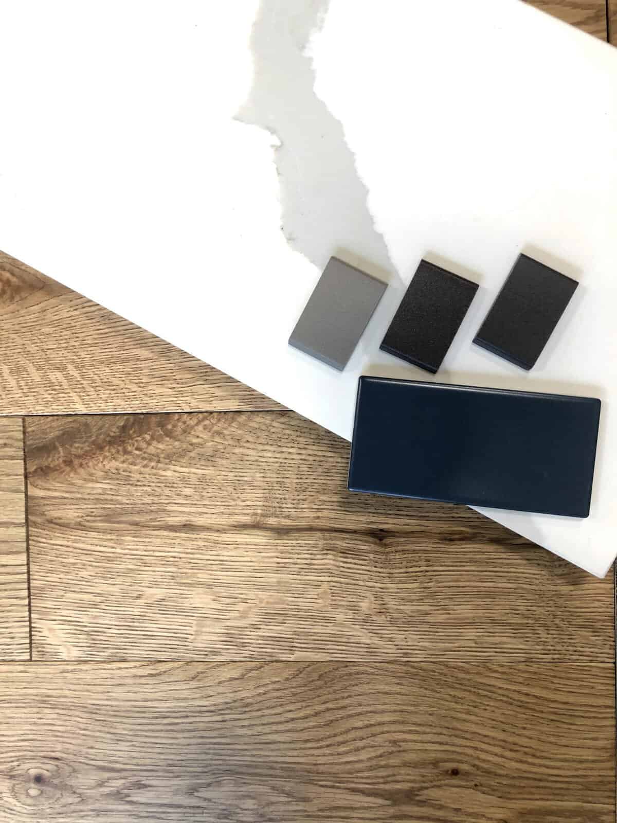
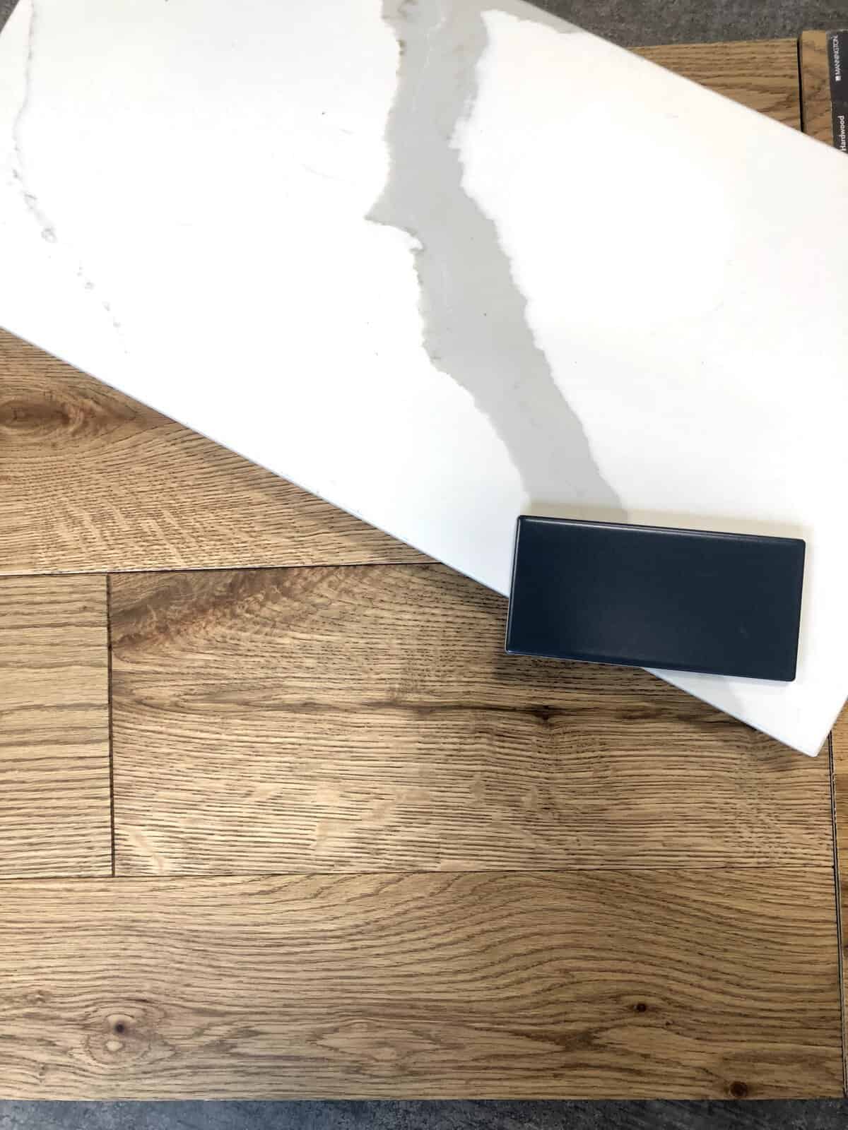
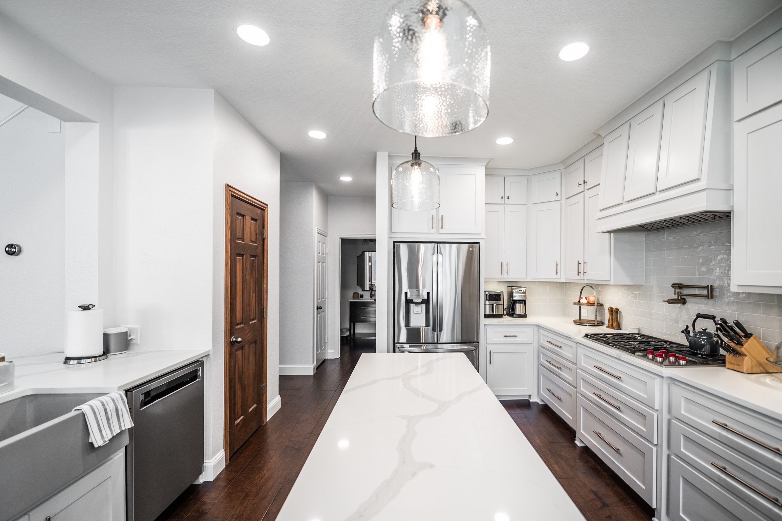
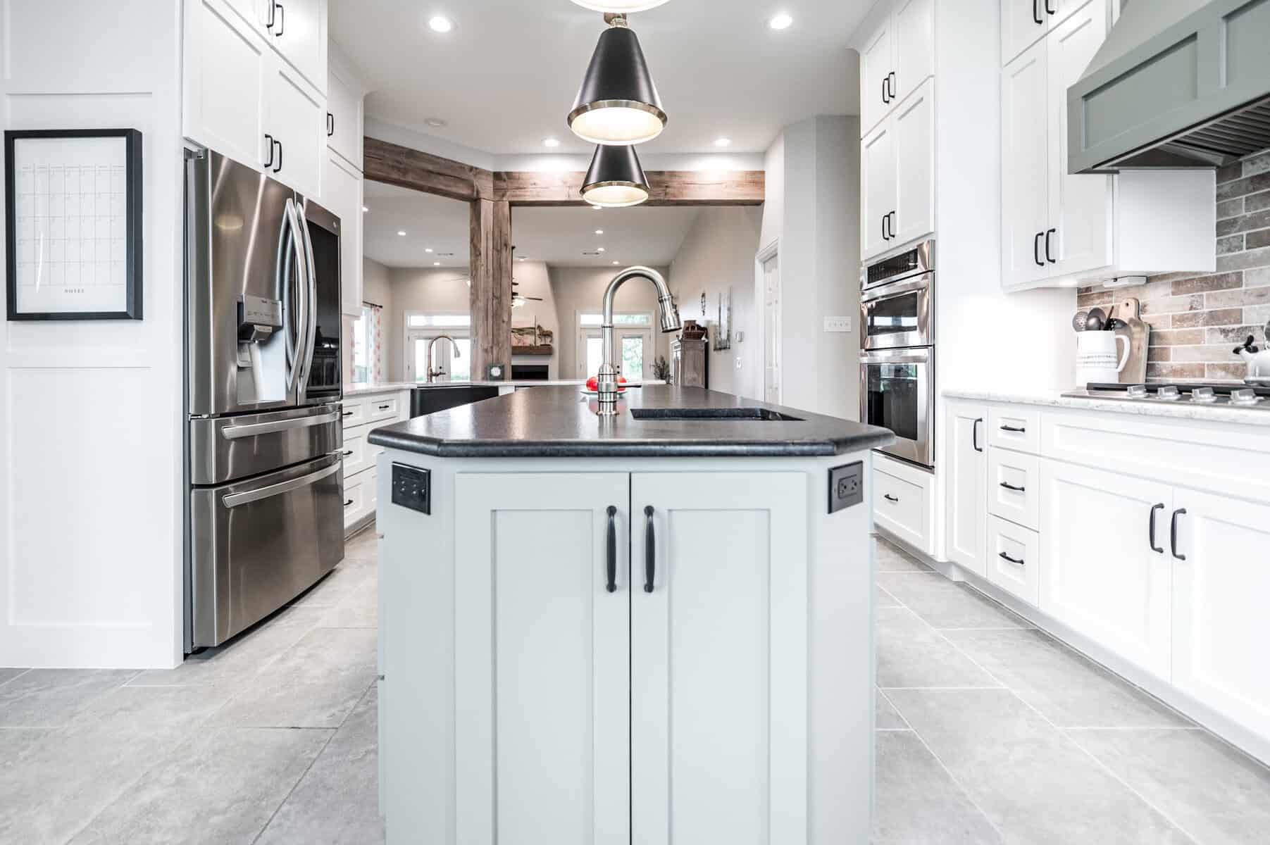
The new island was enlarged to provide more storage and functionality for our clients. If you take a look at the gallery photos at the bottom of this blog, you will see just how much of a difference this change made to the space! We installed new countertops, using Calacatta Sierra Quartz for a more modern look. To further enhance the sleek and sophisticated design, we replaced the backsplash with white terra cotta tile and a snow white grout. We extended the engineered wood flooring that was already in the living area into the kitchen. And for a little bonus feature, we added a pot filler over the cooktop to make cooking prep a breeze!
The walls, ceiling, and trim all received an updated paint job. Our color palette consisted primarily of crisp whites with a deep blue gray on the island cabinet. We installed LED recessed can lights for the main lighting of the space, while under-cabinet and pendant lights were used for accent lighting and brought in some extra brightness.
AFTER
Even though the layout remained the same, the updated colors and lighting makes the space feel brand new. (Isn’t it amazing how changing some color and lighting can make a space feel so different?!). Our clients now have a timeless kitchen that will serve them for years to come, and we feel so blessed to have been the ones to help them realize their dream kitchen.
We hope you are as pleased as we are with this renovation and that it has inspired you to take that step into the kitchen update you have been waiting for. Let us know what you think and we can’t wait to see you back here for the next one!
Project Materials & References :
P A I N T :
Cabinets – Sherwin Williams Drift of Mist
Island – Sherwin Williams Dark Night
Kitchen Room Walls – 50% of Sherwin Williams Drift of Mist
Trim – Sherwin Williams Pure White
T I L E :
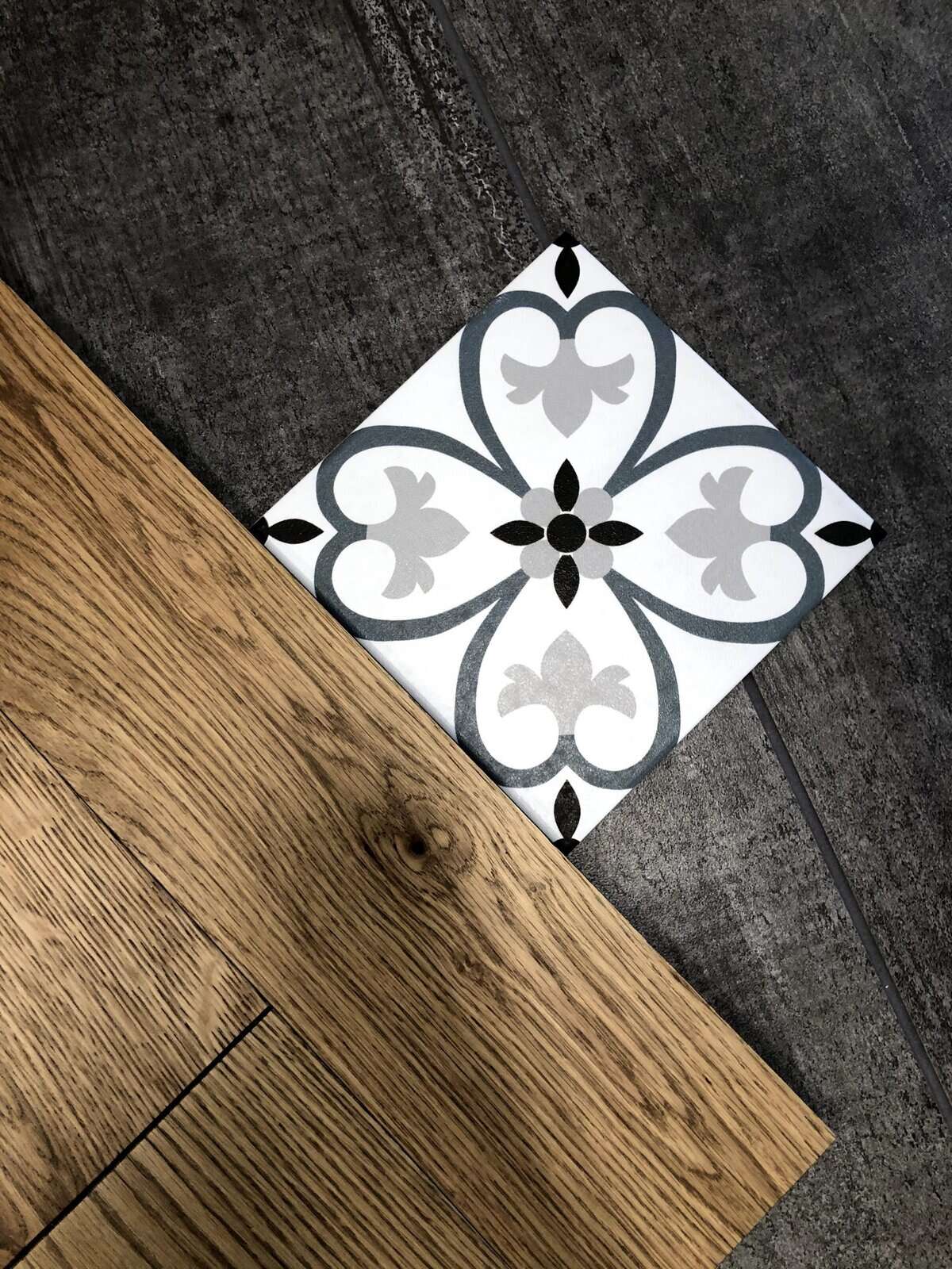
Backsplash Tile – Clé Tile Weathered White Zellige 4×4 terra cotta tile with Custom grout in Snow White
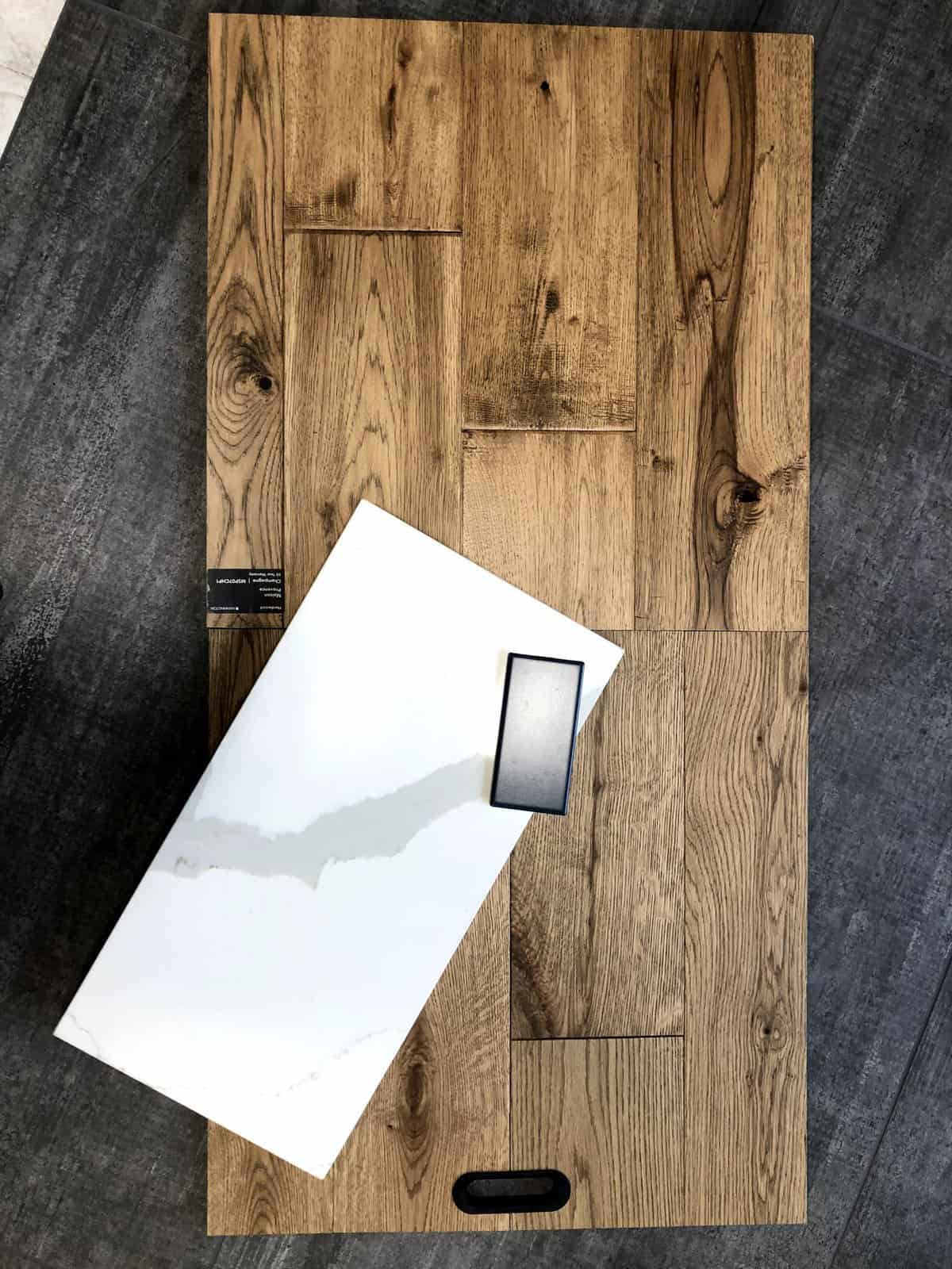
Wood Floor – Bella Cera Amalfi Coast in Marconi (discontinued)
O T H E R :
Countertops – ProStone 3cm Callacatta Sierra quartz (via ProSource)
Sink – Ikon 33 1¾ Low Divide in Concrete Gray (Via ProSource)
Kitchen Faucet – Delta Trask
Flanges – Delta; Delta
Pot Filler – Delta
Pendant Lights – Textured Glass Cord Pendant (2 x 10” bowl, Bronze – Basic finish)
Cook Top – 36″ Gas Cooktop – VGSU5361
Fridge – LG LRFXC2416S counter depth refrigerator
Range Hood – Ancona
Search #socialmediaprojectname on our Instagram | @irwin.construction
[instagram-feed]










Leave A Comment